
The Team:
- Corey Hensley, Front-end Developer, WordPress Developer, UI Designer
- Phoebe Bostwick, Back-end Developer, PHP/JS Developer, Front-end Developer
- Seamus Donaldson, UX Designer, Front-end Developer, UI Designer
Overview
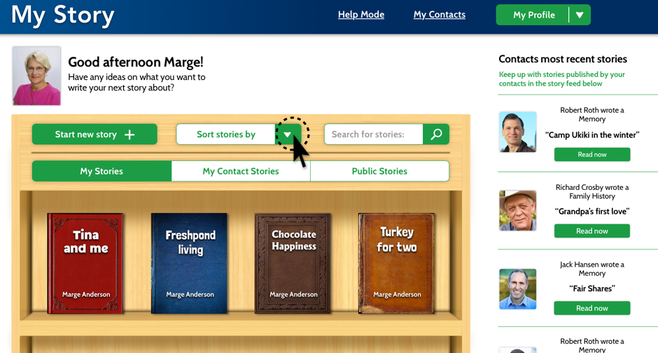
My Story is a website designed specifically for senior citizens to create and share stories on. These days the world is more connected than it’s ever been, but often times as designers we don’t take into consideration the challenges the elderly face when dealing with technology. Our goal with My Story was to create a platform that anyone could use no matter their age or tech capability. Of course we acknowledge that in order to create a successful product, you must have a specific audience to target, but we figured if at the very least we could get seniors to understand the flows, than anyone could. Part of our success in doing this was our focus on creating skeuomorphic elements that users could easily identify with, like the ‘Bookshelf’ or the ‘Story Viewer’. By incorporating skeuomorphism and applying our research in design for the elderly we were able to create a site that users could sign up for and share stories from.
Context and Challenge
Background
My Story was one of many ideas pitched at the beginning of our junior year’s workshop class. Everyone was tasked with coming up with an idea for a website or an application that a team could develop in six months, and My Story was one of the ideas selected. After voting and choosing who would do what, My Story ended up with three members, each with a set of skills and strong suits.
The problem
Seniors are often overlooked as users of technology because a majority of the world has written them off as people who either have no business using technology or simply don’t believe that they’re equipped to understand it. Therefore their needs don’t get taken into consideration. While it is true that there are seniors out there that have no interest in joining the world online, it is still our job as designers and problem solvers to create user friendly solutions for everyone, not just the people who know it best.
So it was our mission to create something that could be easily understood by those who are not as familiar with the inner workings of technology.
Project goals and objectives
From the very start we knew this would be an iterative, intensive process; if we were going to be designing for an audience that we personally had never addressed, we needed to understand how they thought, and the best way to do that was by actually meeting with them. Thus it was crucial that early on we made a connection with a senior center where we could go and do consistent usability testing.
Phase One: Research
It was clear from the start that whatever we designed needed to be backed up with thorough research and testing. What this meant for the team was that we needed to really dive in and understand technology from a seniors point of view. Since we didn’t have easy access to our target audience, we had to get creative when it came to gathering our research, so we tackled it in a few different ways.
Survey & Interviews
 The first thing we needed was a proof of concept…would people actually use this? What would people use it for? Why would they want to use it? How often would they use it? What other sites do they use? What would they be willing to share?
To answer these questions we needed a survey that we could send out to the masses, so we turned to our favorite free survey tool: Survey Monkey. Using the questions above we were able to gather over 60 responses, and as a result we found that there is a demand for My Story and people reported they’d use it.
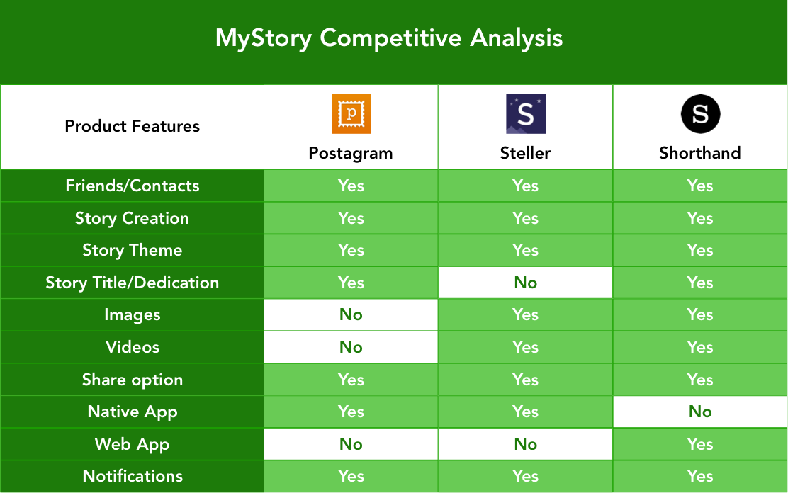
Competitive Analysis
 Since there were already successful sites out there with similar concepts to My Story, we decided to do a competitive analysis to figure out what features we wanted on our site, and what features we could do without.
Design for the elderly
 Before we could jump into any kind of design we needed to understand the challenges seniors face when it comes to interpreting content displayed on a web page, so a lot of our research was focused around text legibility and color contrast.
- Icons should be simple, concrete symbols that look like the objects they represent and should be easily distinguished from others.
- Buttons should have a minimum height of 40px and should include a label as well as an icon associated with the function of the button.
- Fonts must be no less than 16pt and sans serif should be used for all text exceeding one sentence.
- Colors should be high contrast as to distinguish background from the content within.
Phase Two: Strategy
Personas
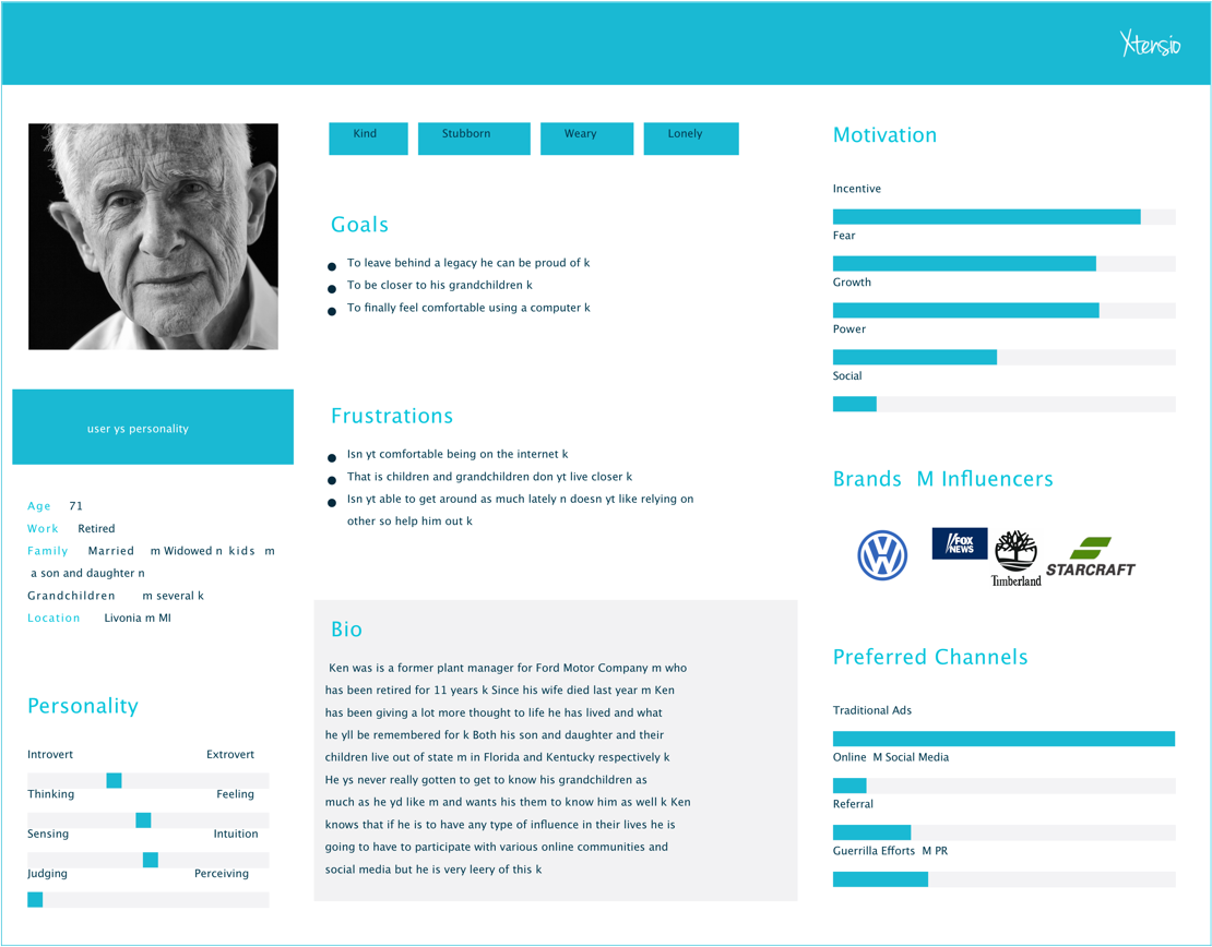
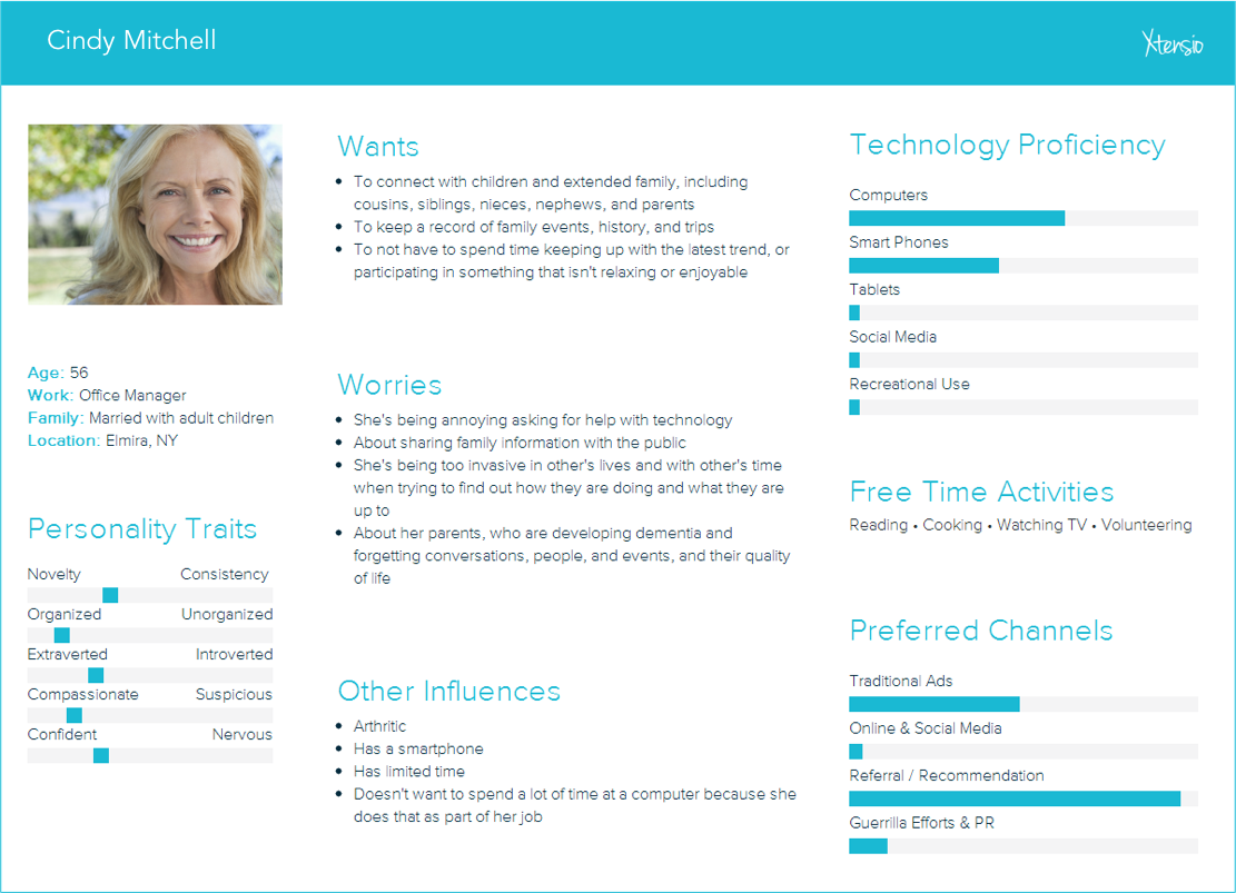
Once we had a solid understanding of how to design for seniors, and what exactly we wanted to include on our site in terms of features, we needed to come up with a few user personas that we could refer to as we began creating the site.
Target audience (60+ age range)
Secondary audience (40-60 age range)
User Flow
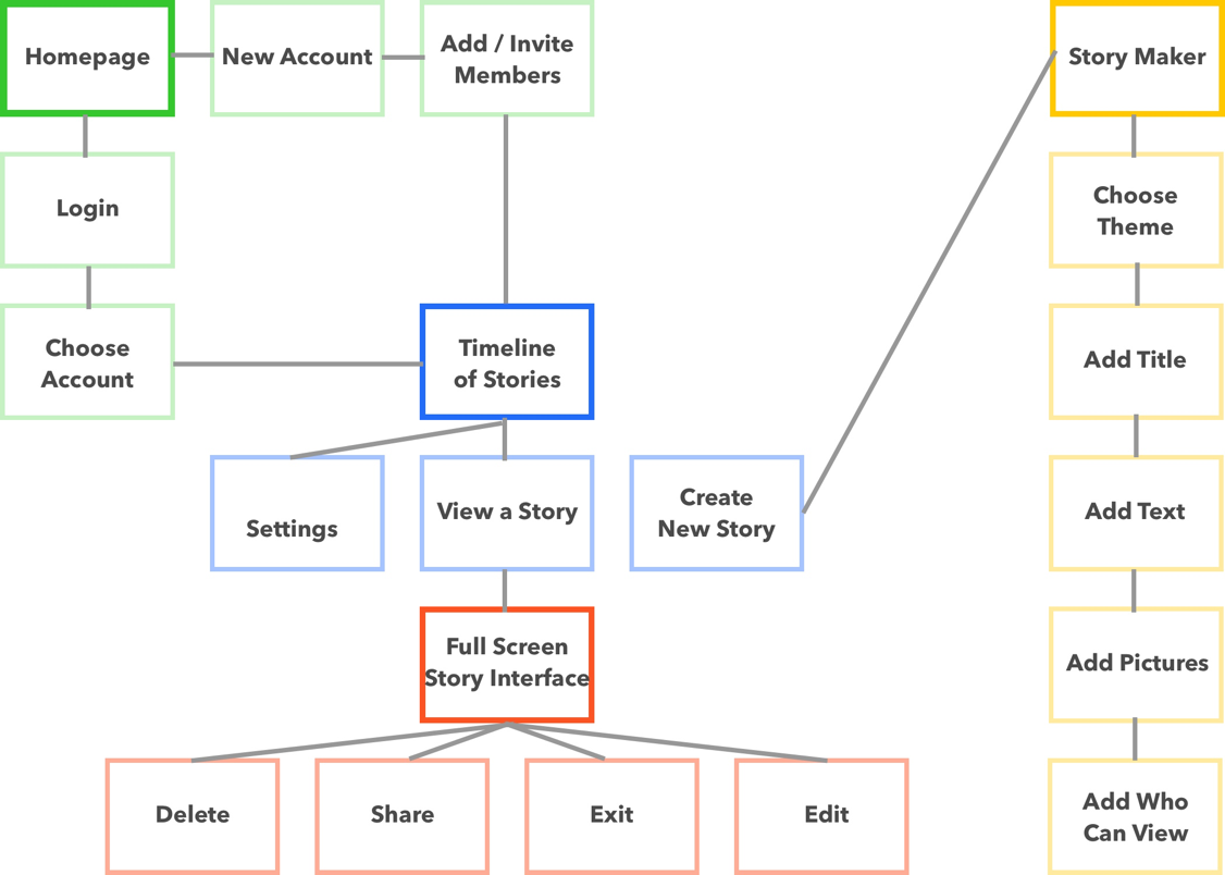
After defining the functionality of our site, and the different pages we wanted to include, we created a site map in order to understand how users would navigate from page to page. This came in handy as it gave us an overview of how the site would work, and where users could go depending on where they were on the site. Our goal was to make every single page accessible with three clicks or less, and the sitemap helped us visualize what that would look like.
Phase three: Design
Sketches
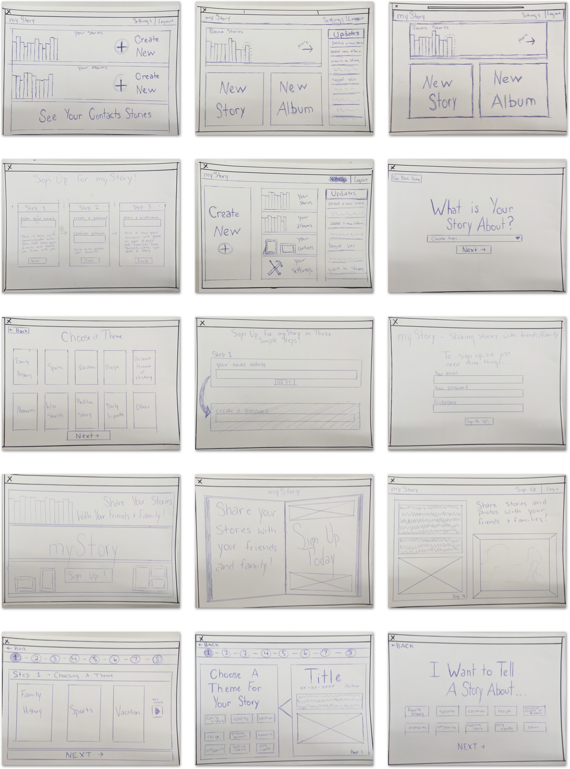
Before we could start designing our interface on the computer we needed to brainstorm all the possible ways we wanted to display the content. Using pencil and paper, we were able to come up with many different concepts that we could quickly cover.
Tools
All sketches were done with good old fashion pencil and paper
Wireframes
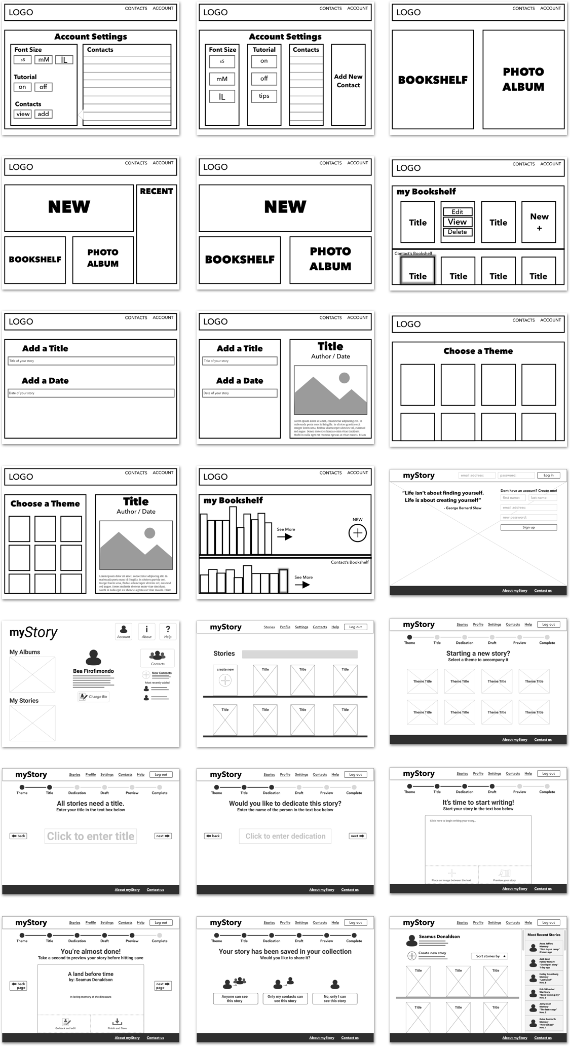
Now that we had a solid foundation for the design of the site, we jumped into sketch and began wireframing.
Tools
Low fidelity screens were created in Sketch and Adobe Illustrator.


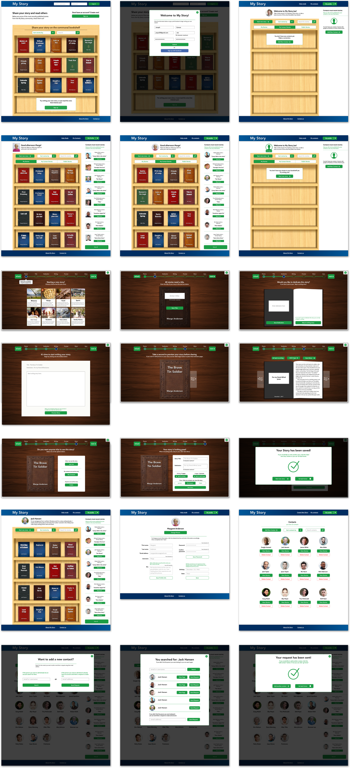
Low Fidelity
After showing our class the progress we had made with the wireframes, we got feedback and decided on a layout that we could then refine and begin to stylize. Using the research we had done on fonts, we decided on ‘Cabin’ as our main font, and used it across the site with varying weights. We also brought in images and reworked the UI based on the feedback we got during critique.
Tools
All low fidelity screens were created in Sketch, then copied and pasted into Adobe Experience Design. Using XD we were able to create a flow connected by premade slide transitions. This wasn’t used for testing because it was too low
fidelity. We put it together so that we could better understand the flow of our story creation process.
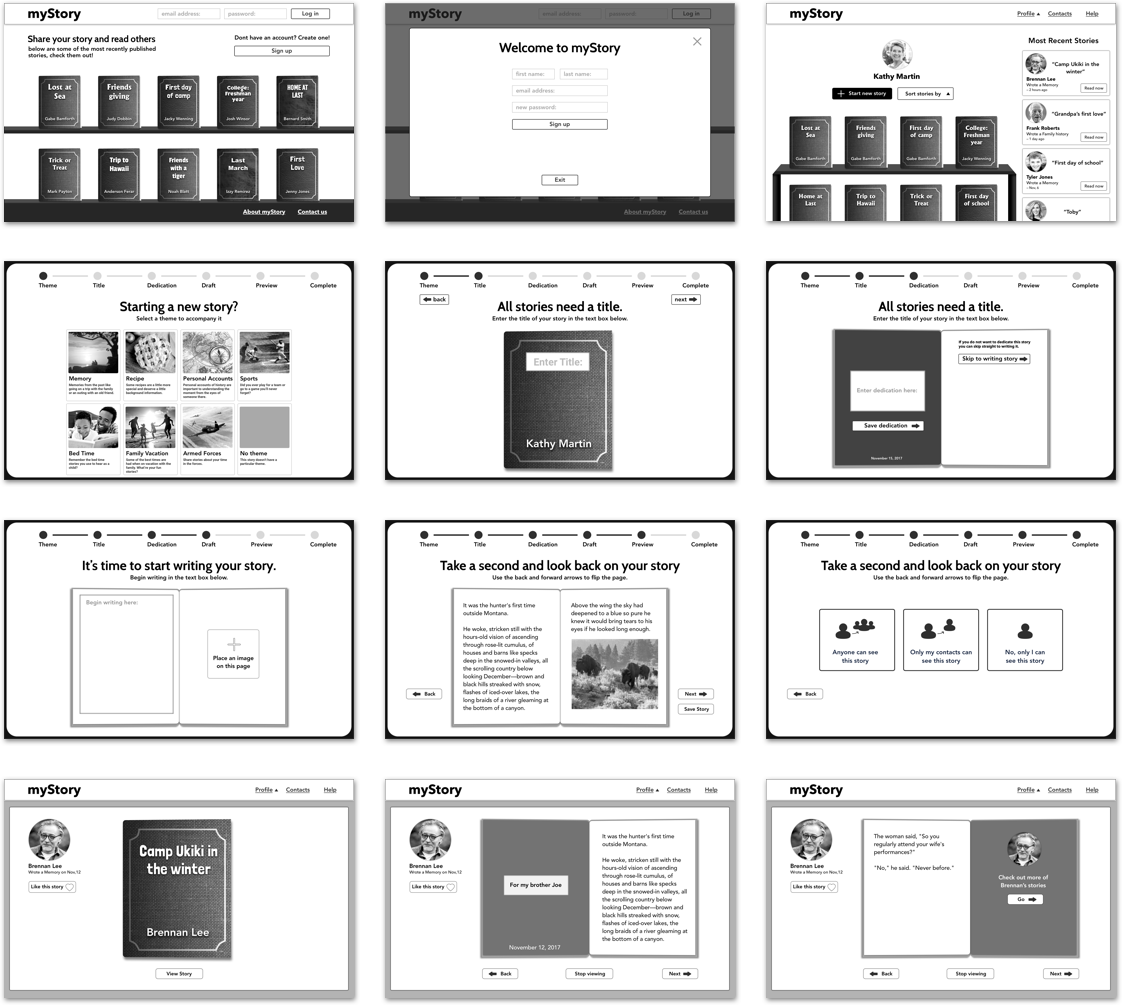
High Fidelity
At this point we had all the screens designed and were ready to implement colors and images across the site.
Tools
All high fidelity screens used in the prototype were exported from Sketch using the Flinto plugin. We were then able to manipulate the elements in Flinto to create links between pages using custom animations.

Prototype
At this point we had all the screens designed and were ready to implement colors and images across the site.
Tools
All high fidelity screens used in the prototype were exported from Sketch using the Flinto plugin. We were then able to manipulate the elements in Flinto to create links between pages using custom animations.
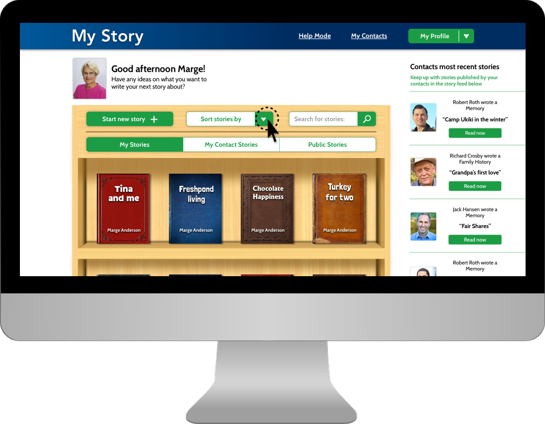
Usability testing – Prototype
For two weeks we performed usability testing with both the primary and the secondary audiences. Each of us showed off the prototype, and explained to testers before they started what the site was about, and what the main features were. We also explained that they were testing with a prototype and some things may not be perfect. After we did our introduction we let them click through while asking them to complete certain tasks. Throughout testing we took notes, which we then reflected on as a team when we got back together.
- Pop-up screens on dark overlays were confusing and disengaged users
- Contact feed was distracting and was unnecessary
- UI elements on the story creation page needed to be clearer and less distracting
- Progress bar needed to be more distinguishable
Phase Four: Development
Initial Challenges
At first we were a little bit worried about accomplishing all the things we wanted our site to do, in code. For a three person team, it seemed like a lot and with only three months left we knew we had to hit development hard. What we had promised for the final was a website that a users could create an account on, add contacts, share stories, and customize stories by theme. Not to mention the challenges we would have creating all of our elements with skeuomorphic styles… we had a lot to tackle but tackle it we did.
Development Research
The first thing we did was a ton of research. Because none of us had ever created a website with such a laundry list of features, we were for the most part going in blind. Quickly we realized that WordPress would be the most sensible place to start because it was built for content management and our site had a lot of it. We also decided that we would start with the ‘twenty sixteen child’ theme because it was already organized and had page templates for things we would need to eventually build ourselves.
We then turned to the Ultimate Member plugin which seemed to solve all of our problems when it came to accounts and friends, but it also came with a set of challenges that sometimes slowed development. Without Ultimate Member we would have had to create a database from scratch that could store account info, request friends, and save stories. That said, Ultimate Member is also an extremely robust plugin so in order to target certain elements in PHP or CSS it took some digging.
The other challenge was creating a custom animation that would naturally resemble a page flipping in a book. Luckily we found a script in a jQuery library called booklet, and just brought it into our code and customized it to fit our needs.
Execution
With all the research that we had done, we had a pretty good idea how to accomplish our goals so week after week, we just knocked items off our needs and wants list until we were down to our wants. The site was initially set up using a WordPress child theme called ‘Twenty Sixteen’. This gave us a solid foundation to start on. From there we began styling the home page. Since we wanted to create a minimum viable product as soon as possible for testing, we started with the skeuomorphic bookshelf on the home page. We used mix-it-up and a grid system to create the books and brought our bookshelf in as a background that could be populated.
Our next step was implementing Ultimate Member. We started by getting account sign up working, and then moved on to adding friends. This was the easy part. The true challenge was how we were going to store the data specific to those accounts, and how we would be able to create share options based on the decisions users make.
The next step was creating a taxonomy for our theme,s which would bring in a book cover style as well as a unique title text. We did this by pulling the category data and assigning a corresponding class, which would then display selected theme styles.
Usability testing – Live site
Once we had reached a point in development where our live site had the core functionalities of creating accounts, posting stories, and viewing stories, we decided to begin testing. The reason we chose to use the live site instead of the prototype was so users could then make their own decisions and become familiar with the flow. We also shifted our focus from design to development and a majority of our UI changes were reflected in the live site as opposed to the prototype.
- Story creation was drawn out and disengaged users
- Story creation flow didn’t reflect a natural thought process when coming up with stories
- UI needed to be more consistent across all pages to convey navigation
- Users needed a delete and edit option for their stories
- Prompting language on story creation process needed to be more specific
Conclusion
It has been incredible to see a vision like My Story turn into a reality. Over the past six months we’ve taken a concept from nothing to a fully fledged website and we couldn’t be more proud of the work we’ve done. While we haven’t gotten every last thing fine tuned and styled, we were able to knock everything off our needs list, and we are successfully delivering on what we’ve promised. If we were to take this to the next step, we would implement some type of social media login, potentially allow for sharing on social platforms; we would also find a way for authors to include images in their stories, and would look to refine the skeuomorphic elements even more to create that feeling of a real book. All in all, My Story has been an amazing experience for all of us, and from the testing to the debugging, we’ve learned a lot.