The Team:
- Martina Calluori
- Jacob Culp
- Tri Do
- Brendan Luu
- Brendan Russo
- Erin Wiegman
OVERVIEW
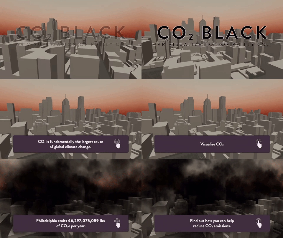
Carbon dioxide (CO2) is the single largest contributing factor to global climate change. If CO2 was black, together as a society, we would have taken strides to reduce it years ago.
Our solution to this problem was to create a way for people to view the world around them as if CO2 was visible, and give people achievable tasks that would help reduce their carbon footprint. It is easy to believe that your actions as an individual have no impact, but we wanted to show users that even something as small as turning off the lights when you leave a room can make a huge impact over time.
By repeating agile development sprints of research, prototyping, and testing over the course of IDM junior workshop, we achieved our goal of creating an AR app that raise awareness of the CO2 emissions in Philadelphia and ultimately made people more conscious of the impact of their carbon footprint.
PROCESS
Our first task was research. We needed to get each team member familiarized with CO2 and its impact on the environment. As we gained fundamental knowledge of the issue, we identified it as good problem to solve with augmented reality, being that CO2 is everywhere in the environment around you. With a strict 6 month timeline we decided for the sake of scope to focus on Philadelphia because of the ability to make an impact within our city.
With basic project scope outlined, we assigned general roles, Brendan Luu as team manager, Martina Calluori, Jacob Culp, Erin Wiegman, and Brendan Russo would focus on augmented reality development, and Tri Do would focus on design, with all team members helping out in different departments as needed.
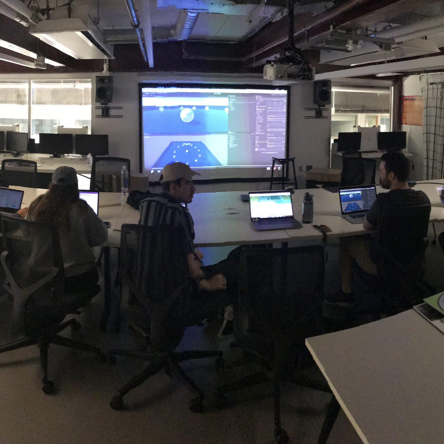
Our final task before diving into our design sprints was getting familiar with Unity, a game engine that we were all using for the first time and also learning the pipeline of augmented reality development in Unity with Apple’s ARKit framework.
LOW-FI
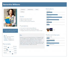
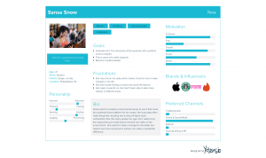
Our first design sprint started by defining our target audience, students primarily in the high school and college age range (15-22). We identified this age range because students are typically the most open to change and learning, and their changes would have the largest impact over their lifetime. We created user persona’s based on interviews we had with students in Philadelphia that fit into our target audience so we could easily picture actual people using our app rather than a number representing an age range.
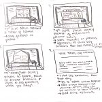
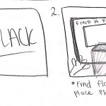
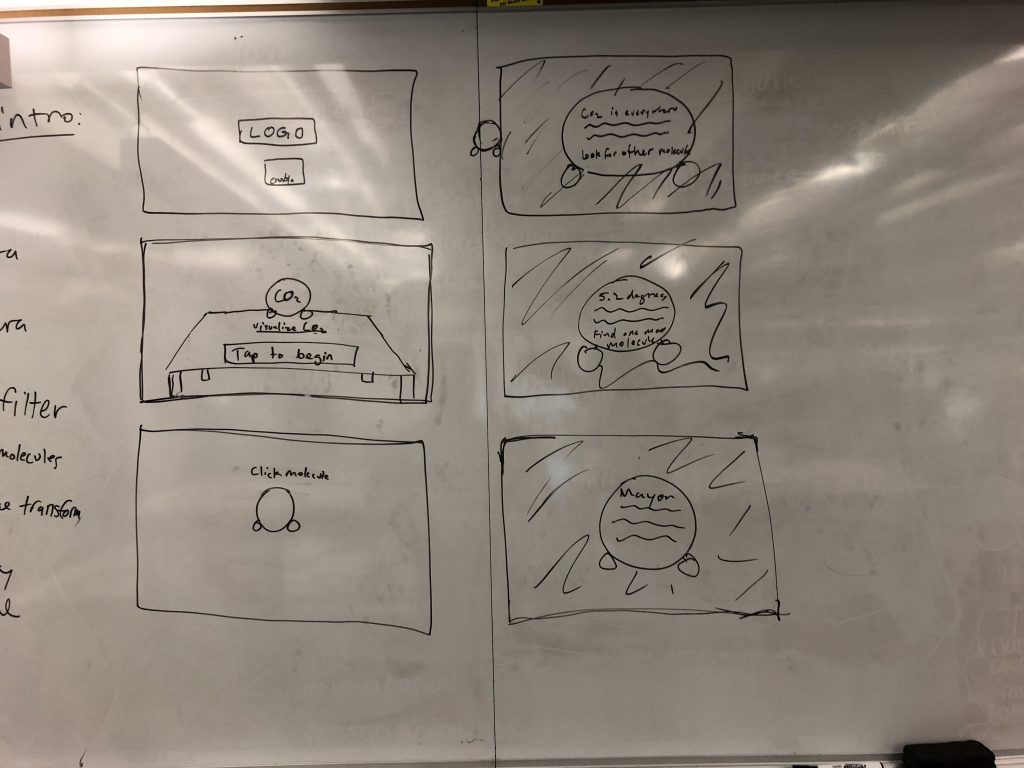
We then concepted storyboards to outline our vision for the app. Our first iteration started off with people navigating through dark clouds that represented CO2 and reading facts off of 3D models of CO2 molecules that were scattered around them. The second half of the experience allowed the user visualize CO2 in a completely different way by showing a miniature 3D map of Philadelphia being filled to the top with the dark smoke to show the smoke on a larger scale. Before getting into development, we wanted to see how people would interact with this new environment.
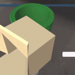
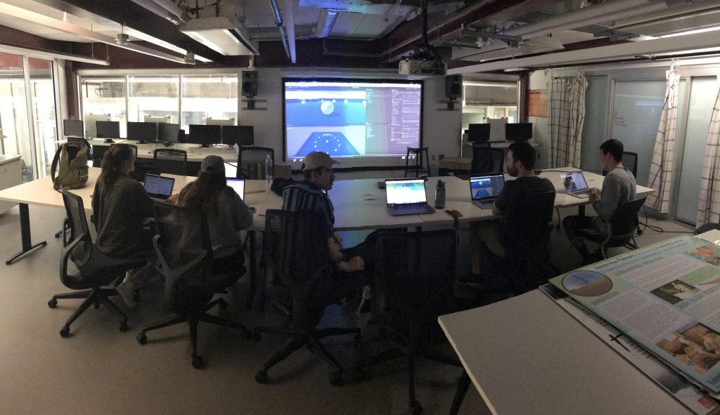
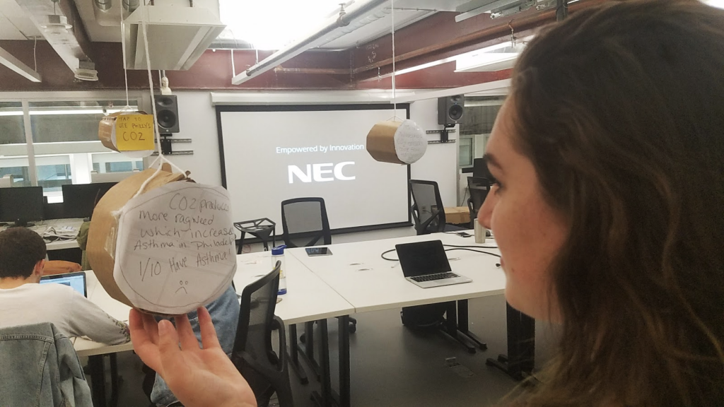
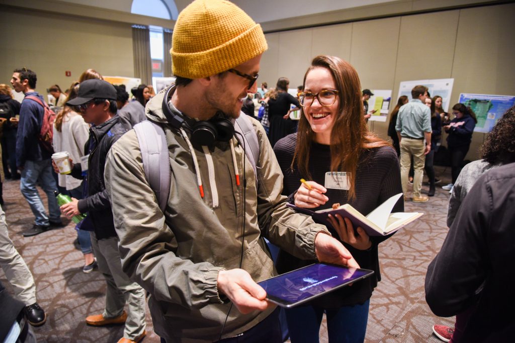
To test this, we build all components of the storyboard with cardboard, tape, and paper and took photos of each step and put that into a clickable prototype and presented this prototype on a phone to users for usability testing. This new way of prototyping in for AR was a good idea, but was not entirely successful because users did not feel like this was representing augmented reality, and it felt just like clicking through photos. We realized that for future projects we would still build the prototype with cardboard, but instead of having users click through a prototype we would bring them into the room where the cardboard experience is being displayed and have them actually navigate around the room and see how they would interact with that.
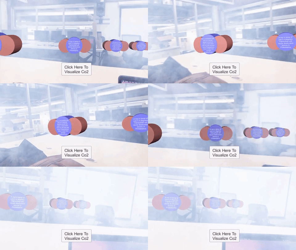
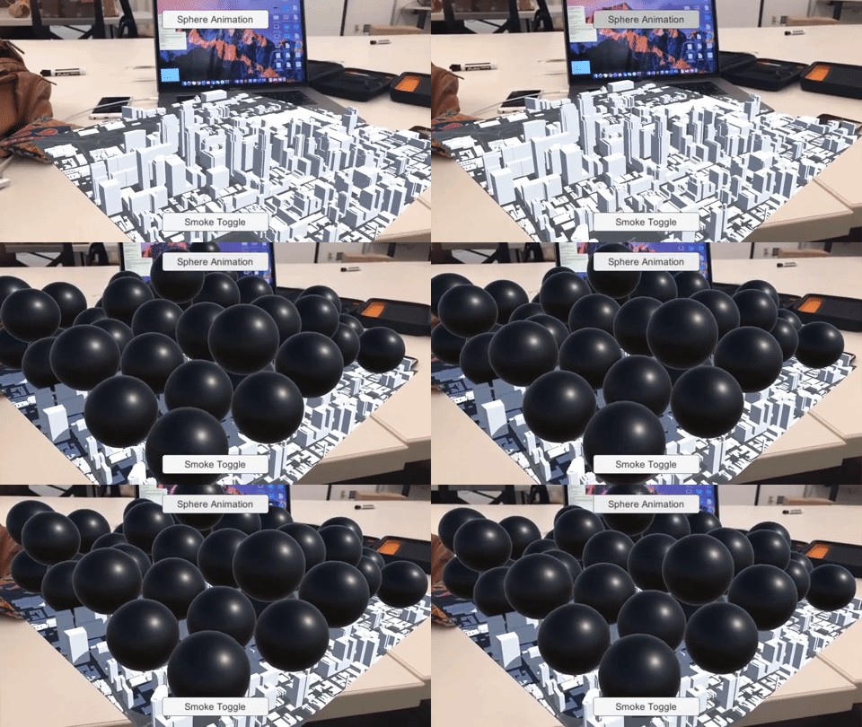
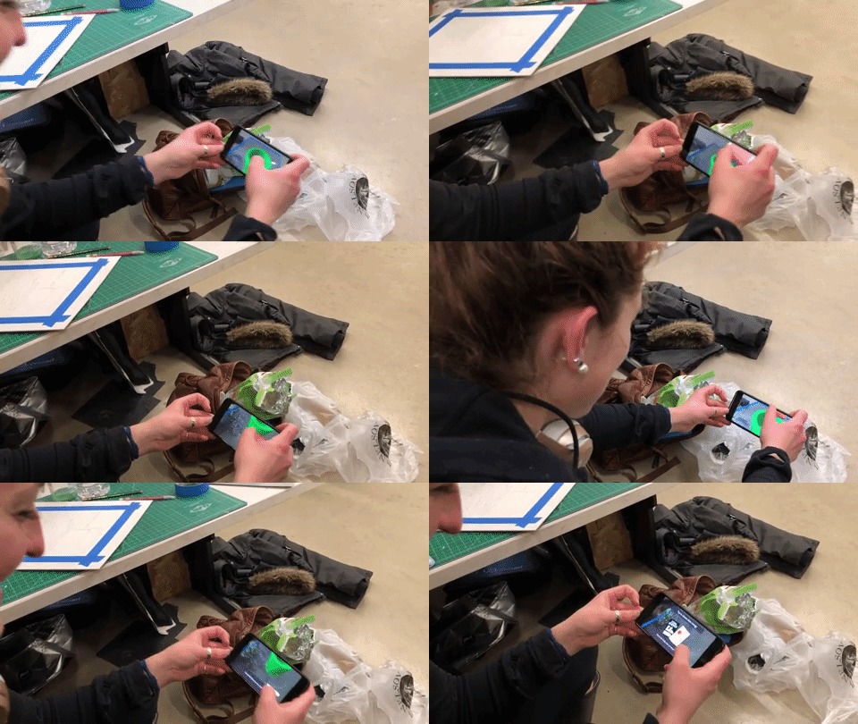
Based on feedback from the cardboard usability testing, we went forward with creating a low fidelity prototype of this experience. We created the Carbon Dioxide molecules and displayed facts in a text format on them, but users struggled to read the text in AR, there were too many representations of CO2 which left users confused, and users didn’t know what to do with these facts and newly acquired information. We surveyed more people in our target audience and realized that we were approaching the problem all wrong, and shifted our focus to giving people achievable tasks, and making the data more geared towards the individual.
MID-FI
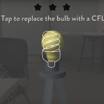
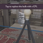
With our failure and lessons learned from the first iteration of our app, we went back to the drawing board to create a more meaningful experience. For our next storyboards we focused on simple household tasks that have a big impact on individuals’ carbon footprints. We presented users with a 3D lamp in their environment surrounded by CO2 visualized by clouds of blackness. In the experience, users are prompted to switch from old light bulbs to energy efficient bulbs, and are informed that using the new bulbs for 1 year is equivalent to having removed as much greenhouse gas pollution as taking 2,000,000 cars off of the road. After, users are reminded that simply switching off the lights when you leave the room will also reduce their CO2 emissions. Each time a task is completed successfully, the clouds of CO2 would decrease. We built this in Unity and tested it with students around Drexel and found this new iteration to be extremely successful. Our success with this module confirmed our theory that people would enjoy a more kinesthetic learning experience. We decided to keep this idea for the rest of the app, and made the decision to break the app up into three “modules” or tasks for users to complete, all of which will help reduce their carbon footprint.
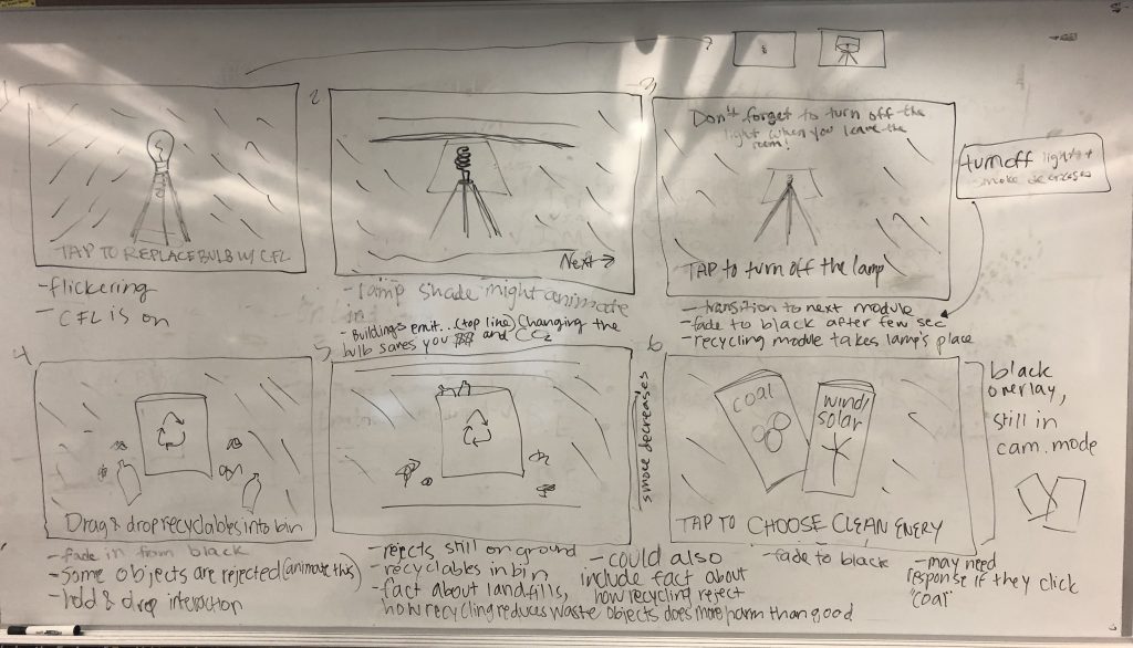
Again, we went back to storyboarding and outlined a module that follows this lamp interaction but places an emphasis on recycling. We found from talking and surveying people in our target audience that not everyone recycles, and this is partly due to people not knowing what you can recycle or not. With this new module you are presented with a recycling bin with a mix of recyclables and trash scattered around. We wanted to gamify recycling, and created a trial and error game shows people what they can and cannot recycle while also encouraging people to think more about recycling an interactive experience. If a user attempts to recycle a piece of trash, it is rejected from the trash can and shown a message saying why the item was rejected. We used physics materials on the trash and recyclables to give a more realistic experience, so when the objects are thrown into the trash it mimics the way the objects would fall if not in an augmented reality experience. We wanted to use these physics materials and the accompanying animations to reinforce that this situation can be replicated in everyday life. This method was very effective, and through usability testing we realized that people did struggle with discerning what is recyclable versus what is not, so this became a very important module.
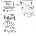
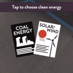
The final module was intended to have users realize that they could change their energy to a cleaner source such as wind or solar in an easy and convenient way. After meeting with Drexel’s Institute for Energy and the Environment, we learned that one of the best things an individual can do to reduce their carbon footprint is change where they get their energy from. The original storyboard presented users with two pamphlets, one advertising coal and one advertising solar and wind powered energy. Users made their selection, and when they selected clean energy they were given more information on why switching reduces your CO2 emissions and how to switch. This module was very forgettable to users and was the least engaging.
HI-FI
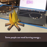
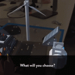
Due to the fact that switching energy sources is one of the most effective ways to reduce your carbon footprint, we needed to fix this. We wanted to create a story for this module because energy consumption has changed so much over the past 200 years so for one last time, we revisited our story boards. At this point, users are shown 3D models of energy sources that society has relied on in the past starting with wood, and followed by gas, coal, and are finally presented with a solar panel and wind turbine. We wanted to show people that these nonrenewable energy sources are a thing of the past, and that clean energy is the future. Users are then prompted to select an energy source. When they select wood, gas, or coal they are shown a message that informs them that there is a cleaner energy source that has does not produce CO2 emissions. When they select wind and solar energy they are then shown how easy it is to switch your energy provider, and are presented with a novel AR laptop that gives a simplified demonstration of how easy it is to switch your energy from coal or gas to solar or wind without having to install anything into your home. After testing this new module, none of our users selected a nonrenewable energy, and were very surprised that switching your energy provider was really that easy.
WHAT WE LEARNED
Designing for AR has proven to be quite different from anything we have done so far because for the first time we are not designing for a screen, we are designing for the world. We have learned that the best AR UI is one that does not interfere with the experience itself unless it directly improved the current view. Interface is still a major factor in AR apps, despite how much it can get in the way, it is crucial to guide users through the app to avoid confusion. As AR is a new technology, most people do not have a mental model for this type interactive experience. A good interface was essential to our project as it will guide users through an experience they are currently uncomfortable with.
For example, instruction text was extremely important. There needed to be readable text that told users where to look and what to tap. Without this instruction text, it is unlikely that users would even get the models placed in the scene. Instruction text occupies the top of the screen and is white with a dark shadow behind it. After testing, users never had a problem reading this text. If there is a major action to be completed, it is communicated at the top of the viewport.
The shock factor of seeing CO2 visualized in your space is accompanied by text to inform users on relevant issues surrounding greenhouse gas emission. We decided to employ dialog boxes throughout the application to display this text. These dialogs are pushed to the bottom of the viewport and tapping anywhere on the screen, rather than just the dialog, progresses through the app. Contrast issues are much more complex in AR. We have no idea what these dialog boxes will be overlaid on. In order to combat this, the background of the dialog boxes are slightly transparent black boxes with white text inside of them. Based on user testing, this boxes are completely readable in all situations.
Finishing a module of the main AR experience unlocks more information about the given topic. We communicated this information using what we call “Learning Layers”. These are large dialog boxes that summarize our scientific research and data surrounding the theme of the specific module. Learning Layers take up only 75% of the screen and use similar styling as the dialogs, they are semi-transparent. This way, users are never fully taken out of the immersion. In the 25% left at the top of the screen there are close and next buttons. The close button is red and accompanied by an X and functionally minimizes the Learning Layer. The next button is accompanied by and arrow and functionally progress through the Learning Layer and transitions to the next module.
The last major interface element is the badges and guide. There are three distinct modules that, upon completion, award badges through the Learning Layer transitions. The badges then stay at the very top of the screen and give people a mental model of progression through the app. All three badges are grayed out until they are earned at the end of modules. The intention behind this was so users are aware of their progress in the app. It also adds a layer of gamification. There is a meaningful congratulatory achievement for completing each module.
The only other instance of interface, besides the Learning Layer, taking up a significant amount of screen space is during the lamp scene where a silhouette of a new energy efficient bulb appears to guide users towards the proper action. This helps users understand they are replacing the old bulb on tap as well as leading users to aim the ray cast properly. This is a great example of development and design working symbiotically.
RESULTS
CO2Black is the result of 6 people, 6 months, and an entirely new realm of 3D application development that nobody had experience working with. We came together with the hope that when people used our app, they would walk away with the belief that their actions have a direct impact on the amount of carbon dioxide in the environment. We are unable to quantify success due to this, but our qualitative metric of success depended on how people felt after going through the app, and our users found the experience fun and engaging, and felt that the experience was much more interactive than just reading a pamphlet about carbon dioxide. With these aspects in mind, CO2Black is a success. One user said after experiencing when going throughout his day, when he would traditionally throw away his morning coffee he went out of his way to recycle it. This result is exactly what we were striving for. We broke CO2Black down into three modules that had everyday tasks in hopes of them influencing their everyday actions.
The last six months was an incredible learning experience for our whole team. We learned that an agile approach is the best approach for this. This is a new technology that not many people have experience with, so it is a delicate balance between pushing the boundaries of the technology and defining interactions that people are comfortable using. We had the special task of not only trying to teach people about CO2 and the impact of their actions, but we also had to teach them how to use AR, usually for the first time. This was a particularly difficult task because we ourselves were learning how to design and develop using AR for the first time. Using AR for the sake of using AR is a lesson that we quickly learned was not the best idea. We wanted to use AR to enhance your experience, and we kept this mindset throughout the development of CO2Black. We found out through user testing that giving instant feedback, whether that is through animations, UI, color, or haptic feedback is very important to show the cause and effect of actions. Lastly, a solid team is one of the most important aspects of a successful project. We were able to depend and rely on each other and that sense of security allowed us to take risks in our ideas and development process.

