
Digital Media Senior Showcase Presentation
Sunday, May 23, 2021 at 1:00 p.m. ET
Overview
afiye is a digital home for families to stay connected by sharing media of cherished events, better preserving and viewing their connections in the form of user uploaded images, image albums and documents. The purpose of this project was to research, design, and develop an app by integrating multiple technologies using the experience and skills our team have gained during our time at DrexelUniversity into a coherent product which effectively communicates a message or to solve a need. That need was to address family communication during the pandemic and our mission was to improve it with our app.
Our team consists of
- Ben Murray
- Brianna Buissereth
- Erik Martus
- Fidel Boamah
- Arpit Ahluwalia
We were advised by Phil Sinatra.
Why ‘afiye’
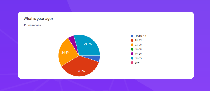
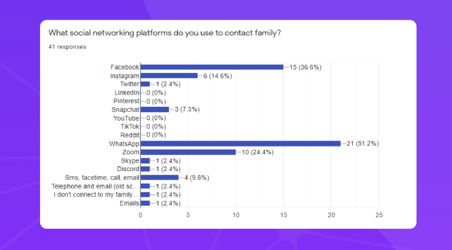
We wanted to quantify the makeup of families and how they interacted with one another.Leveraging our network of peers and our own families we distributed a general survey and encouraged them to share them with their own friends and families. We were pleased that only36.6% of our respondents were in the 18-22 age bracket as the results were able to give us abetter picture of how a wider range of demographics interacted with their families.Reviewing our results, the most frequently used social networking platforms used in family communications were Facebook and WhatsApp. Additional data gathered led us to the conclusion that both of these were utilized due to their accessibility and methods of connection.Facebook specifically was chosen for the “everyone is on it” factor, however, further analysis showed that many would prefer something other than Facebook due to its numerous privacy issues. WhatsApp was favored due to the ease of creating and maintaining group chats within families.
Research
User Surveys
We wanted to quantify the makeup of families and how they interacted with one another. Leveraging our network of peers and our own families we distributed a general survey and encouraged them to share them with their own friends and families. We were pleased that only 36.6% of our respondents were in the 18-22 age bracket as the results were able to give us a better picture of how a wider range of demographics interacted with their families.
Reviewing our results, the most frequently used social networking platforms used in family communications were Facebook and WhatsApp. Additional data gathered led us to the conclusion that both of these were utilized due to their accessibility and methods of connection. Facebook specifically was chosen for the “everyone is on it” factor, however, further analysis showed that many would prefer something other than Facebook due to its numerous privacy issues. WhatsApp was favored due to the ease of creating and maintaining group chats within families.
User Interviews
We started our research with initial user interviews and asked our users questions based on a creative exercise that would help us better develop the idea behind afiye. With remote interviews over Zoom, all involved people could remain safe during our interview sessions. Our initial questions allowed us to gain a better understanding of our target audience and ask them exactly what they wanted out of afiye.
In the beginning of our project, afiye was originally thought up as a social media platform so our first few interviews were based on social media and its expectations with our users. From those findings, we found a problem that needed solving and that was the overwhelming nature of social media. Many interviewees said that social media can sometimes be troublesome to search and navigate through, especially in terms of past events. One of the major negatives to social media was the amount of noise and unimportant posts that were not important to users.
Takeaways
- Our initial interface was very basic. Users expected more relevant themes and pop culture references in a social app.
- Users mentioned chat and other features to be distracting, especially when there are too many to keep track of.
- Families are obviously extremely diverse.
- We must take into account families of 2 or 100+ during our design processes.
- Social Media apps can have too much noise, spam and invasive ads which makes finding specific images or things hard.
- Users are looking for a streamlined, simplified way to store and share things with only specific people, their family.
Setting afiye’s Identity
During our research for afiye we identified a design opportunity in family networking. We noticed that popular digital platforms didn’t provide enough privacy and were a bit too distracting for families to be intimate with each other. On the other hand, certain sites focused too much on genealogy and just the historical aspect of family. Our users wanted a simple digital space to share memories, and stay connected with their loved ones. Our challenge was to design a digital experience with features that supported our users in reaching their goals. That is why we made afiye the way that we did. The web app afiye addresses family communication during the pandemic and how it was once difficult or cluttered which makes the message behind afiye that much more impactful.
We knew it was extremely important to make users not only confident in afiye’s security, but also in navigating through it. Users have expectations when it comes to web apps such as afiye, so we made sure to meet those expectations within the design and UI decisions we made. Without meeting those expectations, users could easily get lost within afiye and not want to use it. Our web app afiye is not trying to reinvent the wheel since its purpose is focused on families and keeping their memories in one digital place.
Takeaways
- Users would never post their children on Facebook, so the privacy of afiye was welcoming.
- Current social media apps do not value privacy as much as they should.
- Simpler is better, too many options can be confusing.
- Integrity and security in a brand is valued by its user base.
- Users have expectations when it comes to apps/sites. Ex: Simple bottom nav, logo that leads to home page in corner.
- Too much change in UI from other media apps is bewildering.
User Personas
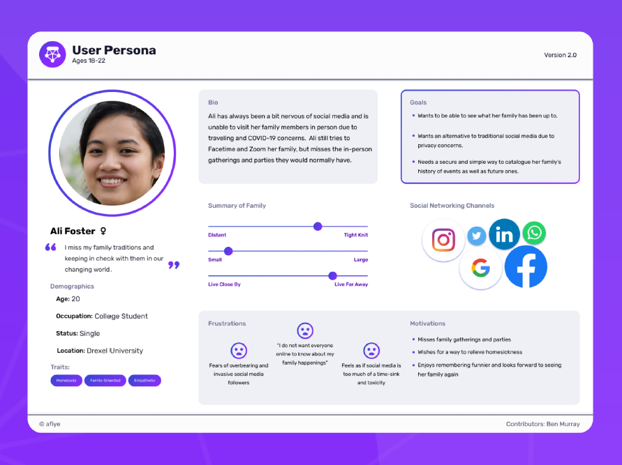
To assist in formulating our target audience, we developed User Personas. Using what was learned from user interviews, we created these personas and gave them each goals, traits and their stories behind how they interact with afiye. With their creation, we were able to put ourselves into others’ eyes and set up Journey Maps for them. Without the personas, theJourney Maps would not be possible and the empathy behind afiye would not exist.
Takeaways
- Given that we had a very broad user age for our target audience, we wanted to aim for a minimalist and simple design so users of all ages could easily interact with our platform, especially the older generation who aren’t traditionally used to new technology.
- We had to ensure our platform aimed to not replicate existing family platforms and rather just focus on cherishing the important memories as that is what our users want.
Journey Maps
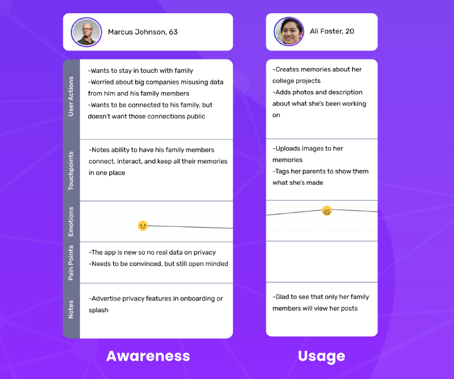
We developed journey maps from each persona which allowed us to focus on the pain points of users in different demographics. Keeping these pain points in mind allowed us to streamline how we wanted to design afiye while achieving our goal of being accessible. These journey maps formed the foundation we looked back upon when making decisions so we could look through the eyes of our users.
Takeaways
- Our onboarding should be simple yet interactive enough to explain our platform and how to use it well. It should also aim to highlight how we prioritize privacy to ensure new users feel safe using our platform right off the bat.
- We had to ensure our platform aimed to not replicate existing family platforms and rather just focus on cherishing the important memories as that is what our users want.
Usability Testing
We tested our build through multiple iterations from the initial UI prototype to our final developed build. Getting feedback from primarily game designers through our classes with the DigitalMedia senior cohort was insightful as well as they gave out great styling critiques. We also got a lot of critical feedback from the UI to minor bugs from our other testers which helped our app become what it is today.
Takeaways
- Our Date Of Birth calendar allowed users to select dates in the future which was a clear bug pointed out by many users.
- Our Profile wasn’t clean with lots of spacing issues which was negatively impacting our user experience.
- General styling feedback and spacing suggestions for our tablet screens.
UI Design
Logo
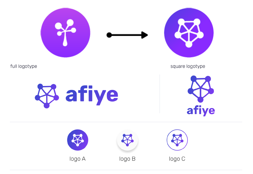
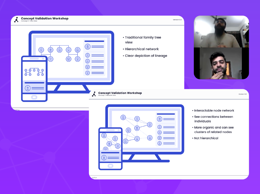
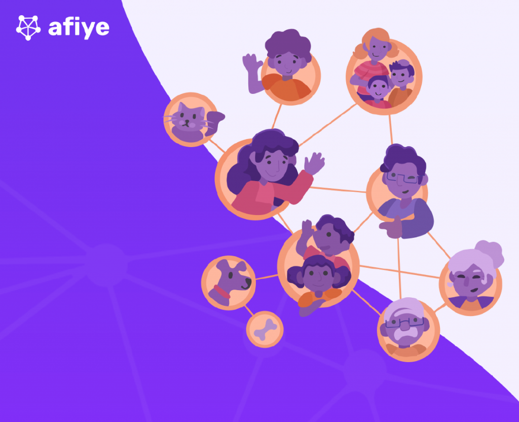
The afiye logo went through some changes as afiye’s purpose was set in stone. Previous versions of the logo were similar to that of a tree. However, after putting it in front of our users we decided against it since the logo gave them a notion that afiye was a genealogy app that focused on the idea of laying out a family tree. As our goal was to bring together family connections, the logo was switched into nodes and lines. The final logo we designed in this style was designed around making our message behind afiye shine. Exploring the idea of connections led to the creation of a new network or web-esque design that not only reflects these as they are shown in afiye, but also to show that families are anything but simple through the intersecting lines. Another subtle aspect of the logo is that the five nodes are also a nod to the team behind afiye with each node representing one member.
Typography
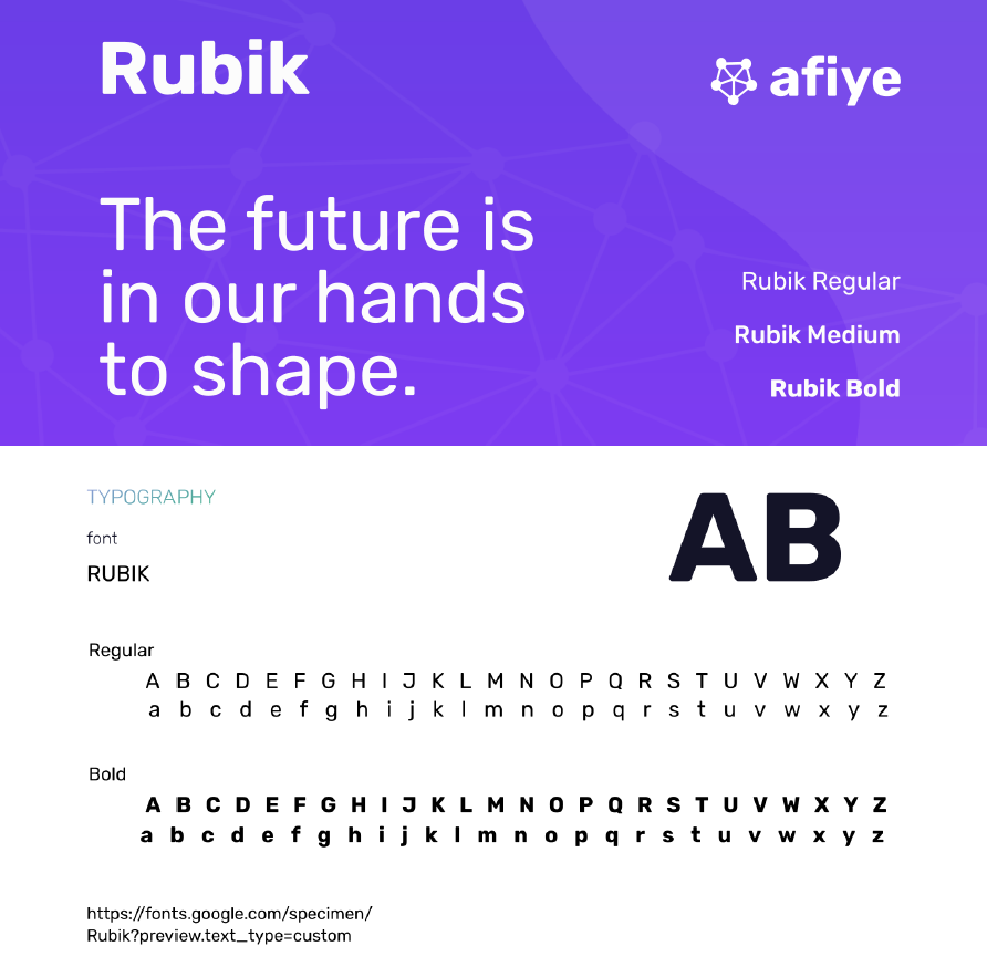
After exploring a variety of different typefaces and font styles, we settled on the font Rubik. This modern sans serif family was selected for its clear letterforms, rounded style, and numerous available weights. The clear and distinct letterforms increases legibility of the font, which is something that should certainly be considered for every project, but especially for afiye considering the expectation that elderly users will be on the platform. As for the rounded appearance of the letterforms, from our initial selection and user feedback we confirmed that the slight roundness to the font contributed to an approachability factor for the application while maintaining a sleek, modern look and without veering too close to a childish appearance. The various available weights for Rubik allowed the team to easily develop several text styles to implement across our application to maintain consistency.
Colors
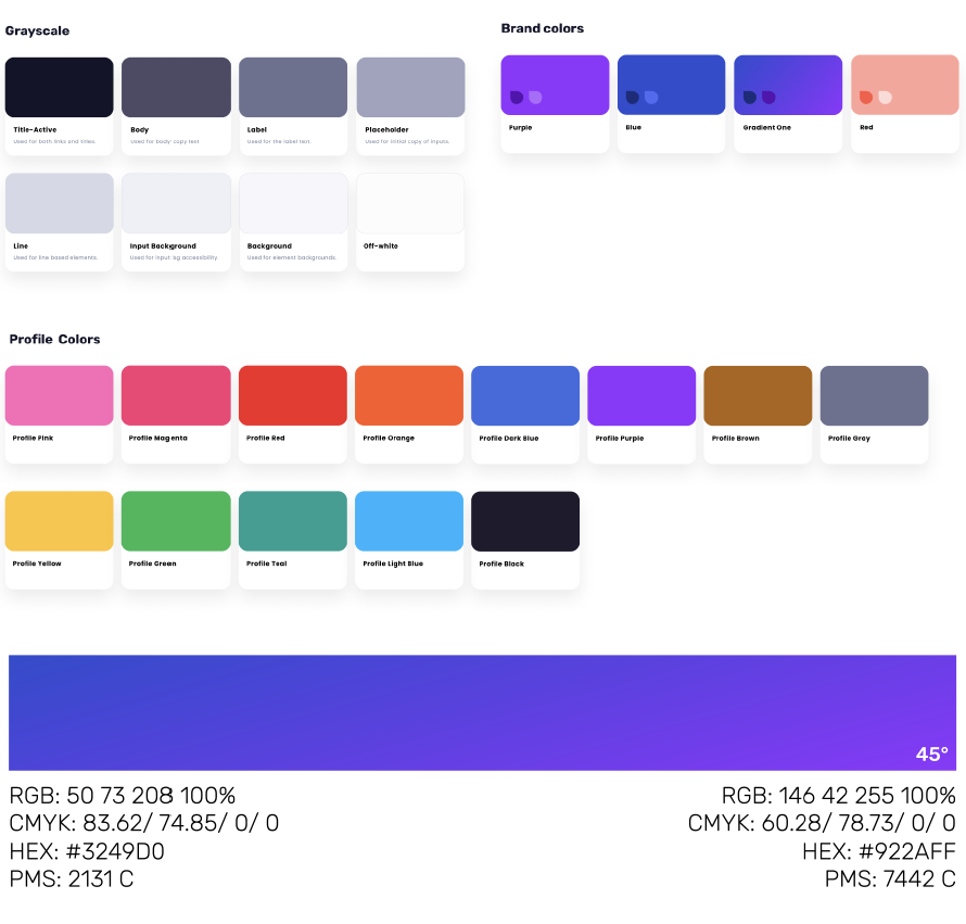
The primary color used throughout afiye is purple. This color was selected for its association with sophistication, vibrancy, creativity and independence. The intention was to make a platform which made every family feel like they are important and unique.
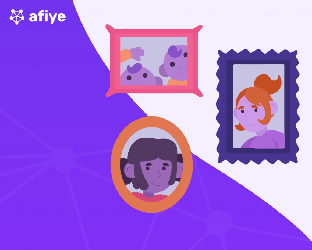
Additionally, a collection of thirteen colors were curated that would become the options for afiye’s user profiles. The idea was to allow users to have customizable sections within their family that matched who they were or what they liked. These colors would be present in thehalos around avatars as well as being used as accent colors on a user’s profile pages. In this way family members would be able to communicate just a little bit more about themselves in a fun and exciting way
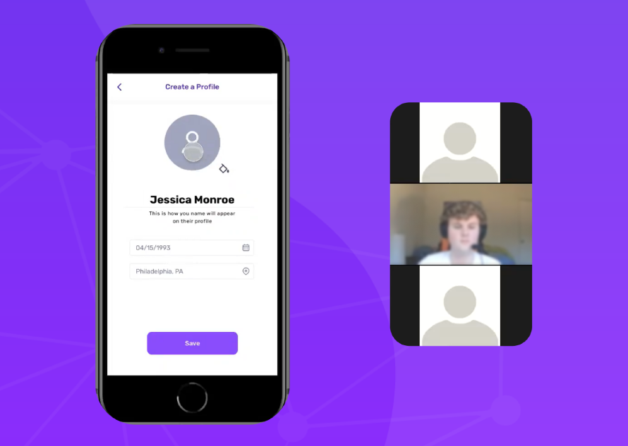
Wireframes
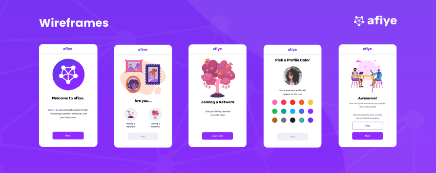
With our brand identity set, the design team got to work creating wireframes. Leveraging the collaborating environment of Figma, we were able to rapidly design, prototype, and iterate afiye and put our ideas in front of users. Our primary goals were to create something distinct from other platforms, but also accessible and fun for our users.
Using an atomic design approach, we gradually built up from small pieces of our interface to whole screens. The purpose behind this approach was to ensure that every aspect of our designs could be easily and quickly updated as we iterated through various designs and layouts. This proved to be crucial in our eventual success, but also created an enormous challenge. We quickly found our design system growing in size and complexity as we added variations and states to each of our interface components.
Our largest oversight in our design phase was not utilizing spacer components as having multiple hands on the interface design resulted in inconsistencies throughout the prototype. This resulted in a lengthy quality assurance stage to polish the prototype as we prepared to shift into full development. While unfortunate, this step was necessary and allowed us to have a clearly defined layout as we moved into development.
Development
Version Control and Collaborative Development
While everyone on the team has had ample experience with development, for many of the members, this was the first time working on a project of this scale with multiple developers active at once. This created many new challenges stemming from ensuring that everyone was always up to date on their code base and clearly delegating tasks to ensure that multiple developers were not working on the same assignment at once. To best prevent accidental overwrites of each other’s work, the team opted to employ a forking model for our repository management and changes would be submitted to the primary repository via pull requests. This allowed for proper reviews to be conducted to ensure that bad code did not make it into the main repository while also allowing each team member to work freely on their changes.<?
Switching the team from collaborating on design to collaborating on development was a longer process than expected, but the lessons learned from working as a team while designing proved crucial to optimizing our development workflow. Clear delineation of tasks and assignments made it easy to pinpoint when any individual was having difficulties with an aspect of the project and allow the rest of the team to assist as necessary. Maintaining forked repositories proved tobe the correct decision as it allowed for front end and back end technologies to be experimented and iterated on independently so as not to override the work of the other. And our review process made it easy to bring the two together if one end of development made more progress than the other at any point in the project.
Front End Development
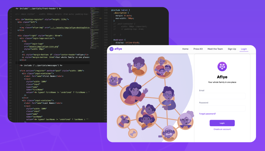
With the team using GitHub for version control and submitting changes to the primary branch, the development pipeline was ready and allowed the team to get comfortable working on a large-scale project alongside multiple developers coding at once. For anything that needed to be added, changed, or fixed, the team used Discord and a GitHub Scrum Board to document and communicate what needed to be done and when. Using what we have created in Figma and our high-fidelity wireframes, we converted all of the elements into code. The blessing of the wireframes is that the sizings and positions of elements were already prepared so coding them into afiye and pushing them on the live site was a successful process.
Back End Development
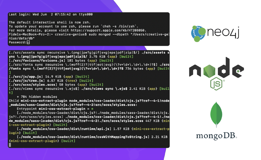
This was the team’s first foray into such a complex backend system. Many mistakes and challenges happened along the way to our final product. First and foremost we learned the lesson of completely and properly laying out our data models and how they will be utilized in the application as not properly doing so leads to numerous headaches over the course of development. Additionally, we felt the pains of working remotely when it came to trouble shooting our local development environments, especially since we had to maintain consistent version and environment controls in both Windows and MacOS.
Over the course of this project, our greatest success is that we demonstrated our adaptability.Prior to this project, no one on the team had substantial direct experience with any of our core backend technologies, NodeJS, MongoDB, and Neo4j, but our previous experiences with other web development technologies allowed us to successfully implement all three in our final application.
Next Steps
Reflections and Conclusion
afiye itself will not live on after this project to become a company or an official platform.However, the lessons each of us learned will be taken into our careers to create exciting experiences for our future users.
The hardships faced in our capstone project have aptly prepared us for our careers in the creative and technology industries. We have learned vital lessons in teamwork and communication that will allow us to be successful in any workplace. Especially the need and benefits of having an established and agreed upon pipeline from ideation to execution that allows the entirety of a project to move smoothly from one phase to the next and accommodates any setbacks or resets along the way. Collaborating in user interface design and development are fundamental in succeeding in these industries, and while it took us a moment to find our footing completely under us, the flow of passing tasks off to one another became yet another vital lesson to each of us as succeeding or faltering at this step we found to be the biggest bottleneck in our project.
Together we grew as a team, and through our collective work we were able to succeed in this roject. The final product may not have been everything that each of us envisioned it would be,but collectively we are proud of our accomplishments and the challenges we put ourselves through. We never thought of this to be an easy project, and it certainly proved not to be, but the final form of afiye is a testament to our skills and our ability to grow as designers, developers, and researchers.