
Final Presentation
March 8, 2021
The Team:
- Anna Leong
- Mikayla Lisiy
- Dolma Sherpa
- Lindsey Smith
- Victoria Stauffer
The Overview
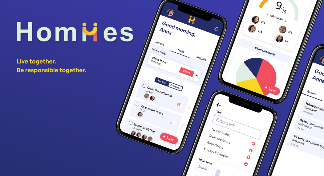
Homiies is a roommate management app that empowers roommates to keep track of individual and shared responsibilities and facilitate communication. The app was built with the React framework and Firebase.
Through thorough and extensive research and testing through user interviews, competitive analysis, and usability testing, we refined and produced a product that meets the pain points of our target users. The main pain points that Homiies seeks to solve are appreciation, balance of responsibilities, and miscommunicated expectations. These problems are achieved through a recent activity feature that allows users to react and comment to tasks, a visualization page that displays balance of effort and responsibilities, and simple yet comprehensive create a task flow pages.
The Context and Challenge
Problem
Living with roommates is not always easy. The Homiies app seeks to help avoid miscommunicated expectations with roommates, balance household responsibilities, and keep track of who is doing what.
Goals & Objectives
The success criteria and goals for our project are to design, develop, and thoroughly test a highly functional prototype of the Homiies app. Some of the functionality goals included adding tasks, claiming “up for grabs” chores, and viewing insights from the distribution of tasks among roommates. This mobile app will be built using the React framework and Firebase for authentication usage.
Process and Insight
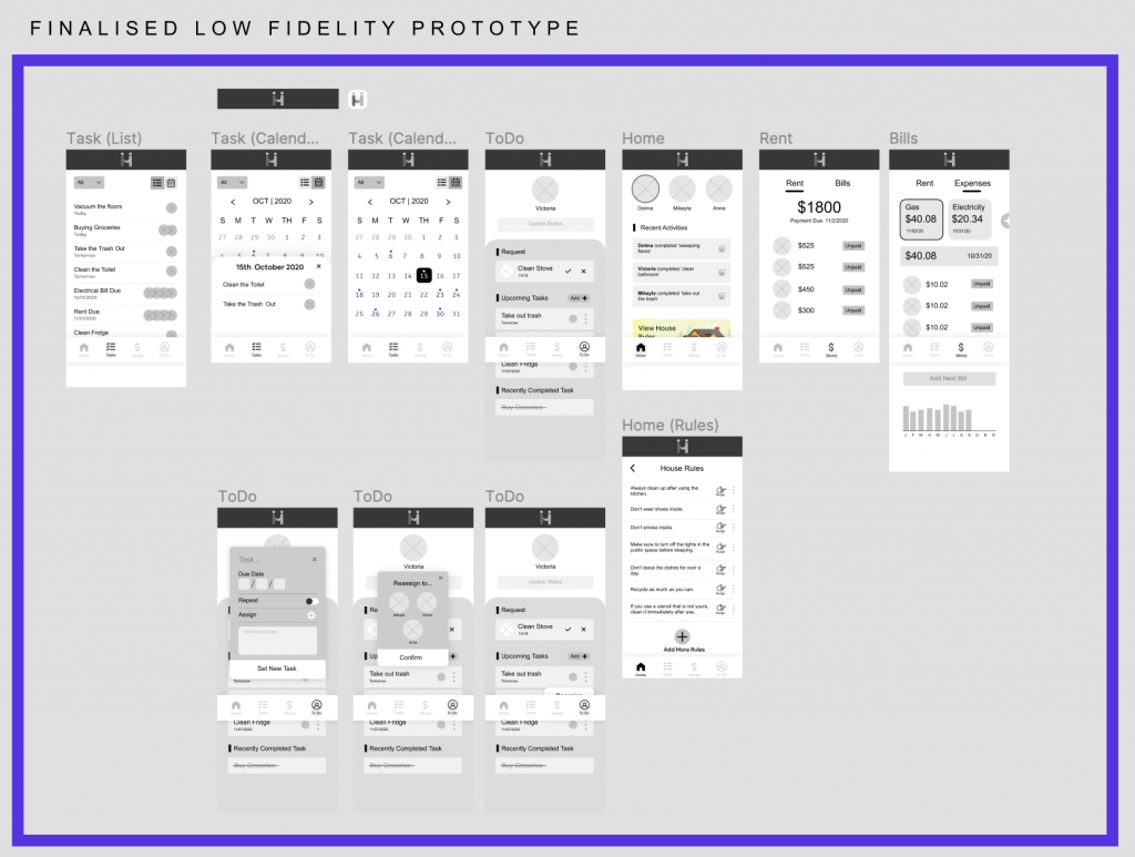
Our process focused heavily on Empathy and Competitive Research, including deliverables such as user personas, competitive analyses, and user surveys. We used these insights to inform the ideation of our product. During our ideation stage, each member of our team produced several design sketches and wireframes to brainstorm our screen layouts and what our app may look like. This led to our Low-Fidelity Prototype, which we tested in Usability Test #1. After receiving feedback from our usability test, we then synthesized our findings to inform data-driven design revisions. During this time, we also performed any necessary additional Research and Ideation to refine our prototype. This was not a linear process, but a cycle of ideation and testing. The process continued with a Mid-Fidelity Prototype and more Usability Testing sessions. Following this, we began the actual front-end and backend development process of the interface.
Understanding the Problem
We wanted to make sure we took time to focus on researching and empathizing with our user demographic in order to develop the concepts for our app. One of the ways we did this was by starting our process by conducting simple preliminary interviews asking five brief questions. These questions were:
- Do you have good relationships with your roommates?
- How do you currently manage your household activities?
- How is your current method effective?
- What problems or challenges do you face living with roommates?
- What is something you wish you had to help you stay on top of shared responsibilities?
Some of the insights that helped us define our initial approach were developed from these quotes from our user interviews:
- “I ask roommates to do something, but they won’t do it right away.”
- “It feels like it’s rude when someone asks someone to do something.”
- “If I see something dirty, I clean it up.”
These quotes capture the (lack of) reliability, trust, and responsiveness that college students often feel when living with other people. One interviewee noted that they “do everything because they don’t trust their roommates.” Another theme from the quotes and the user interviews was the idea of passive aggressiveness and unmet expectations from communication.
Along with these interviews, we also created and sent out a comprehensive online survey to gain insights on living with roommates. This survey gained 44 responses from students ranging from 18 – 23 years old. Some highlights from the survey include:
- 31 out of 44 respondents expressed that they had no form of roommate agreement.
- Most of them did not have a particular system for managing chores and responsibilities
- 35 of the respondents indicated that they thought household chores should be done mutually
- And 36 participants preferred that issues be confronted in-person
To fully understand the specific challenges roommates face, we conducted a “problem interview.” We used open-ended prompts such as “Tell me about a time when…” to prompt users to share stories and pain points they have encountered. After running five problem interviews with students who had roommates, we were able to pull insights about people’s current experiences and emotions surrounding specific scenarios, as well as their current ways of handling and communicating them.
From this, we identified three initial main pain points:
1. Time Consuming & Stressful
Roommates spend time thinking and ruminating on tasks that need to be done daily:
- “Constantly – already stressed about school stuff and then coming home would be stressful as well because of all these issues.”
- “Whenever I was in the apartment the issues were front and center.”
2. Imbalance of Responsibilities
People were not inclined to do a task or chore unless absolutely necessary and were not likely to confront their roommates if something needed to be done.
- “Tasks are put off until someone feels like it HAS to get done.”
- “When someone owns up to be the ‘bigger person’ to do a task, they “become passive aggressive because I take on most of the responsibility anyways.”
3. Miscommunicated Expectations
Roommates did not express clear and well-communicated expectations between each other, which led to frustration:
- “One week when he was away from the house the trash was not taken care of and the groceries were gone. His responsibilities were not taken care of when he was away, and he came back to an empty fridge and lots of trash.”
Understanding the Audience
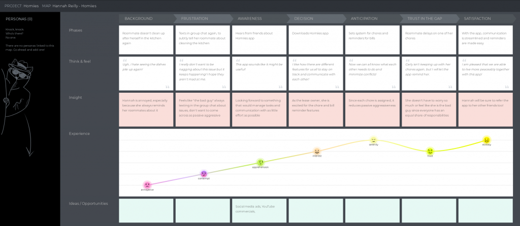
As part of our user research and understanding the problem, we also took time to understand our audience by developing personas and journey maps. The persona and journey map helped establish the tone and hone the target user’s use case, including their personality, thought process, and preferences.
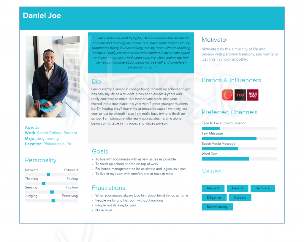
In this persona, Daniel Joe is a college student who wants to live peacefully with his roommates and stay focused on his studies. He wants home management of chores to be effortless, and to keep conflicts between roommates to a minimum. His roommates can sometimes be annoying, but he is not someone who is comfortable with confronting them about issues.
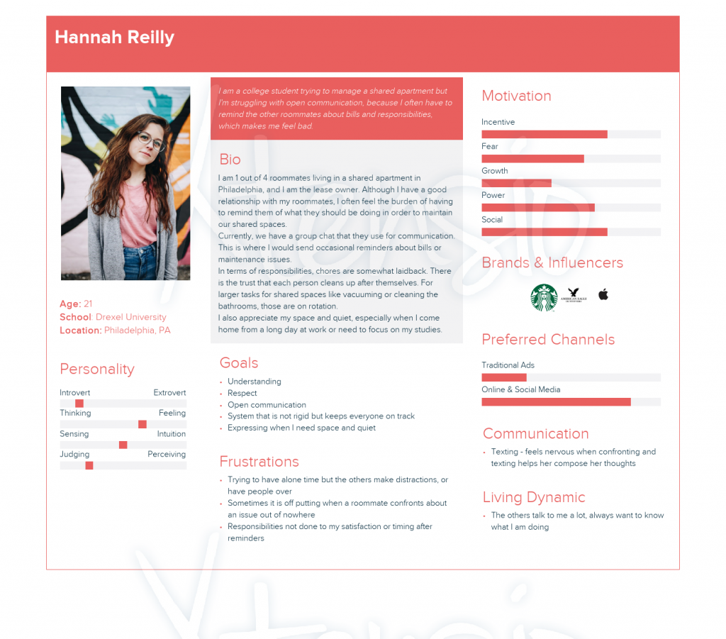
In this persona, Hannah Reilly typically takes on most of the household responsibilities in her shared apartment. We learned that her main challenge is feeling like she is pulling most of the weight and she feels bad when she must repeatedly remind her roommates about certain tasks and duties.
Competitive Analysis
Along with empathizing with our user demographic, we were also interested in researching other apps that are meeting a similar goal. Our competitive analysis included the apps OurHome and Homey.
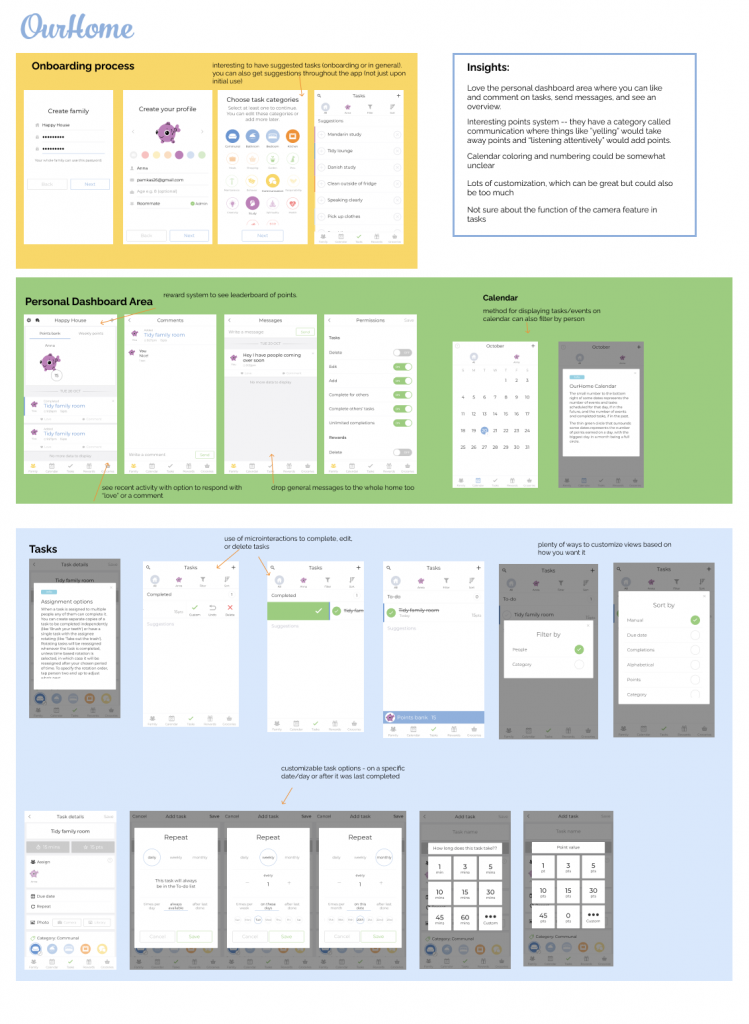
OurHome is a chore management app designed for families with children. What we really liked from this app was that user engagement and appreciation was encouraged, through liking and commenting on activity. What we saw in OurHome that did not really work was the color and numbering system on the calendar. We thought it was unclear and not intuitive, especially since it needed written explanations on what it meant. On the other hand, we appreciated the many customization options it included for creating a task.
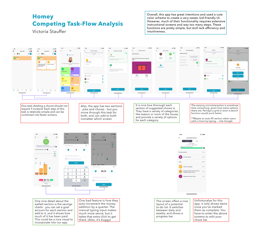
Homey is another similar app. A few strengths we noticed were the visualization elements such as the charts and progress bars as well as categorizing the chores by room. A main takeaway after reviewing Homey was the unnecessary number of screens to complete an action. This takes away from the overall experience of task management.
Outlining User Flows
In addition to developing wireframes and prototypes, we also developed user task flows to outline the various steps and actions users would take across different screens to accomplish a specific goal. These informed how we would approach the sequence of screens when brainstorming the design of the interface.
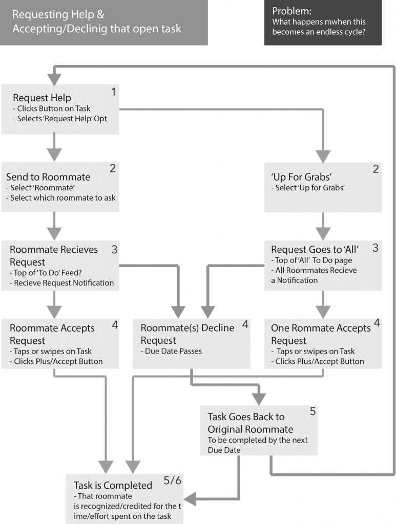
The accepting a task user flow explored the processes of accepting and declining a task.
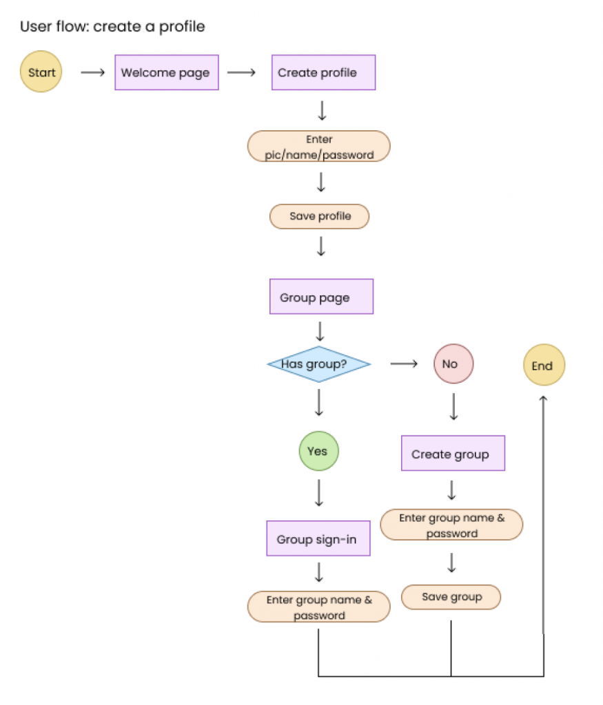
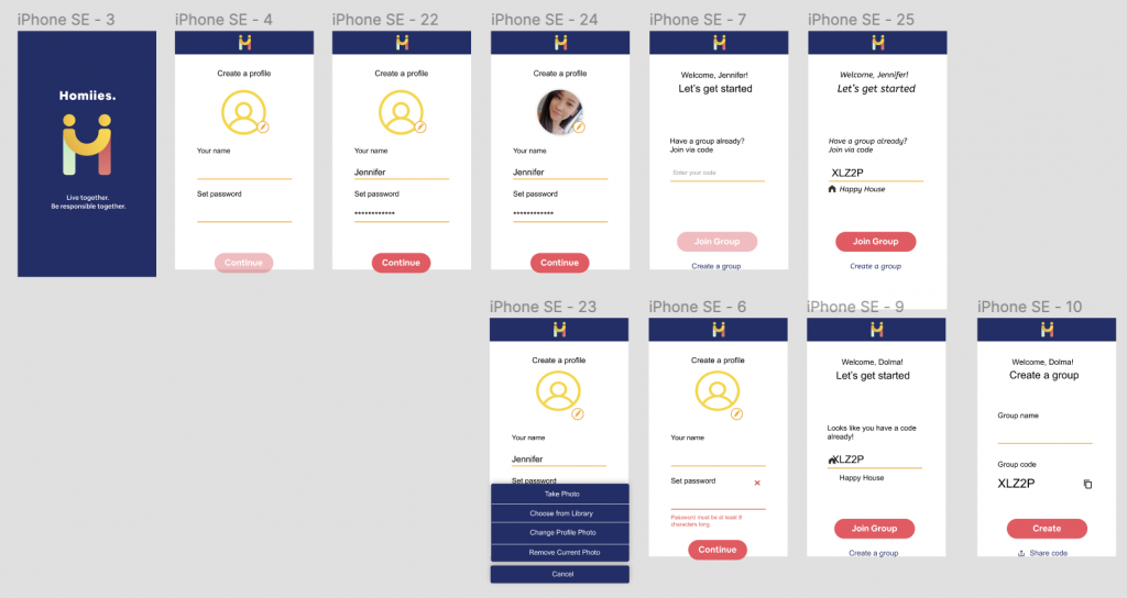
The create a profile user flow outlines the sequence of actions users would take when initially logging in or signing up for an account on the app. It also considers whether a group of roommates have a pre-existing group or whether a group needs to be created.
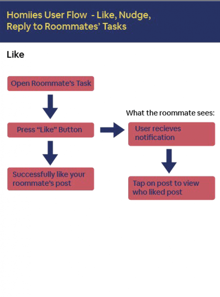
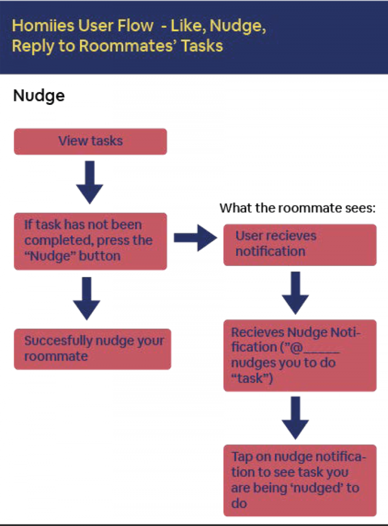
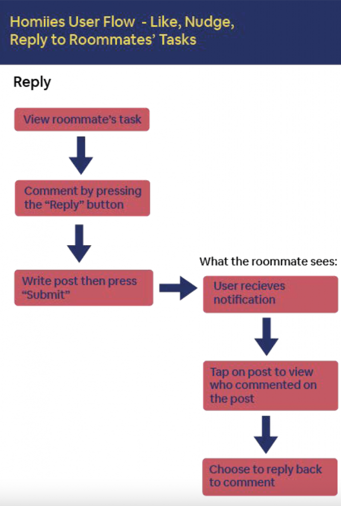
The user engagement flow shows the behaviors users will go through when interacting with recent activity, including the options to like and reply to roommates’ tasks.
Defining the Solution
After conducting problem interviews and iterations of wireframing, we were able to refine our pain points and connect them to a corresponding feature.
Lack of appreciation → reacting to recent activity
Balance of responsibilities → visual of distribution of work (show number of tasks)
Miscommunicated expectations → setting the task, user friendly notifications
At this point in the process, each member of our team produced several sketches for the different features and how they envisioned the app flow to look. We each uploaded our sketches onto our collaborative Figma file and talked through our design process.
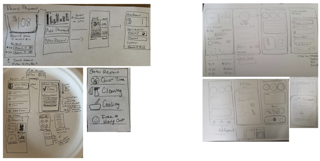
After discussing these solutions, we began low fidelity wireframes.
Validation and Testing
Low Fidelity Prototype
In the low fidelity prototype, we observed several areas that could be improved. Our users did not like how we organized tasks on the home page and the task page because it seemed overwhelming for the user. This connected to the feedback that users were also unsure of our naming conventions for pages or section titles. For example, we had a page called “Tasks” and another page called “To Do.” This produced confusion for the users, not knowing what the distinction was. Another point of confusion was that the icon for “To Do” came across like a profile or account icon.
Additionally, users did not understand the purpose or intention of our nudge feature, saying it seemed passive aggressive. Users weren’t understanding that some buttons prompted extra options, such as the dots to open the options to reassign a task.
We worked on the task management system where you can add, delete, and assign chores, but the design did not seem to help the passive aggressive tone we were trying to address. The request feature that we designed also caused our users to ask questions because they were unsure about the functionality of the feature. One user noted, “I am concerned with the accept and decline feature on tasks. What if my roommate decides to decline tasks on a consistent basis?” Another user also wondered about the concept behind the request feature, asking why rejecting a task request should be an option.
After testing our low fidelity prototype, we also decided to remove less useful features – such as the breakdown of monthly rent and expenses – since they were not as relevant to the core problems we were seeking to solve.
Mid Fidelity Prototype
Validating and honing our product to meet the three pain points that we identified – miscommunicated expectations, balancing household responsibilities, and expressing appreciation, helped us move forward in iterating for mid-fidelity. The most useful function users noticed was the insights tab with the distribution of tasks and the notification system to understand roommates’ activity. Our main takeaways were that users wanted to comment or interact with messages. They struggled to understand how to add tasks, were unclear about the purpose of the roommate agreement, and needed clarity on the function of status updates versus tasks. We used the responses we received from prior testing to inform our design decisions. Some of the major changes during our mid-fidelity include:
- Adding onboarding screens based on our task flows for creating an account
- In the usability testing we noticed that users took time knowing how to create a task, so to simplify this process for the user, we tried adding a plus button to the navigation bar for easy access of adding a task and payment
- We removed the to-do page that was previously on our low-fidelity wireframe since our users found it confusing. We replaced it with a notification page so that they can see activity and respond to notifications at a glance.
After our second round of usability tests, we received more positive responses from users and solved some of the pain points we were running into in our last usability tests. Our notification system helped users be aware of recent activity. Users were engaged with our effort distribution section which displayed the distribution of tasks and liked the idea of seeing exactly how their roommates are contributing.
However, users still seemed to want to comment or react to messages from roommates. Another thing we were seeing was users were still unsure how to assign tasks, what the difference was between status updates and tasks, and the purpose of our roommate agreement.
Iterating According to our 3 Goals
Appreciation
For appreciation, users felt like their work was not appreciated. In other cases, some users were not aware that someone did the work. This could lead to some passive aggressiveness between roommates, like in this quote – “I did trash btw like almost looking for a gold medal.”
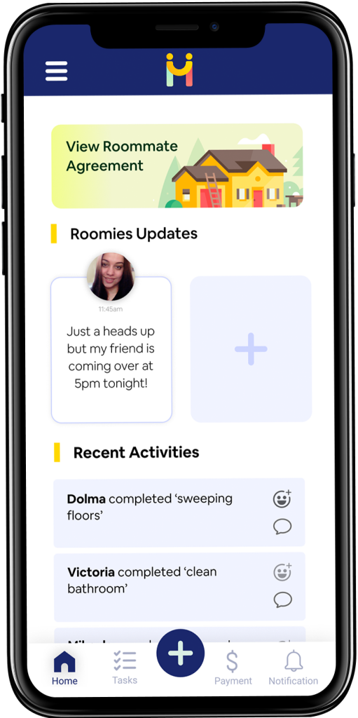
This backed up our design for the homepage. We added recent activities, which tells the user what is going on around the house so they are aware of one another’s work – and users can also react to the completion of other tasks – feeling recognized and appreciated for the work they complete.

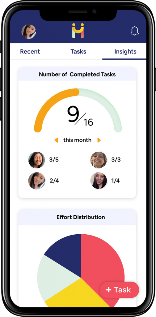
Balance of Responsibilities
Sometimes a roommate is taking on more work than others, which require more effort and responsibilities. This oftentimes leads to a feeling of unfairness between the person and the other roommates.
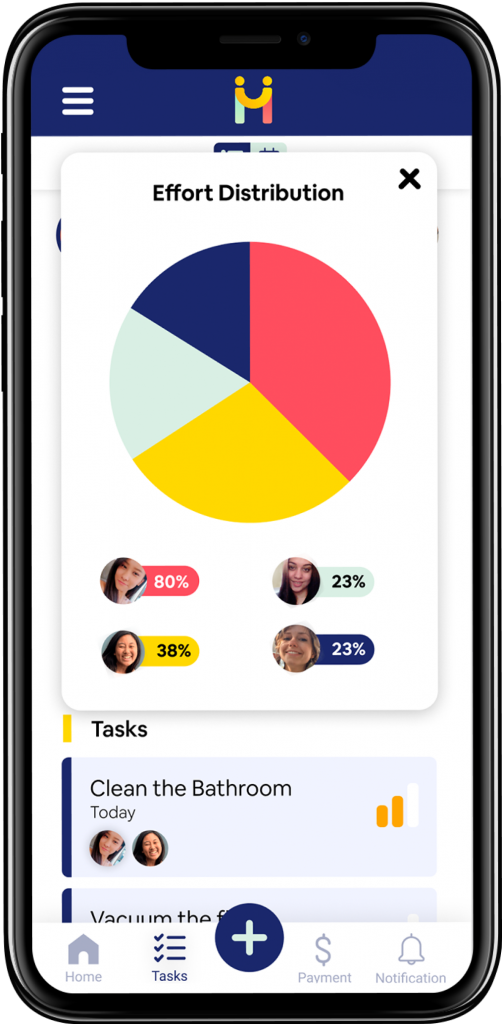
In response to this, in the task page, there is a small button that leads you to a chart visualization showing the “Effort distribution” among roommates. When creating a task, it can be assigned a certain effort level – e.g. cleaning the toilet involves more work than taking out the trash. The pie chart visualization is based on the effort level set to each task a user is responsible for and serves as a visual indicator providing insights to the roommates regarding the current imbalance/balance of workload.

Miscommunicated Expectations
Last is miscommunicated expectations – communication about what tasks roommates should do and how often is not expressed well, leading to the confusion on what should be done.
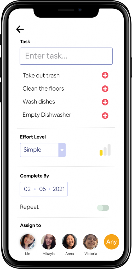
This problem made us realize we needed a clear “creating a task” page with details such as who is doing it, when, what the task is, and how often it should be done.
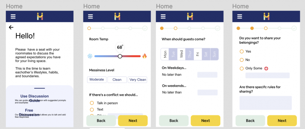
We also have a page that can be accessed from the homepage called the “Roommate agreement page,” where we encourage our user to get together as roommates and discuss living expectations. We even have a guide to help with their discussion.
Developing a Cohesive Style Guide
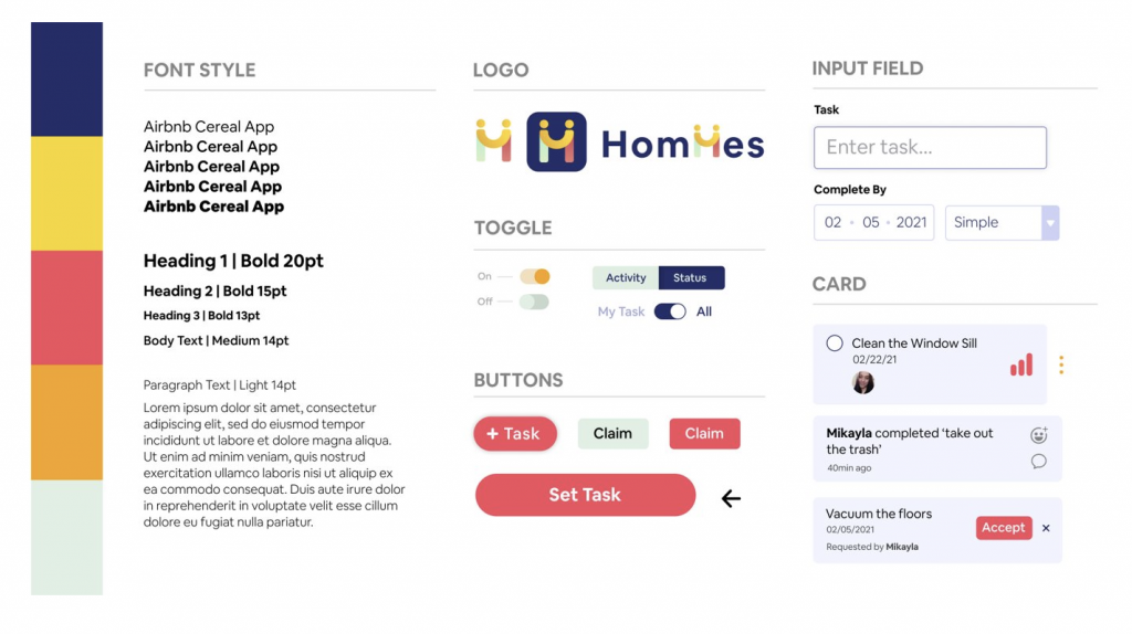
While we had our font and color scheme established, we were lacking a style guide to help keep our design language consistent throughout the app. We knew we needed a style guide but that was not enforced at the start of our project. However, after our UI become clearer through several iterations, it became more apparent that our design language was inconsistent and started becoming an issue.
One issue of the design language was differentiating our input field and the card design. Previously, the input field and the card had the same background color so clearer differentiation was needed as they both serve different purposes. To address this, the design of the input field was altered to have a border and a white background. This change is subtle, but it provides clear differentiation between the two different design elements.
Our color theme is vibrant with a mixture of both cold (blue) and warm (yellow) colors. Our choice of a colorful palette presents the app with an energetic and friendly aura, reflecting our branding as collaborative and confident. Our primary color is dark blue that is present throughout the app in the top and mid nav bar. The red-pink color is primarily used for buttons as it is an accent color that is suitable for the call-to-action buttons.
For our chosen font, in addition to using a san serif font that supports web legibility, its round curves compliments well with the round edges found on a lot of our design elements such as the card or the buttons etc.
Refining Our UX
During the mid-fidelity usability test we were able to identify the following reasons why users were struggling with the user experience:
- Poor use of interactive elements
- Users wanted to post a message or comment/react to posted activity.
- Unintuitive Task Flow: 4 different navigation points
- Choices and options were unclear.
- Users struggled to know what to do, and where and when to navigate.
- Confusion on roommate agreement
- Unclear on what it is and how it works.
Microinteraction
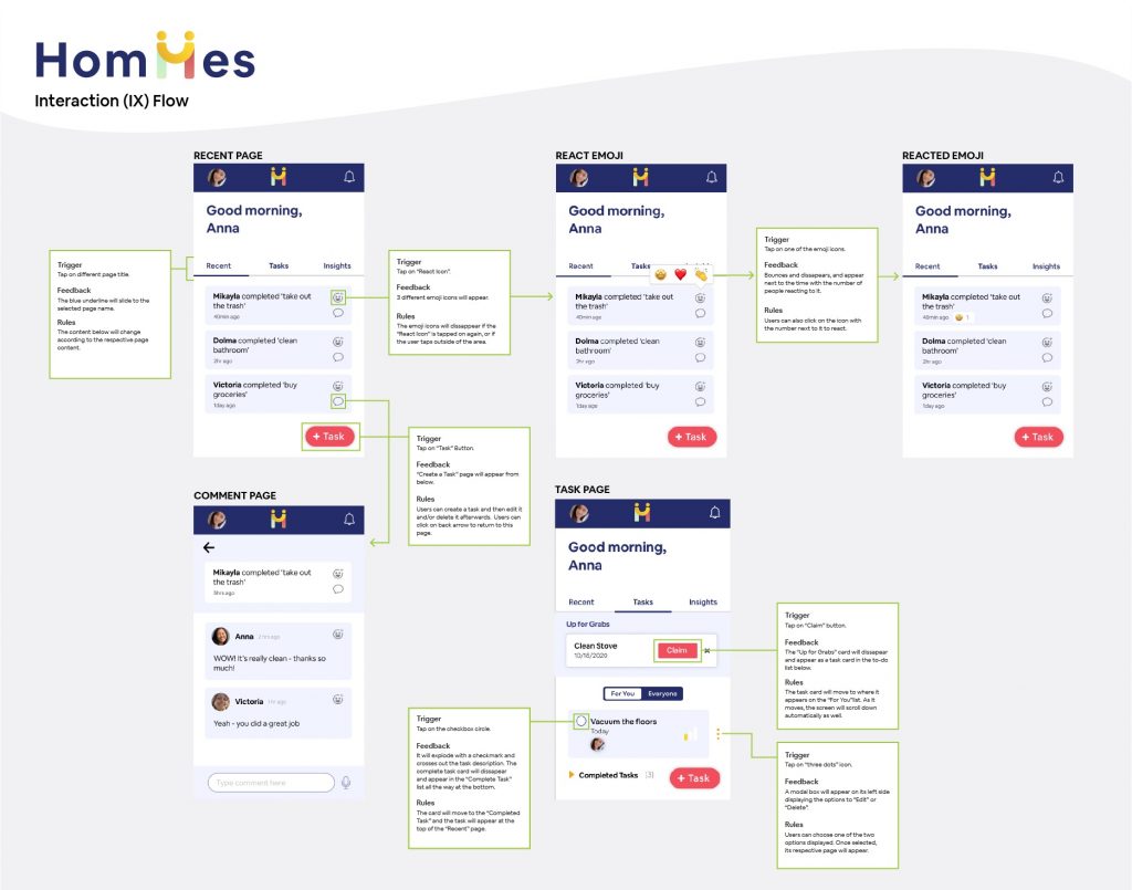
Now that we had the majority of the UI and UX refined, we began to start outlining the microinteractions by creating an Interaction Flow as shown above. We focused on three major microinteractions that assist our main functionalities: one for emoji reaction, one for completing the task, and one for claiming a task. For each of these microinteractions, we identified the trigger, feedback, and rule. This was helpful to make sure that our microinteraction style was consistent throughout the app, as well as for the development team so they can refer back to this flow when developing the microinteraction.
Issues and Key Questions
Our redesigned prototype pushed us further in our thinking and helped us realize some issues. These included:
- Should we relocate our status updates and/or notifications?
- How can we clearly indicate adding a message or update to other roommates?
- How can we use onboarding or action buttons to make the task flow easier?
- Should we remove the navigation bar to simplify the task flow?
- Where would users expect the recent updates?
- How can we better show the effort of distribution?
The Solution
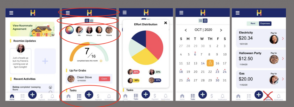
Revised navigation structure
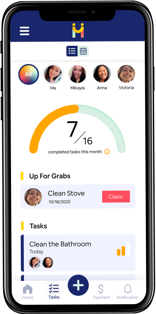
The main functionality is the management of tasks. The final version has 2 points of navigation. By clearing up the top navigation with just profile and settings. We added a main task button which is available on every page like the compose feature on Gmail. In addition, we completely removed the payment feature since it was not aligned with our final vision and functionality goals.
A main addition to the navigation was adding an insight page. In our previous usability test, users expressed the data visualization insights were one of the most valuable features. However, the feature was hidden and not easily accessible. By adding it to the main tabs, users can easily see the distribution of tasks.
Improved content strategy
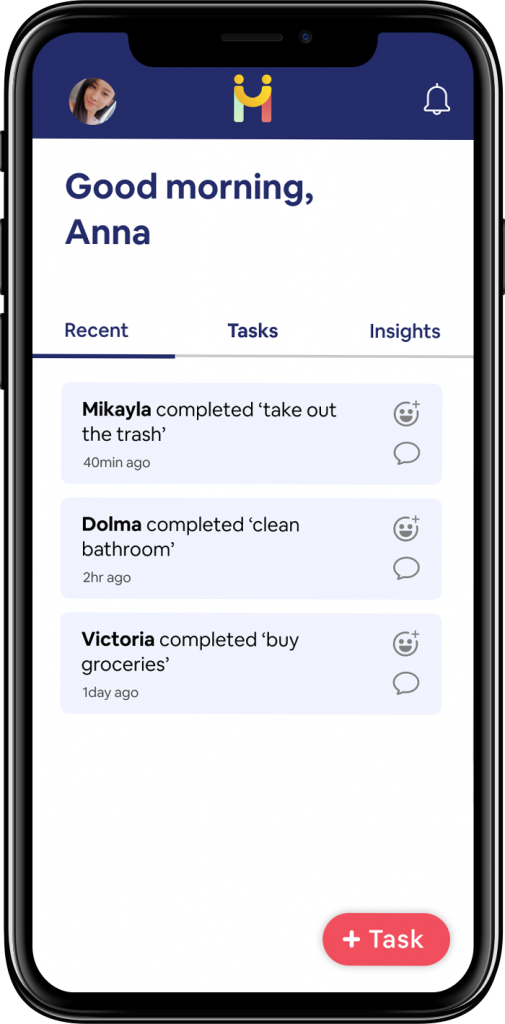
On the “recent” tab, users can easily react and comment on tasks that were completed by other roommates. This is now default to the home page to emphasize the engagement and appreciation for what other roommates have done.
In our previous design we noticed that users want to know their tasks and everyone’s task rather than every roommates’ individual tasks. We decided to make a toggle to allow the user to switch from their task and all tasks.
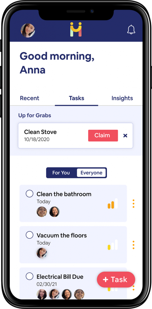
We also clarified the reassign versus request feature and changed it to “up for grabs” with the additional ability to edit a due date for a task if it cannot be completed.
The Results
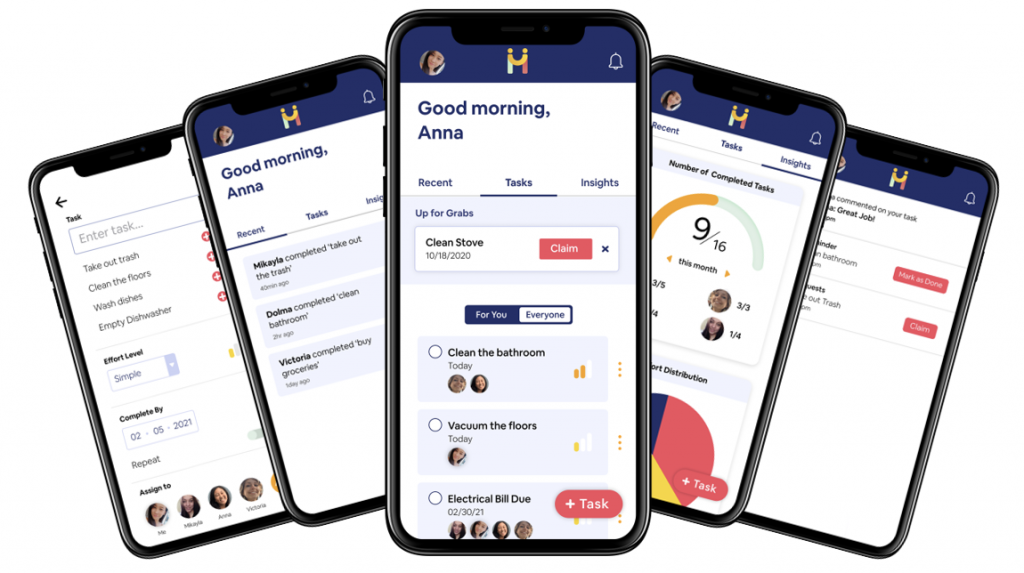
High Fidelity Figma Prototype
The User’s Journey
User feedback successes
- 5/5 users immediately understood “recent” activity and could express their appreciation and thank each other. By seeing the “recent” activity the users knew exactly where they would want to go to next.
- Creating a task was simple and intuitive. Users immediately knew how to get from A to B in the scenario
- The reassigning signifier of the three dots by each task were easy to navigate to.
Notes for improvement
- In the “insights” page, although users understood the breakdown of tasks among users, they did not understand the difference between the two charts.
- Users were not inclined to use the requests feature. Requests and reassign seem to cross over functionally and users would rather be able to “edit” a task instead of request or reassign.
Conclusion
Main Takeaways
- As a team we had to be willing to iterate in our design process and rethink our project scope. For example, there was a lot of discussion about the payment system and whether we were going to move forward with designing for it. Through research, we were able to hone in on and understand what our users wanted and ultimately decide not to include the payment page since it was not solving a pain point we identified.
- Through research we also discovered that it is difficult to facilitate communications that are genuine rather than passive aggressive. By adding features such as the insights page, we were able to facilitate appreciation and communication without the need for a messaging feature.
- By improving the navigation, we noticed that users could easily navigate and complete tasks without hesitation or being prompted, which validated our user experience.
In the Future
This project spanned a duration of six months. Because of the scope and time frame of the project, there are a few components that we would like to implement in the future. Features we would like to build out in the future include the functionality of:
- Distribution of effort – displaying dynamic visualization of the distribution of effort and number of tasks completed
- Roommate agreement in onboarding – building out a roommate agreement process that would be included as part of a user’s onboarding
- Emoji reaction – creating the functionality of emoji reaction on recent tasks, where users could select an emoji and the emojis would indicate the count of the selected emoji(s)
- Functional notification system – for users to be notified of activity