bARk: Augmented Reality Mobile App
Final Presentation
March 8, 2021
Overview
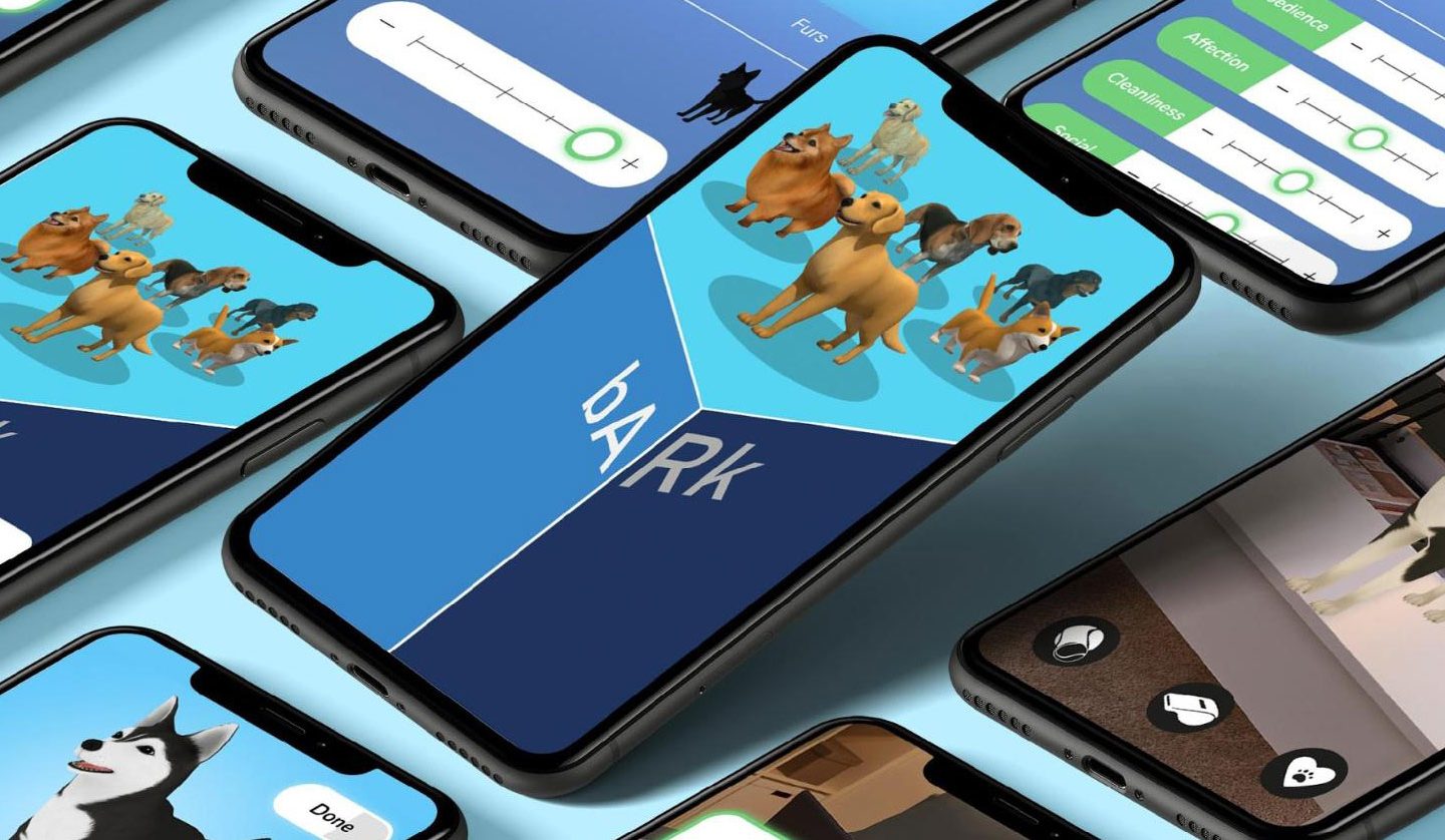
bARk is an augmented reality (AR) app that provides a virtual companion for animal-lovers. This relationship with a virtual pet provides both entertainment and emotional support to our users. What makes bARk special is it allows users to continue to create memories with their pet wherever they are. This application, designed by a team of undergraduate students studying Interactive Digital Media, is a high-fidelity Figma prototype of the onboarding process and a pet interaction screen with AR functionality developed in Unity.
The Team

- Leanne Chin
- Melissa Gabriele
- Chelsea James
- Lillian Raphael
- Devin Taylor
- Britney Tu
UX
The UX team was responsible for researching how a user’s experience differs on a mobile AR application versus a traditional mobile application. Research was also performed on how to best conduct usability tests when dealing with AR applications. The UX team focused on usability test scripts and creating card sorts to better understand our users’ thought processes about how they interpreted bARk’s interface. Our goal was to understand exactly how users think rather than assuming what a user might understand or like about the interface.
Importance of our design (the reason we are creating this product):
- Emotional support
- Infinite lifespan for virtual pet
- Lower depression and loneliness rates
- Introducing users to a new emerging technology
- Access to pet in any environment
UI
The UI team worked primarily in Figma iterating designs and prototypes to meet the deliverables set by the team. Every design decision made throughout the process has been based on research on the market’s leading trends as well as results from user testing conducted by the UX team. There was a lot of collaboration between the UI and UX teams, such that they both functioned as quality assurance for each other’s work. This constant flow of communication was key to successfully realizing the needs of our users within the timeframe we were given. Over the course of 6 months and 5 different prototypes, we were able to reach our goal of a high-fidelity Figma prototype.
AR
The AR team spent this time working with a few different AR platforms, teaching themselves to ultimately build the prototype in Unity. The AR team started development in SparkAR working on initial button functionality. After realizing how SparkAR would limit our design, the team moved on to working in Unity. Unity was used to build out the 3D model interactions for the bARk app. Development started with making sure the camera could detect planes in AR. We then added functionality to spawn an object on the plane upon load. This was followed by linking in the 3D dog model as the object to spawn on load. We styled our interaction buttons, and finally linked the 3D model’s animations to the buttons to bring the app to life.
Context & Challenge
bARk uses AR technology to place a digital pet into a user’s natural surroundings. With their pet in their pocket, users can interact through the bARk app at any point during the day. bARk gives its users an animal companion that can help to fill the void of a lost furry friend or give the pet owning experience to those with the inability to own a pet. Any pet lover with a device can interact with a bARk digital pet. This allows those who may be restricted by things like rental restrictions, lifestyle costs, or allergies to interact with and care for a cute and realistic furry friend.
The team used our extensive knowledge of UI and UX design and research methods to identify an innovative approach to AR. We began with little knowledge of development for AR. We spent the first half of the project researching and learning AR and solidifying our idea through the creation of wireframes. The team continued with their research in AR, and began working in Unity during the second half of the project to create a functional iOS build of the AR app. The team also refined the prototype wireframes and added features like microinteractions to create an enjoyable user experience.
The goal of bARk is to provide users with quick and easy access to a furry friend for emotional support, entertainment, and companionship. Over a period of six months, bARk’s team of six designers and developers have created a functional AR build and high-fidelity prototype.
Process & Research
Research and Data Collection
Since AR is a new technology that none of us knew or were experienced in designing for, the team conducted preliminary research. The team researched how UI and UX are different when working with AR and how we could design to create the best possible experience for this recent technology. Research was also done on AR development platforms such as SparkAR, Lens Studio, Adobe Aero, and Unity. Team members talked with alumni and faculty experienced in the field to understand how to test and design for AR. We also collected data on how people interact with dogs, favorite dog species, and actions our users would prefer to see when interacting with their pocket companion.
Competition and Industry
bARk was developed for the technology and mobile applications industry. The team identified competition as Doggygotchi Go!, Dex, Planet AR, Nintendogs, Tamagotchi, Rover, and TamaDog!. Rover is an AR pet application limited to only a Corgi. The primary features of Rover include petting, playing with numerous toys, and feeding the dog. TamaDog! is an AR pet application limited to only a Basset Hound. The major features of TamaDog! include commanding your dog to perform tricks, with all content locked behind a paywall. Our research indicated that the industry does not have an abundance of realistic AR pet applications.
Survey and Target Audience
From the preliminary survey, we found that a large amount of the surveyors had a great love for pets and were interested in an app like bARk. We asked users questions about what they would like to see within an AR pet app like bARk and took their responses into consideration when developing our customization and interaction screens.
Persona
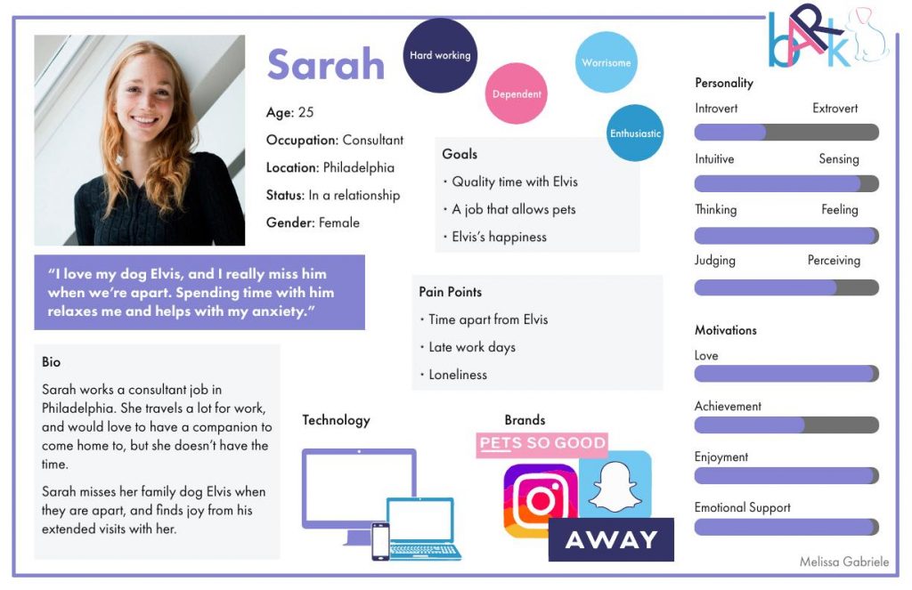
The team created a persona based on preliminary research. This persona is an example of a target user: a pet lover who uses modern technology. Sarah works a consultant job in Philadelphia. She travels a lot for work and would love to have a companion to come home to but does not have the time. She misses her family dog, Elvis, and finds joy in his extended visits with her. Sarah enjoys time with her dog and prioritizes his happiness. She does not like time apart from Elvis and gets lonely easily but does not have the ability to get her own pet since she travels so often for work. Sarah is in the millennial age range, one of the many age groups bARk targets. bARk can be used by any age group that understands to use a mobile application.
Alpha Prototypes and Testing
Wireframe
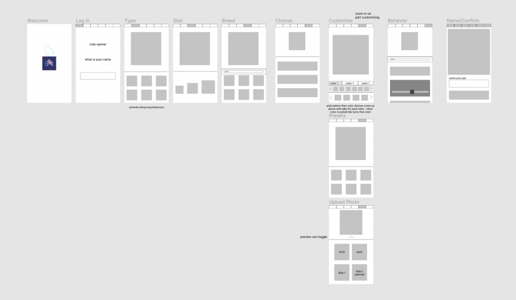
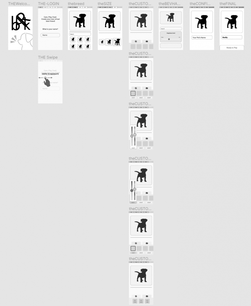
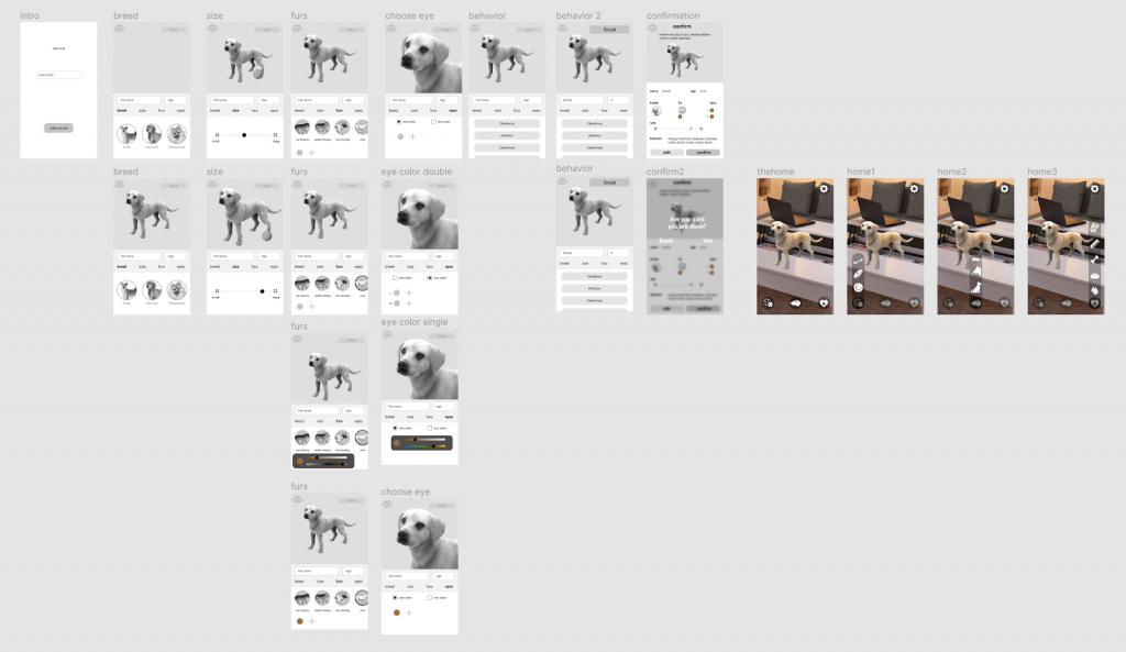
bARk implements the use of a custom pet, so a pet creation screen was necessary to design. Having the customization concept in mind, the UI team created screens including different aspects that could be customized: name, breed, size, fur, behavior.
User Testing Takeaways
The data from the Alpha User Tests informed us that there were many things that needed adjustments. The first change was navigation through the customization screens. The navigation and progress bar were originally combined at the top of the customization screens. The data indicated that this navigation bar was not as intuitive as originally believed.
Data indicated that we also needed to implement changes to size selection. It was difficult for users to understand the different sizes represented by the buttons because the icons did not provide enough feedback. This led to the decision of size selection being changed from buttons to a slider. Users also wanted to have the ability to view their dogs from all angles.
In addition to this user test, research was conducted to understand the most popular dog breeds nationally so these breeds could be represented in the bARk app.
Logo creation
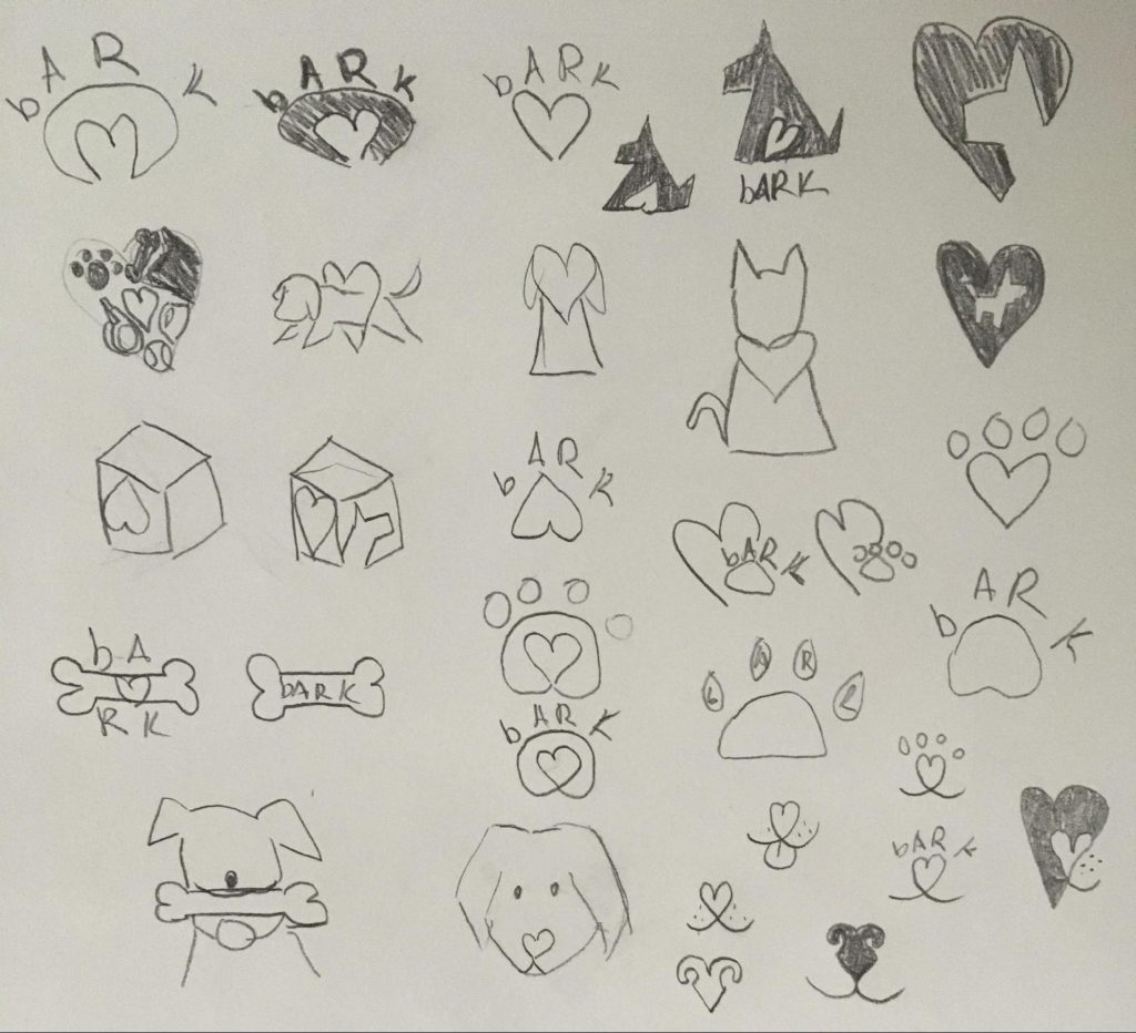
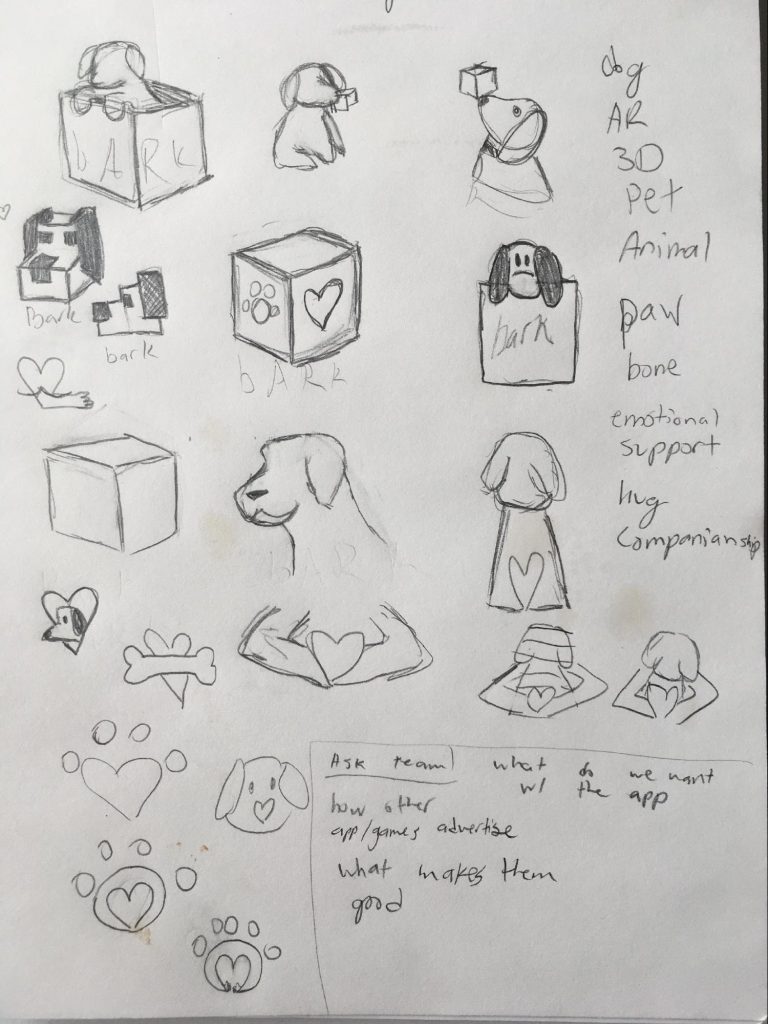
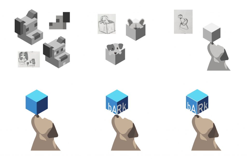
Branding is an important aspect when creating an application. We wanted to make sure we had a recognizable logo that defines the app and creates a brand. Ideas were sketched that reflected the idea of AR and a virtual pet, while also embodying aspects of emotional support and companionship. The team decided on the logo that includes a dog with a cube balanced on its nose. This logo reflects the relationship to pets as well as the AR technology.
Beginning development in AR
The team extensively researched AR platforms and designing for AR before beginning development in any AR platforms. The platforms investigated were Lens Studio, Adobe Aero, SparkAR, and Unity. Lens Studio was the first platform that the team began developing with. The team decided that SparkAR’s interface was too confusing, and it did not allow enough functionality. The team then moved to Adobe Aero, but the platform kept crashing since it was a Beta version. Finally, the team moved to SparkAR where they spent the first half of the project following tutorials and creating a basic interface.
Beta Prototypes and Testing
Card Sorting for Icons
One important aspect that the UX team rigorously worked on was making sure that our users understood the icons that were being presented to them. We also wanted to understand user’s mental maps when grouping the interaction options. Using Optimal Sort as our platform for Card Sort testing, we were able to conduct a completely unbiased test, allowing our users to make groups however they pleased. We included a customized script within the Optimal Sort website, so our users had clear directions on how to complete the test. We also included a separate data sheet where we added comments from users on either confusion points, or things they wished to see but didn’t within our icons. This resulted in quality data which directed us on how to group our icons.
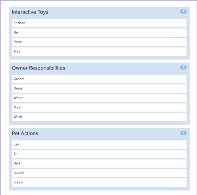
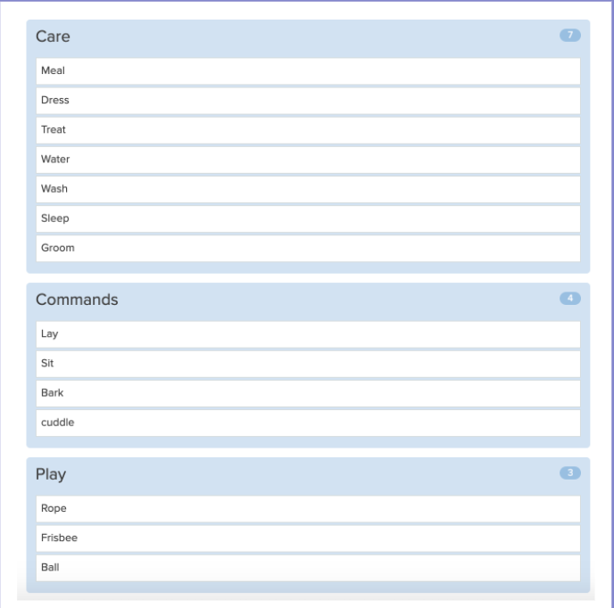
User’s Icon Mind Mapping
Our team tested users with the purpose of collecting knowledge on their understanding of icon meaning. We also asked about the visibility of the icons and the general understanding of the home page. The results were used to help create a more intuitive AR interface.
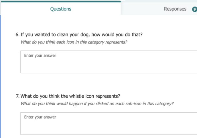
User Testing Takeaways
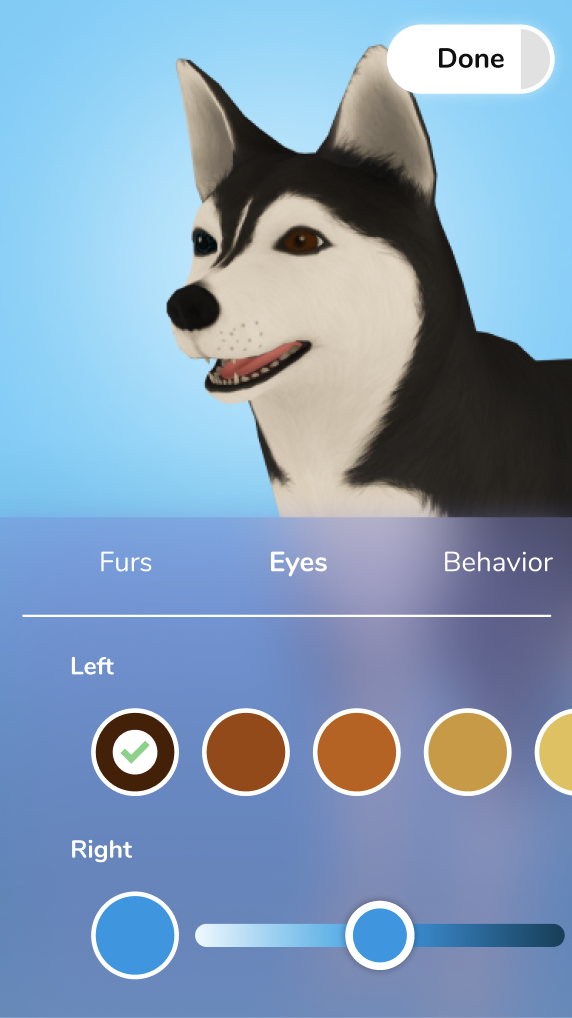
User testing data indicated that changes were needed for the Beta prototype. A major change that was made was the reorganization of the interface for both the interaction and customization screens. The pet creation screen navigation was moved to the center of the screen allowing users to move easily throughout the sections. Color pickers were added to the interface, but we later found that the overlapping of the color picker on other objects was a usability issue. We removed the search features within the customization sections since we will not have enough options in this build for a search bar to be necessary. The ability to edit the pets eye color was also added to the interface.
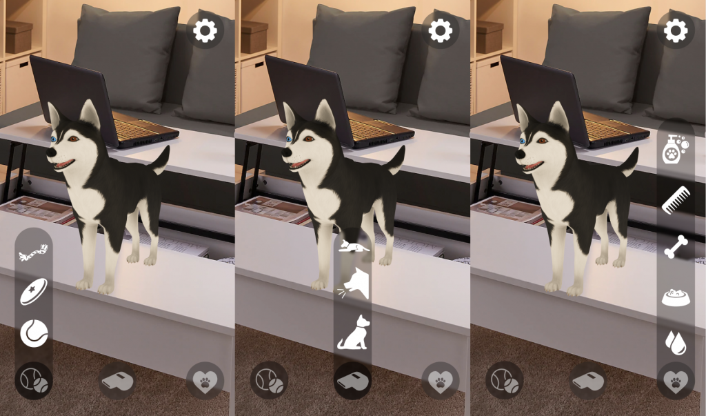
The card sorting data showed that a lot of our users created three categories when grouping the icons, while we had four. We took this data into consideration and used the most popular groupings to implement within our interaction page. The three final categories we are using for our interactions are play, command, and care.
SparkAR
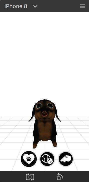
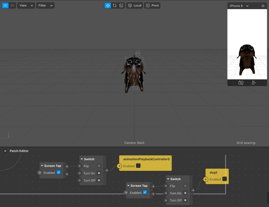
We decided to begin AR development in SparkAR, which is the platform used for Instagram and Facebook filters. The main reason we decided to begin in SparkAR was because of its ability to test our project on Instagram and Facebook.
Our initial progress in SparkAR consisted of creating a basic button set up by following a tutorial through the platform. This tutorial allowed us to create a basic interface with functioning buttons and changing animation states on the screen.
Final Prototypes and Testing
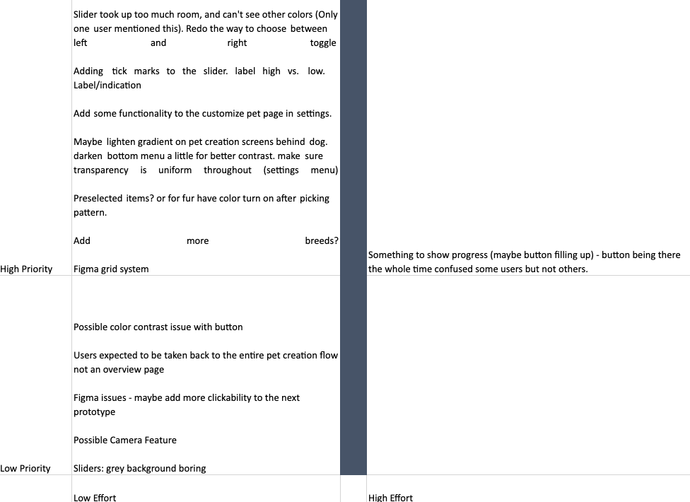
Priority Matrix
The Priority Matrix was developed after an analysis of the team’s User Testing data to better organize our data that was collected. The data was organized by level of effort and level of importance. This was then used to determine what changes were most necessary to tackle when making adjustments to the prototype.
IX Flows and Microinteraction (UI)
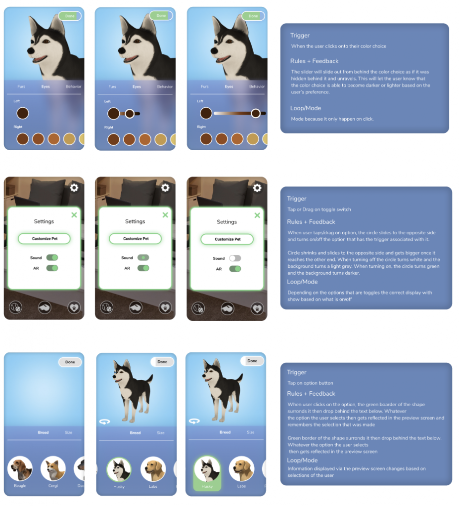
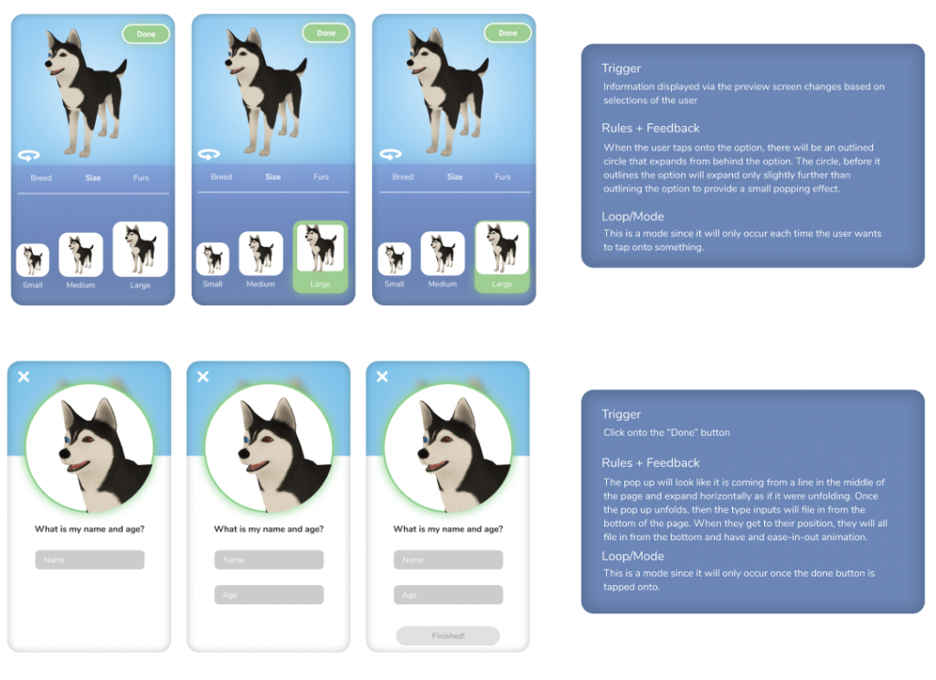
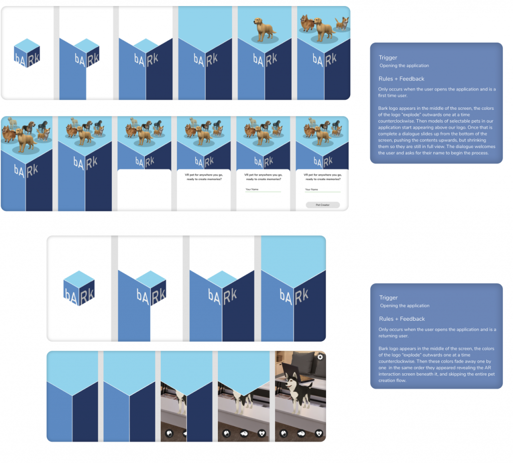
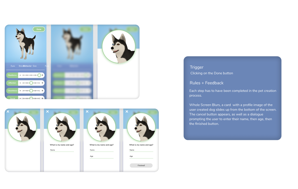
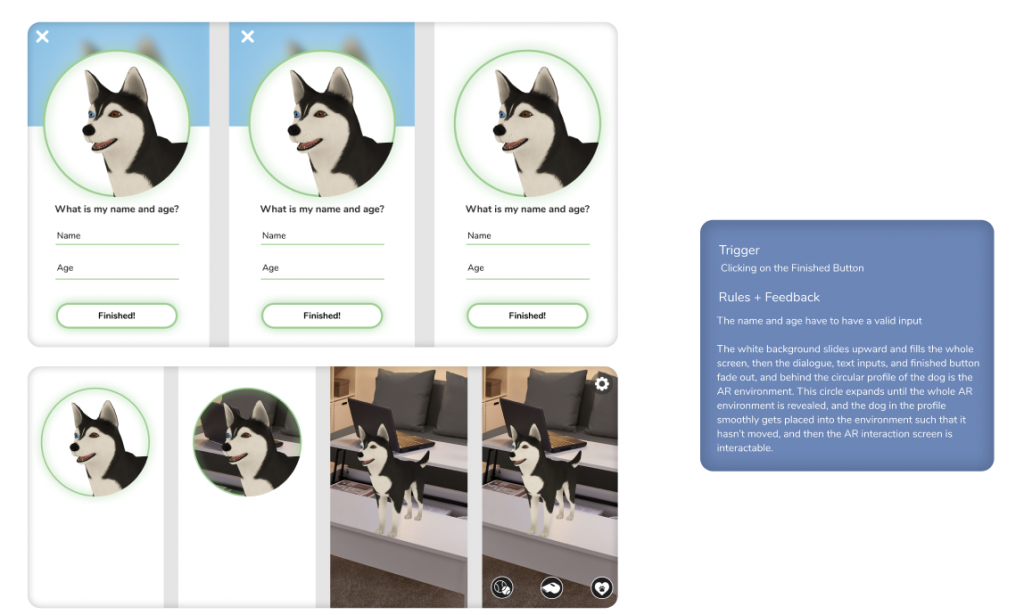
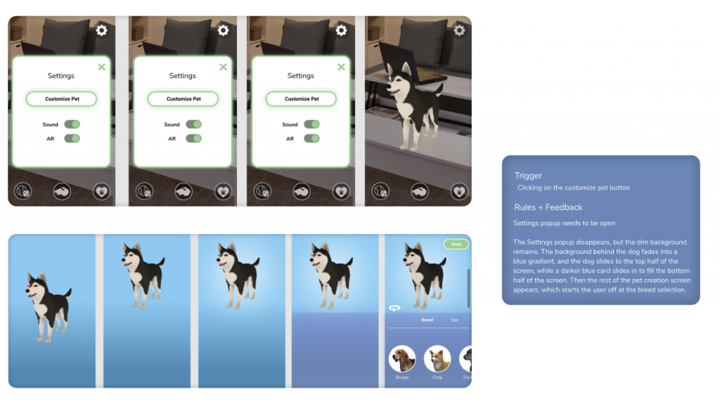
Once we refined the flow and appearance of our application, we focused on microinteractions to give users a smooth and elegant experience when navigating through the app. The UI team developed a series of IX flows for potential microinteractions. These microinteractions span from large interactions like transitioning a loading screen to small interactions like toggling switches. The UI team developed screens to show the different states a microinteraction would go through. The triggers, rules and feedback of the microinteractions were also documented.
Icon Development/Design
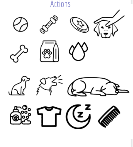
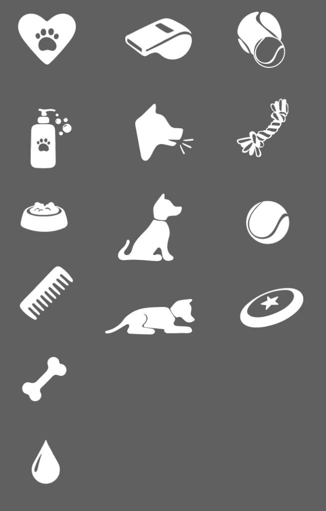
Once user testing indicated that users understood the button icons, icons were developed to match the branding of bARk. While developing these icons, we focused on rounded edges and a playful design. We successfully created simple icons that are easy to understand. The final icons are shown below.
Style Guide V2 and Color Research
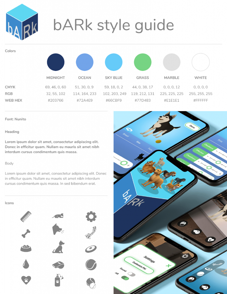
User testing data helped to refine the color scheme, indicating users wanted a more diverse color palette. The color palette was also adjusted to pass the color-contrast test, ensuring readability throughout the app. The final color palette was updated to include a wider range of blues, an accent green, and white to create the diversity and contrast our users needed.
User Testing and Takeaways
The color pickers were adjusted based on user data. We tried to develop color pickers in several different ways in order to avoid obstructing other elements on the page. This led to the implementation of horizontal color pickers and the decision to move away from a color wheel, opting for a selection of preset colors.
User data also indicated the sliders did not fit the aesthetics of the app, so the UI for the sliders was updated to fit bARk’s branding. In addition, data showed that users perceived the green to be a signifier that something could be clicked on or indicated that it was selected. We took this opportunity to further use green within our interface to show that elements were able to be selected.
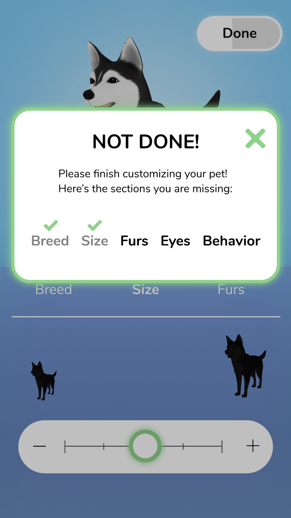
Data from the user test led the team to remove the extensive confirmation screen from the end of the pet creation process. This screen was added inside settings to allow users the option to go back and make changes to their pets.
Color contrast was adjusted after this test to ensure all elements were readable and passed the color contrast test.
Unity
The team decided to move into Unity for the second half of the project because working in Unity would allow us to build out a much more complex button interface. This would give users the option to choose sub-categories of our buttons to really interact with their pet and perform desired interactions. SparkAR was great for practicing projecting the avatar and getting the feel for the interface, but it did not allow much more complexity to be added to our buttons within their “Picker UI” feature. “Picker UI” refers to the arrangement of buttons you may choose from to select your AR action. SparkAR only allowed for one level of buttons, and it was not capable of expanding into sub-levels. The team needed a platform where opportunities for tapping and selecting could be expanded since our buttons on the AR screen opened to menus.
The team researched developing for AR in Unity before moving into the software to make the transition more seamless. We collected a few tutorials to follow in Unity to begin understanding the interface and how to create an AR build within Unity. Unity has the ability to create an iOS build that can be opened in XCode and run on a personal mobile device. To test our progress after each development session we would compile and run our build on a personal device, taking note of any changes or adjustments that would need to be addressed in our next development session.
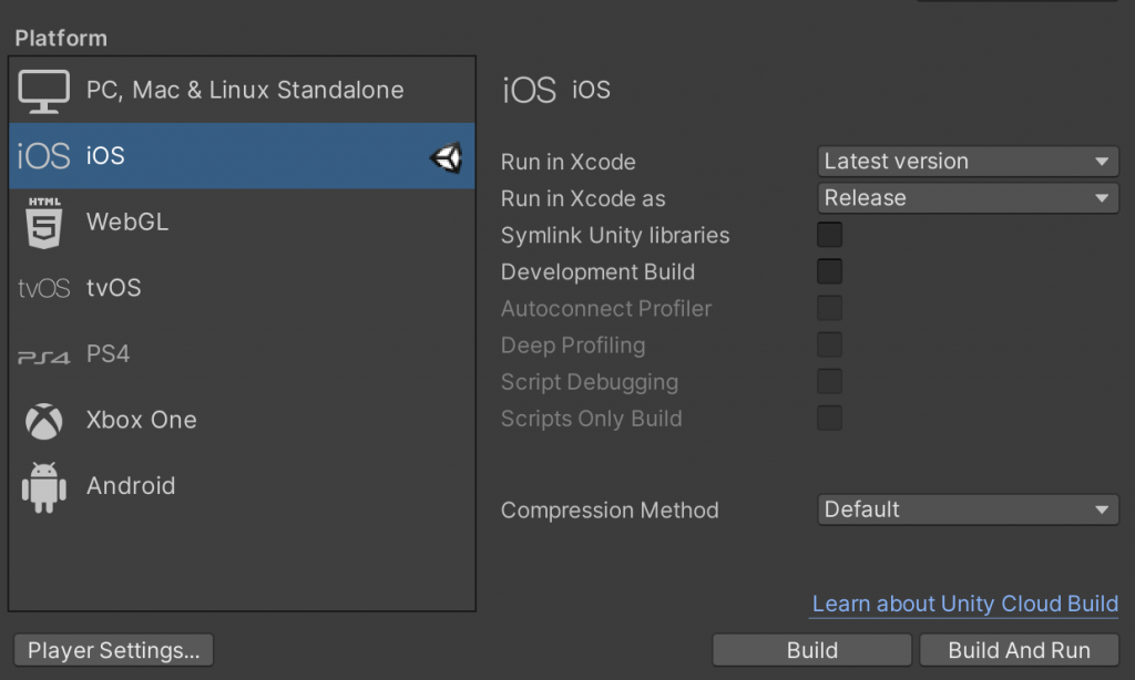
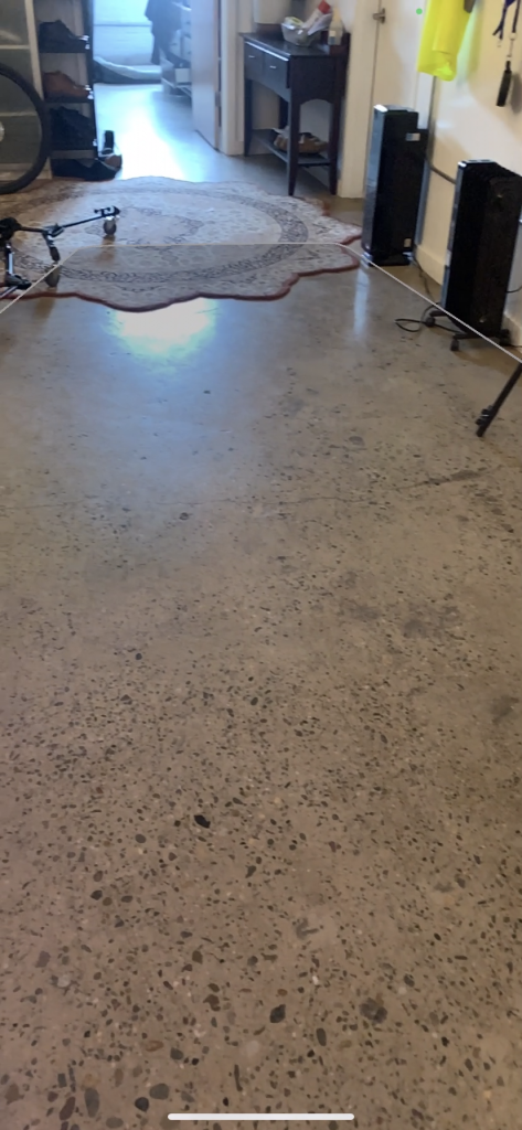
Working with tutorials and previous knowledge from SparkAR, the team was quickly able to adapt to the Unity interface. The team produced their first build which recognized horizontal planes in AR. This plane detection would allow a 3D model to successfully be placed in an AR environment.
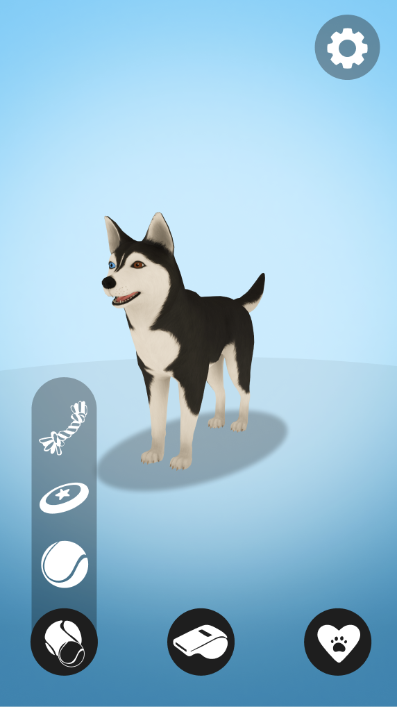
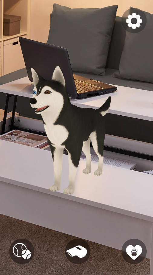
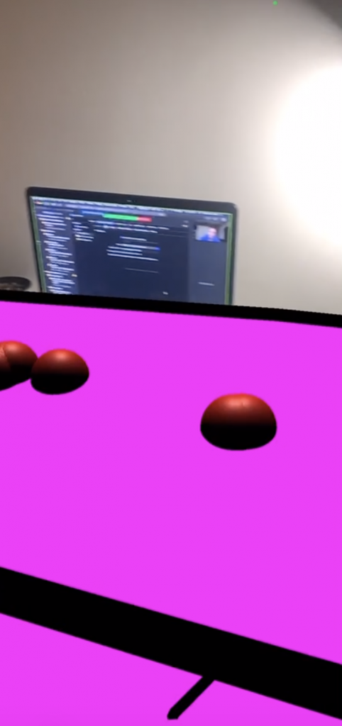
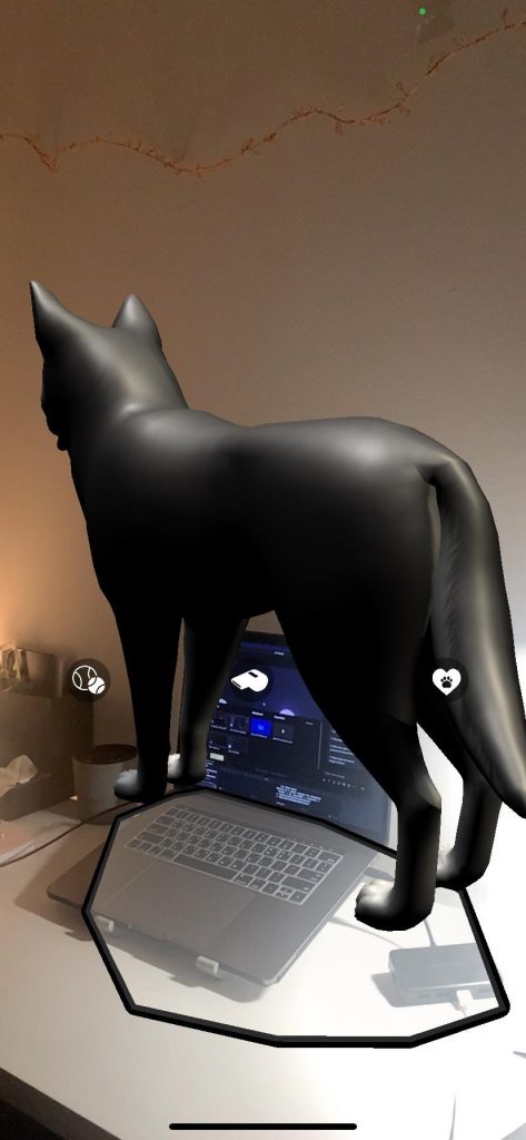
The team then began working towards adding our 3D Husky model to an environment upon detection of a horizontal plane. We first used a sphere as the 3D model, building a prototype that allowed for the placement of a sphere on tap. Next, the team imported the 3D Husky model that was purchased for this project and worked towards placing that on the plane. This new build allowed the Husky model to be loaded upon detection of the 3D plane, but the Husky was halfway below the plane and was facing the wrong direction.
The following few builds worked towards multiple goals, including adding buttons to the interface, adjusting lighting, and fixing the orientation of the Husky model. The team was able to easily link in the styled buttons for the next build and bring the Husky to the plane level. Finally, the Husky rotation was fixed to face the camera, and all that was left to develop was button functionality.
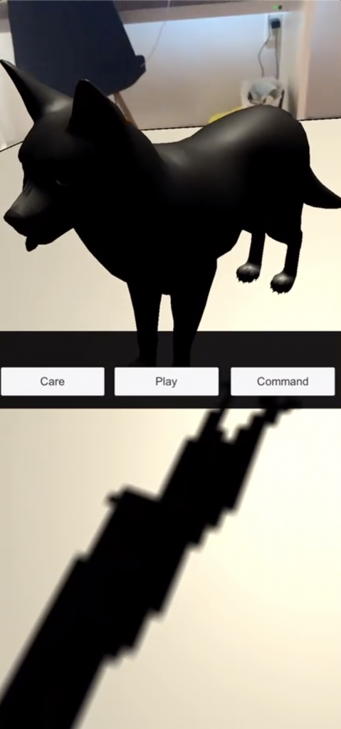
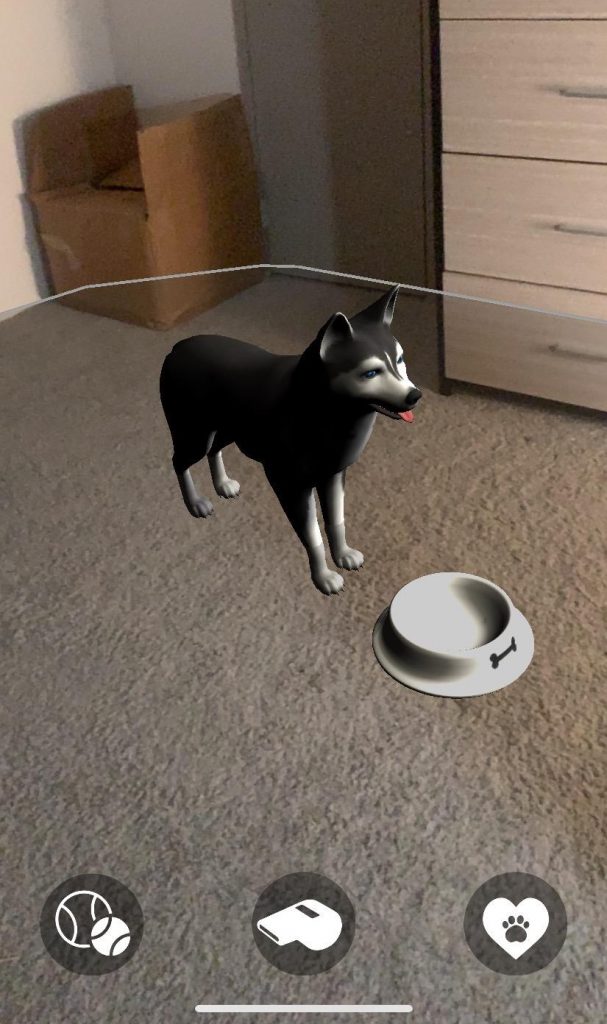
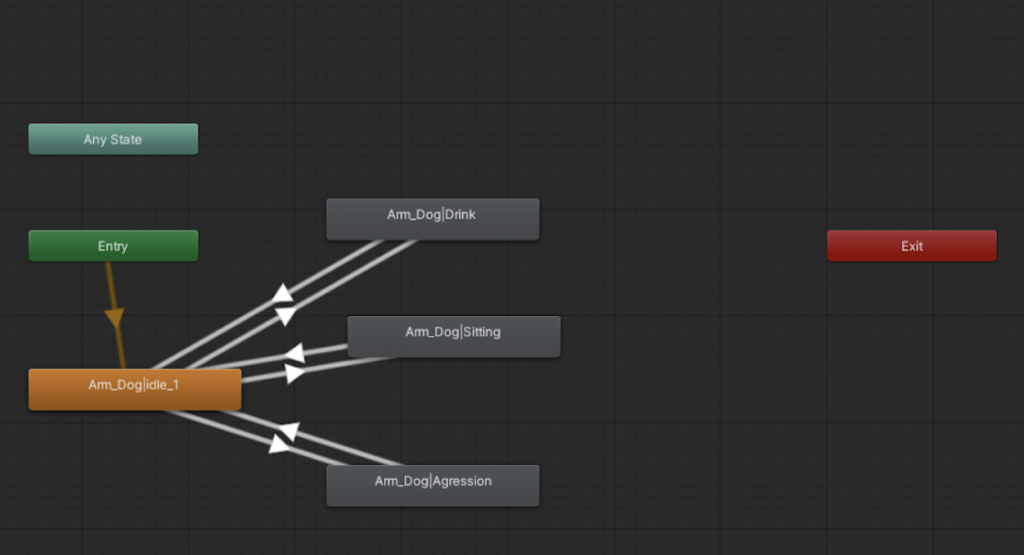
The Husky model had built-in animations that the team wanted to use. The goal was to have the Husky model playing an idle animation. To do this, the team needed to work in animator to link the animations to the husky ‘avatar.’
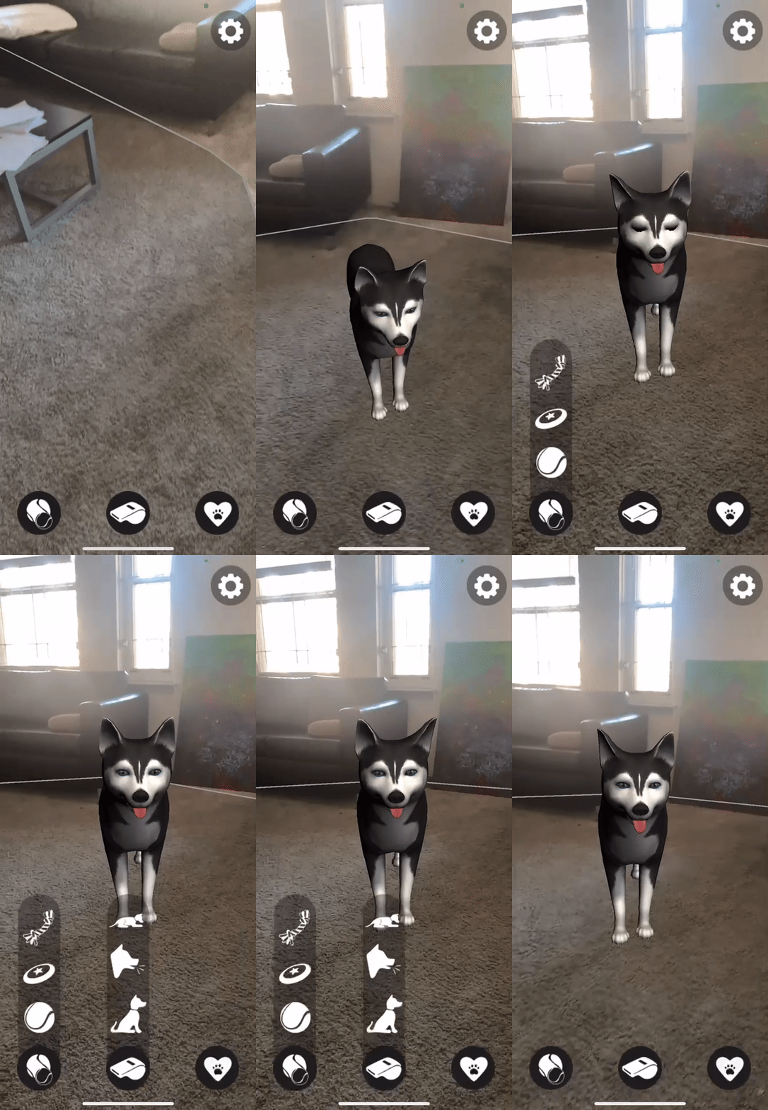
Adding functionality to the buttons has been the most complicated part of this build in Unity. The team successfully added an open state to the main three buttons on the home page. This was done by creating a child element of the button that holds the open menu image, this element was then turned off. Next, a script was written to check if the element was on or off on click, turning the element off if it is on and on if it is off. This script was then linked to the buttons’ built-in onClick function. This allowed the button menus to be opened on click.
Solution
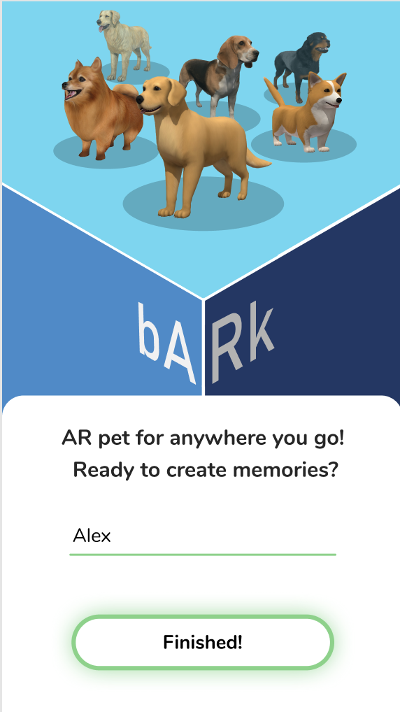
The final prototype is two parts. The Figma build focuses on the design of the pet creation screens. The Unity build focuses on the AR functionality of the pet interaction screen.
High Fidelity Figma Prototype
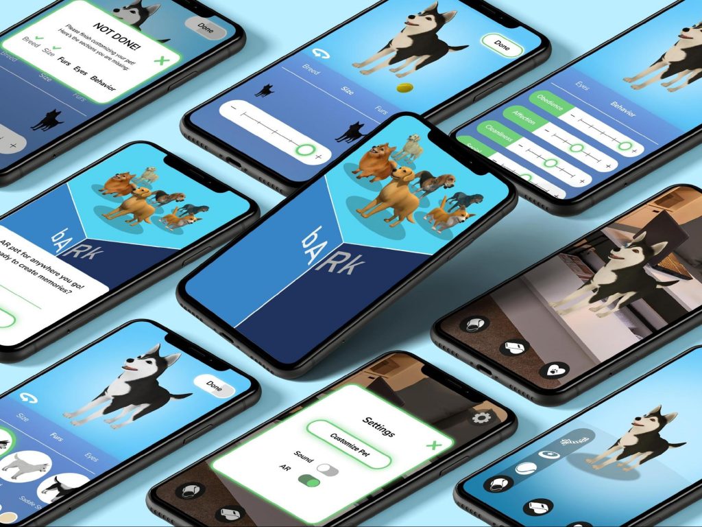
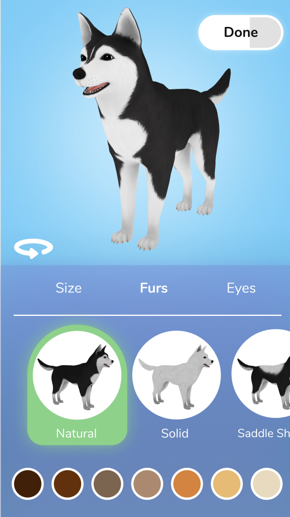
Key features of the pet creation screens include a scrollable menu, pet selection, pet customization, and a preview section where the pet can be rotated. Using the scrollable menu found at the center of the screen, users can navigate between sections. bARk pet creation screens allow users to customize physical aspects of their pet including breed, size, fur pattern, fur color, and eye color. Using the behavior sliders, further personalization of the pet can be implemented.
To display progress throughout the customization process, the ‘Done’ button doubles as a progress bar. The 3D model of the pet being customized is visible on all sections of the pet creation and can be rotated by button or swipe.
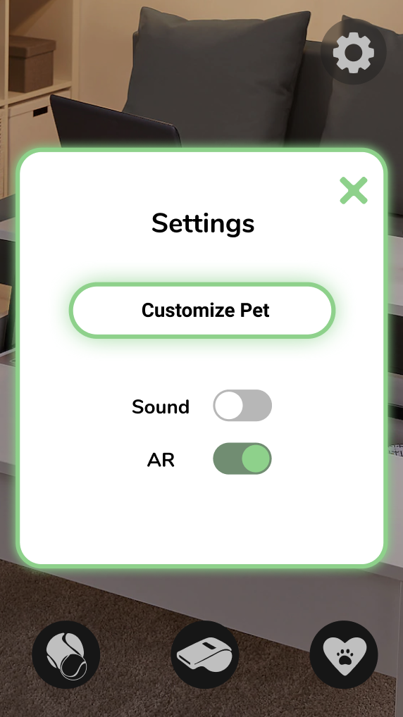
Users can edit the pet after they finish the creation process by using the ‘Customize Pet’ section in settings. Settings also gives users the option to disable sound and AR functionality, placing the pet in a virtual environment.
High Fidelity Figma Prototype
Unity Build
Using Unity, the AR team built a pet interaction screen compatible with iOS. This iOS build includes AR functionality that recognizes horizontal planes and places the 3D dog model on said plane. Once the model is placed, the user can interact with it using the buttons at the bottom of the screen. This Unity build does not feature the full functionality envisioned for bARk, instead it performs an interaction example for each category. These interactions utilize the button menu opening functionality which was implemented through a customized script. An idle state was given to the model using one of the FBX animations that are linked to the 3D model. With more time, this Unity build could have been further developed to include the full expandable menus and additional 3D objects, such as balls and bowls, to make the interactions more realistic.
Results
The current bARk build is a smaller version of a larger idea. This build focuses on a few breeds of dogs, customizing one breed, and a bit of AR functionality. The big idea for this app would allow for the creation of many different types of virtual pets with many commands and realistic functionality. This larger idea would include a more in-depth pet creation process with more options for species, breeds, colors, and patterns.
What we were able to produce in this timeframe was a high-fidelity Figma prototype for pet creation. We finalized this design based on the data collected through extensive user testing, building a semi-functional prototype that allows users to customize their pet. Through Unity we produced an iOS build with AR functionality that allows limited interaction with the pet.
bARk provides a new way to interact with pets using a new and modern technology, giving the user the experience of interacting with a virtual pet in any environment. This initial build of bARk shows that there is not only an opportunity for an app of this type in the industry, but a desire.
Final Thoughts
We are satisfied with the great amount of work that our team has done, but there are some things we could have done differently. Since most of the project was learning new software and learning new research methods, that took up the bulk of the beginning of the project. The ultimate idea for this app is a seamless flow between pet creation and pet interaction. The team chose to focus on experience over functionality, leading to a high-fidelity Figma prototype over a web build. With more time, this build could have been developed. Even if we were to restart this project, we would likely end with a Figma prototype again because of the large focus on the usability of this flow.
If we were to restart this project knowing what we know now, we would have started development in Unity during the first half of the project. Though the work in SparkAR provided knowledge easing the transition into Unity, it would have been beneficial to have the extra time to work in Unity expanding interaction functionality.
Though bARk did not turn out as extensive as originally proposed, bARk still turned out to be a success. We are very proud of our hard work, especially the fact that we learned how to use a new software to build a functioning app from scratch. bARk successfully fulfills our initial goal of providing emotional support, entertainment, and companionship through a fun interactive experience. The extensive user testing and research that went into this build has created a great steppingstone to continue developing bARk to its fullest potential.

