
The Team:
- Alex Alsid
- Hannah Jurafani
- Hannah Sayer
- Sanika Rann
- Veronica Lin
The Overview
Philadanco, also known as the Philadelphia Dance Company, was in need of a new website. As a non-profit organization that is internationally known for their innovation and captivating professional dance performances, maintaining a web presence that promotes their brand image and helps with ticket sales for their performance is of the utmost importance. Their previous website was initially funded by a grant for the arts, and was maintained by an external agency. Philadanco came to Drexel University looking for help with redesigning their website that would better project their brand image while allowing them to maintain the content internally. Our team of 5 undergraduate Interactive Digital Media took on this challenge. Utilizing a user-centered design process, we strive to deliver a user-friendly, eye-catching website that reflects the values of Philadanco.
The Context and Challenge
Philadanco! was founded by Joan Myers Brown in 1970 with the purpose of providing a dance institution for African American students. Their mission is to present the highest quality of dance performance while also increasing the appreciation of dance. Philadanco! came to us with this problem: the website they are currently using is outdated and not user-friendly. The site was not responsive, meaning that the layout was not optimized for mobile or tablet devices. This made the navigation and text of the website very tiny and unreadable on mobile devices without pinching and zooming. Navigating the site and finding specific information was also difficult.
For the redesign, Philadanco had two main goals; 1, to make the donations more prominent, and 2, to allow the user to purchase tickets on their website without being re-routed to an external website. Our goal with the website redesign was to make sure that the new design reflects the company’s values and missions while promoting efficient UI and UX. We will also create a sophisticated and intuitive information architecture so that the site would be easier to navigate.
The Process and Insight
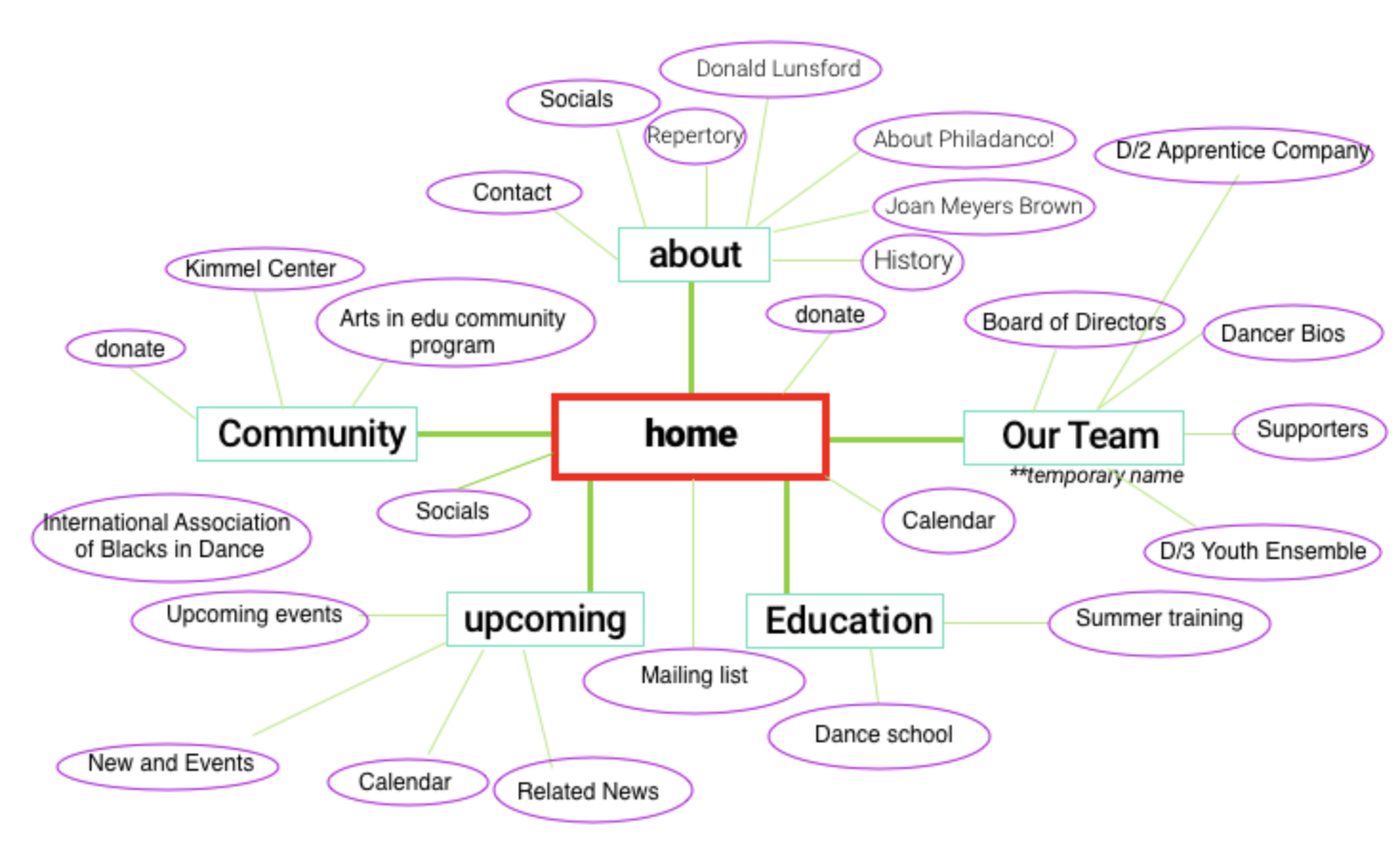
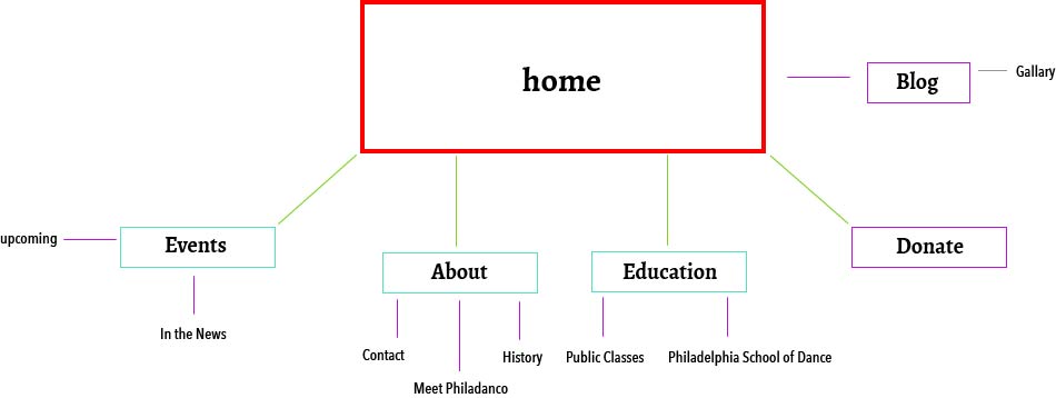
We started out this project by researching the target audience and gathered their general thoughts on Philadanco. We started the process with a content audit, and performed card sorting exercises with our target audience to better understand their thought process on the potential structure or information architecture of this site. Based on the results from this research, we developed a site map to further organize the structure of the site.
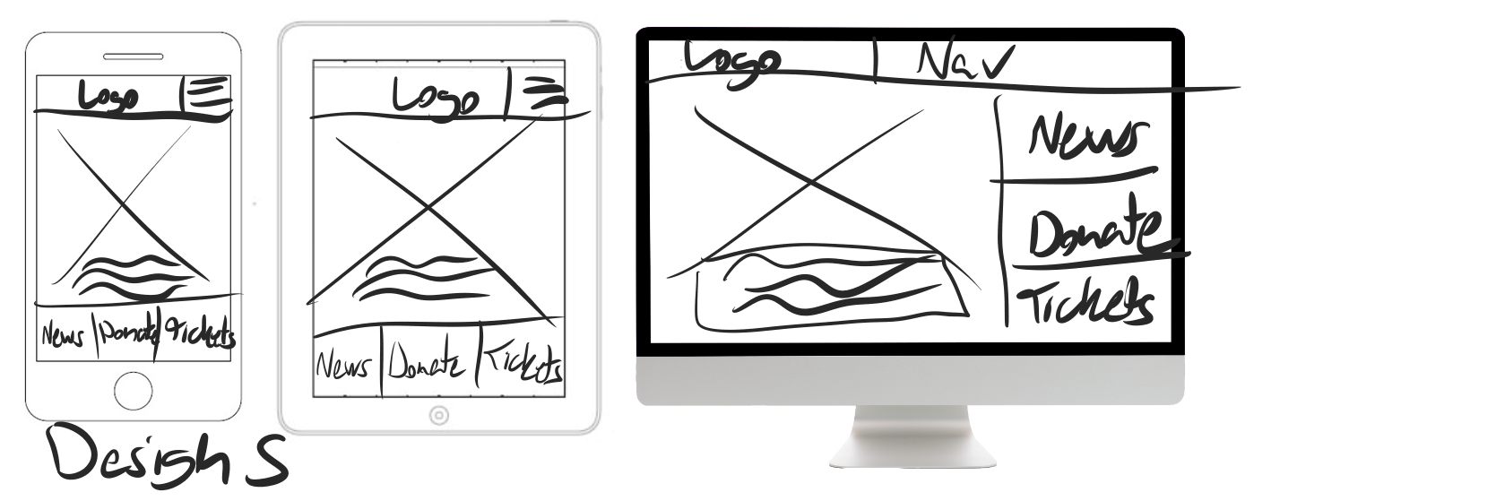
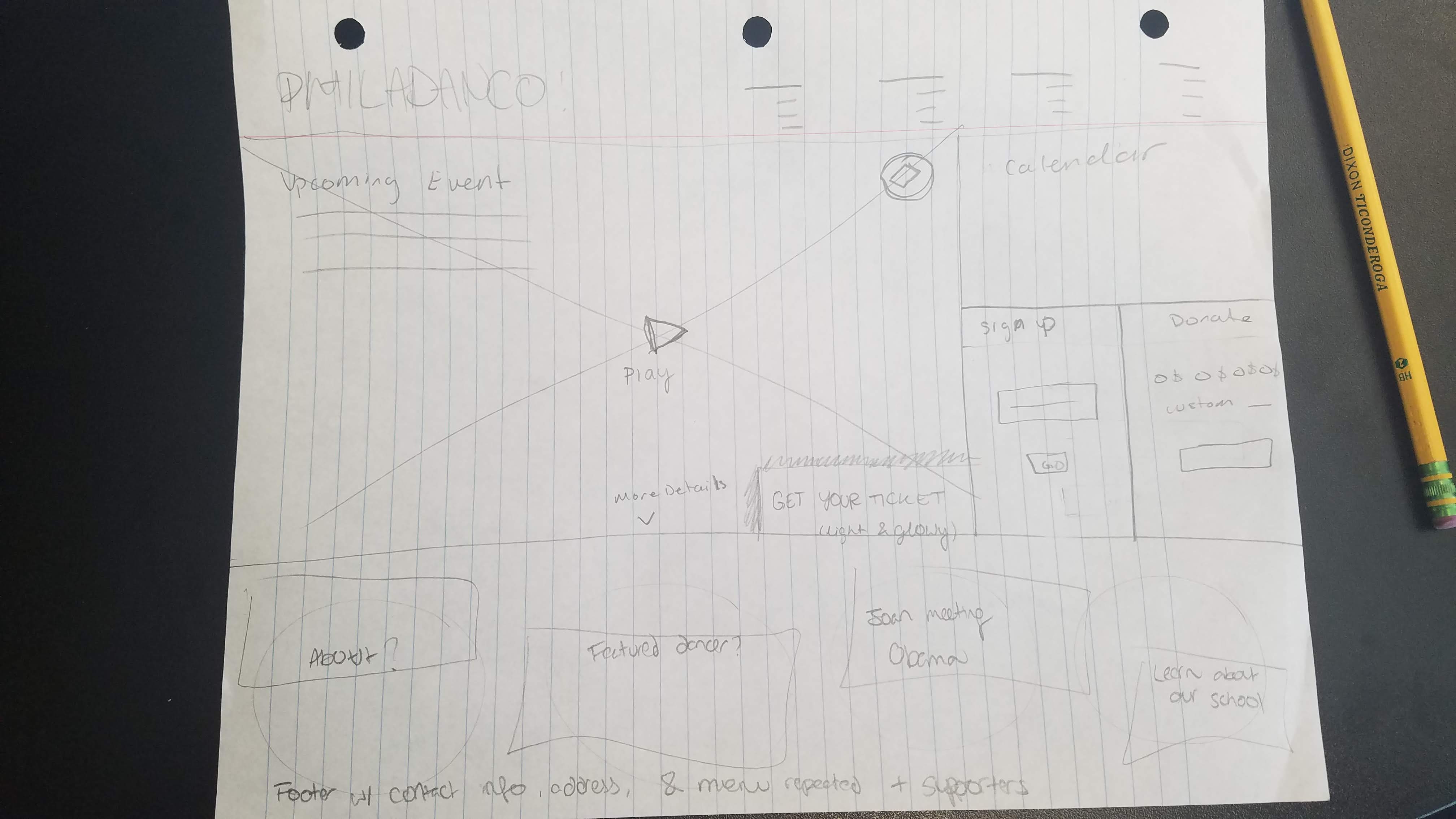
After developing the site map, each group member created wireframe sketches to generate possible ideas of what the future site will look like. As a group, we consolidated our ideas and were ready to start creating wireframes. We designed using the Mobile First approach to ensure that the lack of responsiveness in the original website was being addressed. The initial wireframes we made were used to create clickable prototypes for usability for testing.
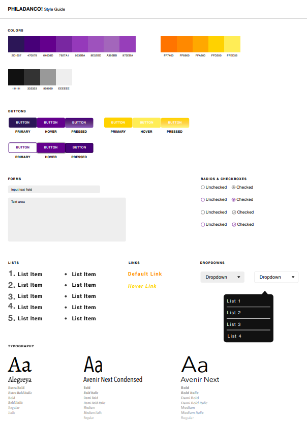
As we were working through iterations of the site’s structural design, we also developed a style guide that was influenced by the color scheme of the original website. We stuck with Philadanco’s current color scheme, but chose more saturated versions of those colors. The original website’s background colors were grey gradients; since we are working with a white background on the redesign, we tweaked the hues so that the colors will stand out. We settled on serif and sans-serif fonts that would help complement the elegance of the company. After we received consensus from the client and the target audience, we settled on the final style guide that reflected Philadanco as a company.
During each iteration of prototyping, from our wireframes to the final product, each member conducted usability testings with target users in order to integrate the feedback we got into our prototype. We made sure to periodically check in with the client and show them our process to get feedback from them. After testing the high-fidelity prototype, we jumped into coding. As a team, we worked together to develop a custom WordPress theme based on the high fidelity prototype.
Research
Target Audience
Our target audience are dance enthusiasts and/or those who appreciate the arts, locals of Philadelphia, kids who are interested in dance, and mothers of kids who dance.
Card Sorting
From our content audit, we conducted a card sort to understand ours users’ thought process of organizing and navigating through the content we gathered.
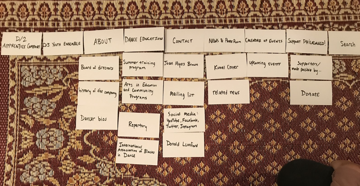
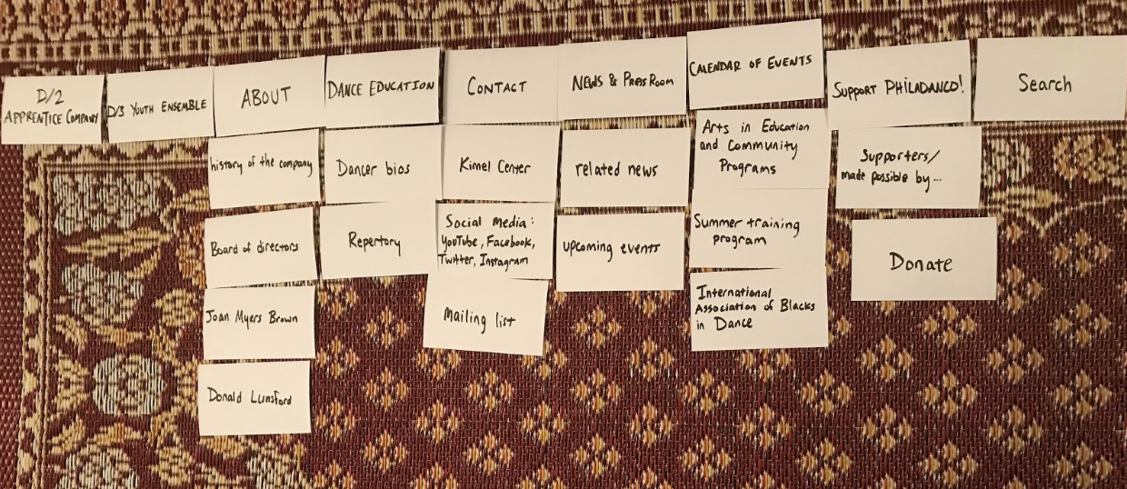
Sitemap
Sketches
These sketches were developed after we figured out the sitemap of the website.
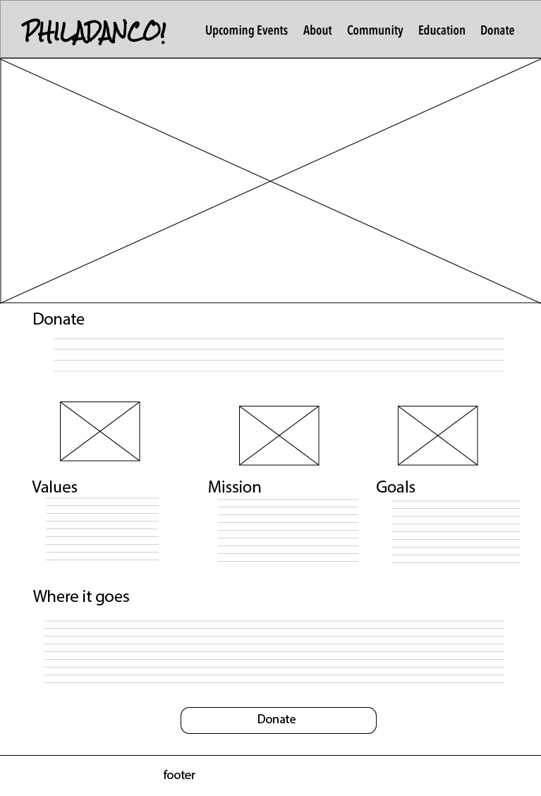
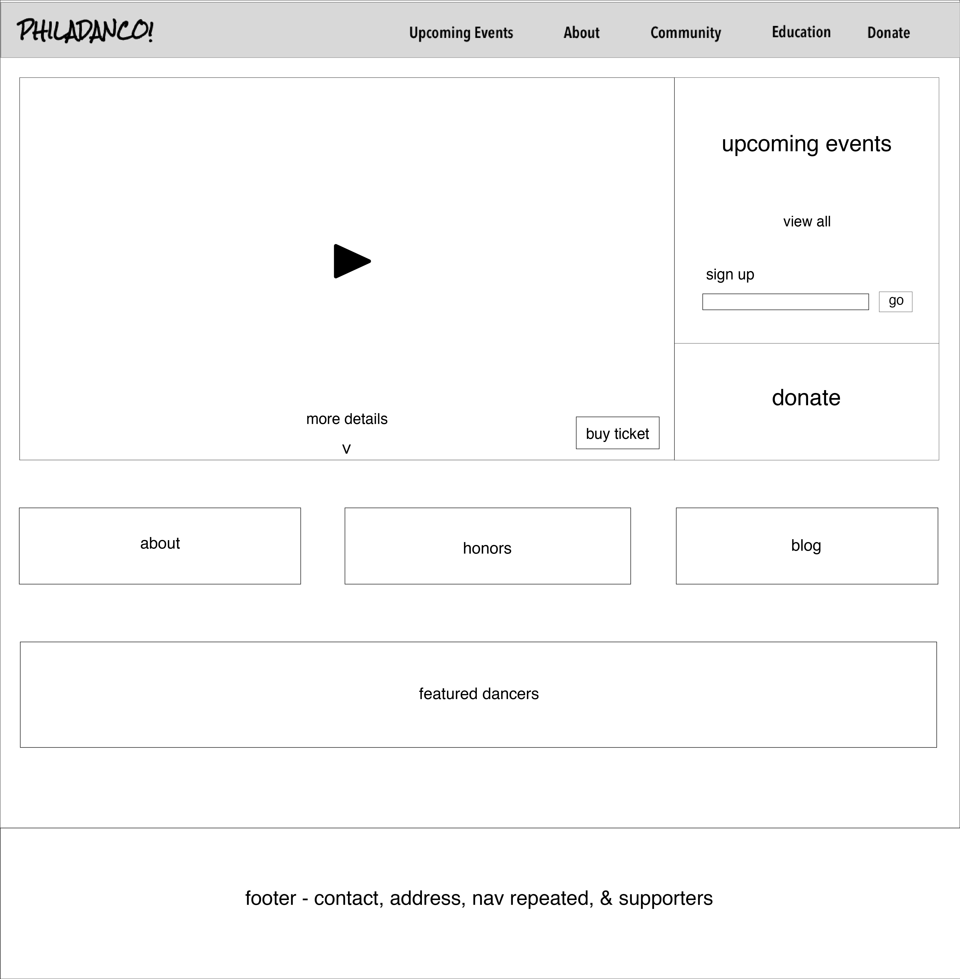
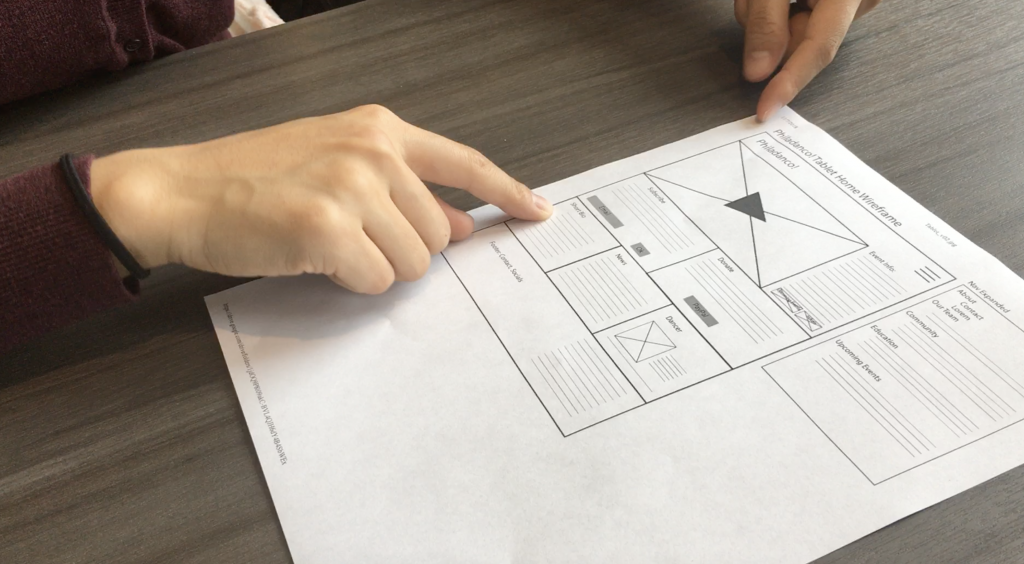
Wireframes
After deciding on elements we want to use for the redesign from our sketches, we made the first iteration of the wireframes that we all agreed on.

Style Guide
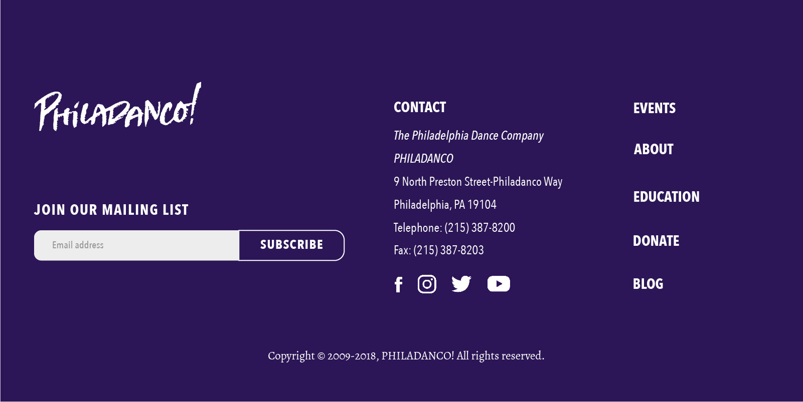
Header and Footer
We improved on the navigation of the current website in our redesign by adding it to both the new header and footer of each and every page. For the footer, we made sure that the contact information should be easier to find compare to the current website. We also added a way for users to join their mailing list on the footer.

Prototypes
We created a paper prototype for desktop, tablet, and mobile to test out our ideas early on. Coming up with an intuitive information architecture was one of our challenges so testing early allowed us to get feedback from users to continue making iterations until we came up with an efficient, organized structure.
Based on usability testing, we made more revisions on our wireframes and worked our way into creating a high-fidelity prototype in Flinto.
Development
A custom WordPress theme for the website was the best way to tackle this project as this allows Philadanco! to easily update their content without going into the code itself. Our team spent the majority of the winter term coding the WordPress theme (HTML, CSS, JavaScript, PHP) and making sure that the website can be easily updated with the help of a user manual provided by us to the Philadanco! Team.
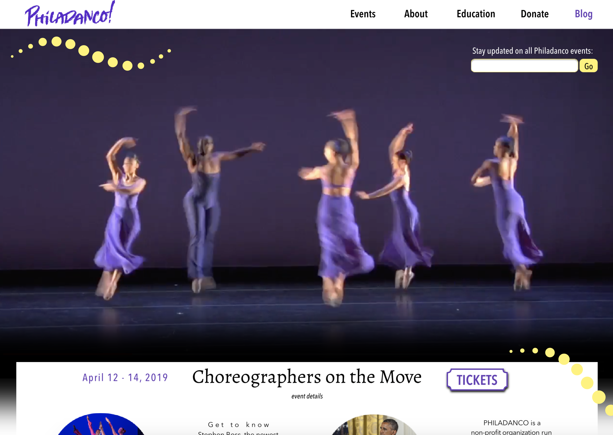
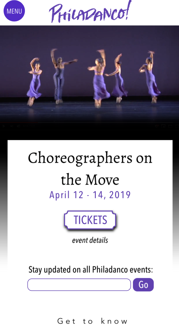
The Solution
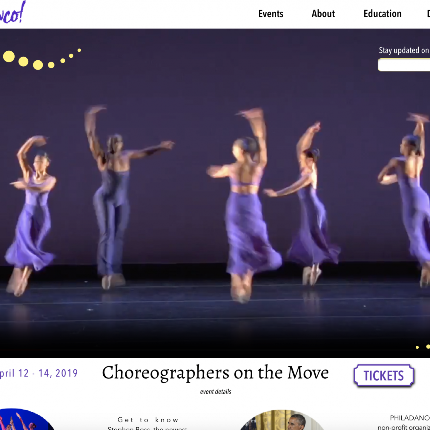
Based on user research and many iterations of usability testing, we believe that we were able to design a fully responsive WordPress website with efficient UI for a more user-friendly site that Philadanco can now update and control. The website has ways for the user to directly get tickets or give donations to the company directly instead of using an outside source. On the front page, users are greeted with a video trailer introducing the company. There on the page is a link that directly leads the users to a page to buy tickets to their current show and other links that leads to other important pages such as the donation and about. From the menu, the users can directly go to the events page and find information on their current, future and news relating the event and company. The next menu item leads to the about page of the company including history, a meet the team page for the dancers and the board of directors. Because Philadanco! also has a school that is separate from the company, we included not only class information but also both the D/2 Apprentice and D/3 Youth Ensemble companies that the school also has. The next main menu page is the donation page where users can learn about the company’s mission and values and directly donation to them. The last thing added to the website is a blog page where dancers and such can post about their events and practice to users. The overall design of the website greatly improves the previous version of the website with more saturated colors and animations. The overall feel of the website is morden and fun.
The challenges that were addressed includes how this website is promoting the brand. This was achieved by having many photos of their dancers throughout the website. In particular, these photos are dynamic in posing showing them in the middle of a move. Another challenge was how the website will be maintained. This was solved by having the website be a WordPress website. With this, updating the content of the website would be easy and done through the WordPress interface with no changes to the code and dealing with the html file itself. Finally, there was the challenge of how the new donate and ticketing systems would would in this iteration of the website. With WordPress, there were plugins the team has found to help the company be able to get donations and ticket sales without use of an external service outside of the domain.
The Results
In the end, our team delivered a product that was solid and a success. We have made a responsive WordPress website that can be easily updated by the Philadanco! team whenever they need to do so. This was our first opportunity with working with a client so that was quite a bit of lessons to learn about how the whole process works from commuting with the clients to working as a team and the different personalities that came with that and how to deal with that. This project was a good way to get us introduced to the concept of working with clients as well as team members.