
The Team
- Claudia Bonitatibus
- Sarah Bray
- Hannah Sayer
- Caroline Scheinfeld
The Overview
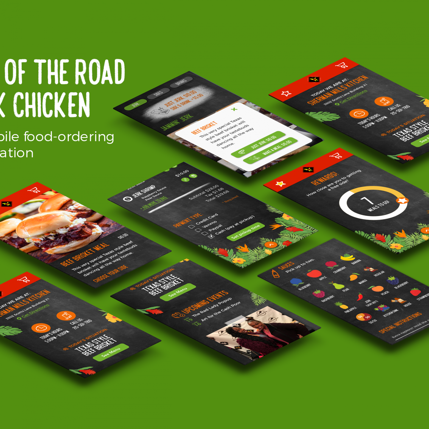
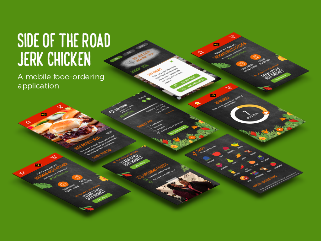
When assigned the project of creating a mobile food-ordering application, our team knew exactly who we wanted to ask. Side of the Road Jerk Chicken is an authentic Jamaican kitchen and food truck based in North Philadelphia. The owner, James Legget, is a passionate and inspiring man who connects with each and every one of his customers. We strived to create an app that speaks to the familiarity of his brand while streamlining the ordering process.
The Context & Challenge
Side of the Road Jerk Chicken takes pride in their strong sense of community and because of this, has a very dedicated consumer-base. The goal of our mobile app is to bring this warm, friendly, community feel to a digital format — just because the customer may not be able to wait extended periods of time for food from their favorite Jerk Chicken Food Truck doesn’t mean they shouldn’t get #TheExperience, a phrase Mr. James coined to describe its magic.
Our main challenge was making the app as personalized as possible while maintaining an efficient and intuitive ordering process.
The Process and Insight
Before beginning the process of designing or even structuring our app, it was important to get an authentic sense of what Side of the Road Jerk Chicken’s business model is and the needs of their clients. Mr. James is very dedicated to the quality and the authenticity of his product. Because of his business model and investment in both the quality of his product and the overall experience of his customers, Side of the Road Jerk Chicken’s fan-base is very loyal. The app was designed to target both new and returning customers.
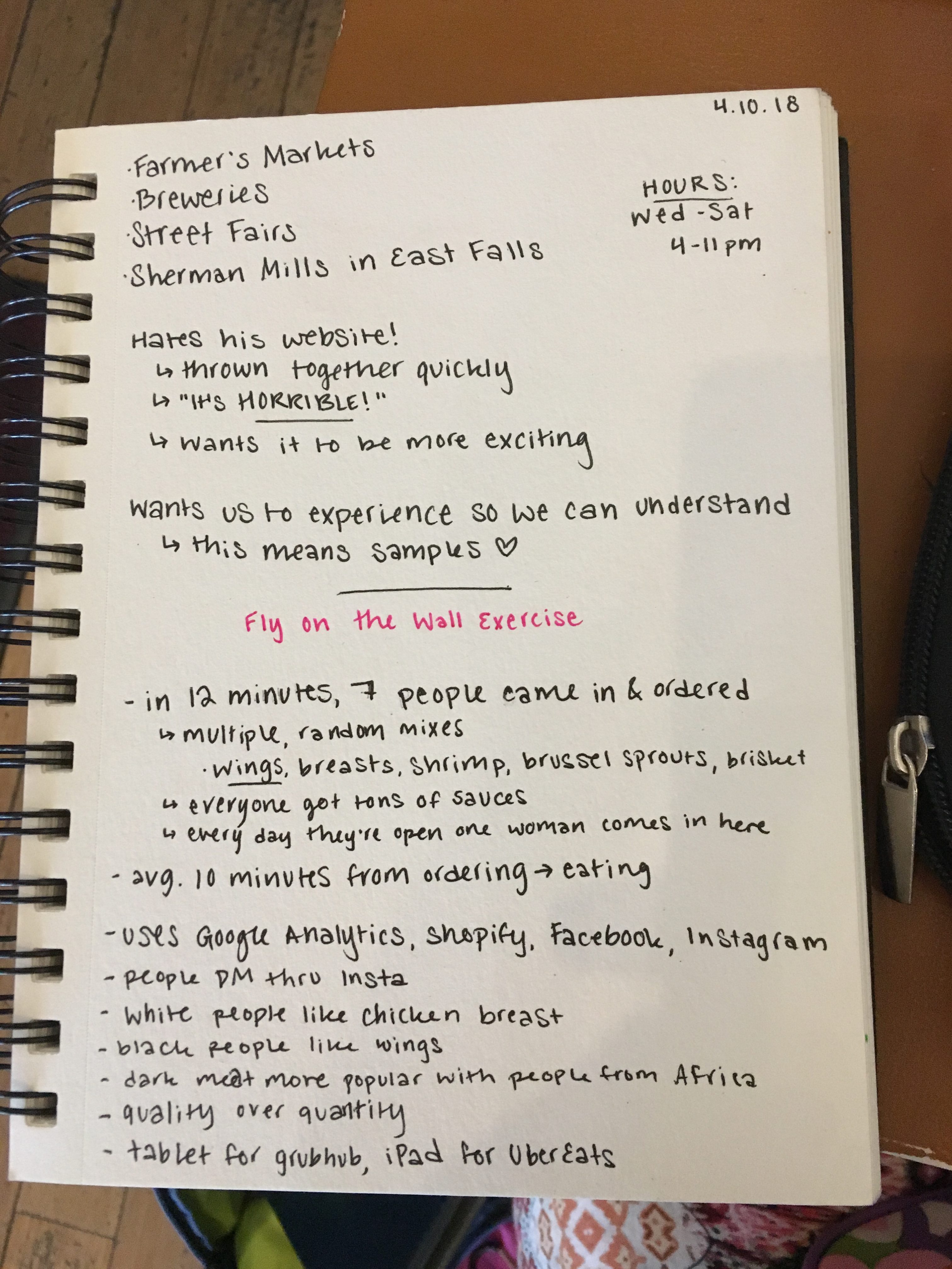
After seeing the onsite location of Side of the Road Jerk Chicken in Sherman Mills, we were able to fully immerse ourselves in analyzing both the business and the consumer-side of the product we’ve designed. This analytical stage included a SWOT analysis, the Four Cs and creating different proto-personas.
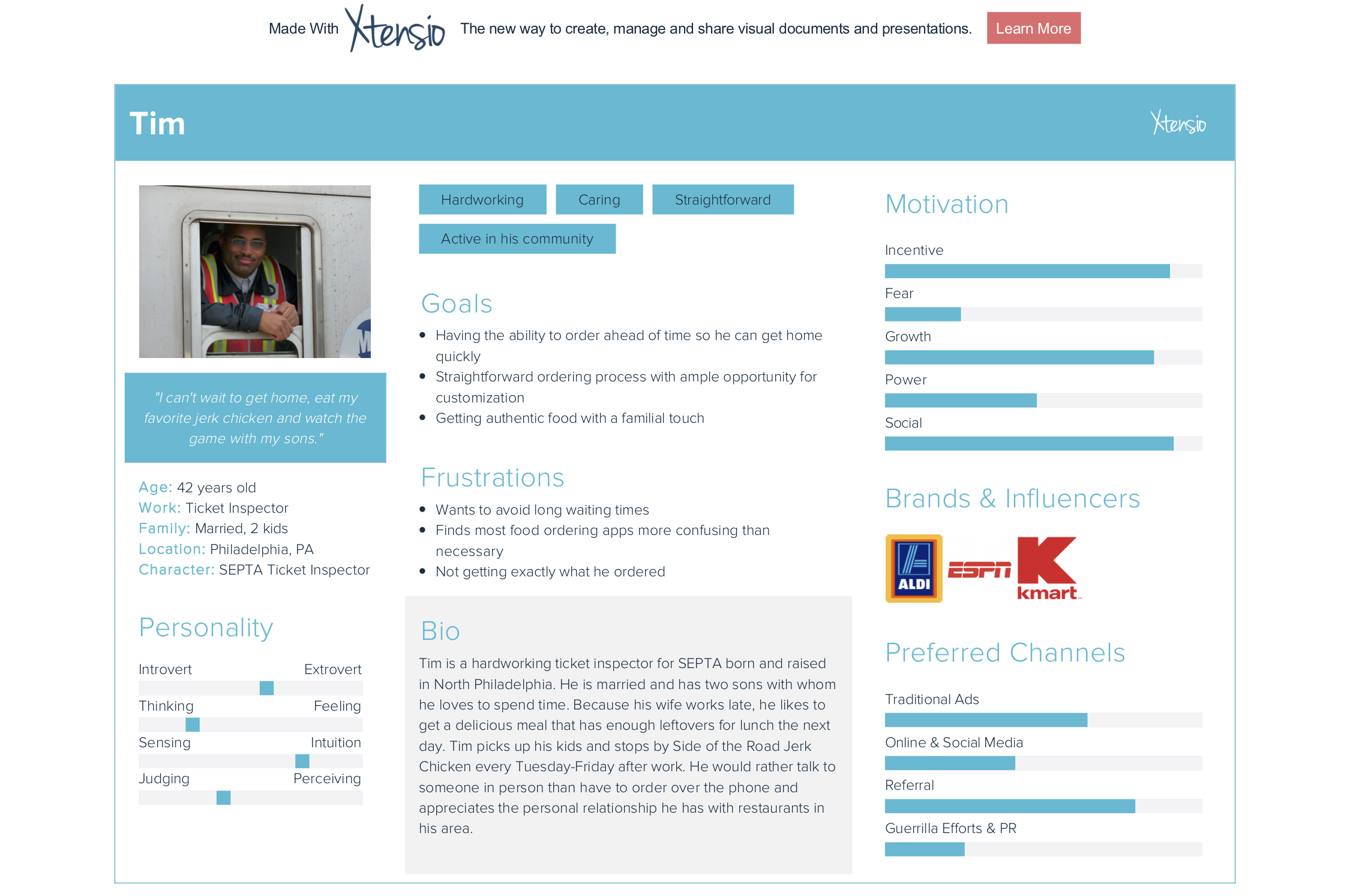
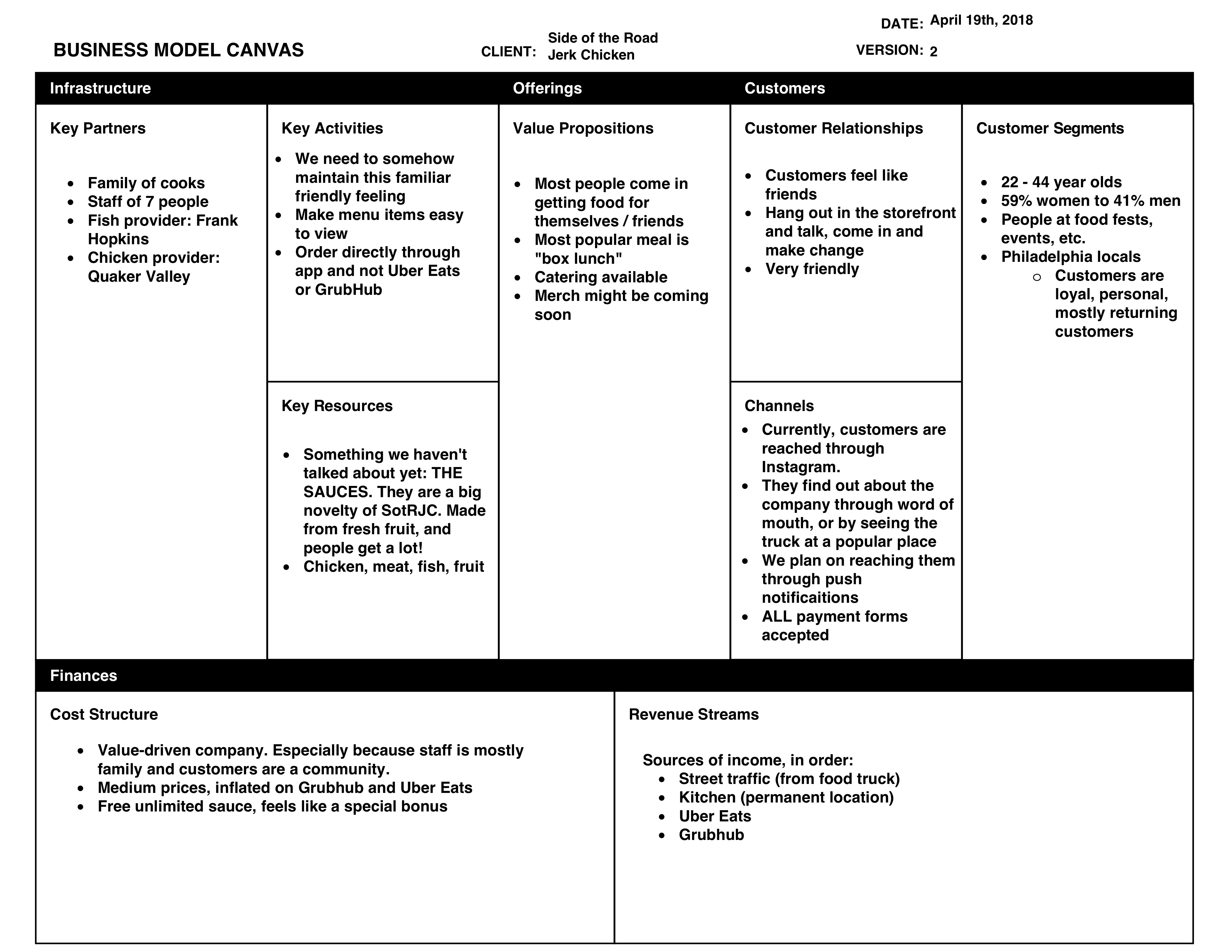
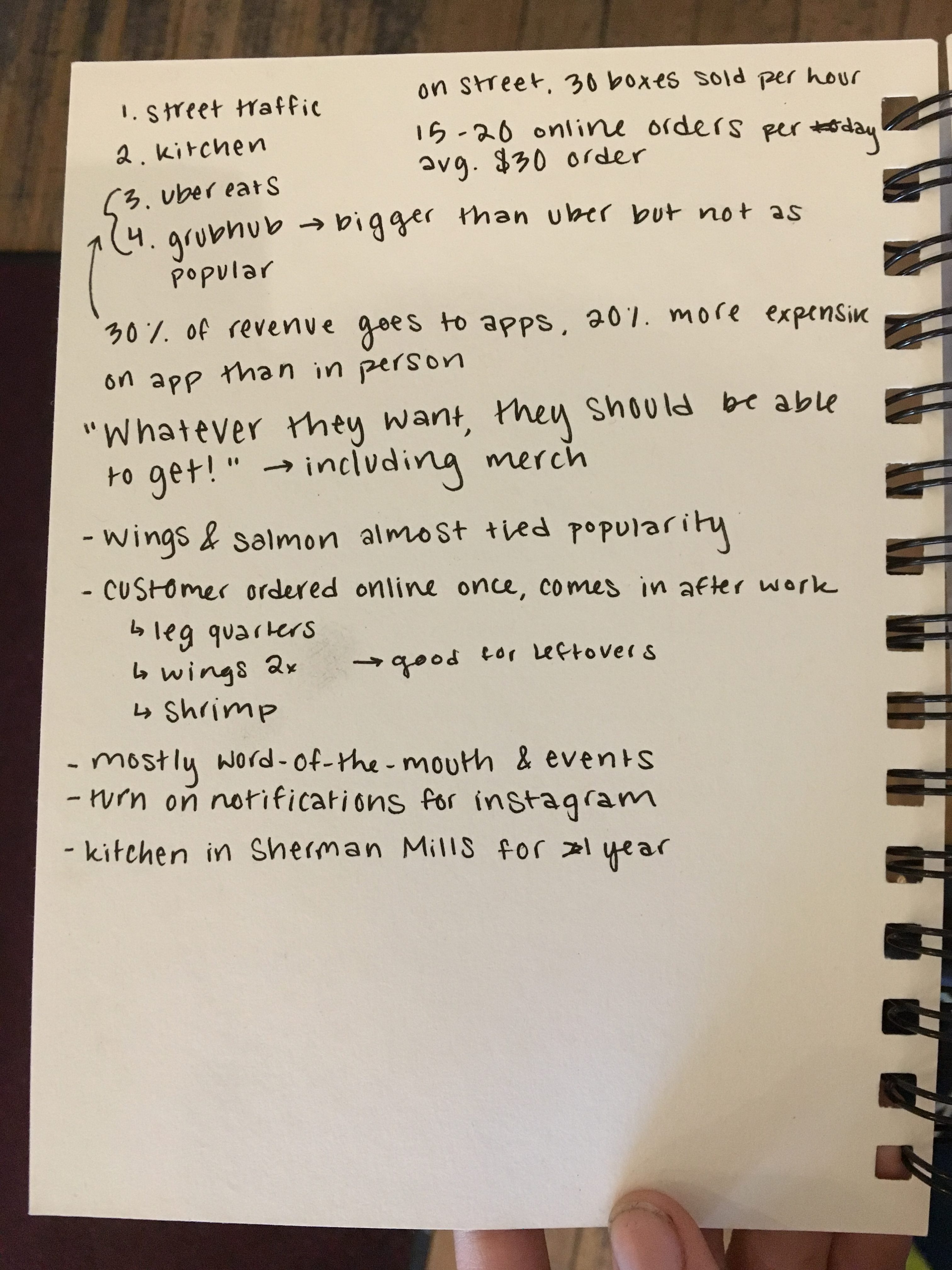
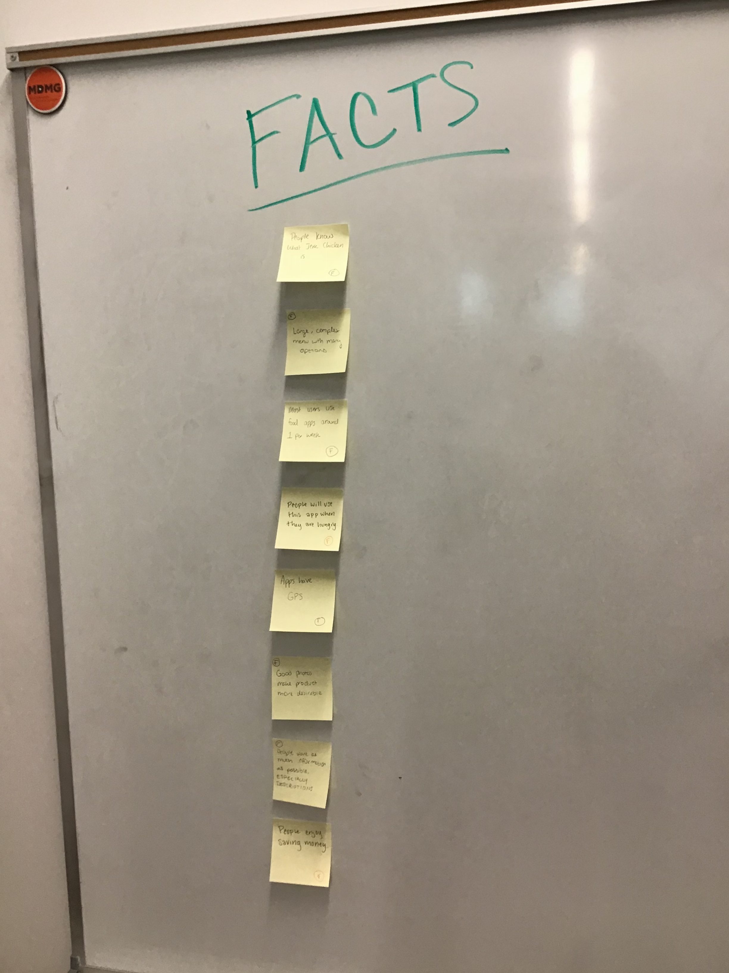
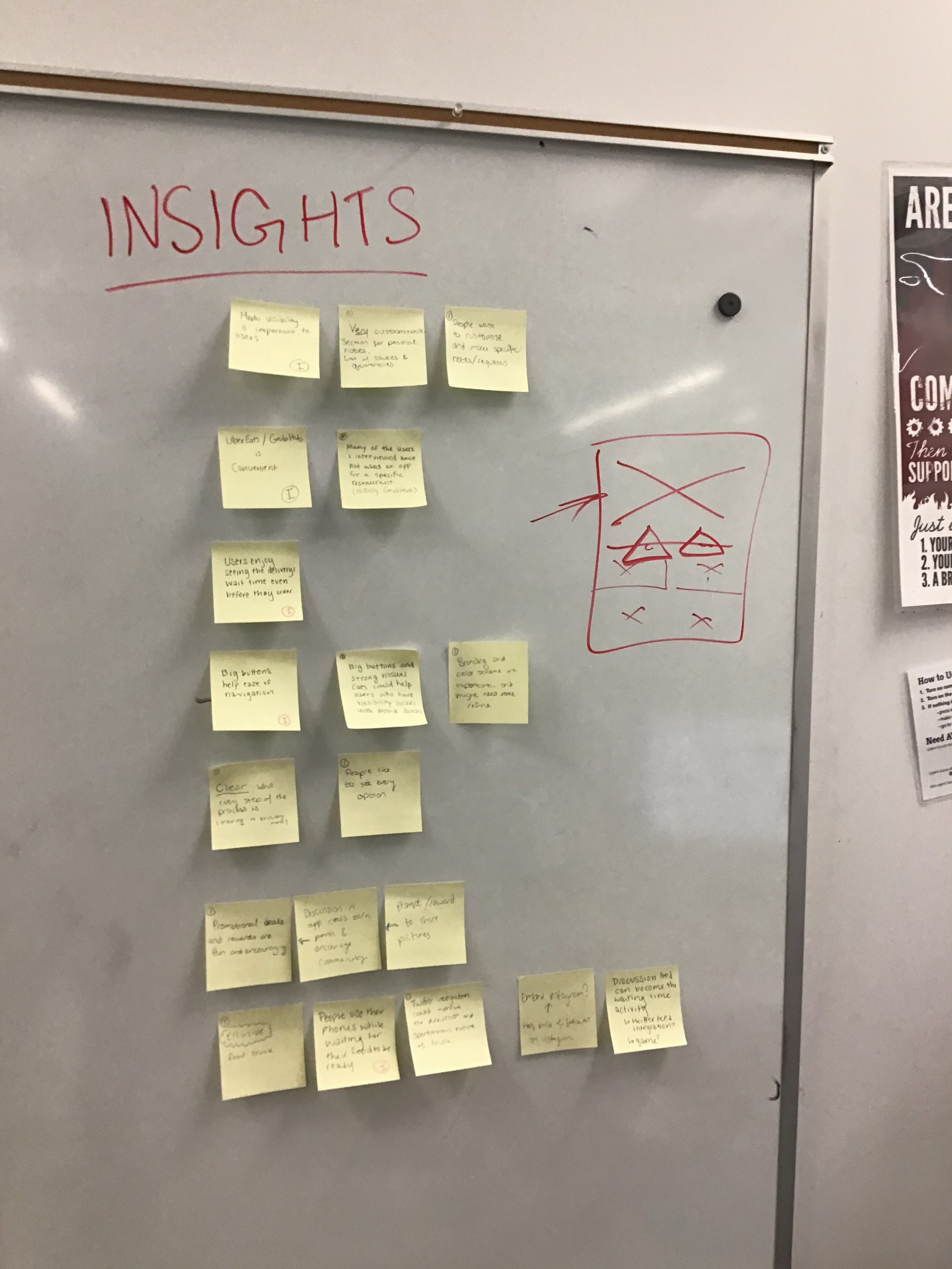
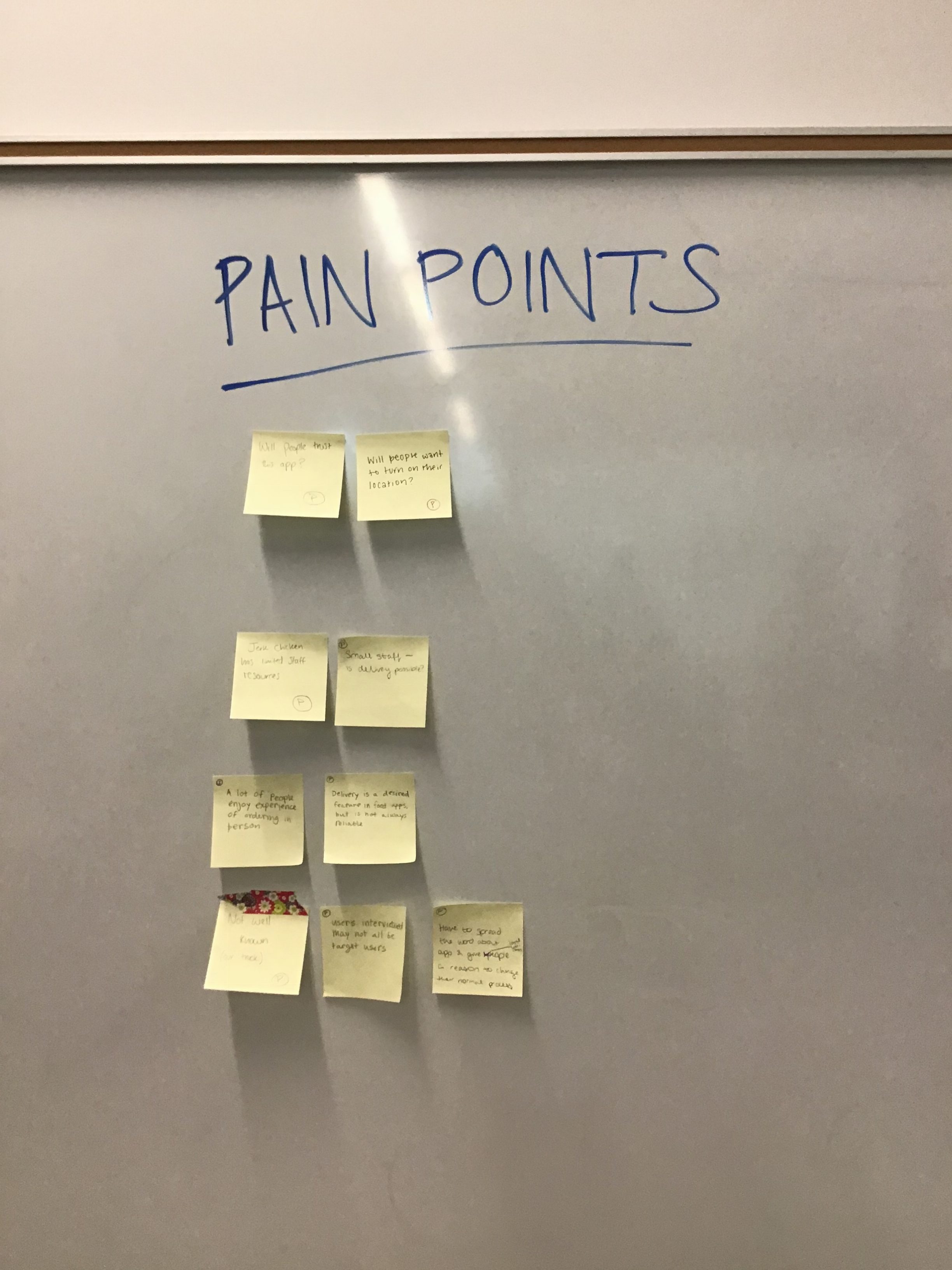
After these exercises, we each conducted user interviews on which we shared detailed notes. This gave us a better sense of who our target users were and what real users would be looking for in a mobile food ordering app. Using the feedback and information we took away from these activities, we made a list of facts, pain points and insights to keep in mind while solving our main problem: how do we make our app meet the needs of the consumer and our client in a seamless, intuitive way while fully capturing the spirit of James’ business?
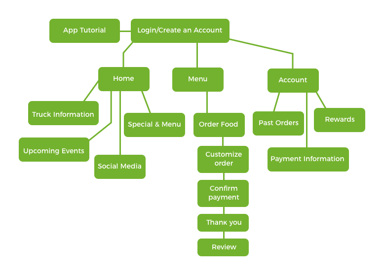
Information Architecture & User Experience Approach
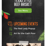
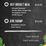
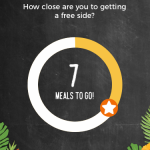
The information on the app was organized in a way that reflects the needs of the users as well as our client. The main things that the user needs to know is the location of the truck, what’s on the menu and past payment information. Our product goes beyond simply clicking on a menu item and ordering it; we allow them to stay in touch with the truck by showing them how to easily located the truck and keep updated on its whereabouts. Other information such as a rewards-based loyalty system, meal combos, the option to customize your meal with sauces and a previous orders section were added to embrace what helped drive the company’s identity.
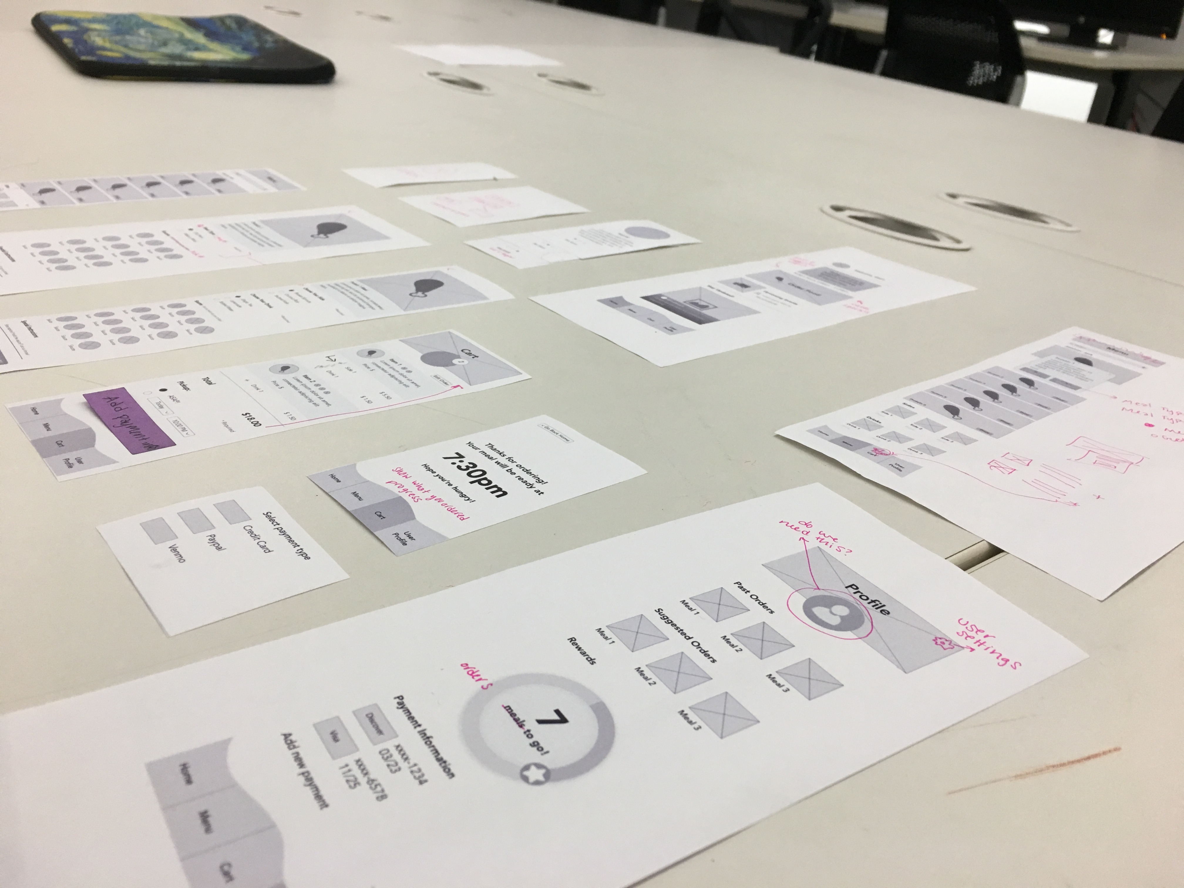
Before building the wireframes digitally, we sketched out what we envisioned the main task flow of ordering a food item would look like and received input from users on how effective our method was.
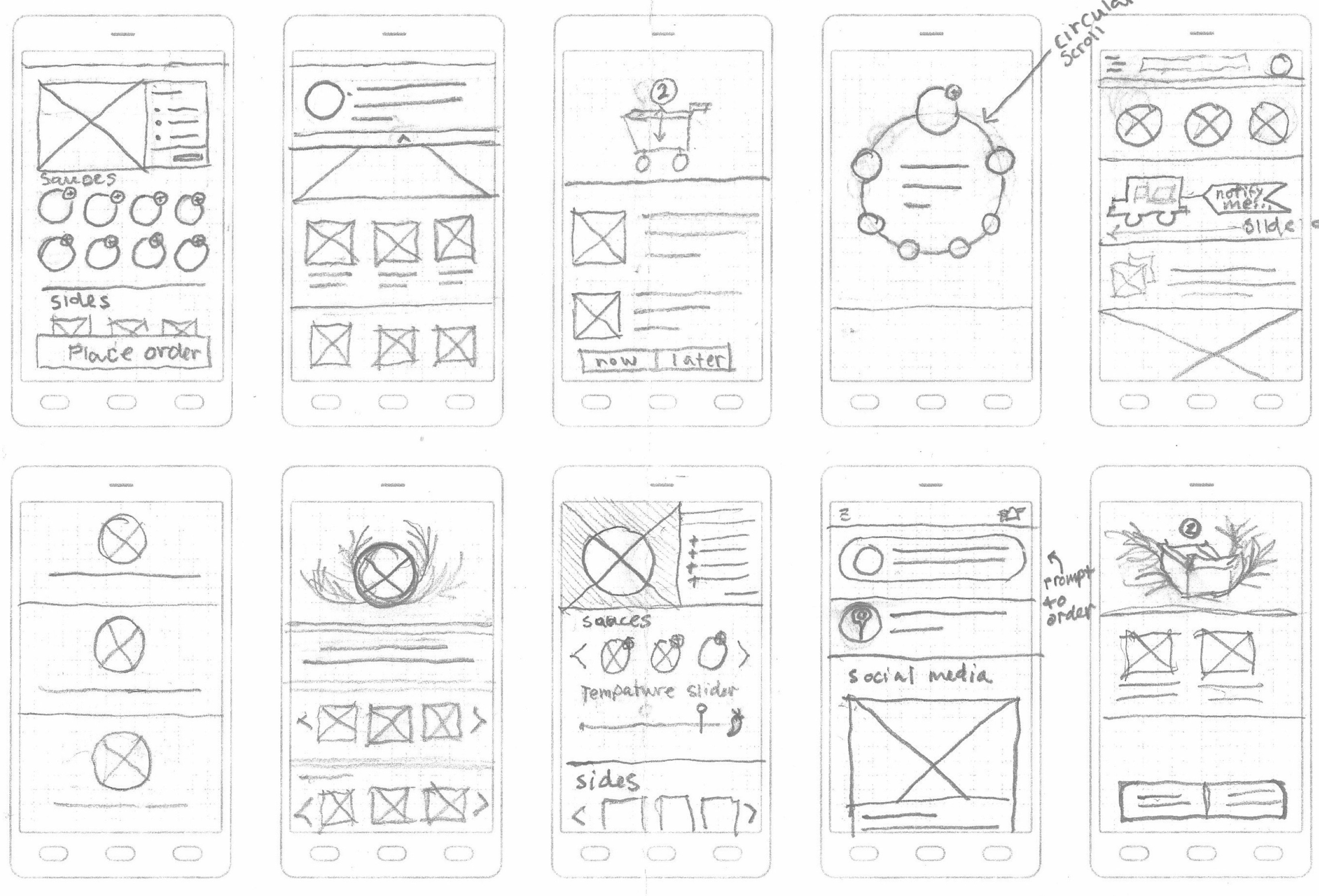
From there, we were able to build a rough draft of the wireframes which we used to conduct two rounds of usability testing and made adjustment to the layout accordingly.
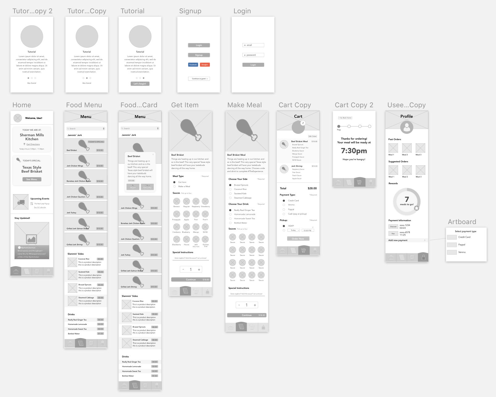
After more testing, we revised and built a paper prototype. This allowed are users to actually “click” through the app and see how the ordering flow would work.
Design and Branding
The branding of our app was a challenge in itself because we had to find a way to bring a very rich feeling to a digital format which would breathe life into our product. What made this task demanding was the fact that we had to a lot of rebranding. This is because while Side of the Road Jerk Chicken has a website, James was not happy with the design of it in the slightest. We began tackling this process by creating individual moodboards and from there, agreed on a dark, chalkboard theme, green and yellow accents from the Jamaican flag and vibrant tropical flowers scattered about.
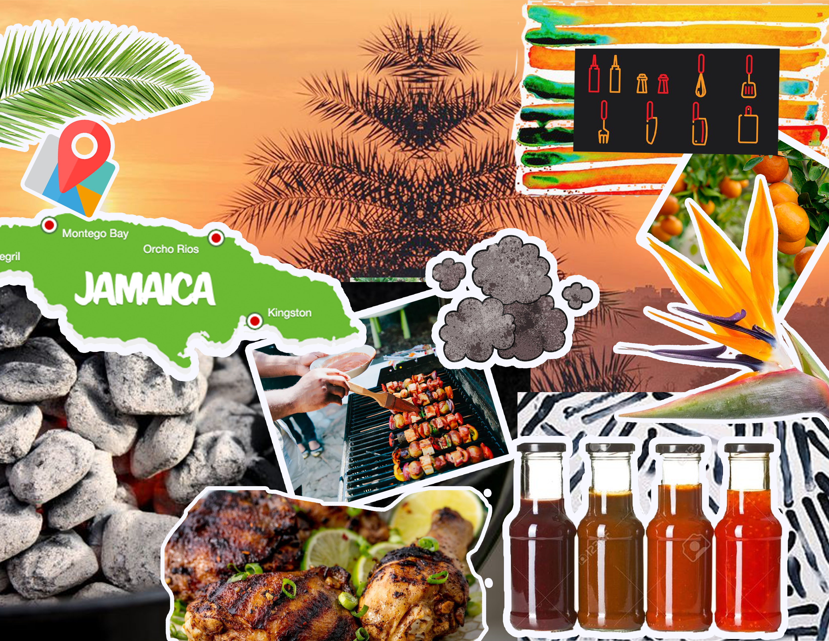
From that point forward, we were making the vector graphics of the fruits and flowers to create that warm atmosphere we were striving for. After we put the wireframes through two rounds of usability testing with we began the process of adding fonts and colors to the prototype. After adding the styling to our app we ran it through two more rounds of usability testing and continued to make minor changes to the layout. Our end product blends the vibrant colors of Jamaica with a hands-on chalkboard texture which gives a touch of James’ personal brand and business model to our food ordering process.
The Results
From where we began to the final product, our team could not be more proud. After only ten weeks and losing a key member of our team, we encountered our fair share of challenges; however, in the end, you would have no idea. Our concept of an island-themed, user-friendly application that used common practices to solve the challenge of mobile food ordering was a success. It is a personalized, intuitive application that has ample opportunity for customization and stays true to our goals.
We’ve learned so much about empathic research and user-centered design throughout this term. Our team can’t wait to share this prototype with the world!