

Team
- Alex Aslid
- Alex Huffaker
- Yuan Li
- Miles Waldron
- Jordan Zagerman
Overview
Over the past 10 weeks our group has been working closely with Schmear It and their customers to create a brand new mobile ordering experience. We conducted primary research, went through multiple rounds of ideation and user testing, and ultimately created a final interactive mockup in Sketch and Flinto. Through this process we learned the importance of collaboration, user testing, team meetings, and understanding business requirements. We are extremely pleased with the final application and hope Schmear It’s users love it as well.
Context and Challenge
Schmear It is a local Philadelphia bagel food truck established in 2013 and recently expanded into a physical location in October 2016. Our team was tasked with developing a mobile application for Schmear It that provided mobile ordering, rewards, and business information for their customers. This application would substitute their existing order ahead solution on their website. We worked closely with Schmear It and their customers to test and develop this mobile application over the past 10 weeks.
While Schmear It already had a mobile ordering function built into their website. It wasn’t advertised or communicated to users very clearly on their website (especially the mobile site) or at their physical locations. The goal of this application was to bring mobile ordering to Schmear It in an accessible and discoverable way for users, while preserving the unique personality and branding Schmear It has developed. The application should also promote their build-your-own option as this is their preferred way for people to order and their collaboration with charities.
Process and Insight
We began the design process by establishing a relationship with Schmear It. We created a business model canvas and project model canvas for the company. After that we began visiting the truck and store to observe the ordering process and the customer experience Schmear It provides.
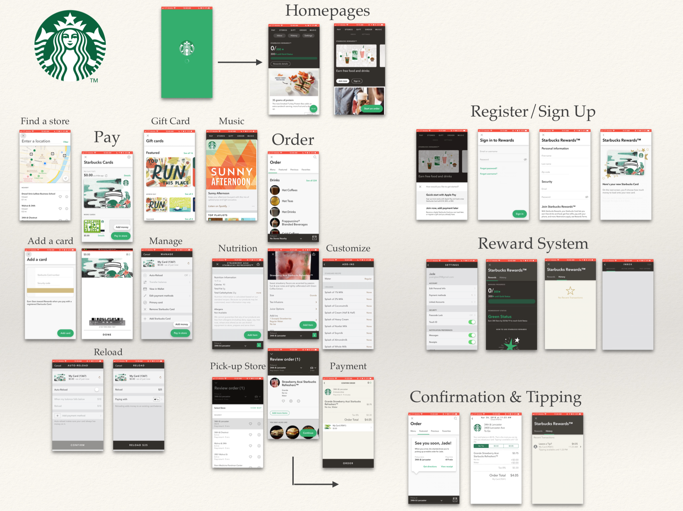
From there we began conducting competitive research on competing mobile ordering applications to determine what ideas, flows, and features were already on the market. We determined our target audience based on the surrounding area and the customers we saw from visiting Schmear It. We determined our primary customer types were students, commuters, medical professionals, and to a lesser degree tourists.
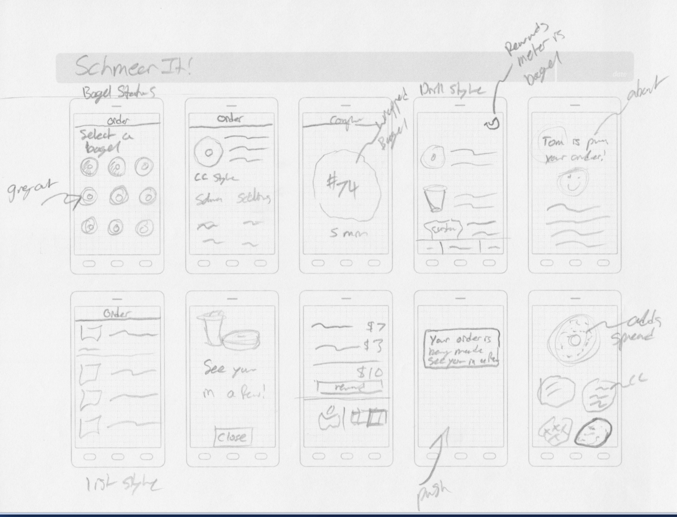
After our initial research and planning, we began to sketch wireframes for potential designs and user flows. This process, like every process was collaborative and we went through 2 rounds of wireframes before moving to digital mockups.
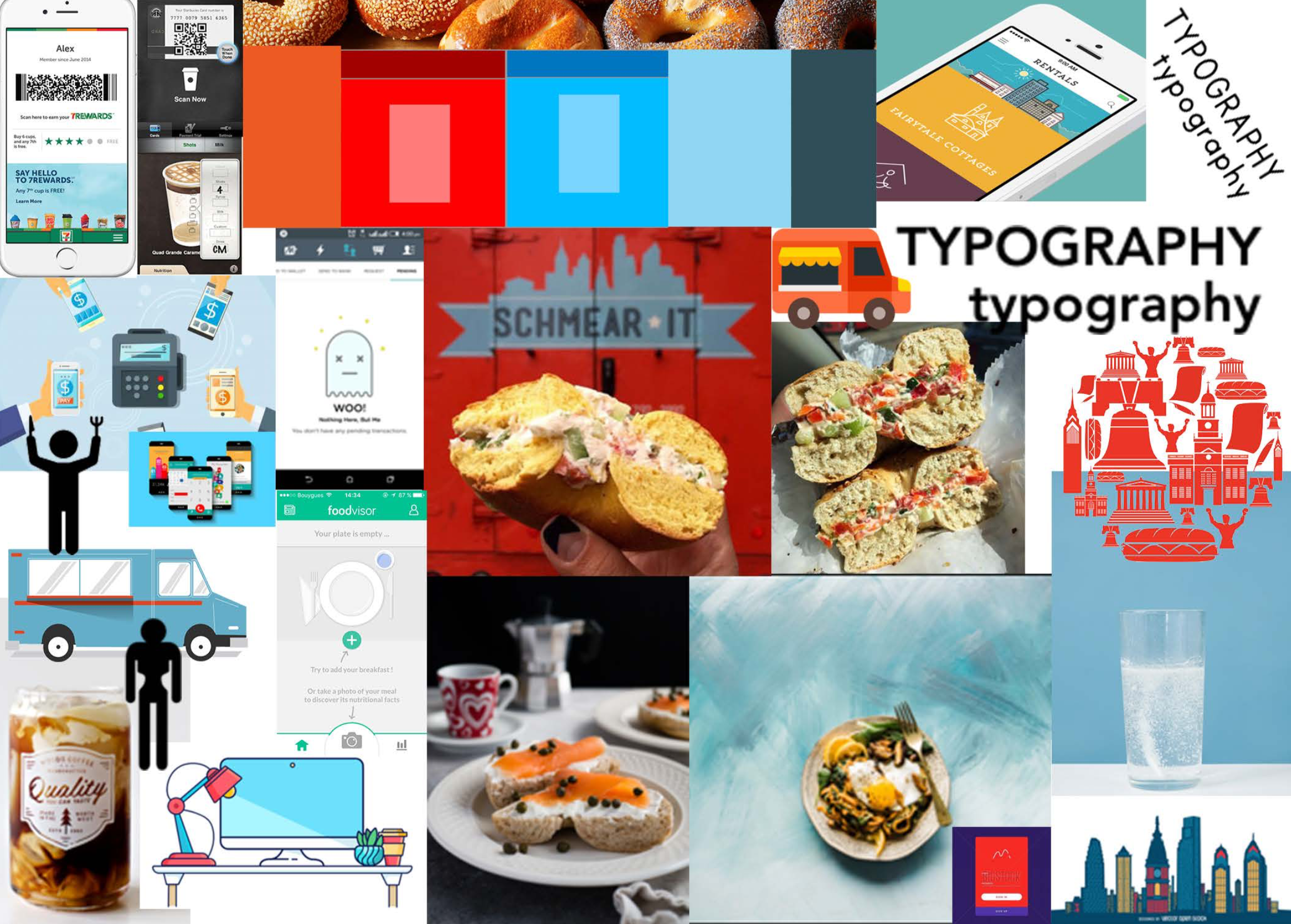
From there we made individual mood boards that we combined into a unified team mood board with our color palette, potential iconography, fonts, etc.
We then began creating wireframes in Sketch and tested paper prototypes with users.
After testing with paper prototypes we moved into testing digital mockups with scripted user interviews. We repeated this testing every week from weeks 6-10. After each round of testing we regrouped as a team, discussed our user feedback, and determined what changes needed to be made for the following week. Collectively we tested with approximately 50 users over weeks 6-10. In week 7, we began using Flinto to add animation and navigation to our prototypes. The navigation went through several revisions as the first few prototypes were difficult to navigate. By week 10 we had a final prototype that went through one final round of testing and validation.
Overall we split the initial wireframe sketches and user testing between each team member. Alex Aslid created mockups in sketch and the final presentation. Alex Huffaker helped create standardized UI elements in Sketch and the final case study.
Yuan Li created the initial wireframes in Sketch for testing and assisted Jordan with animations in Flinto. Jordan Zagerman focused on talking with the business, users, and later animations in Flinto. Miles was responsible for creating graphics and did the final work in Sketch before it was passed off to the Flinto team.
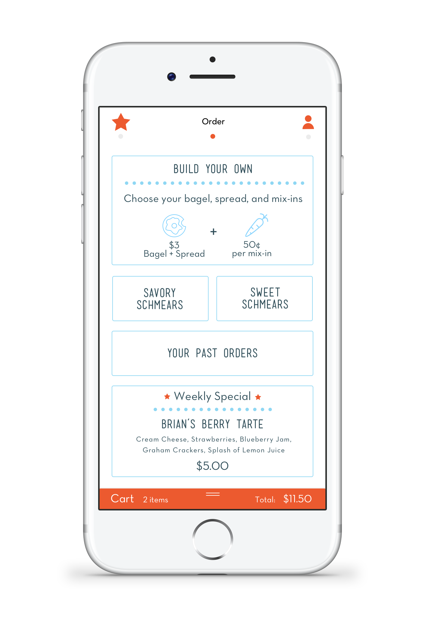
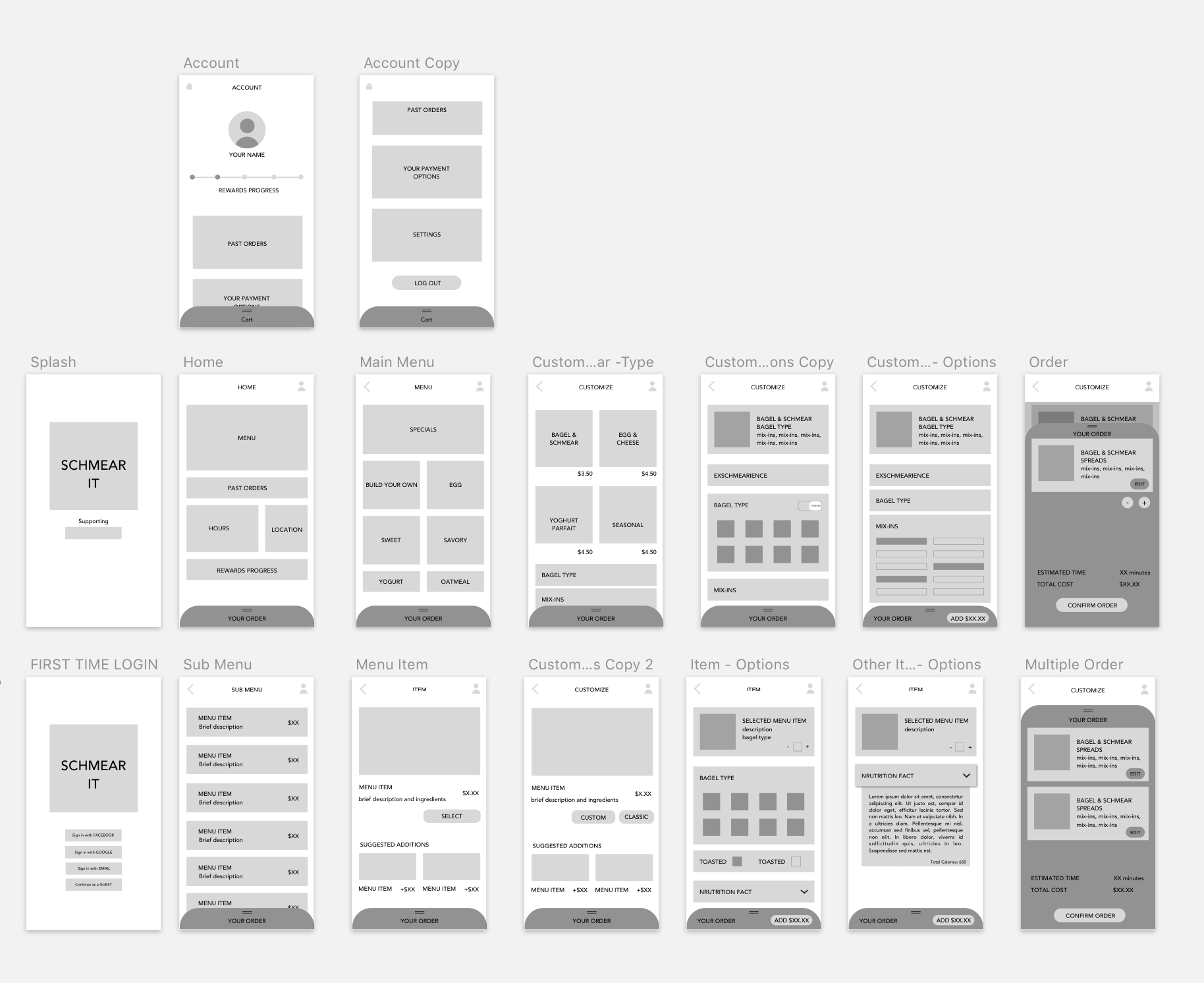
Solution
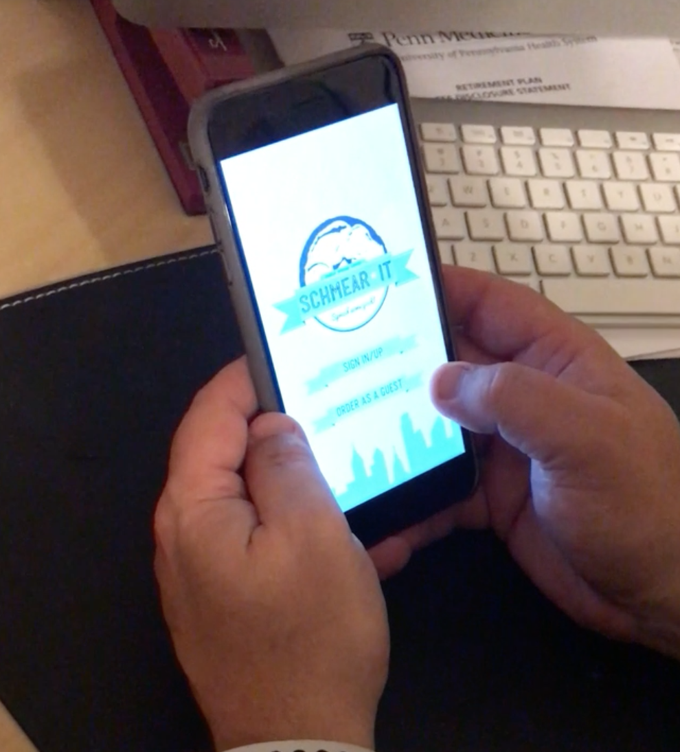
From the start we wanted ordering to be as easy and fast as possible. This was a defining trait that drove our design decisions. This led to the removal of an initial sign up screen and was a driving factor for the adoption of an ever-present card style cart.
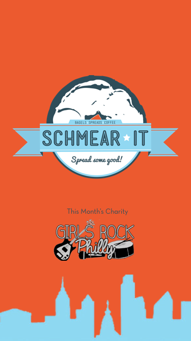
You can see the application clearly promotes the charity Schmear It is working with that month as well as displaying their logo and branding.
The home screen allows the users to dive immediately into the menu and ordering process. A card-style cart is persistent at the bottom of the ordering section of the application. The location and account pages are positioned to the left and right respectively and can be navigated with a swipe left or right or by tapping the respective icon from the navigation bar.
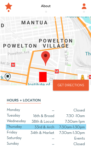
The location and times of the truck are clearly displayed under the about section so users are aware it closes early and the location changes.
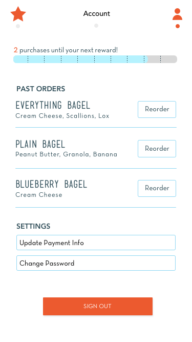
Rewards status, past orders, and account settings are all under one screen thanks to user feedback and provide a general account overview.
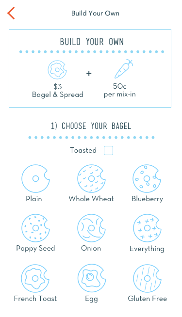
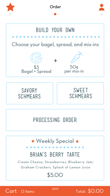
Custom orders guide users through a step by step flow where they can select their bagel type, toasted option, base spread, and mix-ins. Each of the bagel icons were recreated in Schmear It’s graphic style.
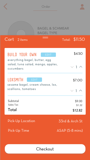
The checkout process allows for setting a custom pickup time and location when ordering ahead.
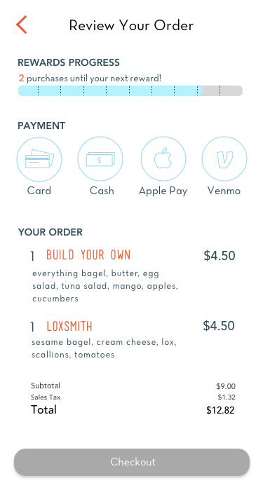
The payment info screen displays the user’s rewards status and alerts them if a reward is available before they complete the checkout. We also accept multiple forms of payment including Apple Pay for faster checkouts.
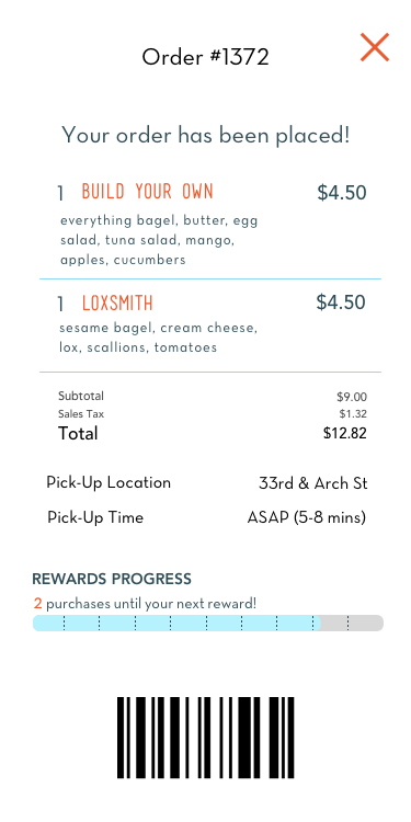
The order confirmation screen clearly shows the location and estimated pickup time. It also has a barcode for the store to scan upon pickup.
Once an order is placed, a new order status button appears on the home screen.
Results
Overall we feel this project has been very successful due to the branding, ease of use, and feedback from users. We met all of the business’ criteria to promote custom orders. User feedback was tracked through quantitative user studies with users reporting increasing satisfaction week to week. The application itself is very straight forward with its ordering process and the lack of an initial sign up screen greatly decreases first time setup for new users.
Creating a consistent meeting time really helped us stay on track even if one or two members weren’t able to make it that week. These meetings became less consistent as the project began wrapping up due to external conflicts from group members and affected the final product. In the future we would be stricter about these team meetings and at least one occurred a week outside of class. Sharing Sketch and Flinto files between the team also proved an obstacle as the team multiple versions for testing and the roles changed weekly.