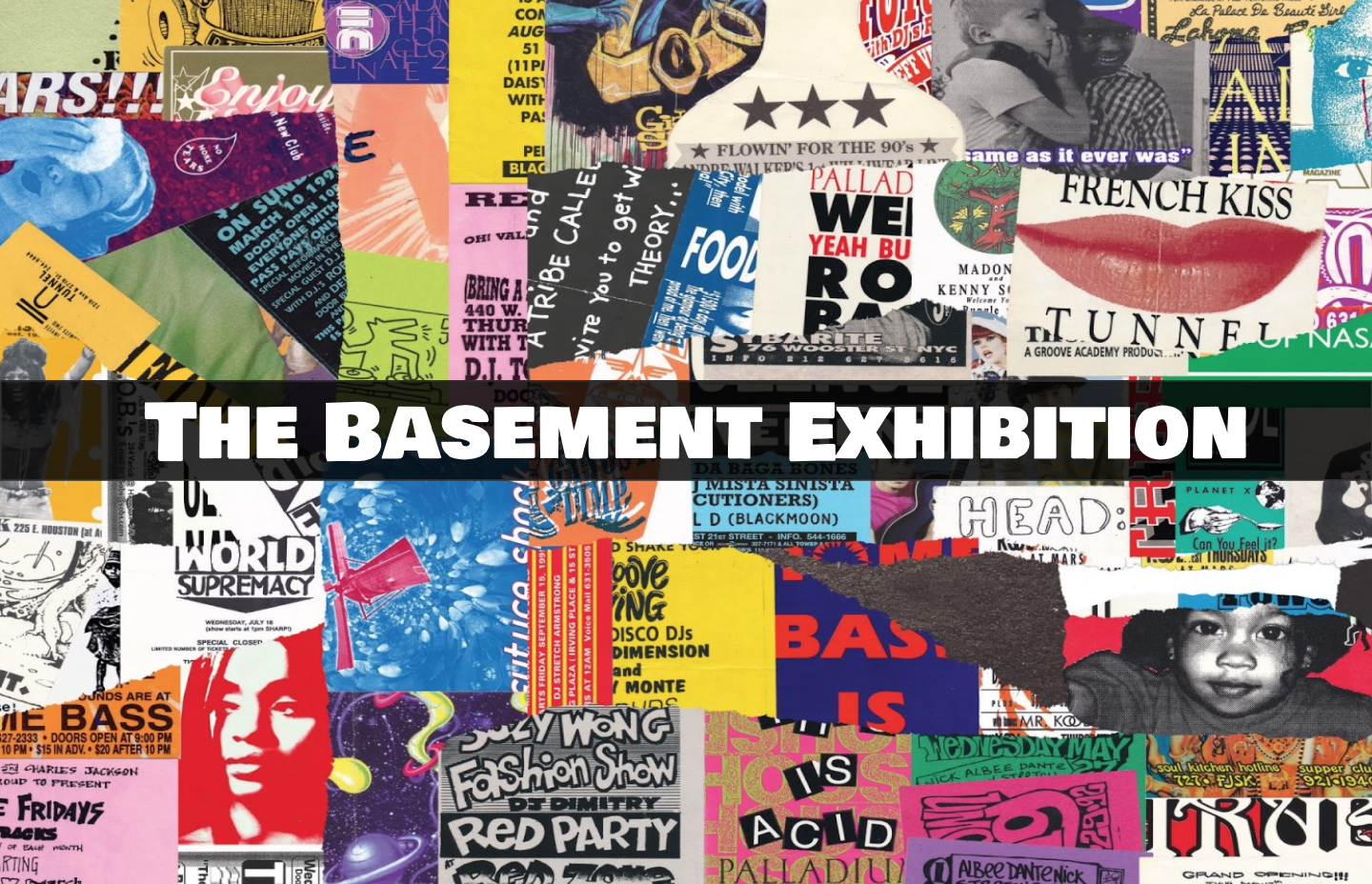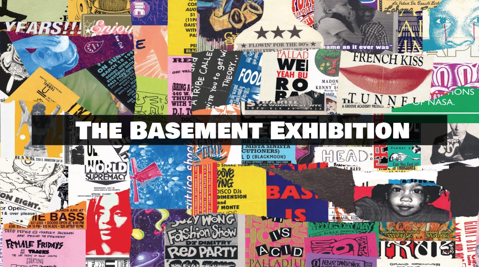
A Visualization of Punk Aesthetic
by Jake Bender & Jake Culp
Introduction
This project was created by combining the ideas of wanting to recreate what it is like at a house show / punk concert in a 3D space and as well try to use augment reality to fully surround a user in visuals via a faux portal.
These two concepts were brought together and the result is The Basement Exhibition.
Goal
- Provide users with an immersive experience that includes both visual and audio elements
- Give the user the sense that they are stepping into a different world
- Allow for the user to interact with the exhibit and be able to step in and out of it with ease.
With these goals in mind and the short time frame we were given, it was crucial to immediately start development and begin wireframing and creating moodboards so we could see how the application would look and run.
Audience
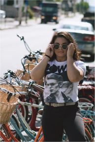

Before creating a moodboard and wireframes, we needed to identify who exactly our audience was. We determined that the majority of users would be between the ages of 13-21 and would have some sort of punk music background. These meant moving forward we needed to heavily focus on incorporating the punk aesthetic into our design layouts.
Inspiration
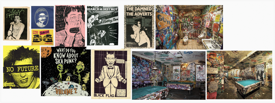
We took inspiration from old punk flyers, posters, and zines that we had collected online. We noticed after awhile that the punk aesthetic was very jarring and in your face. The colors were very bright and text would sometimes be placed directly over images without the thought of design in mind. We drew so much inspiration from these pieces of art and wanted the experience we were developing to really allow for the user to see up close and in detail these pieces of art.
Technology
To create the application we used Unity game engine along with Apple’s ARKit to allow for the user to place their exhibition wherever they want.
To allow for the user to simulate a teleportation into a new world we had to implement custom shaders and materials into our Unity project. This was our biggest challenge with getting this functionality up and running. Once this process was complete the rest was creating the room in Unity and refining the details of the user interface.
User Flow / User Interface
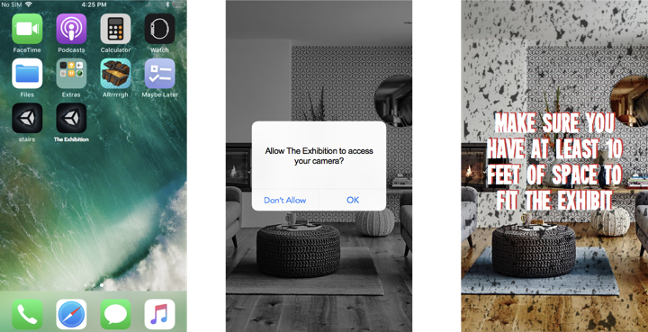
When it comes to the design of the user interface, we wanted for the setup process to be easy as possible for the user. This is due to the fact that the biggest impact the application has on the user is done after they have finished setup.
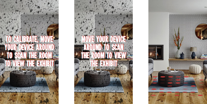
Keeping our punk aesthetic and moodboards in mind, we decided to have a simple layout of steps that the user would complete in order to properly place their exhibit.
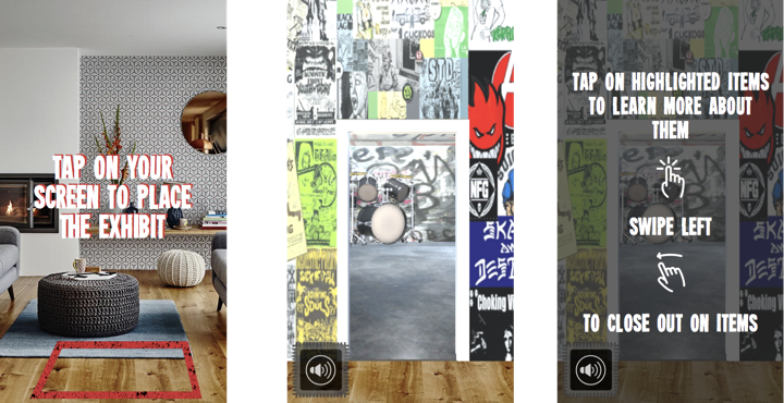
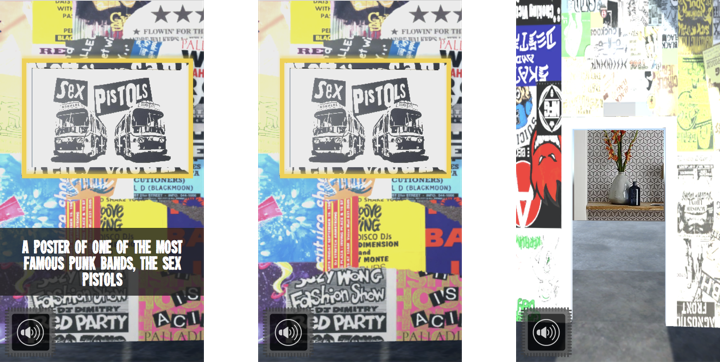
Once the user has properly placed their exhibit, they are prompted to then walk through the portal and be seemingly taken into a different world. This world has the feel of being in a basement where a punk show is about to take place. Along the walls of the basement are posters and flyers that the users can view and look at.
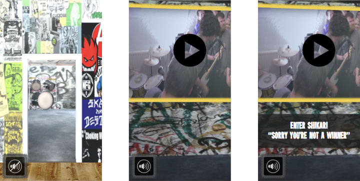
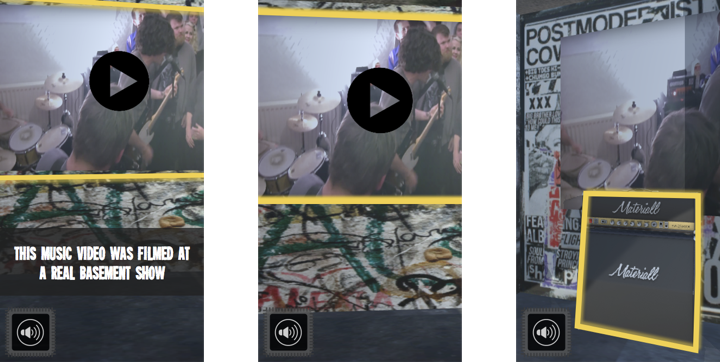
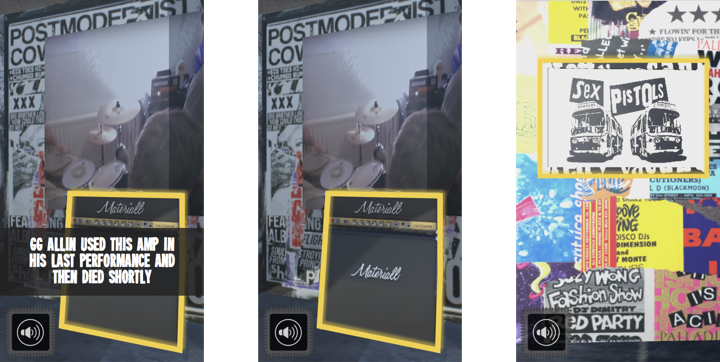
As well, there are future goals to implement interactive objects and videos in the basement space. Users could then tap onto the items to learn more about them. This gives the users more ways to interact with the exhibit and can create a more long lasting and enjoyable experience.
Takeaways
A huge takeaway from this project is seeing how much 3D objects can really help sell an augmented reality experience. Seeing the graphics that we had implemented into the design of the basement in AR made them seem almost life like and we think that they alone could have been enough to fully immerse a user into the exhibit.

