
The Team:
- Jordan Gulbronson
- Zara Leventhal
- Matthew Raghunauth
- Connor Rangall
- Junfaye Teng
- Angel Wu
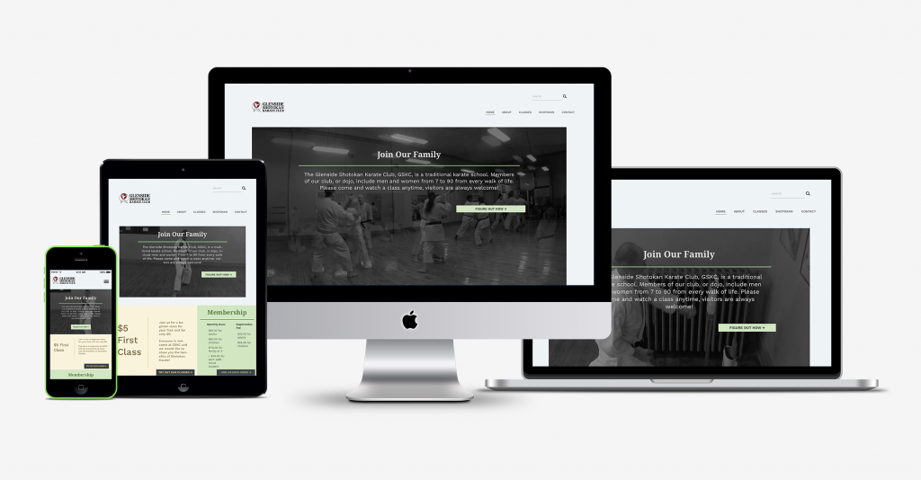
Instructors of the Glenside Shotokan Karate Club (GSKC) wanted an updated website and more personalized branding, understanding that a better experience upfront would allow more potential students to discover the club and decide if it is right for them. The members of the club are incredibly friendly, accepting all people into a practice that teaches character growth as much as athleticism and they wanted their site to project that. Through rebranding, Responsive Web Design, User Experience Testing, and Content Strategy, a team of 6 undergraduate juniors brought their club to life on the web and made it accessible from any device.
Problem
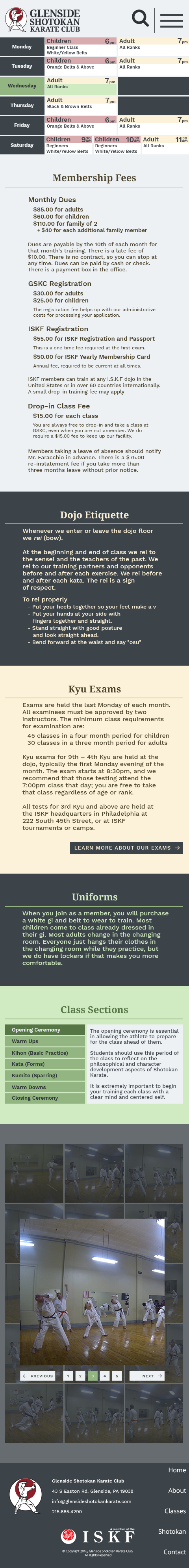
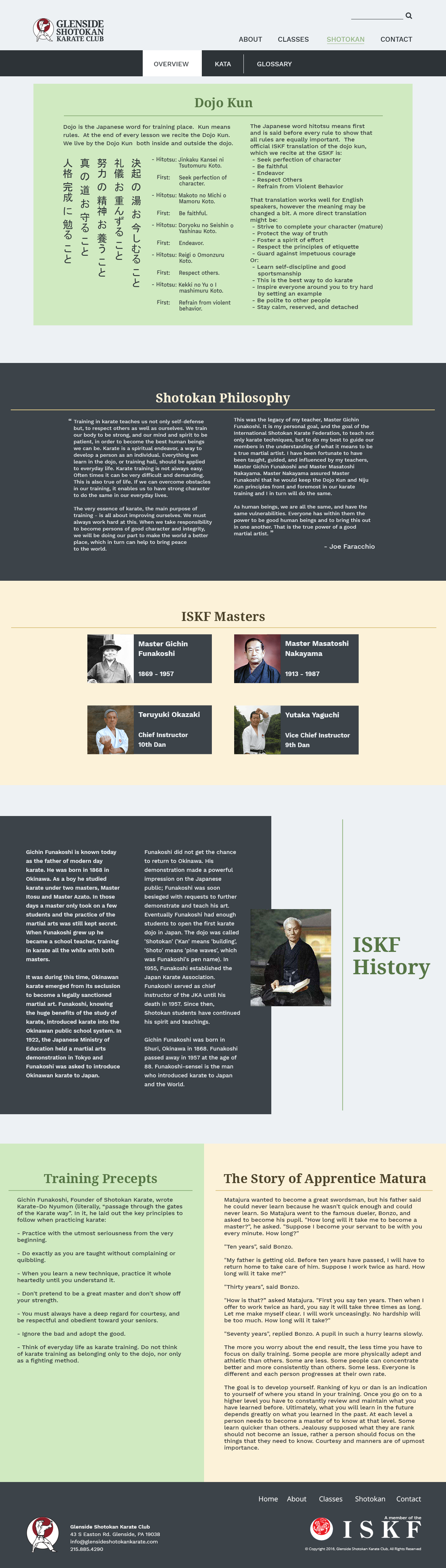
Through initial talks with the instructors and potential users we realized this site would require quite a lot of content. While many helpful Shotokan Karate resources were available online, much of the information was scattered throughout multiple sites. GSKC is also a historic club, established by the founder of the International Shotokan Karate Federation (ISKF) Teruyuki Okazaki, and this information was not easily available. Additionally, this content would often be used by young children and busy parents unable to spend large amounts of time on the site. Therefore, we needed to design and develop a site that was easy to skim and absorb while still allowing the users to dive deeper as they wanted.
Understand
Before beginning the design process, everyone on the team participated in a Shotokan Karate class with our clients to get a feel for the club environment and learn more about the sport. Through initial talks with the instructors and potential users we realized this site would require a large amount of content. So, we determined a few objectives that would allow us to tackle these problems in the most informed way possible.
- Create a design that can be used by diverse groups of people, as a range of students from young children to adults would be using the site.
- Consolidate the many resources already available online, creating a single source for all GSKC students to use.
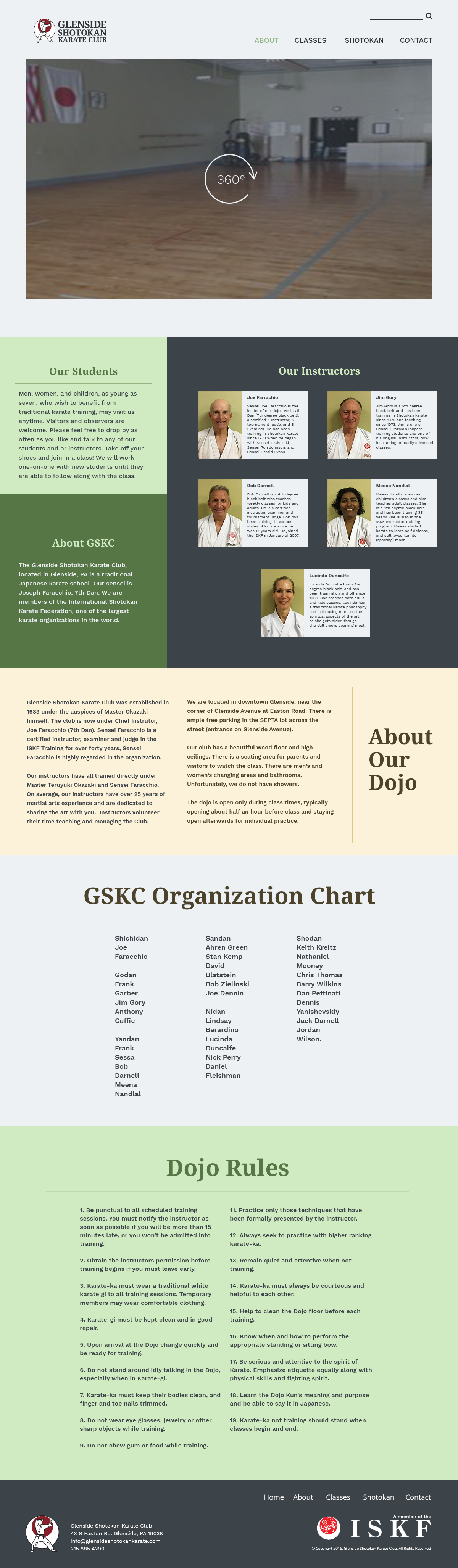
- Conveying GSKC’s rich history through content about the club’s founder and ties to the founding of the International Shotokan Karate Federation.
- Providing an aesthetic that would reflect GSKC’s approach to Shotokan Karate, that being centered around character development and self-growth.
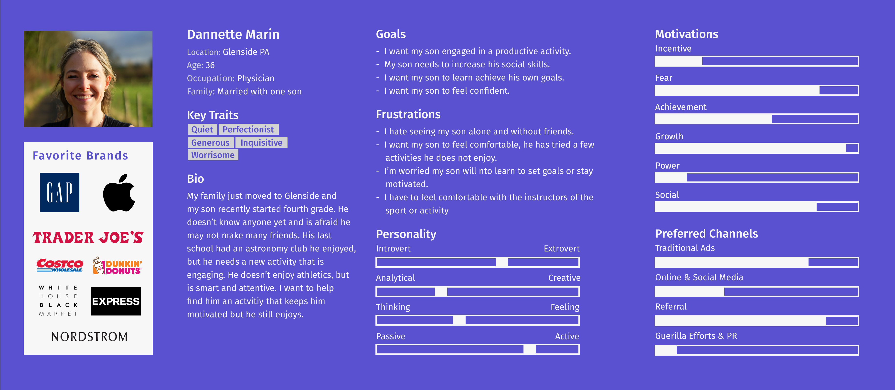
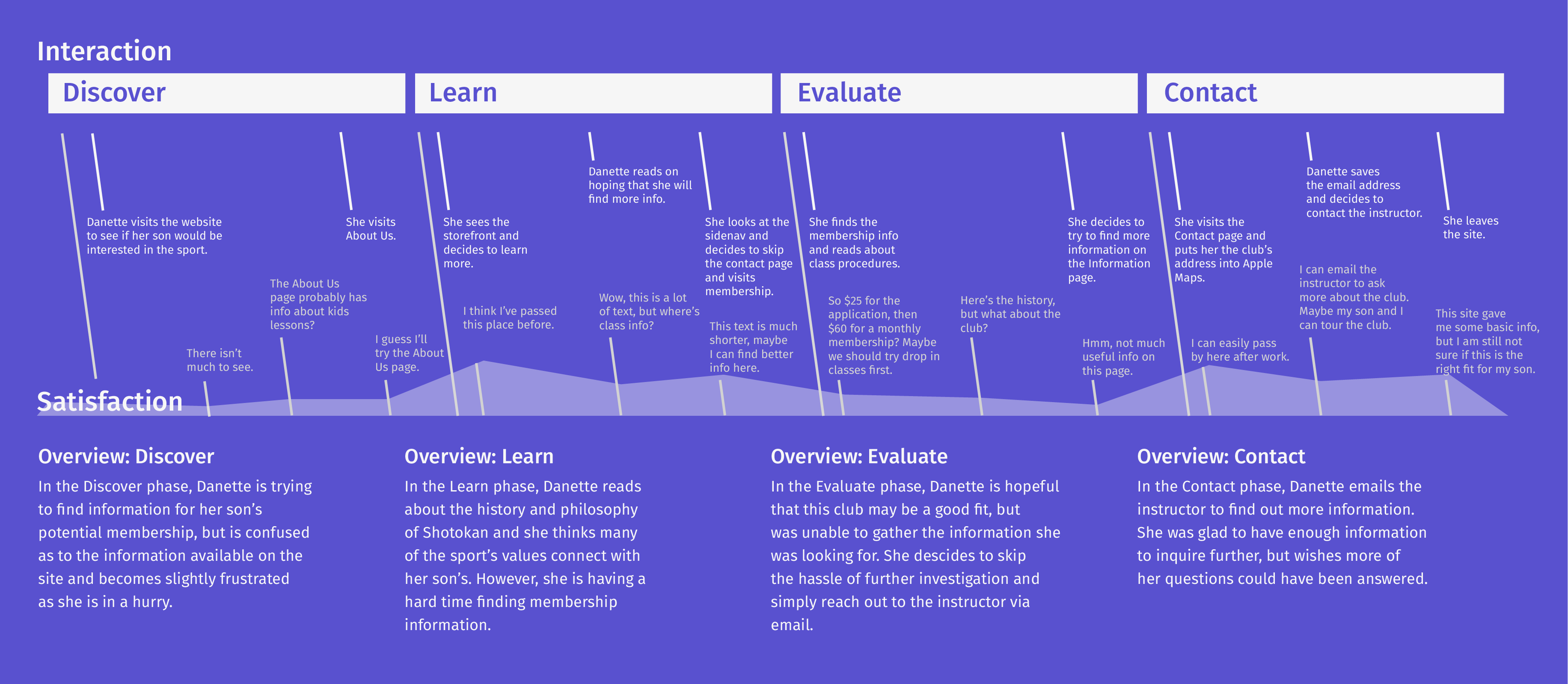
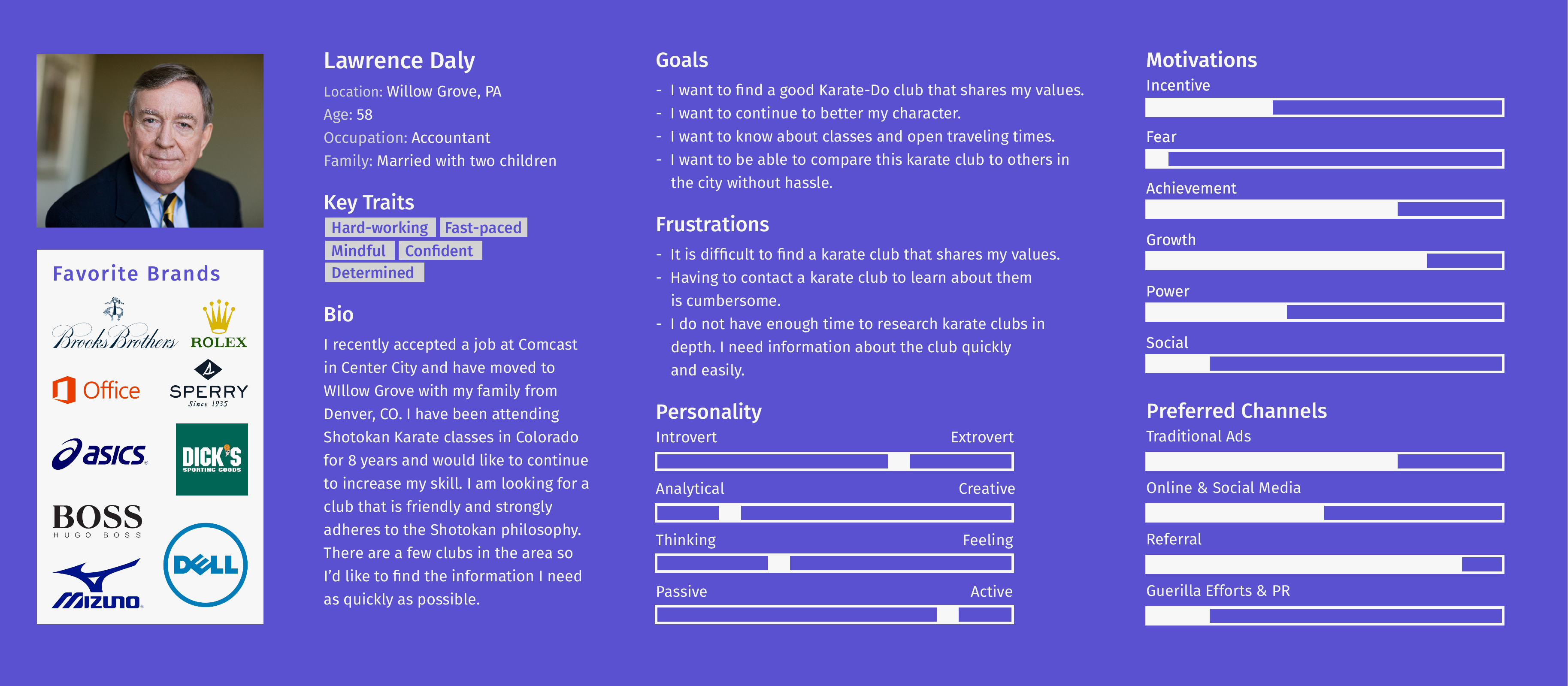
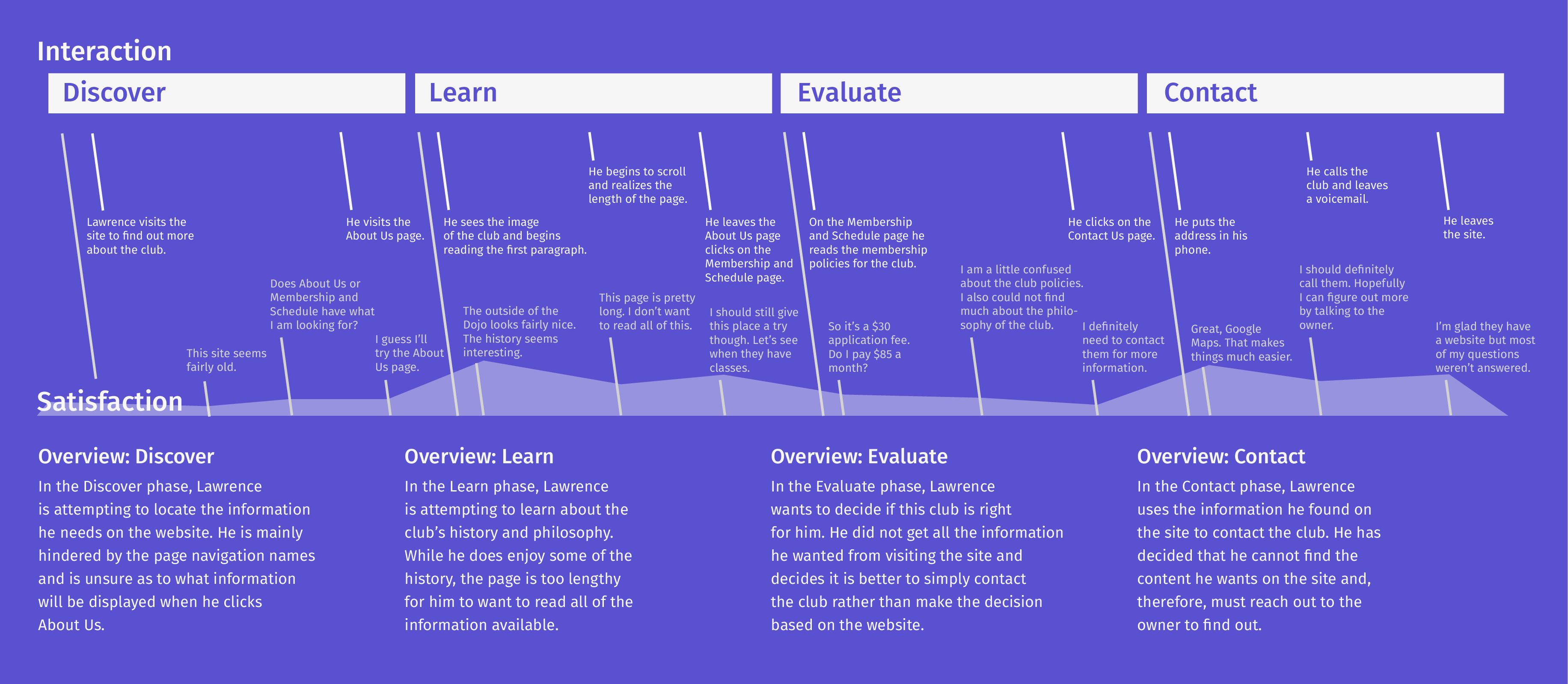
Personas + User Journeys
Speaking with Shotokan Karate students around the Philadelphia and Glenside areas allowed us to gather the types of content necessary for the final design. Through user interviews and card sorting exercises we were also able to obtain helpful knowledge about which content to prioritize and how it would be received by students.
Explore
Structuring
After gaining an understanding of the content important to students, we organized it into sections that could mimic a site navigation. Returning to potential users with these sections both confirmed some of our categorizations and helped us rework others to create an information architecture that would be the most useful.
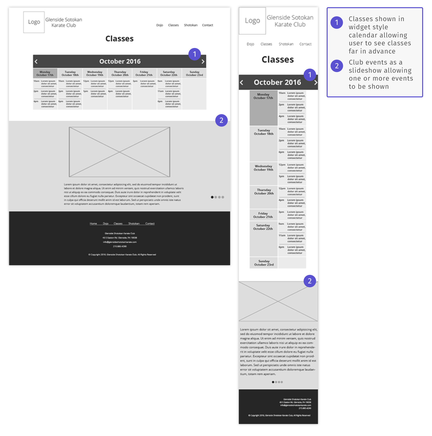
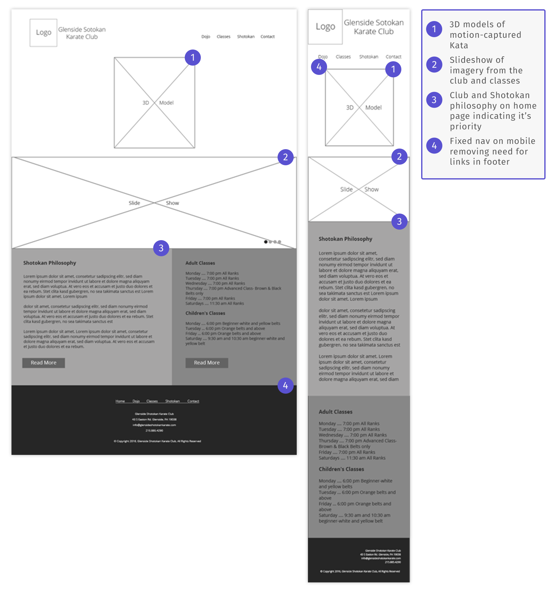
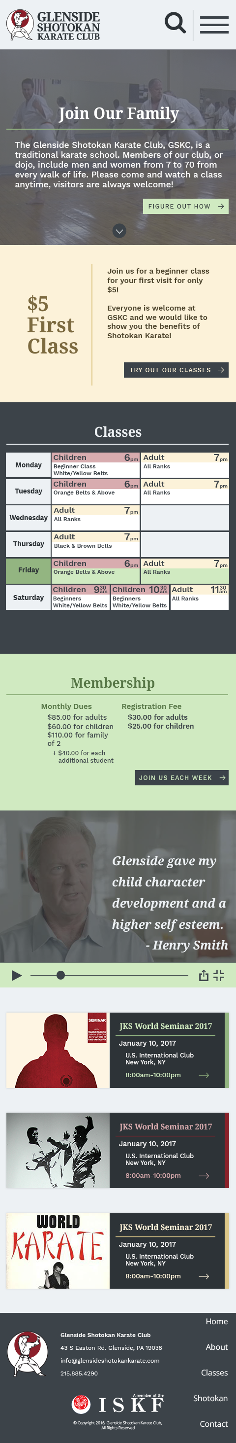
Using that knowledge, we explored the structure and display of the information through sketches, style tiles, and wireframes. We always approached these deliverables with the user in mind and an understanding of the need for effective content strategy. We decided to use large imagery throughout the site with a modular structure allowing for easy prototyping as we conducted usability testing. Early on we added the copy “Join Our Family” to the Home page, as that is how many current students described the club.
Wireframes
Styling
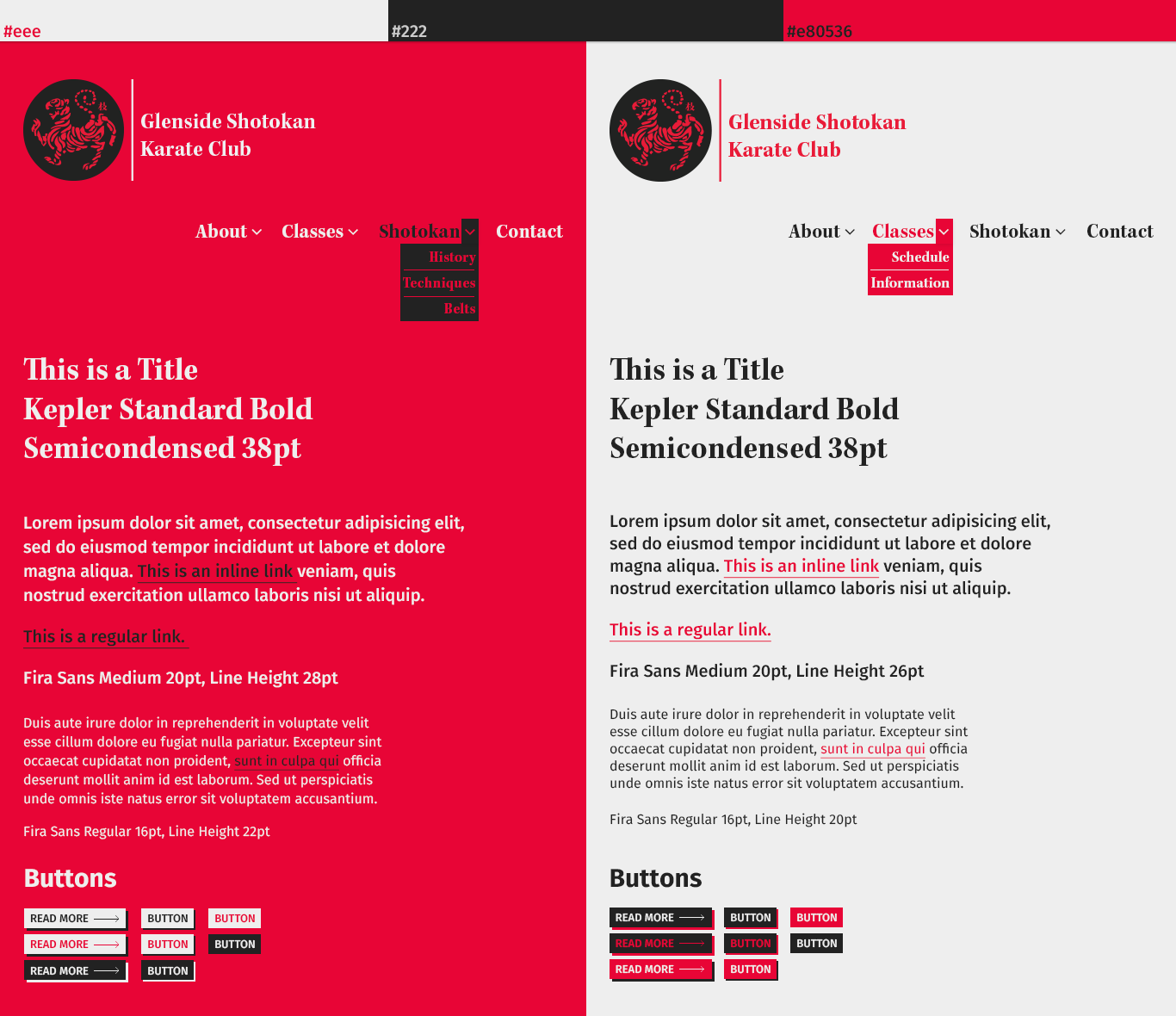
The visual design of the site was initially focused on the history of design for the martial arts, with intense reds, black, and white. However, after speaking with the instructors and revisiting our experience participating in a class, we realized the correct approach was more accurately connected to the Dojo itself. We wanted to bring the history of the club into the design.
Style Tiles
Produce
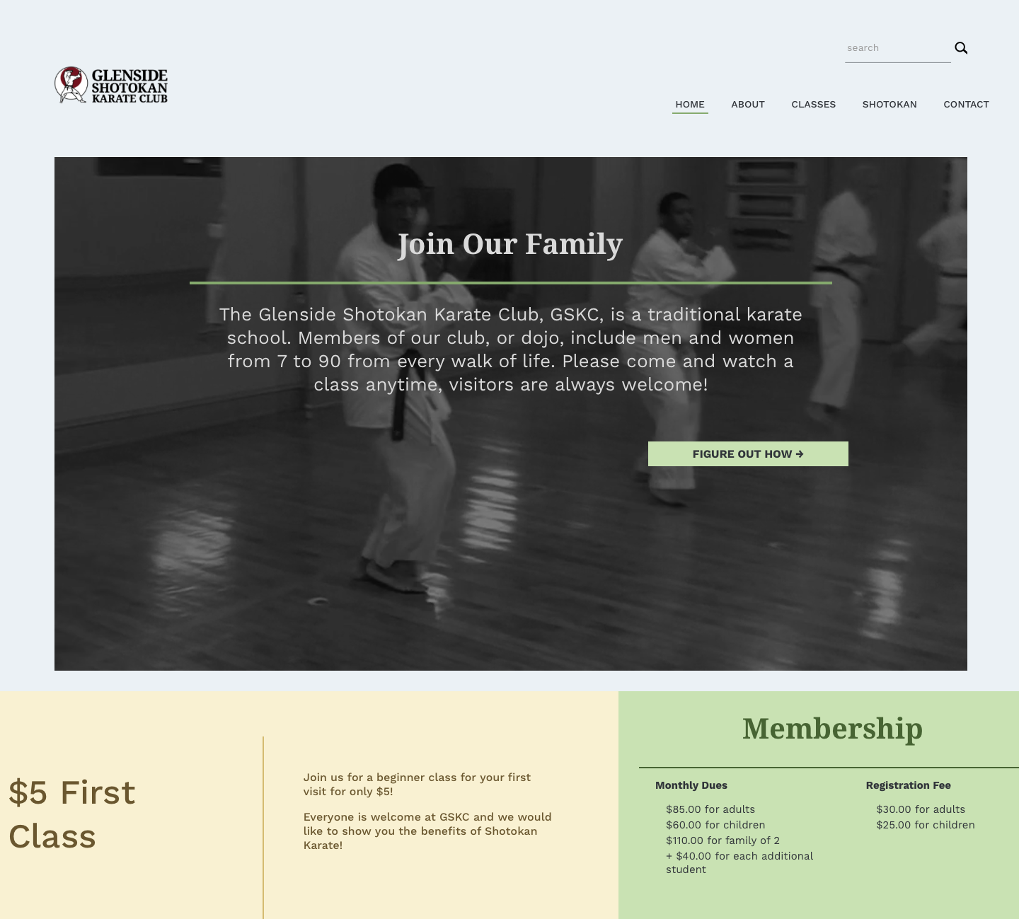
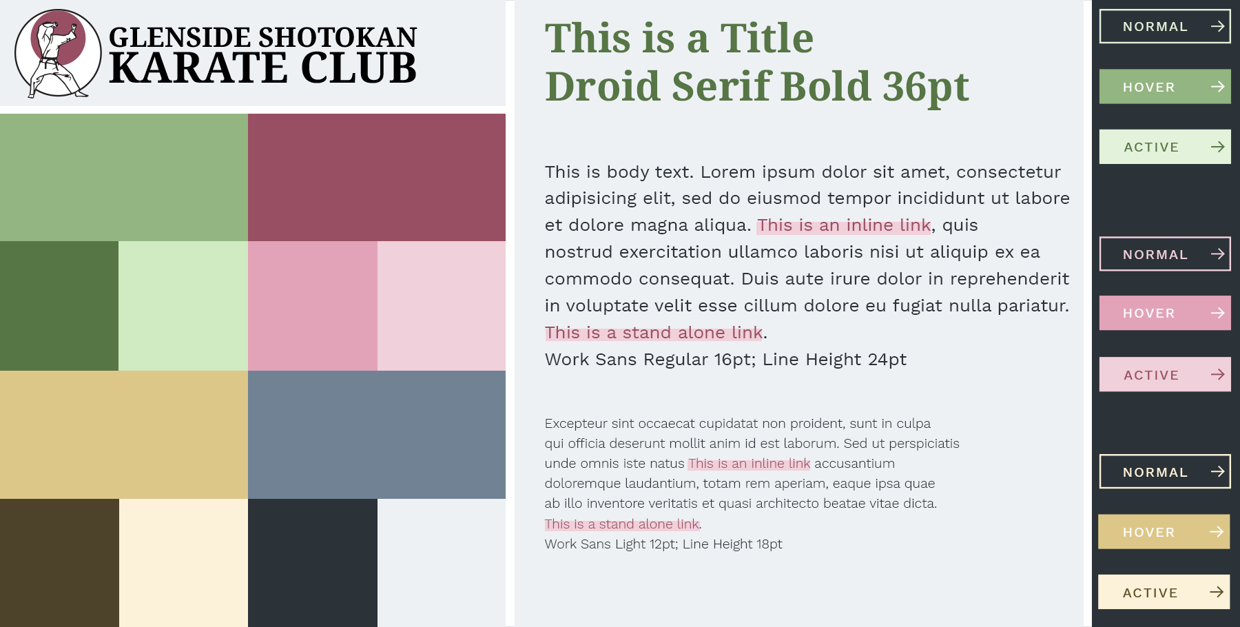
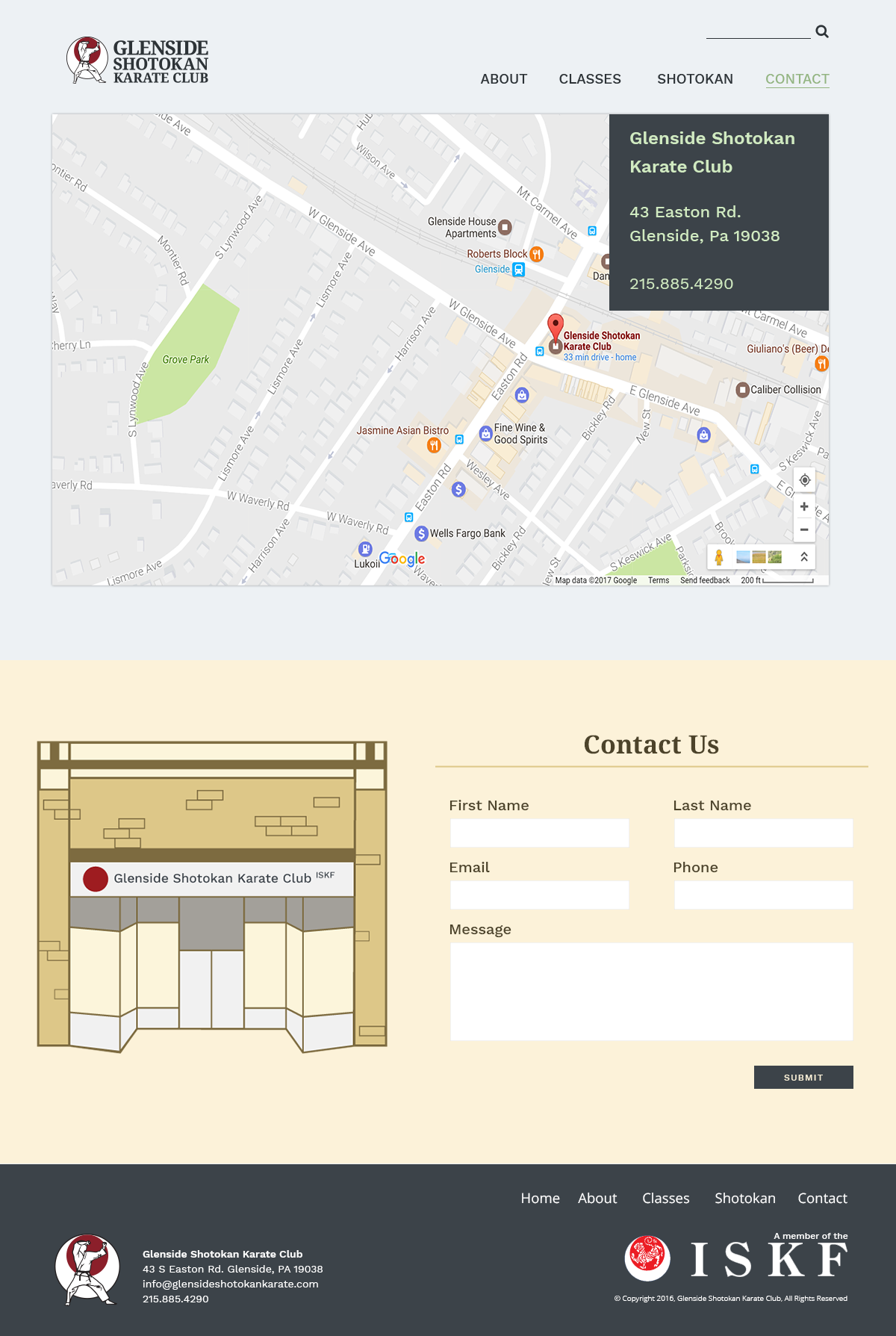
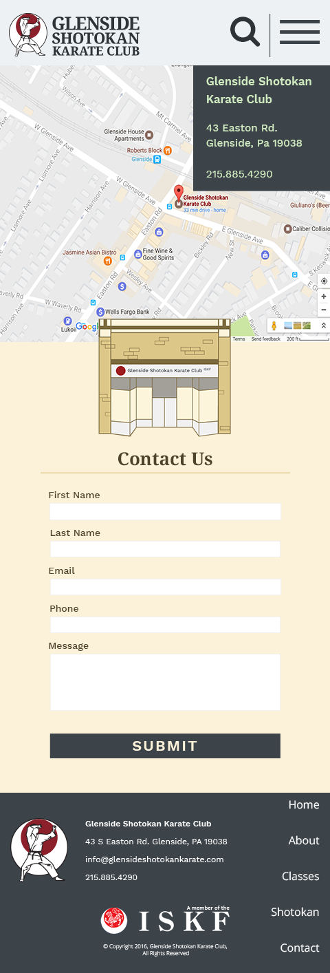
For the final styling we pulled elements right from the club. The green walls, maroon chairs, and light wood were emblematic of the experience. So, we chose colors directly from images of the club and altered them slightly to evoke the same experience on a screen that is felt during classes.
Droid Serif was chosen as the title typeface due to its legibility and because it still carries the established look of a serif font. We decided on Work Sans for the copy because of its reference to early Grotesque typefaces, another subtle way of conveying history. Links were also highlighted rather than the traditional underline to tie them to the rectangular, modular structure of the site.
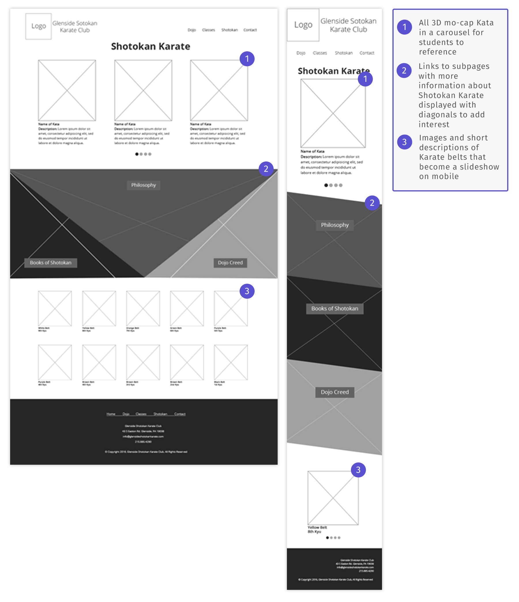
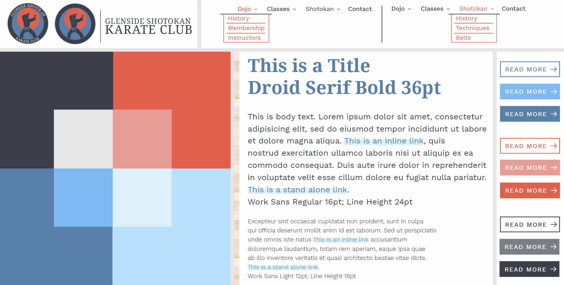
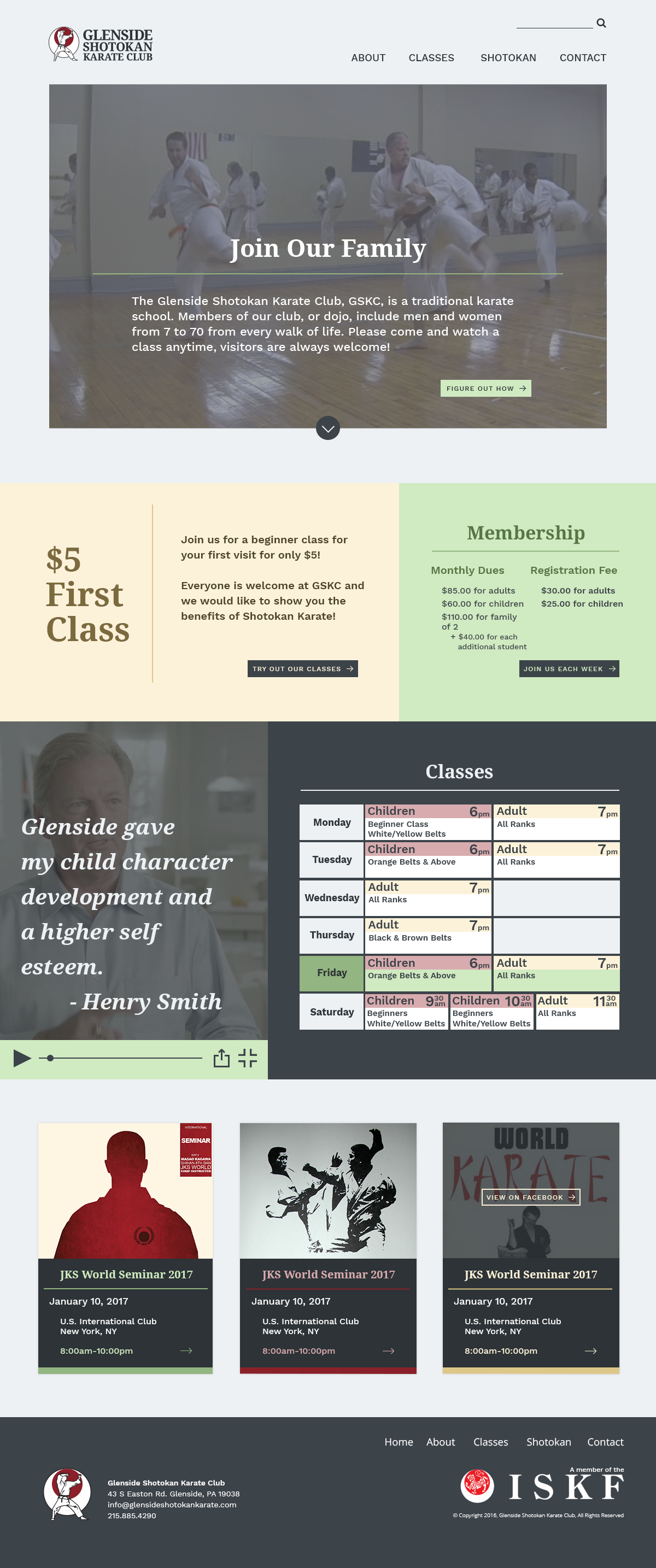
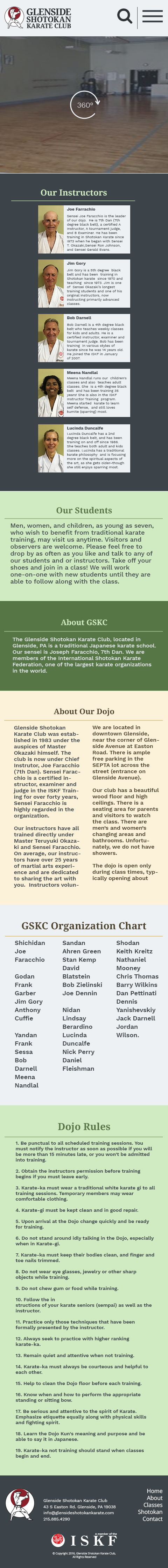
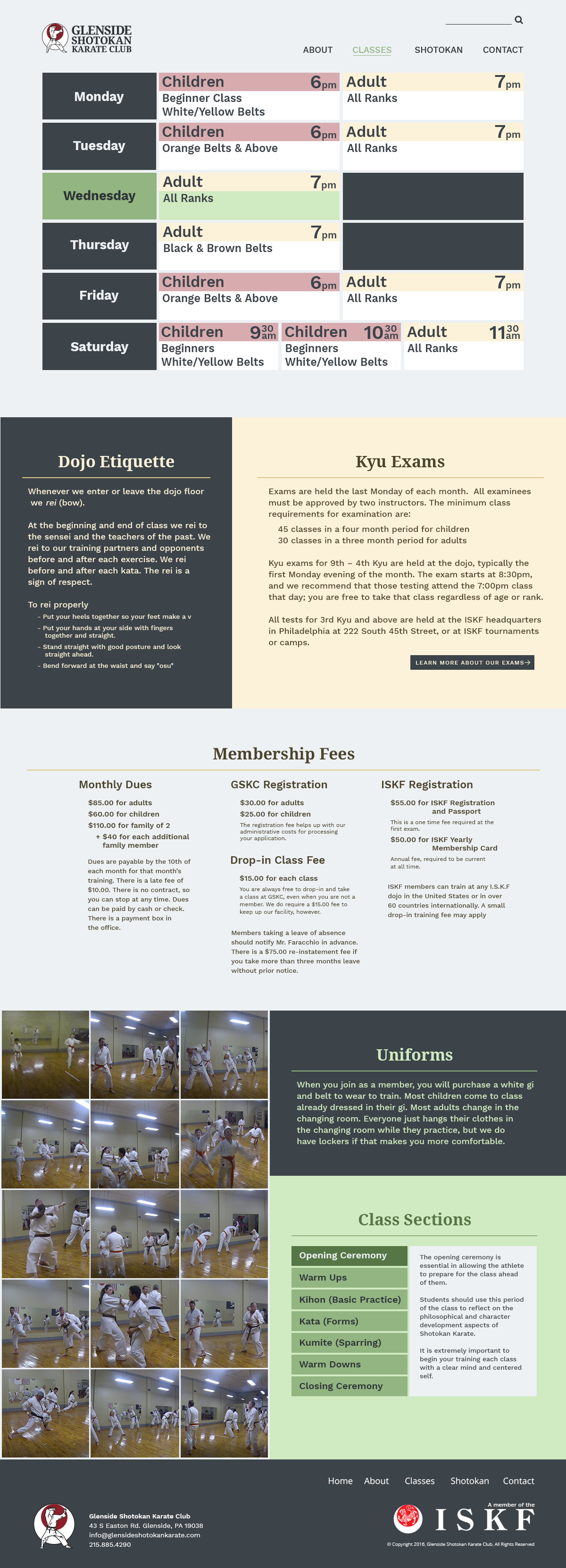
Our high-fidelity mockups are closely tied to the user feedback, interviews, and usability testing. We structured high content pages, such as the Shotokan page, entirely off of user feedback. Instructor, club, and membership information had also been thoroughly usability tested to ensure we were creating the best site possible. We designed the content to be easily stackable on mobile, creating an easily navigable responsive site for desktop, tablet, and mobile devices.
High Fidelity Designs

View High-Fidelity Prototype on InVision
Results
The designs were very well received, with the founder of the club being particularly appreciative of the connection between the Dojo and website. The amount of information available and the well organized, in-depth content has also been enjoyed by students preparing for their classes.
The final site can be found here.
Reflection
Looking back at this project, there were many successes and a few areas for improvement.
Our successes:
- Connecting potential users to the history and story of the club was incredibly useful at building trust, often sparking a desire to dig deeper into the site content.
- Well thought-out and organized content strategy is essential to any site, but particularly important when designing for a diverse group of users.
- Modular site design can help to foster a better agile approach and is often the best solution for sites with content that changes frequently.
- A good way to differentiate a website is to abandon stereotypes in favor of honest design.
A few areas for improvement:
- Even more modularity would have been helpful for the client’s ability to update the site
- More exploration around the Kata and Glossary pages, making them more easily discoverable, could have been warranted.
- Carrying over the warmth of the Home page copy to more historical pages could have allowed for better storytelling and connection with the user.