
WordFor Team Case Study
Overview
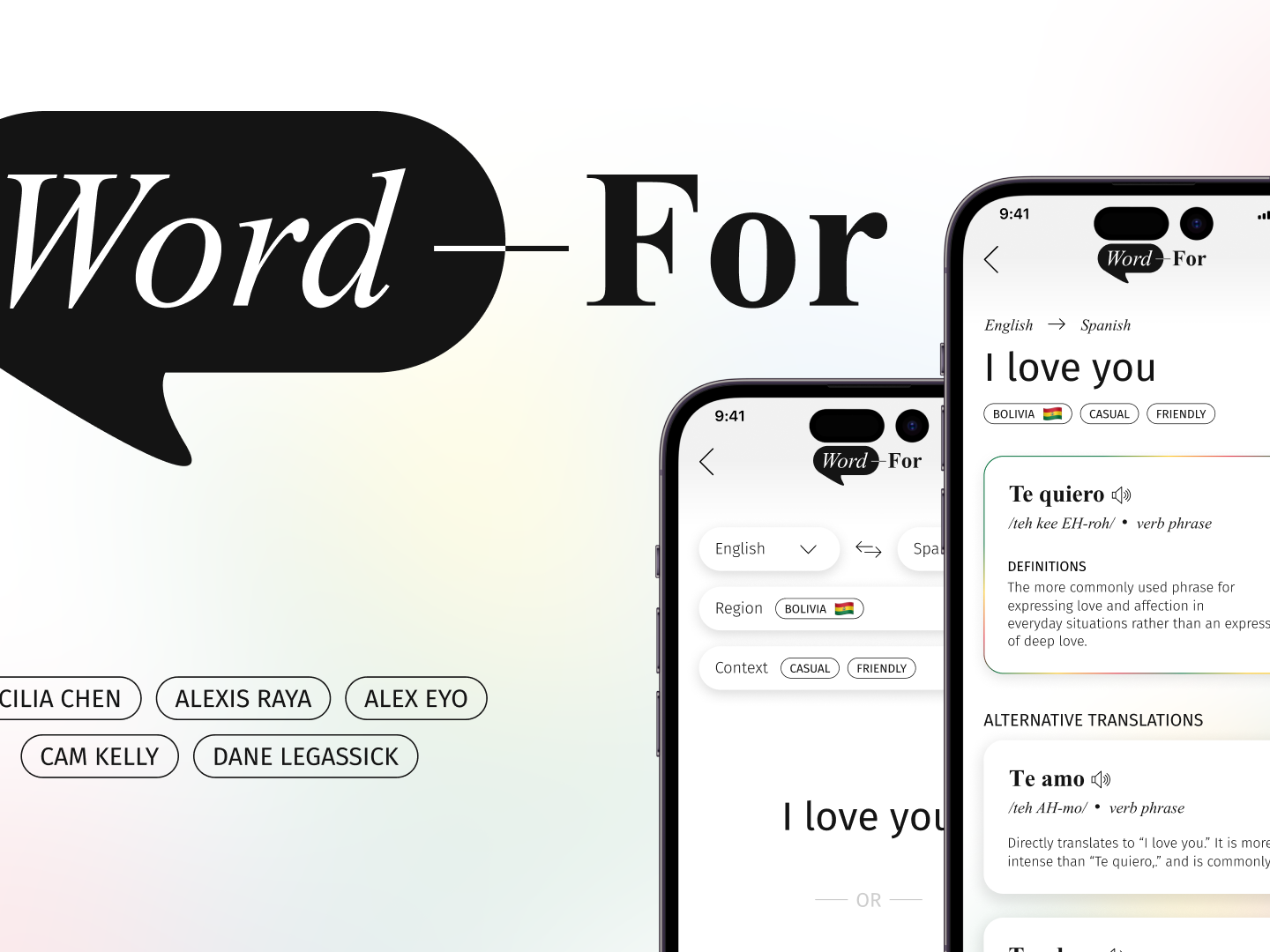
Across a 6-month span between September 2023 and March 2024, a team of 5 Drexel UXID students worked on a translation web-app for our Junior Project that involved wireframing, prototyping, iterations, UX research, content management, and coding development. The fall term mostly consisted of wireframing, prototyping, and UX research. In winter term, the team worked on front-end and back-end development of our web-app and more UX research to support our design decisions. The team consisted of a project manager (Cecilia), a UI lead (Cam), a UX lead (Dane), a developer (Alexis), and a content manager (Alex). Together, we make WordFor.
Context and Challenge
September 2023 of our junior year came and we were all expected to come with a project pitch. After hearing all the project pitches, we formed groups and teams based on respective interests. From then on, we grew and refined the original pitch to what is today.
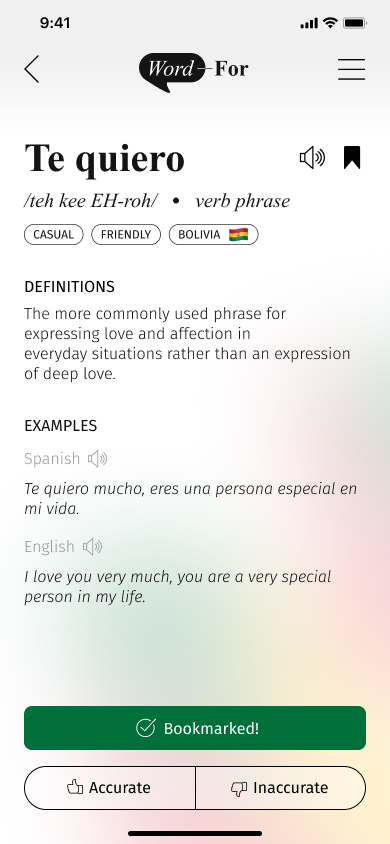
WordFor aims to strengthen and emphasize connections by breaking down common language barriers when people struggle to find the same sentiment in another language. Through our own experiences (initially) and user research (later), we had discovered that the problem was that multilingual speakers have difficulty expressing feelings and sentiments across their respective languages due to a lack of culturally accurate translation resources, lack of direct translations for sentiments all around, and their difficulty with switching between languages in general. Our goal was to create a web-app that allows users to translate sentiments and emotions from one language to another that considers contextual and regional nuances of each language.
To create a fully functional, intuitive, creative, and live product within a span of 6 months, needing time to have initial designs complete, iterations of our designs based on weeks of user research with multiple rounds of usability testing, and weeks of coding development with quality control efforts, we had the following goals:
Goals
- UI: Create an intuitive architecture for seamless user experience and a minimalistic design system that allows our differentiating features of regional and contextual consideration to be visually emphasized in a creative way
- UX: Validate the problem of failed mental translations, understand the frustrations of multi-lingual speakers, and ensure that our design features are desirable and useful for the end user
- CM: Assist in the development of an application featuring clear and user-friendly copy, overcoming language barriers for enhanced comprehension
- Dev: Develop a fully functional web-app that uses OpenAI to be able to produce multiple translations that are accurate, consider contextual nuances, and provide cultural understanding.
- PM: Facilitate tasks to and monitor the progress of a cross-functional team and curate a timeline of deliverables for the team to have enough time to design, iterate, research, develop, and ensure the quality of our product before it is due
Process and Insight
Our target audience is all genders ages 18 to 35, who live in multilingual households or communities, and who speak or think in more than one language. Research was our main focus in the first three months. Dane had developed surveys to understand how many people experienced failed mental translations (94% of people surveyed), how often it happened (74% experience it at least once per week), and in what contexts they spoke this language (98% with family, 75% with friends, 31% professionally). These surveys helped us understand that there is a real problem here, and the existing translation apps were not cutting it. To follow up on these surveys, we structured interviews to figure out more about the problem and our target audience asking questions about their experience with other translation apps and gathering more details about how and why these failed mental translations occurred.
“[Translation apps] don’t take the situational context into consideration. Google
Translate just defaults to the most formal option when really a more casual response
would be more applicable” – from interviews
Meanwhile, Cam worked closely with Dane on UX to ensure that our designs are consistently aligned with and/or iterated on in ways that take our users’ wants, needs, and feedback into consideration when making design decisions for the goals of our product as a whole. As Dane made design recommendations from the UX interviews, Cam consistently prioritised and implemented those design recommendations from Dane, all the way down to scope creep, to ensure the design was refined down to the smallest details. Ensuring that our design decisions were rationalized and backed up by our product goals, user experience and/or research data, and UI/UX design best practices / common patterns, Cam always included this rationale as annotations and comments on design changes for UX to review (which also helped with organisation).
One of the biggest goals for this design was to ensure that our differentiating factors of including regional and contextual consideration for our translations were highlighted, which meant keeping this product goal in mind during all of design decisions. With Cam’s development background, she was also able to ensure that she was creating feasible designs from a time and effort standpoint to develop and always checked in with the dev lead if she was ever unsure – this was the ensure that when dev time came, the designs would not act as blockers or that design changes would not have to change for actual implementation. Moreover, Cam also created and maintained components to build and create screens for easy and seamless dev handoff as well as consistency across all screens.
Another of our biggest struggles was gathering a group of multilingual Spanish speakers. Despite reaching out to multiple Spanish-speaking resources available to us as Drexel University students, we faced a lot of rejections from Spanish professors, Spanish-cultural clubs, and more. We decided to pivot and test on multilingual people in general (taking the focus out of only Spanish speakers) for the first half and find Spanish-speaking participants to test later.
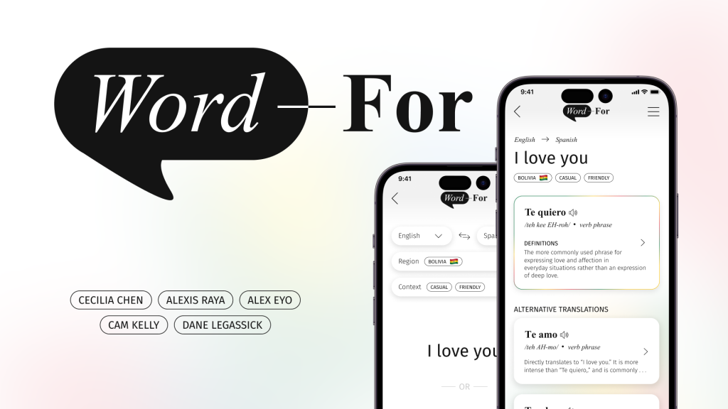
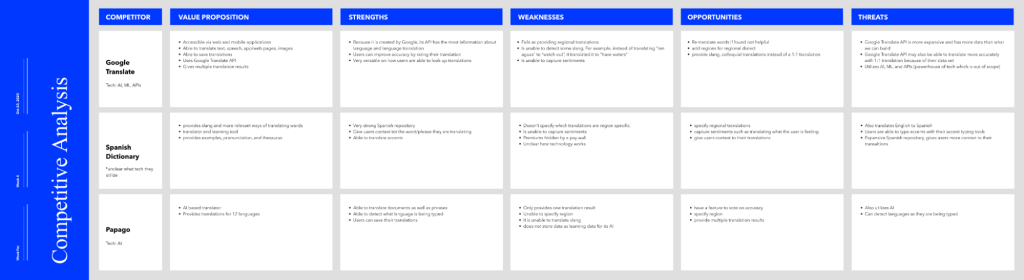
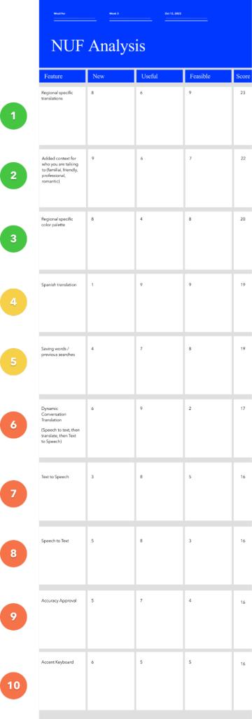
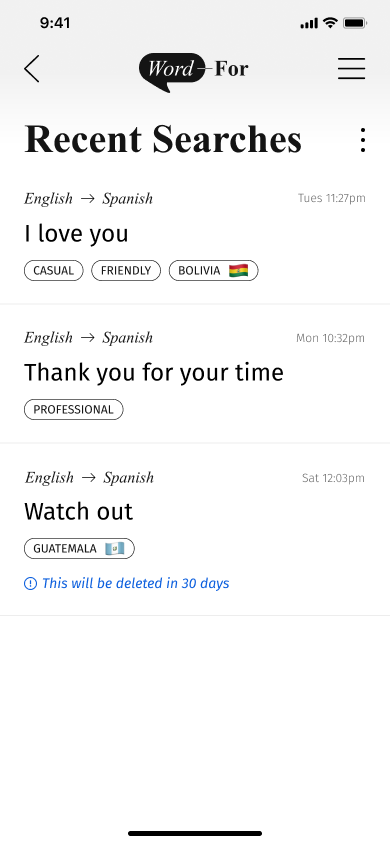
We also created a project model canvas, competitive analysis documents, 4C’s, NUF analysis, empathy map, and journey map to further understand the scope of this project. Taking these insights into our first prototype gave us a clear direction, but left questions unanswered with designs like: Do users know some dropdowns are optional? Are there navigation issues? Is there anything missing? Do the region and context options make sense? Would users use them? These lead to findings like users understood that drop downs were optional with no indicators, examples in both languages would be valuable, and Recent Searches should link to results.
Soon, with sufficient enough research after design iterations, we were able to start development! Although initial technological research findings lead us in the direction of using ReactJS as our frontend with a Flask Python) backend, we decided in the Winter Term to use a SvelteJS front-end, which also performed as our backend as well. Along with using Svelte, we chose to use OpenAIʼs APIs for all of our AI functionality like GPT-3.5 Turbo for our translation functionality, TTS (text-to-speech) for our functionality regarding text-to-speech, and Whisper for our speech-to-text functionality. Lastly, we used Google Firebase for storing our feedback from the user when they interact with the feedback modal, allowing us to very simply look at the data from the users to determine if the translations being produced are accurate, in hopes of being able to train our own language learning model to provide more accurate translations.
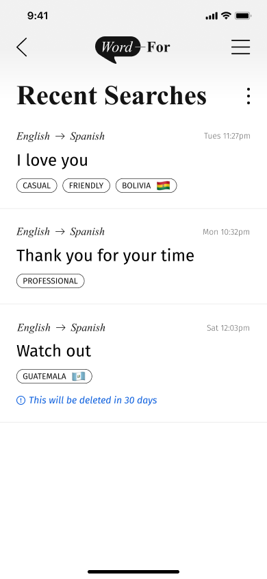
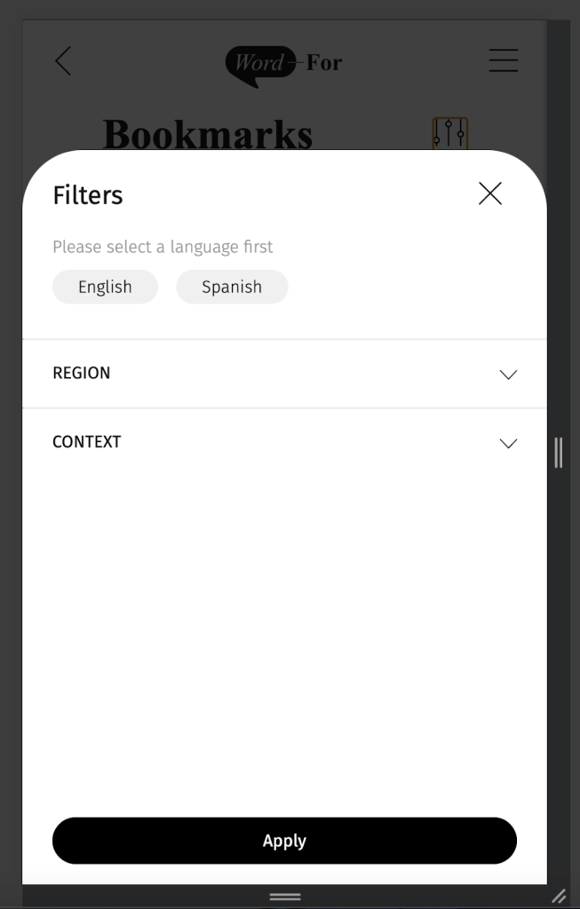
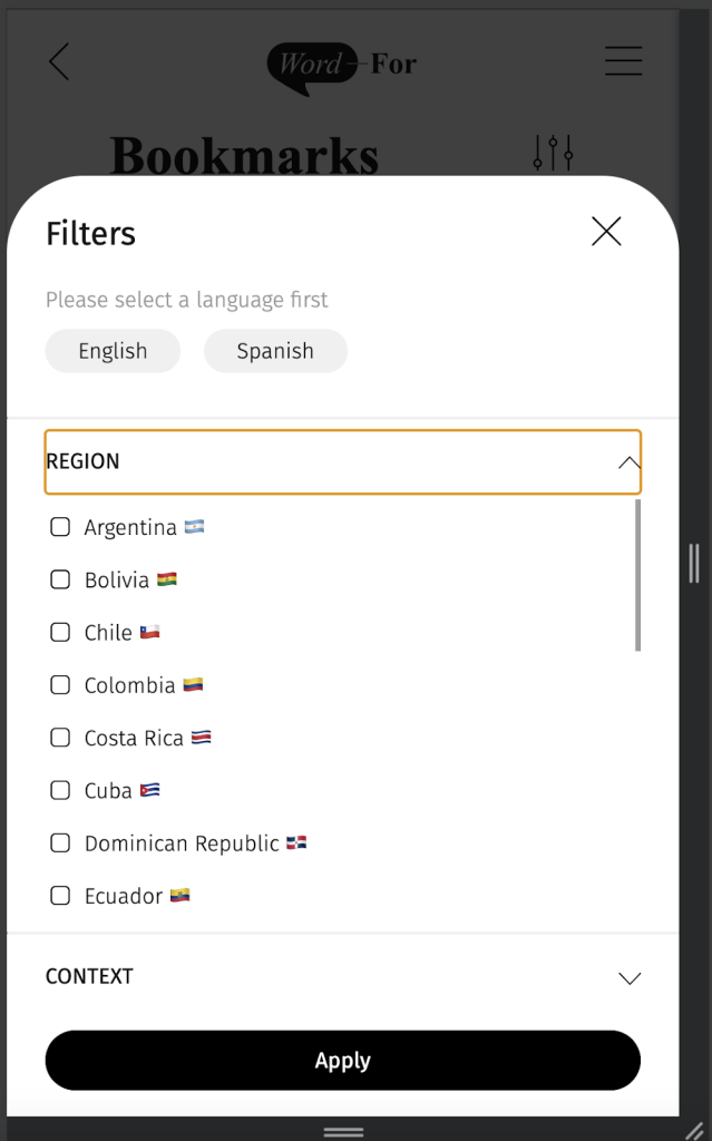
The second round of usability testing revealed that navigation to clear history feels clunky and needs an intermediary step, adding audio buttons to examples so low-fluency speakers can improve, and Bookmarks need a filter system to sort through multiple languages and recency. Our last round of usability testing revealed that the Results page needs more structure and we need to prioritize one translation, the microphone interaction was confusing, and we should add region and context to bookmark filters.
To transition to development, Alexis was working on the backend to break down what needed to be done in the alpha phase (which was defined as containing full functionality of our main task flow) and in the beta phase. Alpha deliverables were translating phrases across English and Spanish using Open AI, text-to-speech and speech-to-text functionalities, Bookmarking and Recent Searches functionalities. One of the biggest dev leaps during our alpha phase was connecting all of the AI models being used to our app. This was a bit of a hurdle, especially for the translation flow, as the response time of our API was initially 20 seconds (long). To cut down on the time, we had to make a lot of revisions to make the response time less than 5 seconds. Because of this, we had to develop a loading screen in order for the time to seem quicker to the user.
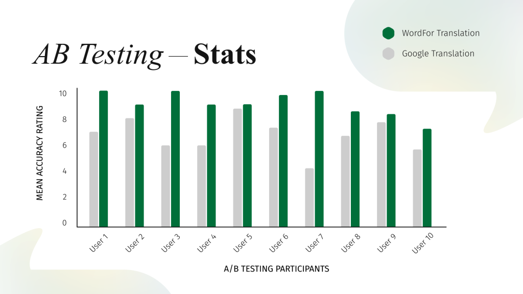
As development and design recommendations were being implemented last-minute, AB testing was in the process of validating our research findings and solutions. Alex and Cecilia conducted in-depth user research to understand linguistic preferences and cultural nuances. Using Dane’s previous records, scripts, and forms for past usability testing, Cecilia made the AB testing script based on the questions Dane had proposed and improved it from there. Most of the participants use translation apps on mobile devices than other devices, which allowed our team to focus on our mobile design more. Putting WordFor up against our main competitor, Google Translate, users were asked to pick 3 phrases to translating using both WordFor and Google Translate, then to rate the accuracy of the results on a scale from 1 – 10. Overall in almost all of the tests, WordFor scored higher than our direct competitor, Google Translate, in every phrase we asked them to test!
As we accomplished more tasks and a bit more of design, research, or coding of our project, we would have weekly meetings and Cecilia would check in with each member to be updated with their progress. After each standup, we would meet as a team to discuss the critiques given and update each other on what we had accomplished since we last met. Alex would organise all files and upload notes he would take from the critiques given during standup.
Solution
Overall, the design was minimalistic so that our differentiating features could be clearly highlighted; utilising greys, blacks, whites, and multi-coloured gradients as branding colours, we incorporated regional flags and gradiens throughout our pages with ease. The colours in the gredient can be alerted to be region-specific (both background gradients and stroke gradients). We included professional elements that alluded to a dictionary, hence why we chose the Times New Roman font and the dictionary-based UI layout patterns and components. The design was intuitive from the use of common patterns in areas like navigation, architecture hierarchy, search, drawers, and feedback; this made our web-app easy to use which was validated through user research and testing.
In terms of UX research, our top-level findings from research methods included how speed and functionality make a translation app usable in conversation, accurate translations are a combination of correct word, tone, and context, and that regional identity changes language.
Meanwhile, on the development side, beta deliverables consisted of 1:1 accuracy with the designs, responsiveness, feedback modal functionality, and the filtering of the bookmark page. Once the main task flow functionality was complete, Dane joined in on developing the styles of our components. The bookmarks page required a filtering system to filter bookmarked translations by language, region, and context. The recently searched page required the ability for the user to edit the page and remove all or any recently searched items. As Alexis would finish the functionality and components, she would hand it off to Dane to style. Additionally, our UI Design Lead and Content Management Lead QA tested any of the areas of the webapp that were marked as complete by our developers. If there was a bug, they logged it within our GitHub repoʼs bug tracker and Alexis and Dane would determine whether it was a functionality bug or a styling bug and triage it accordingly.
One area that was a difficult process to develop during this phase was the back button. The solution was to include additional state management that would track the userʼs navigation. Additionally, since state management is not persistent if the user refreshes the page and there is a chance that the stage management stores would clear if the user clicked on the browserʼs back button, we also utilized the browserʼs local storage to minimize any internal errors.
However, a notable area of success during this phase was the progress and accuracy of our developed pages and components to our wireframe designs. Not only were we able to style these components as closely as possible to the designs, we were also able to include microinteractions to make the web-app feel more usable and delightful. An area where this success can be seen is the skeleton loading screen that is shown after the user translates a phrase.
Results
WordFor is a success! We have received an overwhelming amount of positive feedback by the participants who have been asked to do AB Testing; based on the Spanish-speaking users we tested, while Google Translate’s average ratings of translations were around 6, WordFor’s average ratings of translations were around 9! Not only did our tests support and validate our product, it also proved that providing accurate, contextual and regional translations is possible. Not only was the team about to create an intuitive, minimalistic yet visually-pleasing styled app that understood the frustrations of multilingual speakers, we were also able to develop the application with user-friendly copywriting and connect both front-end and back-end with an API with seamless user experience. After everything that has happened, we have now gained a better understanding of how to work well in a team along with insight on how we can express our sentiments accurately in other languages.
Live: https://wordfor.vercel.app/