
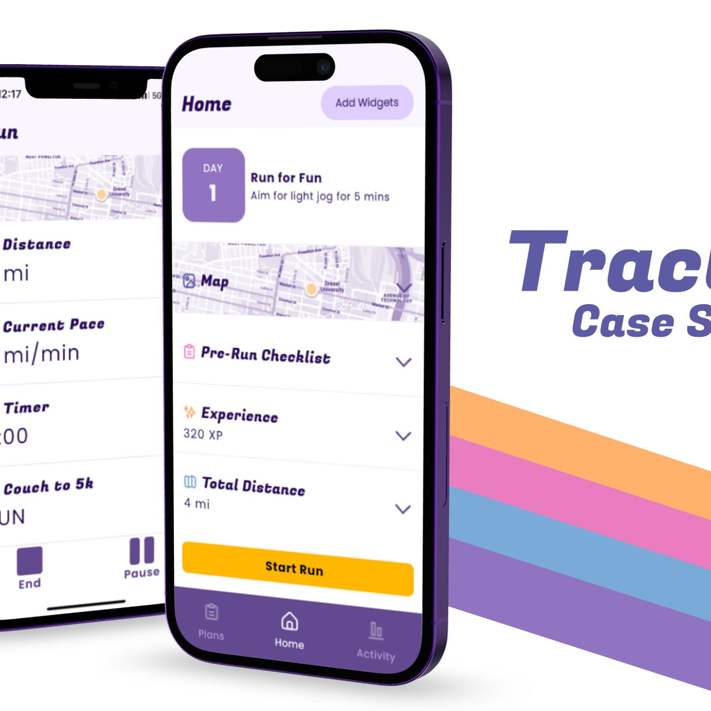
Traction is a running app made for aspiring runners who want to run but lack the knowledge to do so by giving them the appropriate tools to get from 0 to 1.
Problem Statement
Most people view running as a way to better themselves and get exercise and want to learn how to run properly. However, they lack the appropriate facilities and resources to do so. So, our main mission was to address this phrase: How do we make people “want to want to run?”
Overview
Traction is an empathetic approach to running that helps beginners learn how to start running.
For our capstone project, we decided to create a running app and, through our research, we noticed a market gap in applications made for recreational running. These apps are more geared towards users who already know how to run, with a lot of high-detail statistics and tracking that a beginner just wouldn’t know what to do with. Traction is our way of bridging that gap.
Goals & Objectives
Initially, our project aimed to create a prototype of a running app that recorded a user’s breath while running through earbud microphones, and used this data to allow for real-time feedback during a run. However, while we initially had a team member who had the necessary dev experience to make this goal possible, she was unable to join the team due to extenuating circumstances. Therefore, we pivoted our objectives to include:
- Develop a running app that fills an unmet need within the current running app market
- Create a working Svelte prototype of this app
- Research and address the issues that beginner runners face while starting to run; keep those new runners engaged with the habit of running long-term
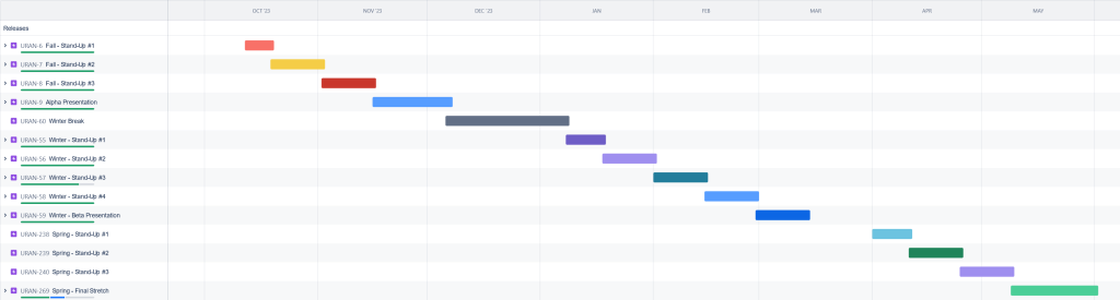
Timeline
We used Jira to track our progress throughout the 3 quarters that we worked on this project.
Process
Research
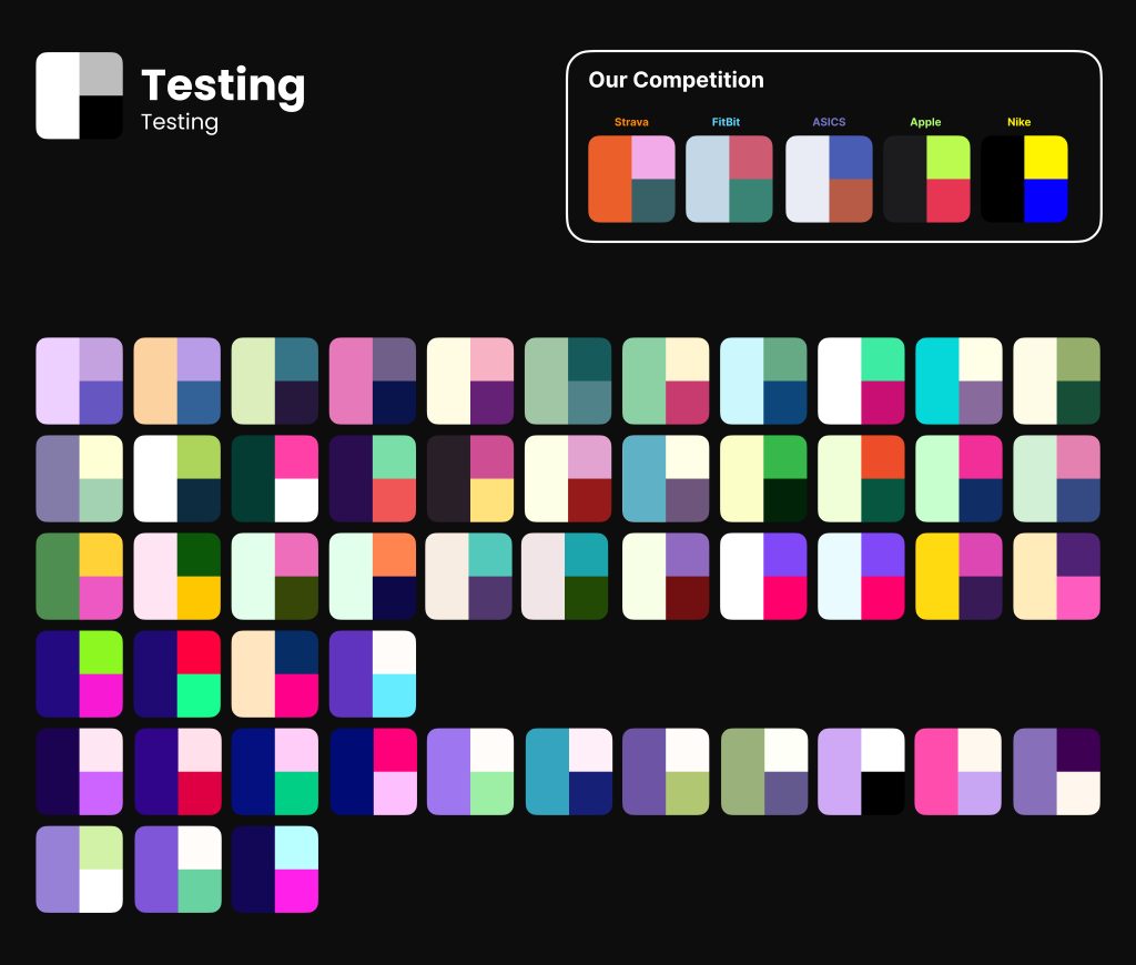
Competitive Analysis
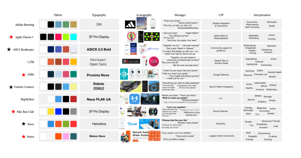
One of the first steps in our research that we took was conducting a high-level analysis of other competitor running applications. From this analysis, we generated the following questions that would be answered through our design process:
- Core user flow of competitive apps (What do users do BEFORE the run? During? After?)
- What is the core goal of these apps? (Stat-tracking or educational?)
- What are their strengths?
- What are their weaknesses?
- Who are the MAIN competitors? (These have been highlighted with red stars.)
Surveys & Interviews
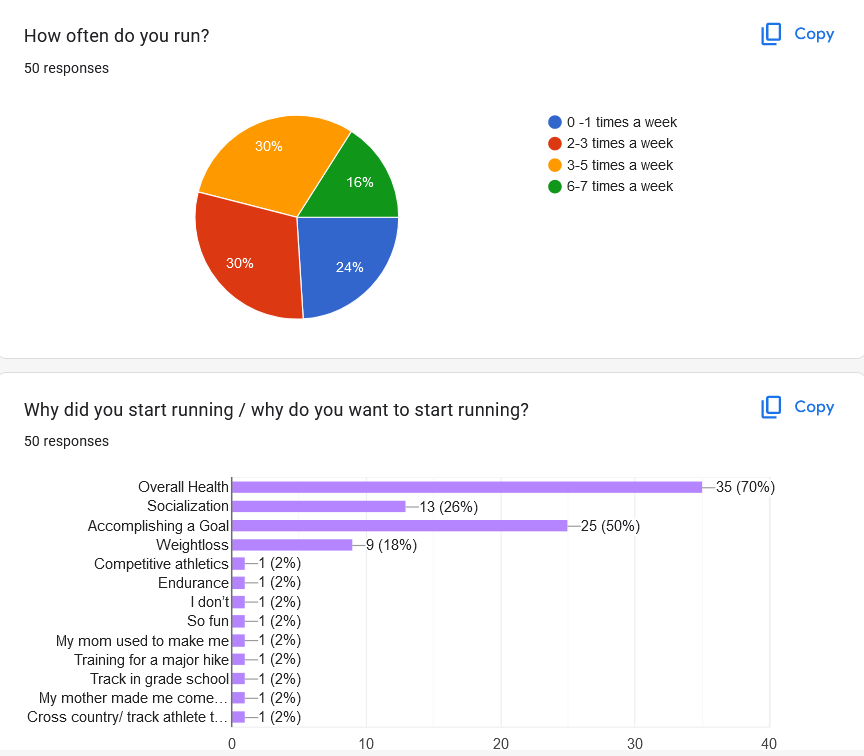
We sent out a survey that collected 50 responses from various people – some experienced runners, some very inexperienced. From these results, along with 10 interviews with some of those who took our survey, we were able to create an Interview Synthesis that gave us in-depth, emotional data about users’ ties to running. We learned…
- New runners are overwhelmed by running apps and often choose not to use them.
- Many users don’t have access to any equipment other than their phones.
- Some users want their stats tracked, some don’t.
- Most running apps don’t provide users with information on HOW to run.
User Personas
From our initial research, we ended up condensing our data down into our two user personas as high-level overviews of our target audience.
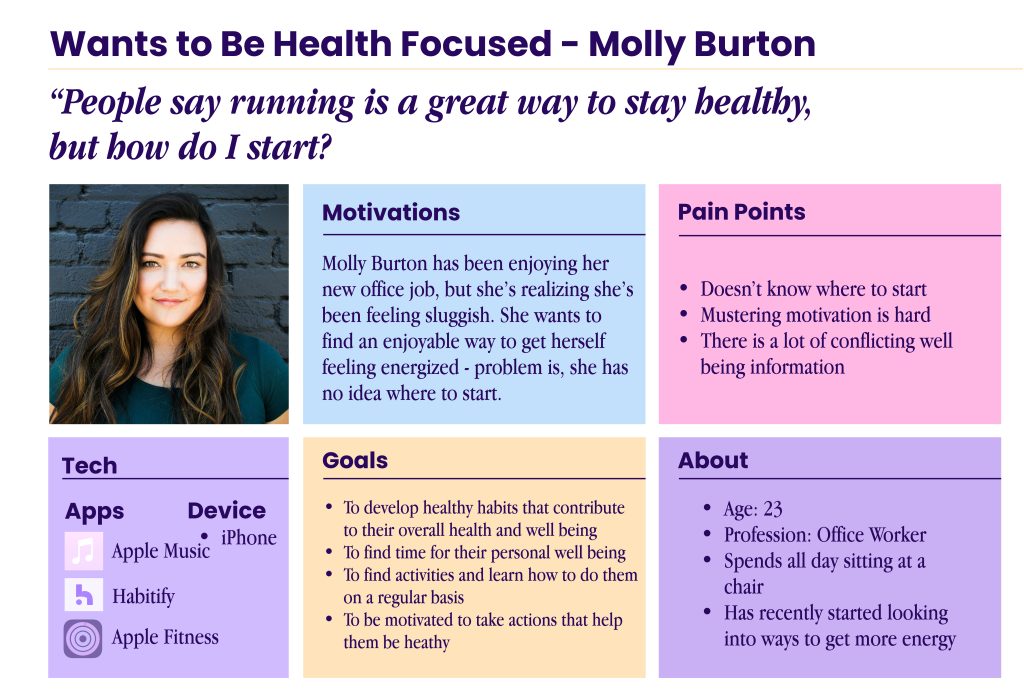
The “Wants to be Health-Focused” individual aims to make running a consistent part of their life, creating an active and healthy lifestyle.
Key Characteristics:
- Lacks the knowledge and experience in their present state
- Wants to improve physical fitness and personal wellness
- Wants motivation to take action
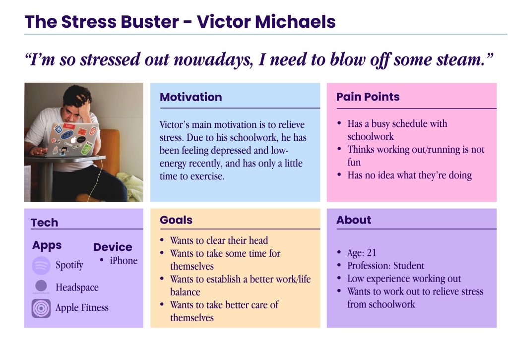
Our other persona, “The Stress Buster”, is more focused on the mental benefits of running. This individual is in a high-stress environment and wants to run as a means to blow off steam.
Key Characteristics:
- Wants to establish a better work/life balance
- Wants to take better care of themselves
- Aims to use running as an emotional outlet
Design
Color & Typography
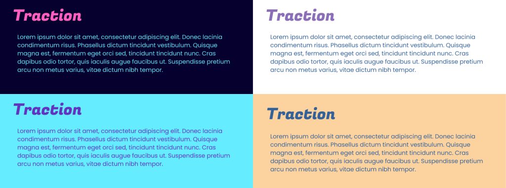
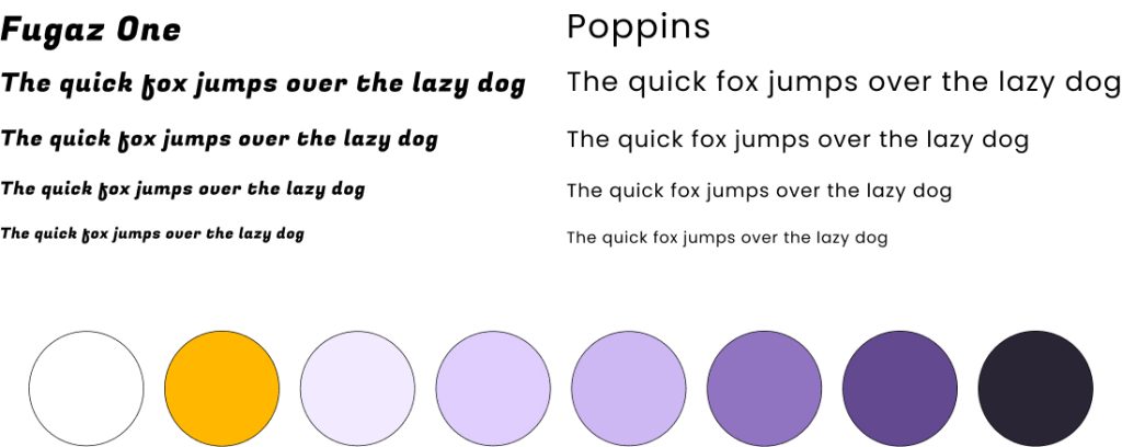
We created a large quantity of color schemes as an initial ideation phase. Then, we narrowed them down to six that we liked. From there we narrowed them down further to two color pallets that we felt really fit with our brand. At the same time, we chose a font pairing. We applied the color pallets to the font pairing to find the pallet that fit with the fonts and our branding goal best.
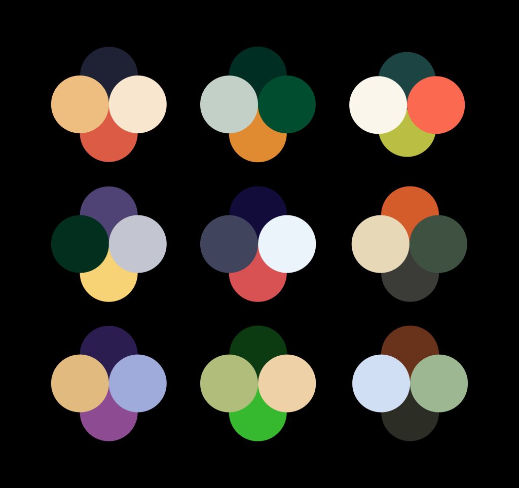
For our typography, we tried to find fonts that had a fun and breezy energy, while still being somewhat sporty. Our initial font choices were vast, and we slowly whittled them down.
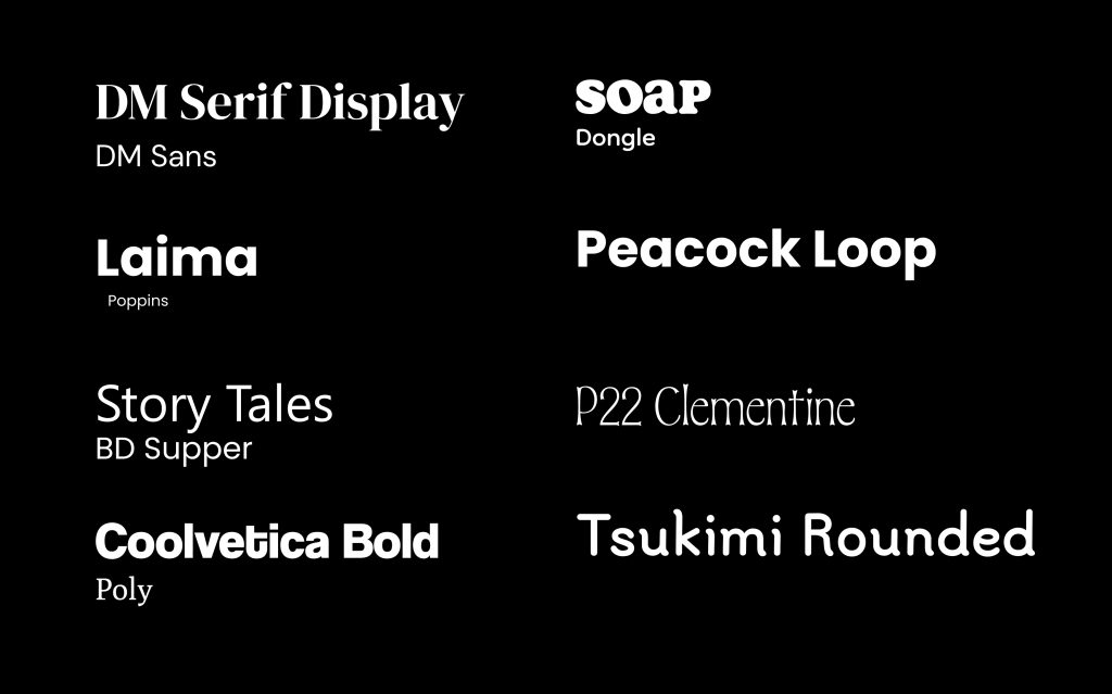
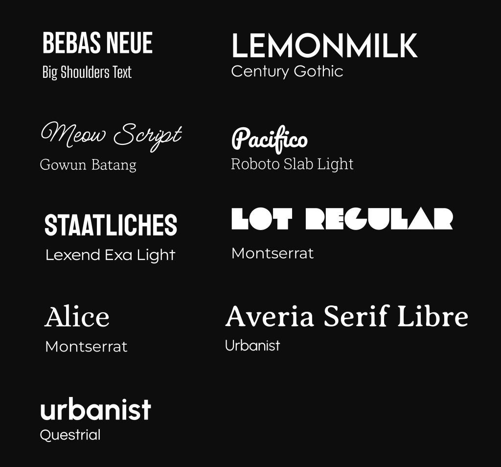
Then, we began exploring and experimenting, combining these styles together to find a match that communicated what our app represented.
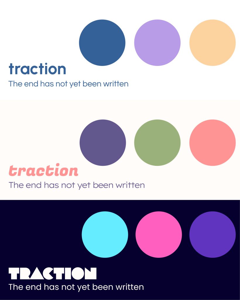
Final Style Guide
Eventually, we settled on a purple-focused color palette with orange accents, as well as Fugaz One as a display font and Poppins as a body font. We felt that this stylization captured the empathetic and cheerful aspects of our app beautifully.
Wireframes
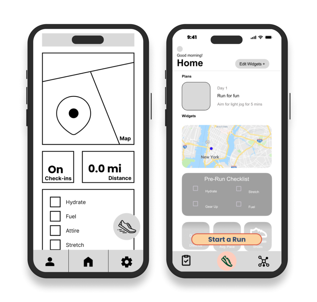
Low Fidelity
Moving into our design, we aimed to implement what we learned from our research in two main points.
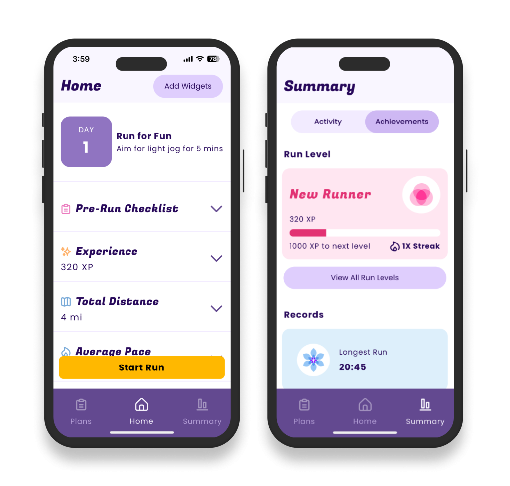
First, we implemented a Widget System that assists with our empathic approach by allowing users to customize their experience. Users would be able to choose what information they wanted to see, both on the Home screen and during Runs.
Second, we realized that our approach led to there being three main user flows in our app: the Before Run flow, the During Run flow, and the After Run flow.
Before Run
- Change your Widgets.
- Read advice on how to run in the Guidance section.
- Check your Awards and run Records.
During Run
- See current stats and get feedback according to your running plan. For example, if you are following the Couch to 5k Plan, the app will help remind you to alternate between running and walking.
- The widgets that you have selected to display on your Run page will keep track of the data that you want to see.
After Run
- See how much experience you’ve gained and what Awards you’ve achieved!
- Be guided through Cool-Down Exercises to help minimize soreness and injury.
- Rate your overall run experience as well as track any specific discomfort you felt. This data is stored for each run in order to help users understand how their mental and physical states have changes from run to run.
Mid Fidelity
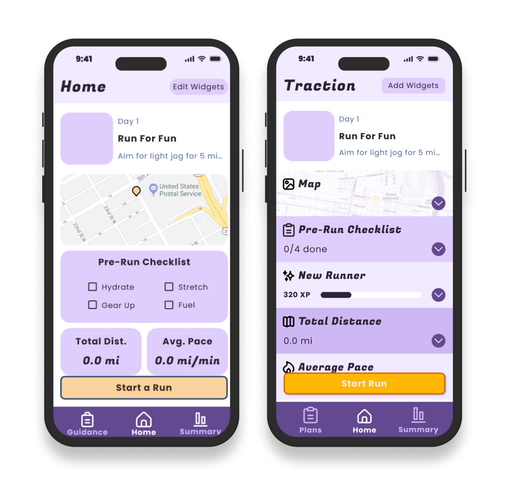
Initially, we based our Widget stylization on Apple’s style guides. We decided to change to the edge-to-edge design that you see on the right in order to make better use of our space and to better match the rest of the app’s edge-to-edge designs.
However, the usage of saturated color in our widgets became somewhat overwhelming, now that they filled the screen.
Hi Fidelity
We addressed our color issues by using the background color from previous iterations for the widgets, with dividing lines in a light purple.
We also started incorporating a few more colors, especially in our new reward system, in order to break up the monotony of a single color.
Our reward system was also fully fleshed out during this phase. It would allow users to track their running progress, as well as stay engaged through the promise of higher levels and unlockable Awards.
Development
Development Challenges
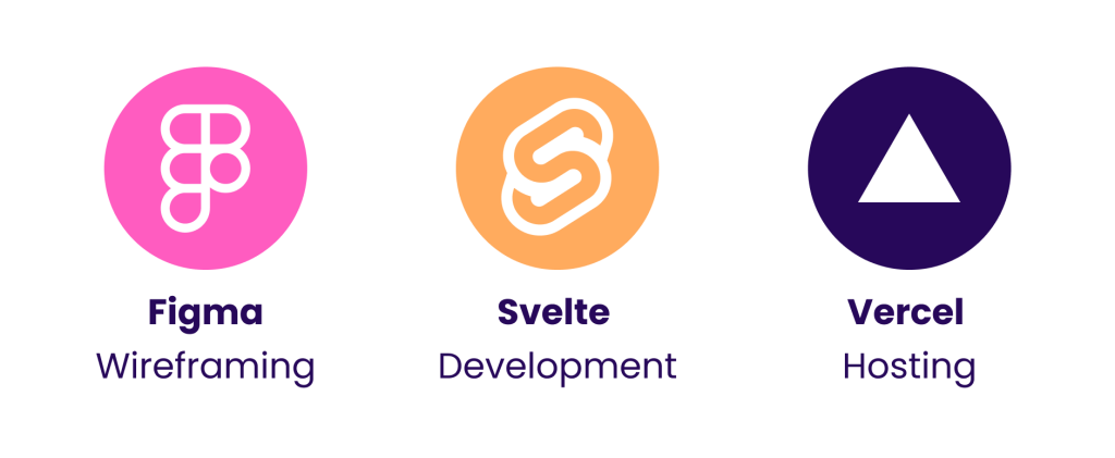
As a result of our pivot into an empathetic running app, we were left with a team with less code experience than others. As a result, multiple members of the team took on an independent study course taught by Phil Sinatra during our winter term. His advice and help were crucial to our project’s success. Thanks to him, we were encouraged to use Svelte to build out a working demo of our app and were shown that Vercel could easily host our demo.
Technologies
We utilized a variety of technologies for this project:
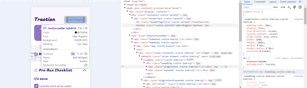
- Figma was used for initial wireframing. The new Figma Dev feature was also used in order to translate these wireframes into our coded prototype.
- We used Svelte as our framework, allowing us to develop in HTML5, CSS, and JavaScript with the added functionality that Svelte provides. Its component-based design allowed us to create coded components simultaneously as we developed wireframes. Then, if changes need to be made to these components, they would be reflected across our full prototype.
- Finally, we hosted our finished prototype on Vercel, which allows for free web hosting.
Our Solution
Our main deliverable is our coded prototype, showing what it would be like to utilize Traction. The app has been populated with dummy data in order to be used during our expo table. It is meant to be used on a phone screen but is functional on any interface.
Finally, here is a recording of the presentation we gave at the senior showcase.Senior Showcase Presentation
The Results
In the end, this project was a great success. Our team was able to successfully build a working coded prototype that built off the research that we conducted, while also being clean, enjoyable, and fun to use. We were especially proud of our ability to pivot and rethink our approach to this project while still creating something creative and needed in the running app industry.
We want to thank Phil Sinatra for all of his help, as well as Troy Finamore and Jervis Thompson, who gave critiques and assistance throughout the project. Thank you all for making our senior project a success!