Team Members: Arpit Ahluwalia, Fidel Boamah, Brianna Buissereth, Erik Martus, Ben Murray, Beck Rivera, Ben Schenerman
Thunk is an exciting game developed by the Interactive Digital Media class of 2021. The game is designed to bring together players in a social setting and promote creativity through divergent thinking. It can be played amongst friends or as a creative warmup in the workplace. Players go through six rounds of prompts and must come up with as many responses as they can for each prompt. Each round also has a twist. These “switch-ups” add constraints to the prompts that players must work around. The random pairings of these two components give each playthrough of Thunk variability and replayability.
Research
Right from the beginning, we wanted to interact with our players. Starting our research with interest interviews put us in front of them and asking them questions to help us better develop the idea behind Thunk. We ran them through sample questions that were based on a creative exercise developed by Cas Holman. We also gathered data on what other social games our players enjoy.
The three games that came up most frequently were Fibbage XL, Quiplash 2, and Drawful 2. Our main takeaways from these games were that in order to make a digital social game engaging, there needs to be some sort of personality to the game itself, like a game show host, and that most of the action in the game happens on a single main screen and players all connect to that screen via a personal device like a phone.
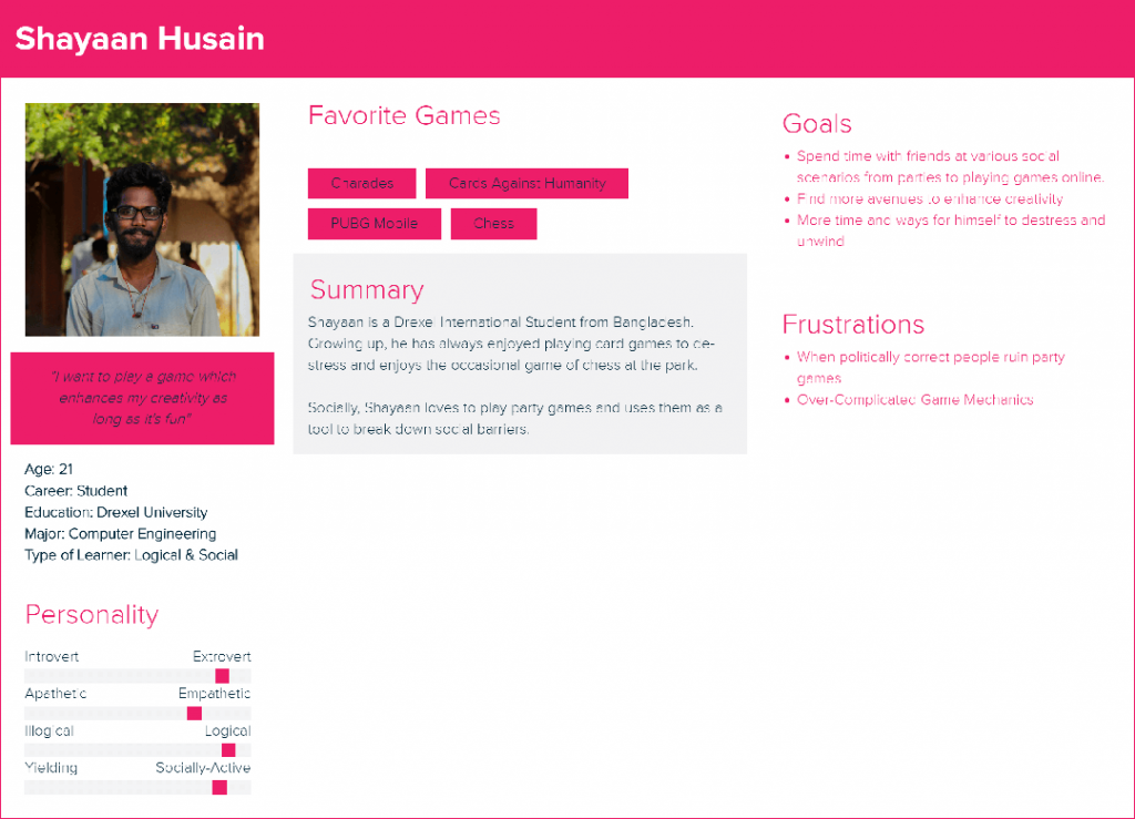
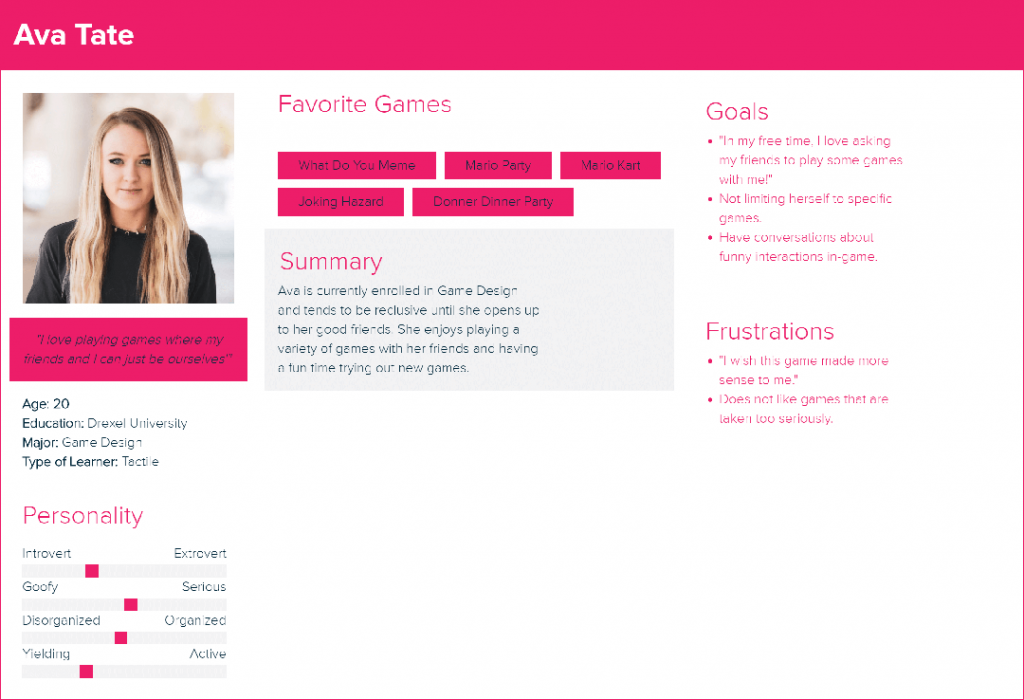
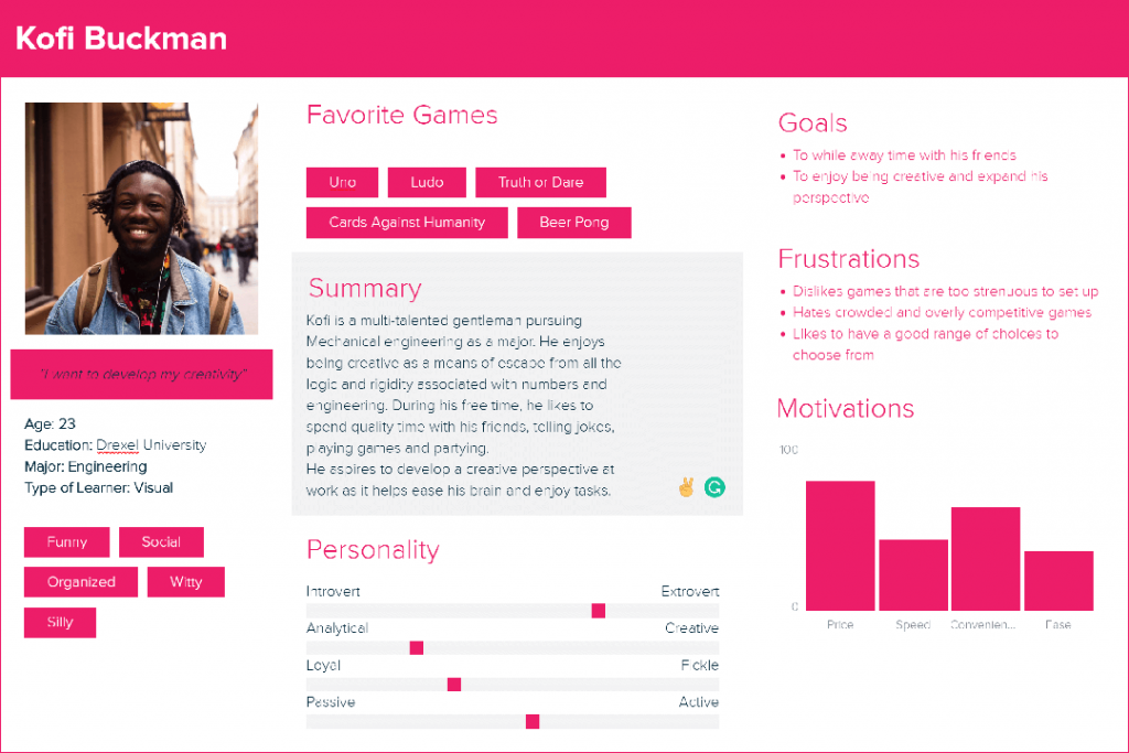
From the interest interviews, we also derived user personas and journey maps. Each persona was based around college students, who we identified as our primary target audience. Each persona was identified to have ample time to socialize with others their age and a desire to stretch their creative minds. The journey maps developed from each persona allowed us to focus on the pain points of each and help us better understand how we can design for them.
User Interface Design
Designing Thunk was an exercise in collaborative design. The team settled on a three-step agile design cycle. First, create and iterate during which the team would work on individual tasks, typically multiple people working on one task simultaneously. Second, discuss and evaluate during which the team would regroup and present their ideas for their tasks. Third, merge designs during which the ideas brought to the table would be refined and iterated upon, all while the team as a whole moved back to step one for another task.
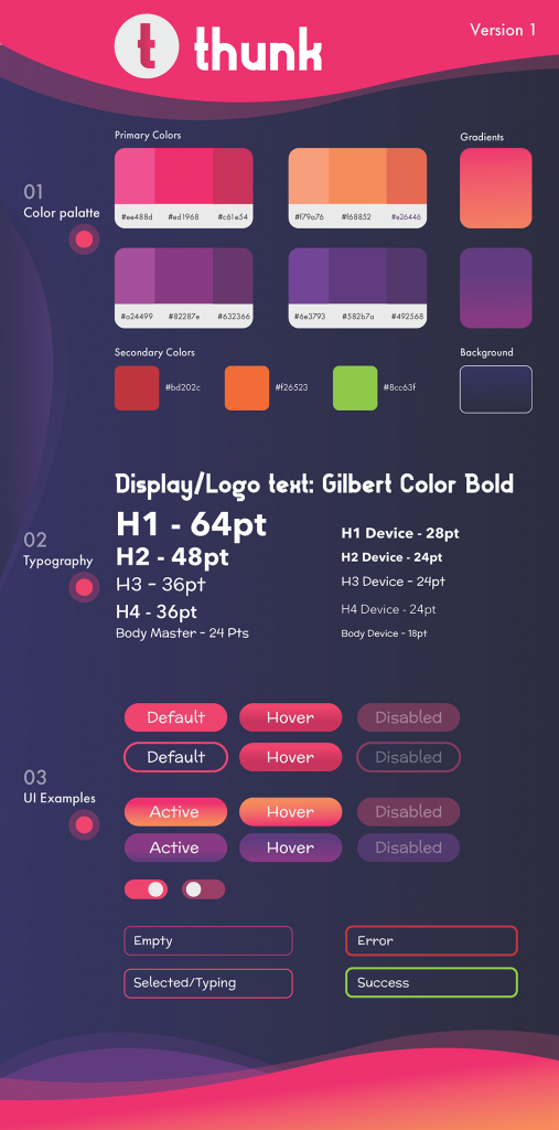
The challenge for the UI team was being able to design something that said “creative” while also maintaining web accessibility. With this in mind, we settled on a color scheme consisting of pinks and purples and font pairings of Avenir Next and McLaren, with Gilbert being used for the logo and branding. While we were unable to push this to AAA accessibility standards without sacrificing the aesthetic of the project, we were able to create a distinct visual identity for Thunk.
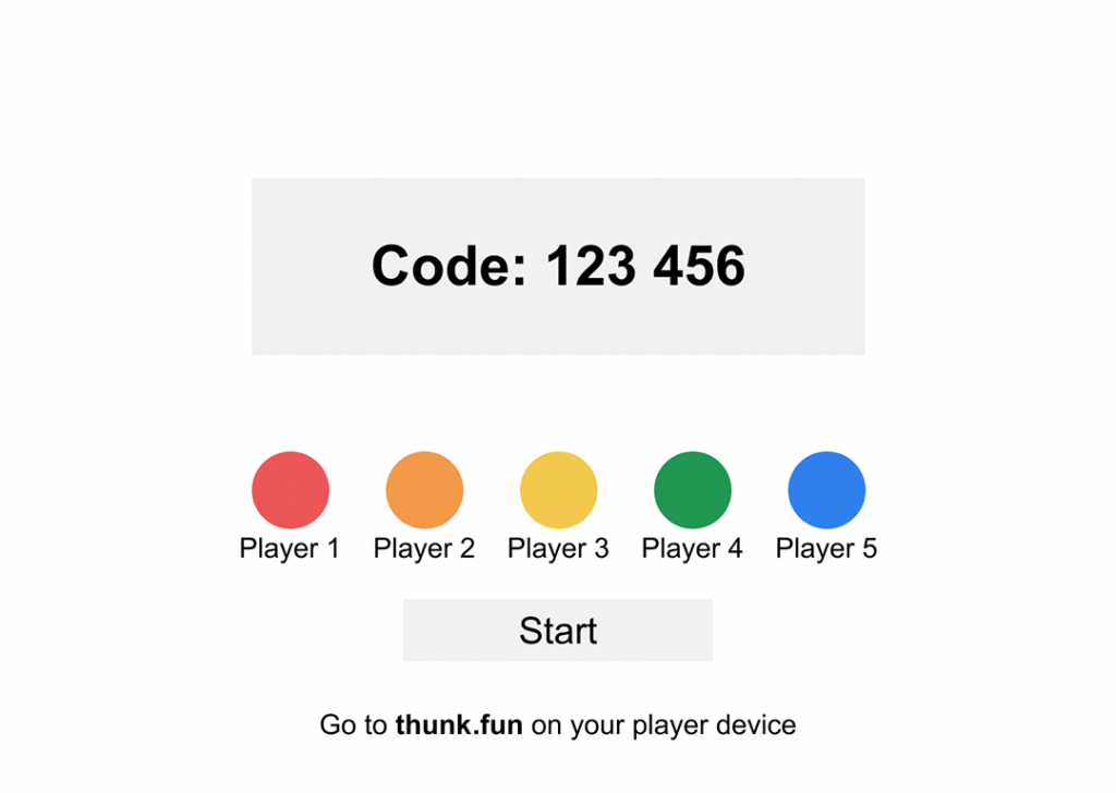
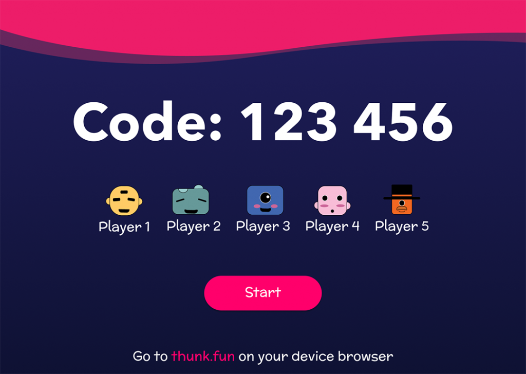
Host on Desktop Prototype
Player on Mobile Prototype
Development
The final product of Thunk runs on NodeJS and Socket.IO. NodeJS was settled on because it was decided by the team that other server side languages, like PHP, would not be able to handle the dynamic server-side actions that were to be built. Socket.IO was a new technology for the development team to work with. Socket would allow multiple users to connect to a room simultaneously and communicate between devices.
While the proof of concept prototype the development team created went a long way to validate the use of these technologies, it also proved that the team had a lot still to learn about working with server side JavaScript. Solutions that worked for the small scale proof of concept would not translate well for the full-scale app, and the latter required numerous features that the former lacked, such as room creation and user identification.
Takeaways
Creating Thunk was a learning experience for everyone involved. The final product may not be perfect, nor really considered complete by the standards of what we set out to do, but each step of the way yielded something new for each member of the team. What we learned here we will take with us as we move towards Senior Project, where we will now have a better idea of how to pace ourselves and set goals along the way. Foremost is a better understanding of how to better plan for a project, especially when that project involves unfamiliar technologies. Also, we are all walking away with lessons learned on the importance of constant and clear communication between team members. Although what is arguably the most important lesson we learned is employing better time management because on this project, more than any we have worked on in the past, it became clear just how much our team members are reliant on our own work in order to move forward with theirs.

