
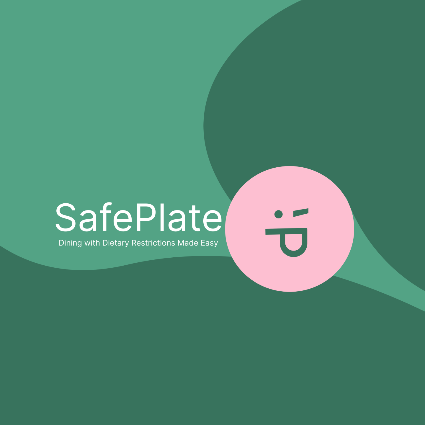
SafePlate Mobile App
Dining with Dietary Restrictions Made Easy
Overview
In a 24-week project, we revolutionized shared dining experiences with intuitive Who/What/Where search functionality, trustworthy dietary restriction details, and personalized restaurant suggestions for every group. SafePlate, our user-friendly mobile app, also fosters social connections through dining buddies and offers clear menu labeling with branded icons.
Context and Challenge
Background
- Team:
- Gianna Maaddi: Project Manager, UX, and Development
- Dabin Lee: Development Lead and UX
- Cindy Quach: UX Lead and UI
- Cheryl Vo: UI Lead and Content Lead
- Timeline: 24 weeks (October 2023 – March 2024)
- Tools: Figma, Adobe Illustrator, After Effects, React Native, Firebase
The Problem
For individuals or groups with food allergies or other dietary restrictions, finding restaurants that cater to their needs may be difficult. Challenges arise from factors such as limited menu options, the risk of cross-contamination, and the absence of dietary labels on restaurant menus. As a result, this situation often forces individuals to conduct time-consuming research and make advance calls to restaurants, hindering their ability to enjoy spontaneous dining experiences.
Goals and Objectives
Upon completion of this project, we hope to achieve the following goals:
- Enable users to create a comprehensive dining profile
- Display tailored restaurant recommendations based on a dining party’s restrictions
- Facilitate user connections through dining buddies
- Provide clear menu labeling with branded icons
Process and Insight
The early stages of our project consisted of external research, where we gathered key statistics about allergies and diets and analyzed six competitors that address allergies, diets, or a limited combination of both to identify unique aspects and shared features across the various platforms.
Next, we engaged with users of our target audience through surveys and interviews to understand their unique experiences and how we may create designs that address their common pain points.
We also defined our branding strategy, where we decided on a friendly, warm, and appreciative tone that maintains a balance between professional and playful. These values shaped the tone of voice and the visual language of SafePlate, encompassing its colors and mascots.
With an understanding of the problem, the audience, and the emerging SafePlate brand, we began our iterative design process, creating sketches and mockups and implementing changes based on research-driven decisions. With a firm understanding of user needs, we revisited our goals to determine how to accomplish these within our given timeline. During this process, we identified and prioritized key features and pages needed for a minimum viable product. Additionally, we settled on an approach detailing how to represent menu and restaurant data in our app. By anticipating what would be feasible for development, we successfully determined the granularity of our designs and aligned on a high-level approach. The second half of our project comprised the iterative tasks of design, usability testing, and developing a coded prototype.
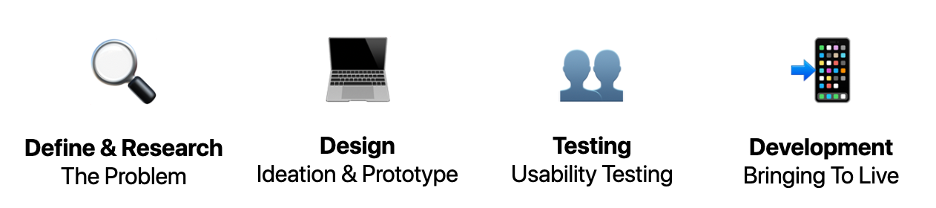
1. Define and Research
Idea Validation
Our initial research indicated that very few platforms provide restaurant recommendations specifically for individuals with dietary restrictions. Before getting too far into our process, we needed to validate the problem. Based on our research, we learned that there is a lack of safety and trust involved in dining with dietary restrictions.
Key statistics:
- 51% of all Americans are impacted by food allergies or sensitivities.
- 52% of Americans with exclusion diets struggle to find food when eating at restaurants.
- 50% of food allergy-related fatalities occur in eating establishments.
- 29% of restaurants do not have a plan for answering questions on food allergens.
Competitor Research
A crucial step early in our research process was identifying our competitors. We compared various restaurant finding platforms to identify the most essential and unique features.
Common features include:
- Filtering by allergies/intolerances
- User reviews/ratings
- Limited free options (e.g. pay to download mobile app, limited results, etc.)
Unique features include:
- Saving dietary restrictions for a personal profile
- Showing which menu items match dietary settings
- Displaying restaurants’ cross-contamination procedures
Overall, we identified a unique opportunity for SafePlate to emerge as a restaurant finding application that caters to groups with multiple dietary restrictions.
Survey
After gaining a comprehensive understanding of the problem’s severity and overall impact, we shifted our focus to learning more from individuals who have dietary restrictions or frequently dine with others who do. We sent out a survey and received 25 responses from Gen Z and Millennials with experience dining out with dietary restrictions. The frequency of dining in a group with restrictions and the lack of transparency with restaurant menus and policies validated our idea and helped us move forward.
Key findings:
- Users expressed an interest in these top 4 features:
- External menu links
- Menu dietary labels
- User reviews and ratings
- Filter by restriction
- High frequency of dining in a group with restrictions
- Lack of transparency regarding restaurant menus and policies
Interviews
To build upon the quantitative data gathered in our survey, we collectively conducted 8 interviews. Based on the frequency and impact of each finding, we prioritized the top 5 action items from key themes:
- Individuals are disappointed about missing out if the rest of the dining party can order something from a restaurant.
- Once a dining party is selected, only restaurants safe for the whole party should be displayed.
- Waiters may not take their dietary concerns seriously or take their dietary restrictions too seriously.
- User ratings to communicate the “helpfulness of staff.”
- Individuals sometimes feel guilty or like an “inconvenience” depending on the level of business or waiter disposition.
- Friendly tone of voice and imagery to promote positivity.
- Individuals frequently communicate with waiters to ask questions about the menu, seek recommendations, etc.
- It can be difficult to find new restaurants, especially in new areas or if they want to try something new.
- Immediately display recommended restaurants when users open the app.
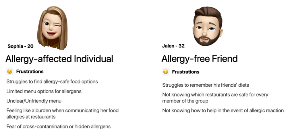
User Personas
We utilized our research findings to craft personas representing both a Gen Z and Millennial user: one individual with allergies and another who frequently dines with others affected by allergies. While we have addressed some of the challenges our allergy-affected person may encounter, it is crucial to consider the perspective of the friend without dietary restrictions who seeks to provide support.
2. Design
To define the scope of our project and key features of our app, we utilized several research methods, including “I Like/I Wish/What If” and card sorting, to gather user insights and validation. We identified the following themes from each research activity.
I Like, I Wish, What If:
- Participants wanted a community focus, which helped inform our future scope.
- Restaurant verification and user reviews help participants feel safe.
- The majority of participants prefer the green/blue color palette over the red/orange alternative.
- The majority of participants favored the tags with icons to represent dietary restrictions.
Open Card Sort
- Filter options should include:
- Price range
- Distance
- Cuisine type
- Star rating
- Rating criteria should include:
- Helpfulness of staff
- Comfort level.
- Display restaurant recommendations on the homepage (by location, e.g.)
- Restaurant information updating system (future scope)
- Address change.
- Opening hours change
- Report inaccurate dietary information.
3. Testing
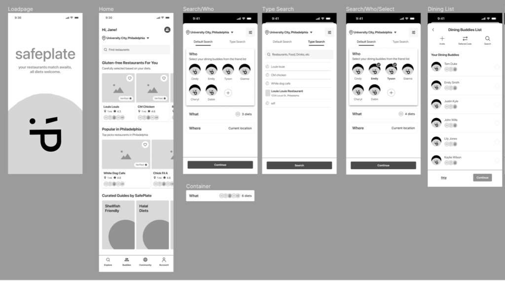
To test our design solutions, we created a Lo-fi prototype, prioritizing intuitive navigation and information hierarchy. We mapped out the main sections of the SafePlate app, such as the onboarding flow, search functionality, and viewing search results, to ensure easy access to essential information for our users.
Low-Fidelity Usability Testing
Key findings:
- Modify dietary icons.
- Clearly communicate whether food is safe or unsafe.
- Increase the size of dietary icons and explore simplified silhouetted icons for smaller versions.
- Explore ways to display dietary icons on restaurants detail card
- Variety of options: solid icons only, icons with color-coded backgrounds, icons for allergies and initials for diets.
- Displaying icons with text is the easiest way user can understand but further explanation with key should be considered
- Add option to manually create profiles for friends.
- Incorporate desirable content into curated guides (e.g. signs to stay away from, knowledge about different types of diets, etc.)
- Consider different format or language to make search bar more intuitive.
- Modify confusing language: (e.g. “default search” vs. “type search”)
High-Fidelity Usability Testing
Following our high-fidelity testing, we prioritized revising our color palette to be accessible, creating a flow to add manual buddies, and deciding on how to show dietary restriction pills (e.g. filled or unfilled, “Dietary-friendly options include” label, etc.)
4. Development
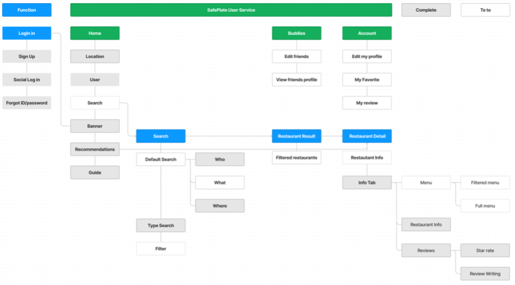
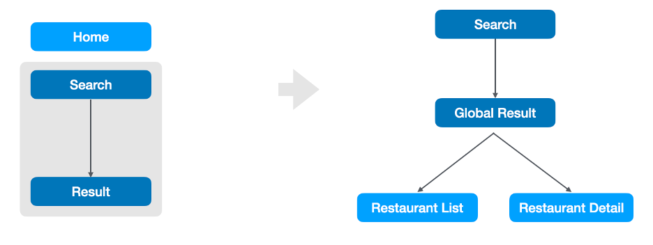
Information Architecture
By analyzing each feature and page to include in SafePlate, we created the information architecture. We later identified the pages and features that would comprise our MVP.
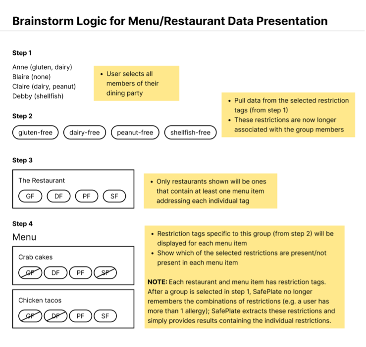
Search Functionality Logic
From the outset, we established a consistent approach for presenting menu and restaurant data in our app. Despite revisions, this core logic persisted: users select their dining party members, and based on their dietary restrictions, we display restaurants with menu items catering to each need. Upon restaurant selection, users can easily identify safe menu options for their specific restrictions.
Roadblocks
1. Data delivery
During the process, we encountered several roadblocks, including data delivery. When the search function operates, it displays data on each page and delivers that data to another page. We encountered many difficulties with the search functionality and carrying the data across pages. To ensure the completion of this aspect of our app, we deprioritized other features.
2. Data accuracy using APIs
During our research to determine the most suitable API for our project, we initially considered both Google and Yelp APIs due to their open-source nature and ease of adaptation. However, as SafePlate’s design evolved, it became apparent that we required more detailed information regarding specific restaurant dishes, descriptions, and ingredients. Consequently, we ultimately opted for the UberEats API, which best aligns with our project’s requirements. However, due to issues with gaining access to this resource, we had to pivot. As a result, we could not display accurate dietary restrictions and menu data for each restaurant. At this point, we realized that if we could pull from a database and display that arbitrary content in our app, this would create the framework for our displaying data process. With more time, we would work to get accurate information into our database, which would dynamically display in SafePlate.
3. Verifying dietary restrictions
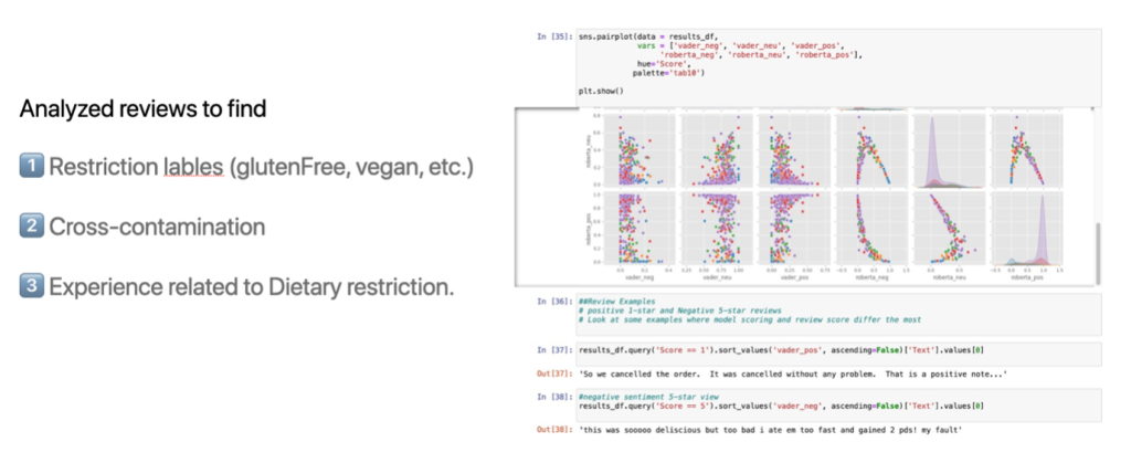
As our app prioritizes delivering the safest and most suitable restaurant recommendations for people with dietary restrictions, content verification for safety was our foremost concern. We utilized data mining to aid in analyzing reviews, identifying restriction labels for each dish, assessing restaurant cross-contamination policies, and evaluating user ratings related to their experiences with restrictions. This data would ideally supplement the dietary restriction labels for each menu item. However, we chose to pivot once again because given the choice between pulling menu information from a database and pulling information from online reviews, we prioritized the former. Since trustworthiness is an essential aspect of delivering any data, we did not want to display partially accurate data.
The Solution
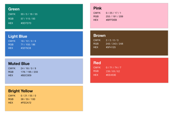
Color
We chose the color scheme for SafePlate, aiming to create an atmosphere of positivity and warmth that would instantly put users at ease. Through user validation, our primary colors, green and pink were selected to evoke feelings of freshness, vitality, and friendliness.
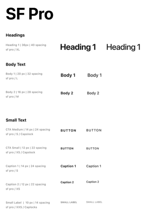
Typography
In addition to our meticulous color selection, we made deliberate choices in typography. After careful consideration, we chose the SF Pro font for its exceptional clarity, readability, and contemporary style. Notably, SF Pro is a font favored by Apple for its devices and platforms, ensuring familiarity and consistency for users across various devices.
For content texts, our font size varies from 12, 14 to 16. Our smallest font size is set at 12px, chosen to maintain legibility and readability. For headings, titles, and other prominent elements, we utilized a larger font size of 36px, allowing key information to stand out and grab the user’s attention.
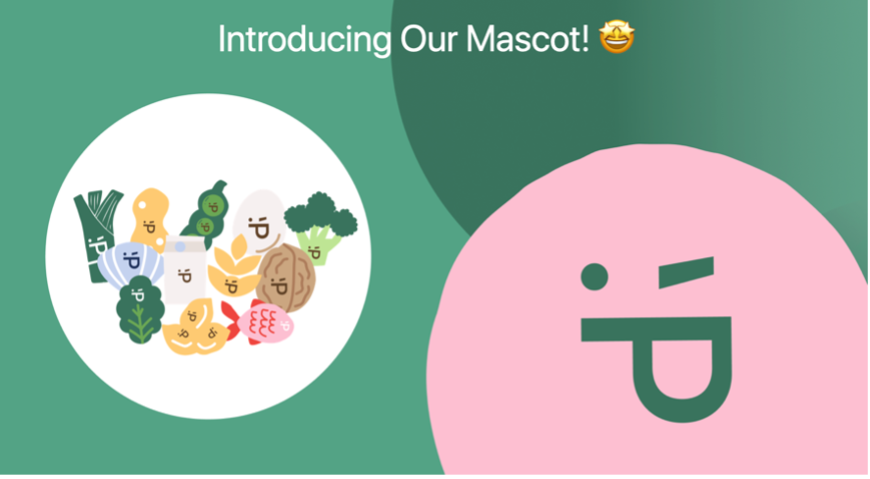
Mascot and Icons
We created each of the following visual elements to support the SafePlate brand:
- The Plate: As part of our efforts to infuse SafePlate with personality, we introduced a delightful mascot represented by an emoji within a circular icon, representing a plate.
- The Emoji: The chosen emoji, “: P”, cleverly represents the letter “P” in SafePlate, adding a playful touch to the app’s branding. This friendly mascot serves as a recognizable symbol for SafePlate, reinforcing its identity and making the user experience more engaging.
- The Other Iconography: In addition to the main mascot, we also incorporated individual symbols to represent each of the dietary restrictions catered to by SafePlate. These symbols include broccoli for vegan, celery for vegetarian, a peanut for peanut nut allergy, and a seashell for shellfish, among others. Each emoji features the “: P” symbol, similarly to the plate mascot. These mascots not only add visual interest but also serve as intuitive cues for users, helping them quickly identify suitable dining options based on their specific dietary needs.
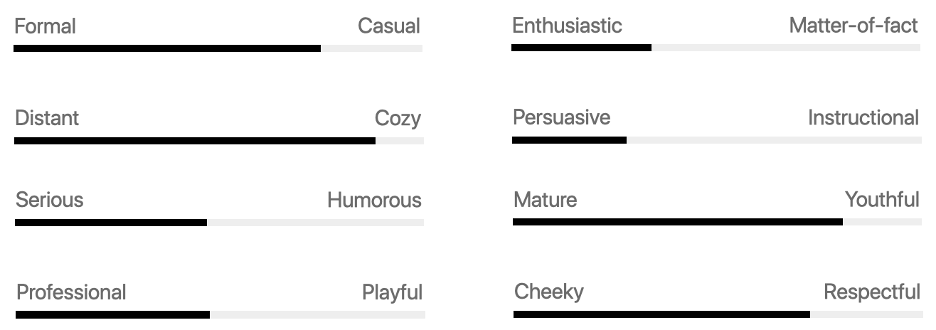
Tone of Voice
SafePlate’s tone of voice influences perceptions of the following features to maintain a warm and welcoming tone, the app aims to create a sense of comfort and reliability for users through friendliness, trustworthiness, and coziness. To achieve this, we strived to use more verbs and fewer nouns to encourage action and engagement.
- Passive voice example: You can create a list of dietary choices for your group.”
- SafePlate’s voice example: “Explore eateries that take care of everyone’s concerns.”
Low-Fidelity
Sketching
In the early stages of our design journey, we delved into sketching sessions to generate ideas and concepts for SafePlate. These collaborative brainstorming sessions allowed each team member to contribute their unique perspectives, resulting in a diverse range of sketches. We focused on key elements such as:
- The search engine: We aimed to create a user-friendly search interface that enables users to quickly identify who they are dining with, what their dietary restrictions are, and where they are located.
- Menu representation: We explored various ways to effectively represent allergies on restaurant displays or menus, ensuring clear communication of dietary information to users.
Wireframes
After gathering a variety of sketches, we narrowed down our focus to the most promising ideas. We then translated these sketches into wireframes, which served as blueprints for SafePlate’s interface design. The wireframes prioritized functionality and layout, outlining features such as:
- The ability to create and save dining profiles: We envisioned a process for users to create and save their dining friends or companions.
- Exploration of the search engine: We mapped out the search engine’s functionality, ensuring intuitive navigation and filtering options for users to find suitable dining options based on their preferences.
Curated Guides
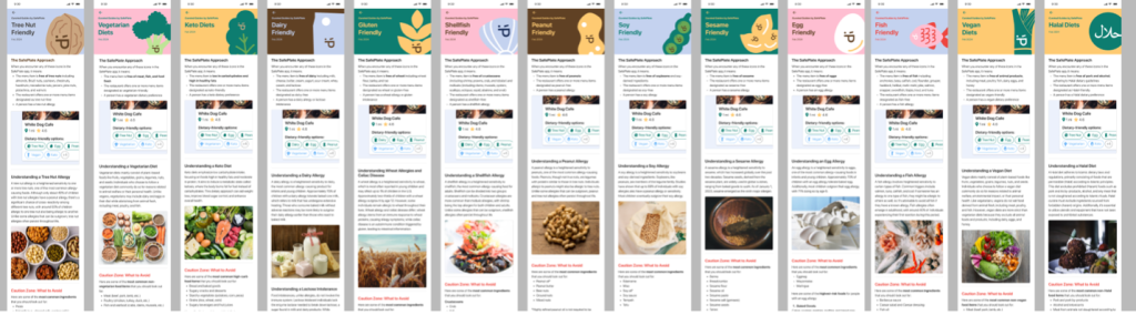
As part of our commitment to user education and empowerment, we collectively worked on creating 13 curated guides within SafePlate. These guides serve as invaluable resources to assist users in ensuring a safe and enjoyable dining experience. Additionally, these guides offer valuable insights for users who may not have dietary restrictions themselves but wish to understand and support their friends or dining companions who do. Topics that curated guides cover:
- Information and practical tips on navigating various aspects
- What to react in critical or emergency cases
- Understanding food allergens and cross-contamination risks
- How to communicate effectively with restaurant staff and making informed menu choices
Dietary Labels
After conducting lo-fi usability tests with 8 participants, we discovered a significant pain point: understanding and distinguishing between different restriction indicators on the restaurant detail cards or search result page due to their small size and unclear design. This realization marked a pivotal moment for us. Arguably, the most critical aspect of our app is ensuring clarity regarding which menu items and restaurants are safe for users with dietary restrictions. Upon receiving feedback from numerous users that our current system lacked clarity and intuitiveness, we prioritized iterating on this aspect of the design.
We explored 3 options and validated them through additional user testing.
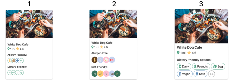
- Icons for allergies, letters for diets, outline
- Pros: Looks the most pleasing and clean
- Cons: Users can’t see the cross check and unable to recognize & identify the meaning for each icon
- Icons for allergies, letters for diets, color filled
- Pros: Aesthetically pleasing
- Cons: Users are concerned about accessibility with color contrast and mentioned the childish appearance
- Icon and letters for all restrictions
- Pros: Best for clarity and quickly scan through
- Cons: Users are concerned about the possibility of overwhelming content
After getting feedback from 6 participants, we found that Option 3, which includes both icons and letters for all restrictions, performed the best. Despite Option 2 being visually appealing, it lacked clarity due to issues with color contrast and intuitiveness for representing 13 dietary restrictions. Option 3 was chosen to prevent users from having to memorize icons and to ensure clear presentation of information. To address confusion about whether a restaurant contains or does not contain certain ingredients, we will include a subtitle stating “dietary-friendly options include” alongside icons to provide clear guidance on restaurant safety.
High-Fidelity
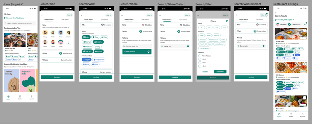
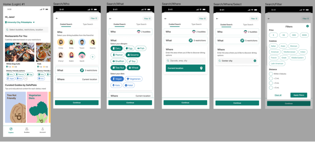
Who/What/Where
SafePlate’s unique feature is the Who/What/Where search functionality that helps cater through the user’s entire dining journey, considering (who) they are dining with, (what) restrictions they have, and the location (where) they are dining. This helps inspire user decisions and optimize the simplicity of searching for the most compatible shared dining experiences.
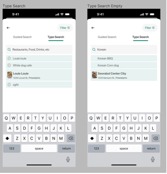
In addition to the Guided search of Who/What/Where, SafePlate also offers a Type Search for users who know exactly which cuisines or restaurants they want to eat at. This feature provides deeper insights into those restaurants’ food restrictions and how they fit the user’s dining party.
Results
Usability Testing
Overall Takeaways
From our latest High-fidelity usability testing, we gathered:
100% of usability testing participants indicated they would recommend this app to a friend because it is a unique app (2 responses) that “solves real life problems.” It is “easy to use” and “will save a lot of time.”
According to a 5-point Likert scale, our participants rated the following criteria for SafePlate:
- Usability average rating: 4.4 / 5
- Branding average rating: 5 / 5
- Some keywords they use to talk about SafePlate are: “Vibrant”, “Simple”, “Friendly”, “Cute”
Validation
Through this usability testing, we heard from our various user testing participants:
” I wish an app like this existed and fully expect you to make it happen someday.”
About the curated guides: “I’ve never seen an information page on a restaurant kind of app so it’s a cool addition and easy to read.”
“Since there hasn’t been an easy way to check the restaurants’ offerings and accommodations quickly, I think this app will become very helpful for individuals who want to find a suitable place for their groups. The app is intuitive, easy to use, has an eye-catching theme and colors, and I like its features.”
Project takeaways
Lessons Learned
- UX Research: During this project, we had the opportunity to apply various new UX Research methods, including I Like, I Wish, What If which we learned through a Research Methodology class. It’s exciting to be able to apply this knowledge in a real project as we progress.
- Empathy: Through researching a unique target audience of people with dietary restrictions, we gain insight into their needs and pain points, fostering empathy. This empathy becomes a driving force in finding solutions for our users’ frustrations.
- Teamwork: By assigning roles from the outset, we learned to delegate tasks and excel in our designated areas. Having secondary roles allowed us to collaborate more effectively, stepping in flexibly to assist one another and aiming to achieve the best possible outcome.
Future considerations
Due to time constraints, we focused solely on developing the key features of the app. However, given more time, we aim to continue developing the remaining screens to provide users with a comprehensive and functional app experience. Additional development work would strive to match the amount of detail and level of refinement in our final designs. Additionally, further development would build out the screens and logic needed for fully designed and tested processes, such as onboarding, login, signup, creating buddies, and sharing. Finally, we would create additional designs and perform further testing to incorporate new features based on user feedback for desired features, such as a community aspect.