
 Context & Challenge
Background
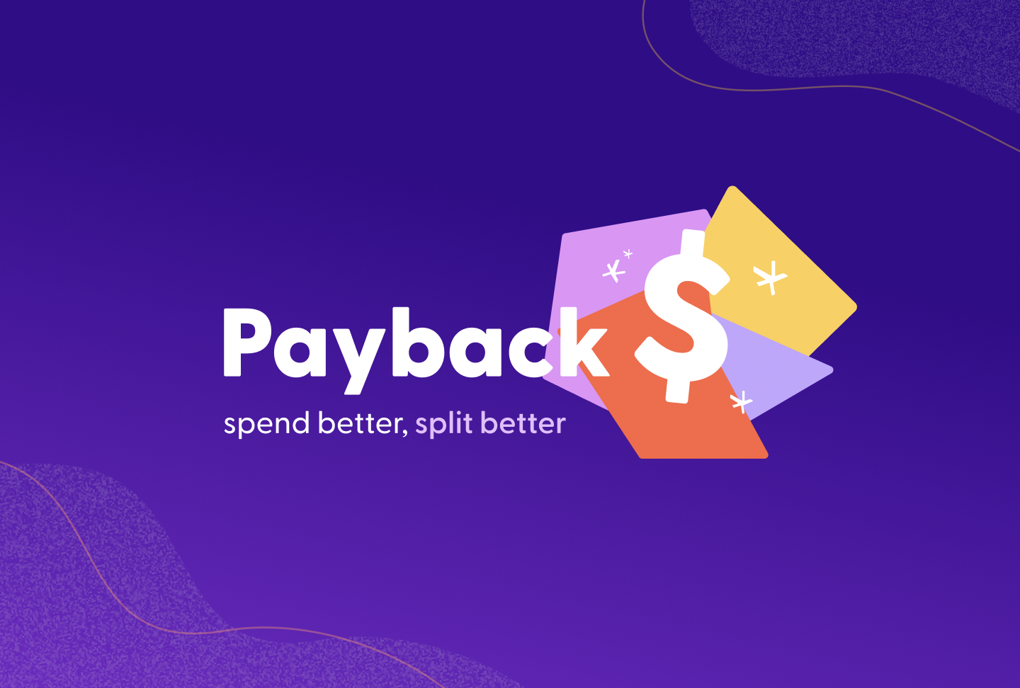
Payback is a new app designed to help you manage expenses between your friend group and easily keep track of group payment at the palm of your hand. Our app integrates a bill splitting feature that does the work for you when it comes to shared transactions.
This project was completed over the course of six months, relying on our team’s individual skills to research, design, and develop the app.
Goals
- Research our target demographic and analyze existing competitors to determine user needs
- Create low, mid, and high-fidelity prototypes, iterating based on usability testing feedback
- Build a comprehensive design library to ensure seamless handoff to development team
- Develop a working web app for the project, prioritizing MVP functions
Problem
It’s difficult to calculate expenses and manage group transactions between friends and family regularly. Existing apps are outdated and cause further confusion when dividing costs.
Process & IT
Research
Initial interviews
To help us map out what our solution should look like, we started our process with initial research. These interviews gauged user interest in the product idea, helped determine foundations for designs, and discovered which functionality would be necessary.
Competitor Analysis
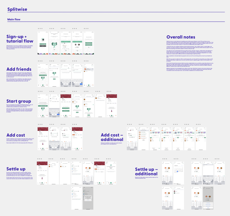
The team identified major competitors, like Mint, Splitwise, TriCount, and Venmo. These competitors provided us with information on user demographics and their needs. While Splitwise and TriCount are competitors who also focus on bill-splitting capabilities, Venmo and Mint provided perspective into budgeting and mental models of money sending apps.
We completed task flow analysis for all four competitors, noting any pain points of their flow and taking notes of things that they were doing well.
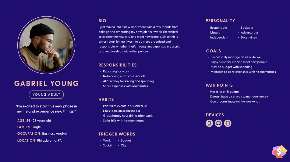
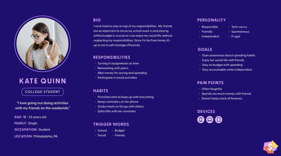
Target Audience
We developed personas based on our research, with our main focus for our target audience being college students and young adults. We found that people ages 16-32 were the most likely to split bills with their friends or families. Additionally, we created journey maps to think through any pain points the user might go through when using the app. This helps us foresee any issues before we begin designing.
Usability Testing
Created scripts for each usability test that included a mix of questions that provide both qualitative and quantitative responses. From these tests, we gather the design recommendations to create a severity chart that helps indicate priority of design changes that need to be made.
We completed usability tests for low, mid, and high fidelity prototypes with a total of 32 users.
In order to determine priority of design changes that came from analyzing usability test feedback, we created severity charts. These outlined prominent issues we had with our prototypes and helped organize our workflow.
The Solution
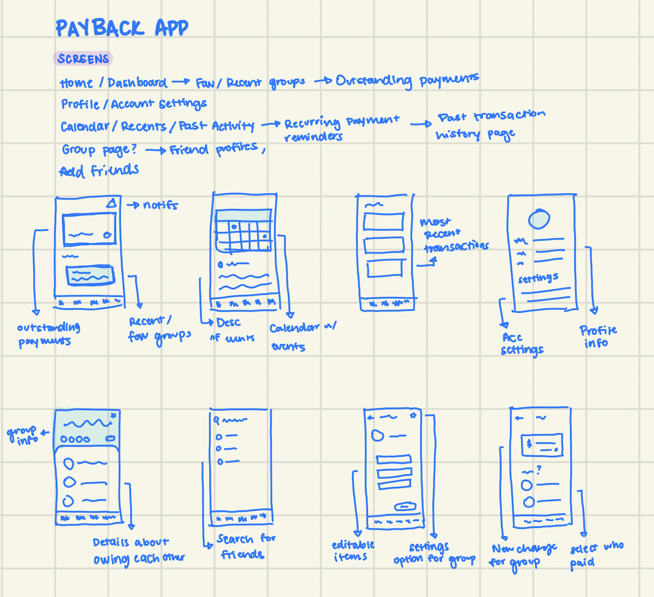
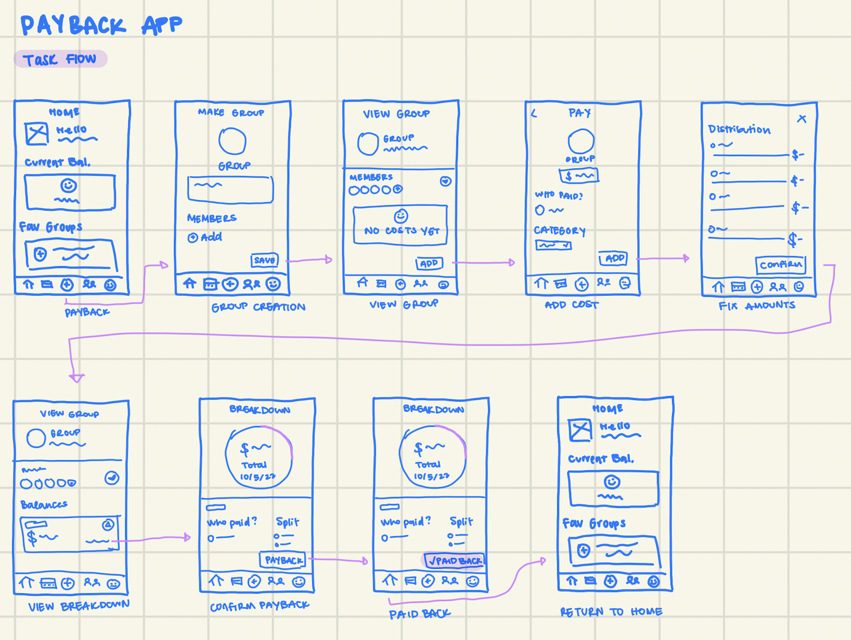
Initial sketches
Our initial sketches mapped out our core task flow, and drew upon our initial ideas for what we envisioned the app to be. This provided a good base to work off of with our low-fidelity prototype
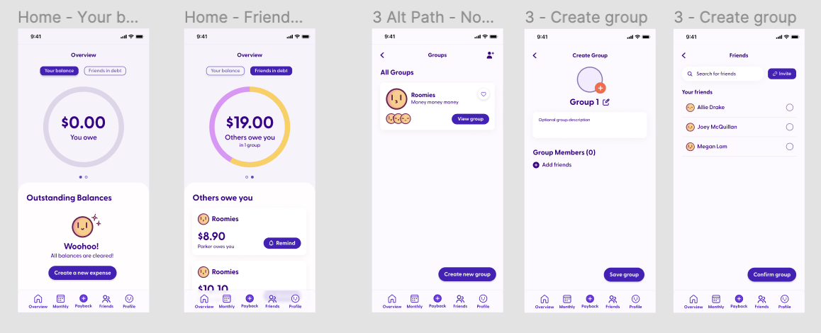
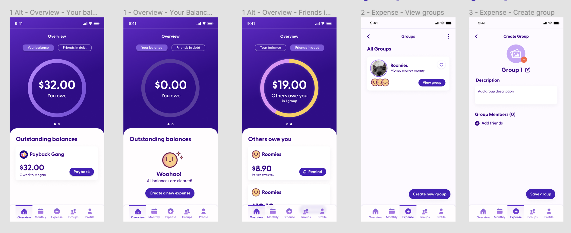
Low-fidelity
Based on initial wireframes and task flows, our low-fidelity prototype helped us discover a lot about which functions are MVP versus nice to haves.
Branding
Color connotations in products that deal with money or finances was a large area of concern for us. We wanted to ensure a fun and playful brand identity while remaining accessible. Because of this, our app leans away from the blue/green color palette you usually find in finance platforms. Additionally, we used a rounded typeface to visually represent this further. Our color scheme has been checked for color contrast, as well as tested for various forms of colorblindness to ensure accessibility.
Mid-fidelity
While we already had ideas for possible color palettes for our app, the mid-fidelity prototype was where color was first implemented. In these iterations, color was used rather sparingly, usually to draw attention to CTAs.
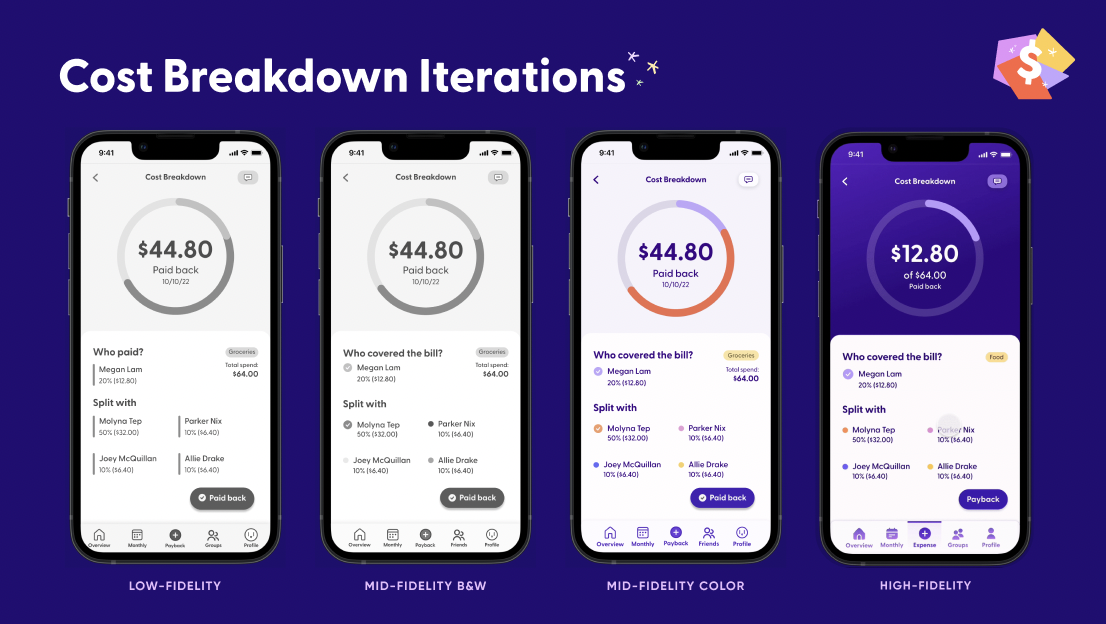
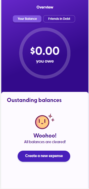
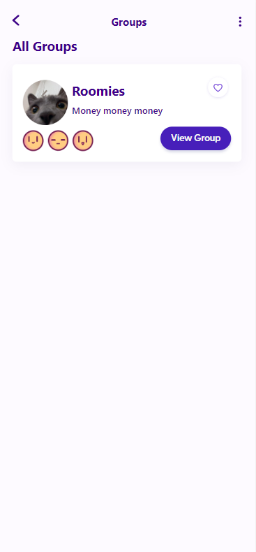
High-fidelity
In our final prototype, we changed our usage of color in order to strengthen our brand identity throughout the app. To help with user orientation, we also redesigned our nav bar to include obvious active states as well. From our usability tests, we also adjusted our category names to be more broad and cover a wide range of expense types.
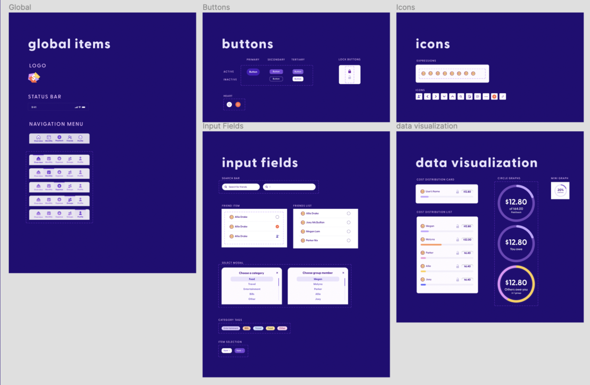
Design System
Our team prioritized creating a design system in order to ensure that our designs were consistent across all pages and to help automate our workflow. It includes component organization, typography usage, color guides, and guidelines for grids and spacing.
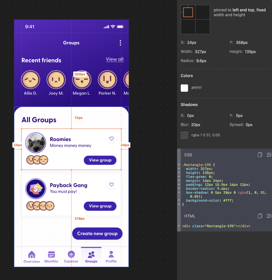
Dev Handoff
Instead of having our dev team searching through our design files, we used Zeplin as a centralized place for developer handoff. Zeplin has additional features that allowed the team to create pixel perfect coded prototypes based off of our designs. Accuracy of our front end was drastically improved by using the inspection tools that Zeplin provides.
Development
Tech
React.js
Chart.js
Bootstrap
Framer Motion
Front-end
When we started to get into the development of the app, building out each page came first. Parker took on some of the pages with more advanced features like the graphs, while Allie coded out pages that were largely static. Parker was also in charge of checking over all of the pages with Molyna to ensure that each was design-accurate as well as reviewing accessibility issues. We found this to be a helpful process that made sure that the front-end was clean and that any last-minute changes could be implemented on the spot.
Back-end
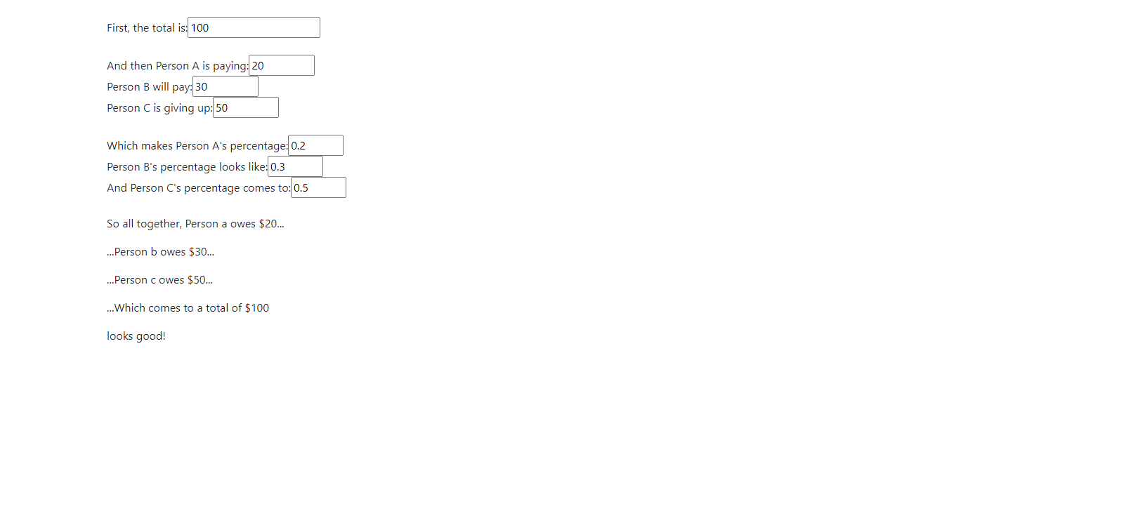
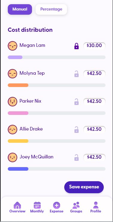
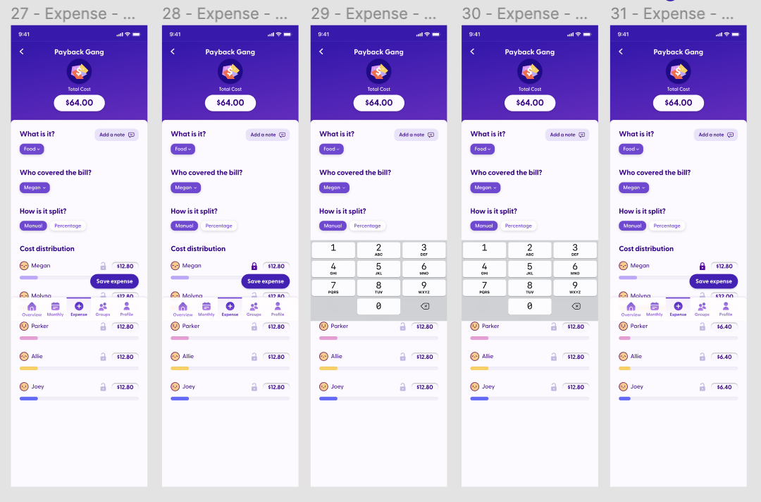
One of the first things we worked on was the calculations. Our initial prototype could split a total three ways and allowed the user to enter different amounts for each person. This prototype was later updated with new code with more group members as well as automatically recalculating after updating a number.
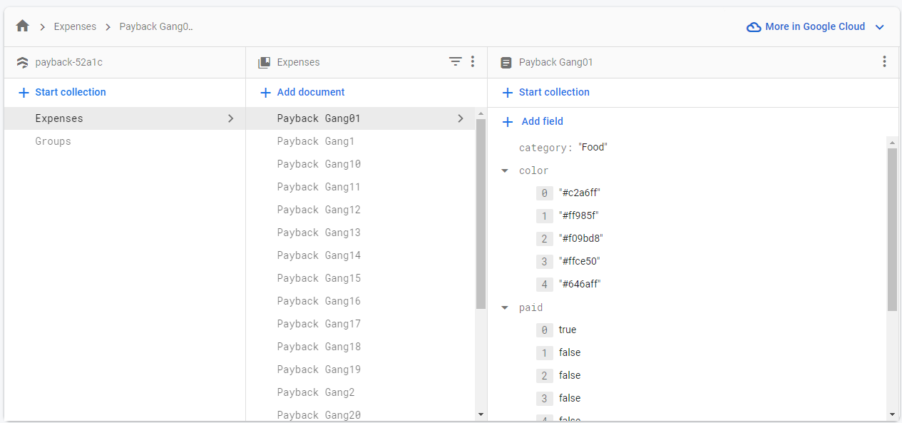
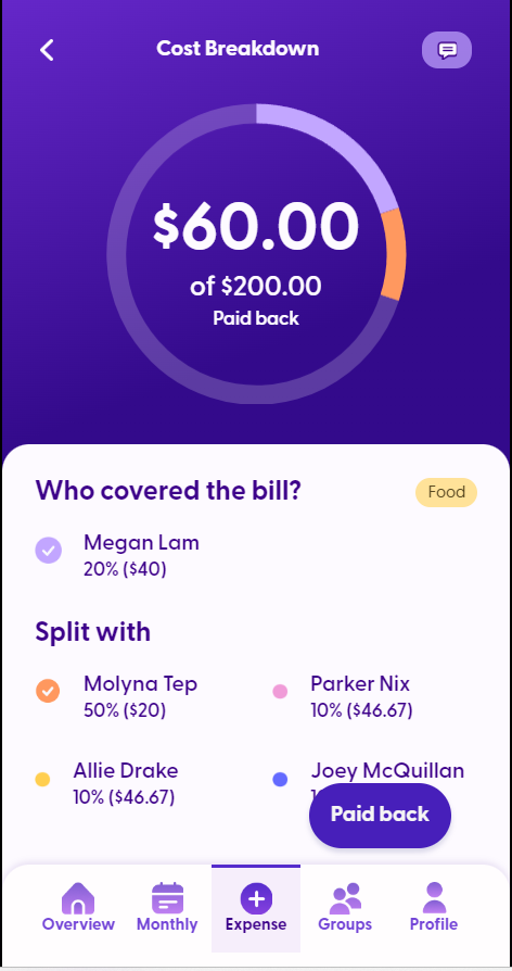
Creating and reading data from our database was another big focus for Parker during the back-end development. Using Firestore, we were able to create two large sections, one for storing expenses and the other for storing information about groups. While we had to forgo updating the groups section, a placeholder group in the database is referenced in the code to simulate how we could pull data onto pages, like the cost breakdown page.
Content
Language use
To enhance the friendly experience we wanted for our product, we used language and vernacular to reinforce our desired expression and tone. We opted for copy text that created a cheerful and inviting style. Through our usability testing, we were able to confirm that our updated copy boosted the user’s morale while using the app.
IxD Documentation
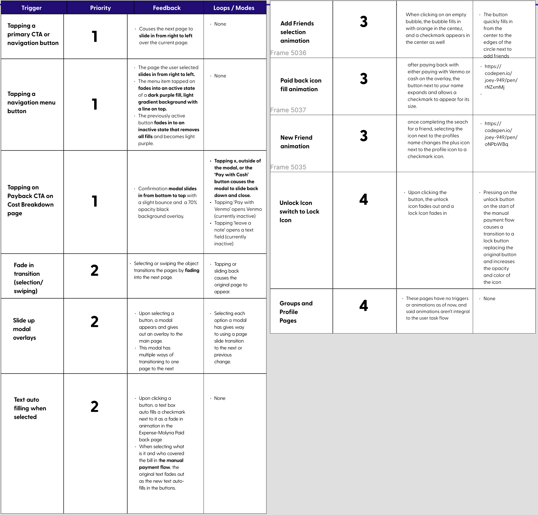
As the app has a variety of microinteractions included, we decided to create an interaction guide that would let the dev team know which functions were most important. Going through each page, we documented the triggers, feedback, loops and modes of every microinteraction. They were then ranked in order of most important to least. Although some microinteractions were built out, due to the lack of time it is not in the final prototype.
The Result
What we learned from this project is what tasks we could start earlier such as building the library, using Zeplin, and planning our coding sprints. We should have clearly defined the MVP scope early on as well. If we had more time, we would implement more functionality and microinteractions to the coded prototype.
Despite these shortcomings, we still believe our project was a success for the two terms we had to do it. Through extensive research, thorough design, and accurate development, our project was highly successful in meeting our initial goal. Over the course of 6 months, our team created a concept, researched, designed, and developed a mobile web app that helps users split bills with their friends.
Our designs cover a wide range of functions, expanding past the MVP and following standards to ensure consistency across all pages. Additionally, our development team built out nearly all front-end pages, and completed core functionality for the back end.