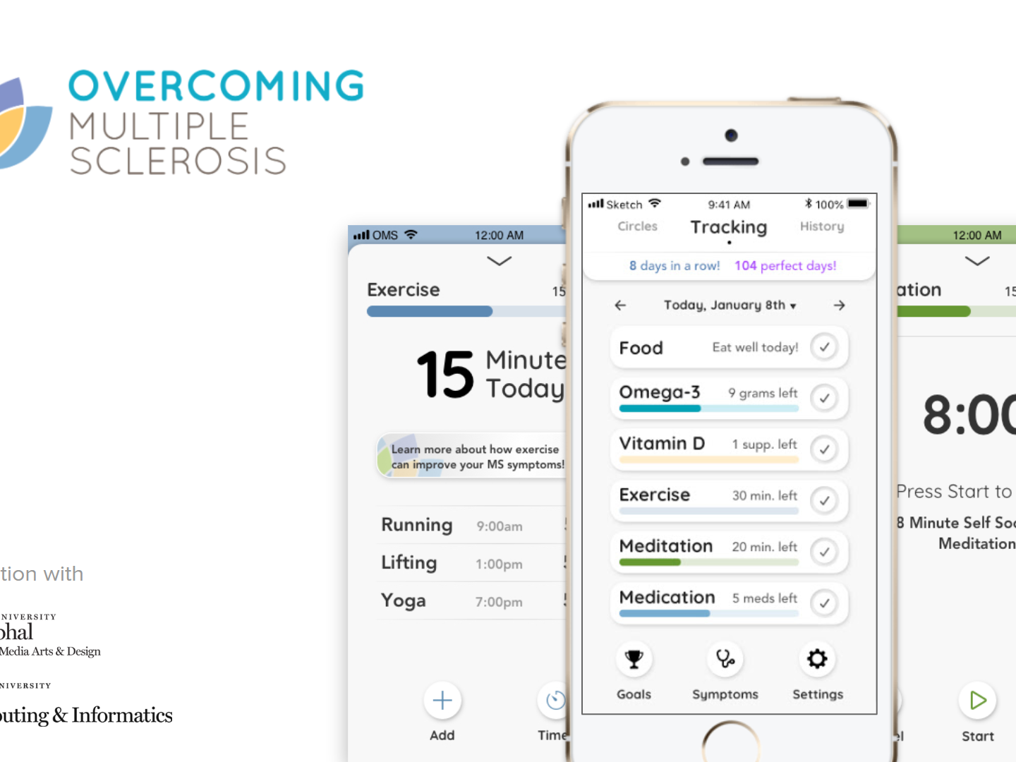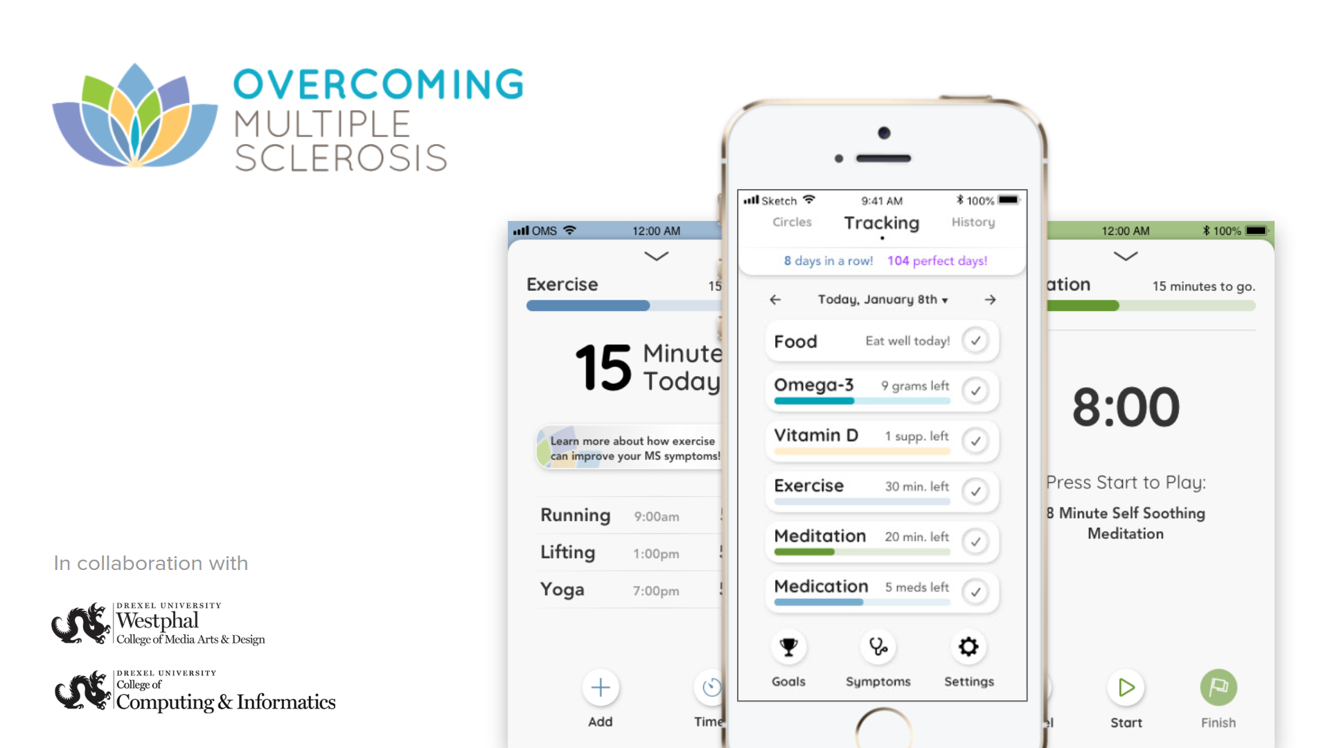

Overcoming Multiple Sclerosis (OMS) is a non-profit organization that provides a holistic lifestyle program to help people with Multiple Sclerosis (MS) live a better life. In the summer of 2018, OMS reached out to Drexel University to propose an app to compliment their lifestyle program. Our team took their initial proposal and brought it through our User Experience process to ensure that our developers were building the best possible experience.
PROBLEM
Living with MS can be difficult enough without having to change your whole lifestyle. While OMS has a robust holistic program for people with MS, it can be hard to adjust to. We aimed to create a motivational space where people could go to track their progress and educate themselves about the program.
GOALS
ACCOMPLISH
OMS provides 6 daily steps for people to follow in the program. The main function of the app is to allow people to track which steps they have completed and which ones they can.
EDUCATE
The first step of starting the OMS program is understanding it. Users need to be able to have a resource where they can either learn about or quickly reference parts of the program.
ACCOMMODATE
MS is a degenerative disease that affects each individual’s body differently. Therefore the app needs to follow Accessibility standards so that someone with any range of symptoms can use it.
MOTIVATE
One of the biggest issues with lifestyle apps is retention. We wanted to create a space where users feel encouraged to use without being punished if they cannot complete a step due to a symptom flare-up.


Through this, we identified two personas that would be key to feature development. The first persona was the new recruit. This person is new to the program and needs the most guidance, they are the primary target for the app. Our secondary persona was the experienced user. The experienced user is someone who has been following the program for at least five years, they know what works for them and how to do it. This group required less hand-holding yet desired tools to analyze how they were doing. Along with personas, this was the first step that garnered the four goals I mentioned earlier. We also garnered some interesting findings about what people are currently using, so we decided to take a look.
COMPETITIVE ANALYSIS
We identified several key categories that our participants struggled with and decided to take a look at the apps that they tried to use. For this, each of us on the research team used the apps we were assigned and reported back on them through a PowerPoint. These apps included lifestyle, meditation, and motivation apps.
LIFESTYLE
Our participants showed frustration with lifestyle apps like Gyroscope and MyFitnessPal due to their inflexibility and punishing demeanor towards missing input. I looked at these and also at Superbetter, which none of our participants used, but enough of them knew about it that it caught our attention.
MEDITATION
We also found that a lot of people were frustrated with their meditation apps. Upon using three different meditation apps, I and my research partner found that they were not very beginner friendly. The ones that were tailored for beginners though, were not accommodating to experienced meditators, specifically in the diversity of meditation. For reference, OMS recommends Mindfulness Based Stress Reduction (MBSR) meditations, while most apps only provide Mindfulness. MBSR is a special kind of Mindfulness meditation that focuses on relieving stress and attuning to the body. Unfortunately, due to time constraints on the project, we were not allowed to research much further into creating a more robust meditation feature.
USABILITY TESTING
The largest portion of the research fell upon Usability Testing. Of our seven phases of research, five fell under the umbrella of usability. Each phase of usability was for a specific set of features that were being designed. Our designers would send the research team their initial designs and we would conduct a quick Heuristic evaluation to see if anything needed to be altered before putting the designs in front of users. Once they were ready we conducted remote testing sessions using a mix of Invision Prototypes and Google slides presentations. Due to our crunched timeline, we only had time to test each feature once. If we were lucky we could test it again if that feature fell close enough to another to warrant putting it in the protocol.


FOOD HUB
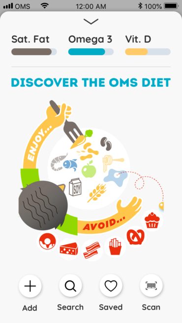
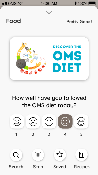
The Food Hub started as a place for participants to track how much Saturated Fat they were in taking so they would know to stop. This proved to be too confusing for the users as the Sat Fat bar on the Tracking Page counted down the amount that the user had left, while every other tracking bar counted up toward an objective. This made people think they needed more Saturated Fat. To address this we changed the metric to ask the user how well they felt they followed the OMS diet that day.
Additionally, the contents of the Food Hub needed to change. As we moved away from logging food to tracking saturated fats, we added more functionality to help people understand the program. The Search function became a way for users to check if something was ok to eat based on database tags. We also added a section to find recipes that fit the OMS diet, so that people would have a place to start when cooking for themselves.

HISTORY
Another major change to the design was the History section. This section started out as an Analysis, where users could go and see how they were doing on the program. It would tell that by comparing how well the user met their goals with how badly they rated their symptoms. This section soon became a catch-all for things that were missed. At one point this was the only section where users could go to add something they did on a previous day. Luckily we were able to sort out where to put the rouge features after testing the History section.
IF ONLY, IF ONLY
Though our process yielded a wonderful app, there were also issues that arose. Our biggest obstacle was our scope. Currently our team is looking for a development group to finish creating all of the features that the team designed for. We had to cut our History section, which would analyze how much of the program someone would complete per day, and show it against their symptom ratings. The research team specifically cut plans to research what our app could do to make the meditation experience better for new users.
IN CONCLUSION . . .
Overall the process was not without its bumps and bruises. For our Senior Showcase, we had to cut much of what we had planned for the final application, such as the circles and history, as well as the more comprehensive meditation feature. What we did complete though, was an app that we believe will help people who need it. Our team lived up to the challenge of designing and developing an app in nine months and we walked away better for it. The app has already won first place among all senior projects in Drexel’s College of Computing and Informatics, as well as within the Interactive Digital Media major. Here is what our client had to say about the work we did over the past year.
“Overcoming MS is a global nonprofit that educates and empowers people with MS around the world about diet and lifestyle changes they can make to improve their health outcomes. We had been contemplating the urgent need to develop a comprehensive smartphone app that would make it easier for people to adopt and stick to our evidence-based program, and fortunately for us, we were selected by an amazing group of Drexel University students as their senior thesis project. From the start, it was hard to imagine we were working with a group of students. The Design and Computer Science teams conducted the development process with unparalleled professionalism, dedication, and creativity.
The Design team dove into the complexities of MS, and the intricacies of the lifestyle changes that our program recommends. They conducted dozens of interviews with people around the world, from those on our program to medical professionals, in order to form a solid foundation on which to develop numerous iterations of UX and UI design that would most effectively accomplish the app’s goals of helping people with MS adhere to a wide range of lifestyle modifications. They collaborated seamlessly with the excellent team of programmers that comprised the Computer Science team, and who translated the front-end requirements into highly functional code. The entire effort was kept on track by super project management on both sides of the development coin. Throughout the process, the two groups worked together in close coordination in order to anticipate issues before they become problematic, come up with creative user-friendly workarounds, and ultimately produce an app that will undoubtedly make a positive impact on thousands of lives.
We at Overcoming MS were thoroughly impressed with the entire team’s performance and commitment to the project they had embraced, and we are ever grateful. We were not working with students; we were working with young professionals whose contributions went well beyond a student project. We would happily offer the highest reference for each and every member of the team, and we know an employer who hires any of these 11 amazing students will quickly see the extent of their talent and know-how.”
–Alex Twersky, Global Marketing & Communications Manager for OMS

