
The Overview
Through several weeks of user interviews and countless hours of research, our group developed and tested, a food ordering app for the NY Famous Gyro Halal food cart on Drexel’s University City campus.
Our team focused on creating a seamless and easy to use user experience that would allow for quick food pickup and tracking. Since this was our first user experience project as a group, we spent several weeks learning and practicing some UX skills before we set out to research and begin the development of our app.
As proud designers, we used the branding of the Halal cart as an inspiration, we came up with some design principles for the cart to incorporate into the app. This was to create a look and feel that was not too distant from the physical experience of ordering at the cart.
Finally, with broad and extensive research, we not only were able to come up with a good application but also learnt a great deal about the design process, how users think and interact, and how intense, exciting and interesting the entire task is.
The Context and Challenge
Background / Description: We were given 10 weeks to complete our project. The purpose of this project, is to learn the research, interview, and design processes that goes into the development of a digital product for a business. The business we decided to work on, was the NY Famous Gyro Halal food cart next to the W.W Hagerty Library on Drexelís campus. As a group, we strived to meet at least once a week, where we compiled ideas, discussed research findings and designed prototypes. But we also worked individually, doing some usability testing and other design focused exercises.
Goals & Objectives
Every week with our ever improving prototypes and wireframes, we interviewed groups of users for their feedback on the layout and design of our app. We recorded their feedback via video recording to be able to pinpoint aspects of the screen their thumbs struggled with and some other intuitive decisions they made in silence; the other records were taken through Google Forms. The most tangible goal of our app was to simplify the user flow so that app users would have an easier, and simpler time with ordering food.
In effect, our goal to provide a simple means of food order and pickup through our app hinged on how well we incorporated our findings and user feedback in its design.
The Process and Insight
Our process started with the basic collection of the Halal cart’s information followed by model exercises to find the most important aspects of both the cart’s identity and the food ordering process as a whole.
With each exercise we completed, we gained insights into bettering our application. Those minor discoveries, which led to major and minor tweaks, compounded over the 10 weeks is what we are presenting to you.
In the beginning, we focused on research, where we interviewed and conducted exercises, such as a fly on the wall, to really dig into some of the flaws of the business and what our app should be working on improving. With enough information, we then moved on to working on wireframes and usability. As our wireframes and user flow began to solidify, we developed low fidelity prototypes and gradually began including aesthetic design elements and micro-interactions, till users were satisfied with the digital product they were interacting with.
Research
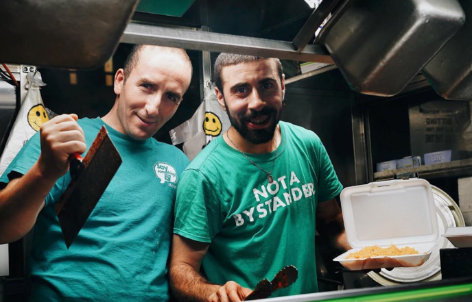
We began our research process by talking to the gentlemen who worked at the food cart, we introduced ourselves and the project we were embarking on to establish a working relationship. And then we began to collect other basic data such as its menu, prices and contact info while discussing with the gentlemen their experience working at the truck, customer relationships, busy times, how they track their sales, etc. more indepth. We needed to do this to better understand its business model and intentions, that way we knew what was a priority to them and what wasn’t.
From the collection of the cart’s important information, we moved onto a ìFly on the Wallî exercise that focused on gathering notes and observations of how consumers interacted with the Halal cart in person. This is the stuff that the business owners were unaware of. We noticed that no order would take longer than about five minutes, and most interestingly, only one person we recorded ordered more than one dish at a time.
Next we focused on the Project Canvas which helped us identify the scope of this project. We listed the goals of our app, the users that would use it, benefits, as well as the constraints, deliverables and risks we would be faced with during the completion of this project.
| Users | Benefits | Constraints | Deliverables | Risks | Goals |
|---|---|---|---|---|---|
| College Students | Increase in sales | Feasibility of the app | Research of App / Business | Maintaining Application | Lower Customer Wait-Times |
| University Staff | Better customer relations | Has to be a Mobile App | User Interviews and UX Testings | Drexel Break Schedule Unaligned with Halal Cart Times | Increase in Customers |
| Construction Workers | Improved business presence | Time constraints | Flinto Prototypes | Only a Single-Truck service App | Educate Users about Halal Cuisine |
| Nearby Business Employees | Avoid Communications error of Orders | Must use Flinto for Prototypes | Final Presentation | Cost of the App | Improved Sales for Business |
We listed college students, staff, and local construction as users for our app. The most obvious benefit of our app would be in increase in sales for our client, as well as more people becoming familiar with Halal foods. One of our most prominent constraints was the fact that we had to use Flinto for our app. This limited our potential user testing due to the fact that not everyone has Flinto usable devices such as iPods or iPhones.
The next project we worked on was the 4Cís, which comprised the Components, Characteristics, Challenges and Characters involved with our client and our app.
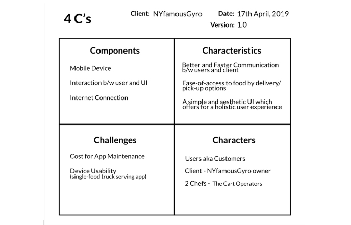
As we already knew, it would be on a mobile device that focused on an easier time to order and pick up food from NY FAMOUS. Our Characters were the users and customers, our client, and the chefs. The Challenges would be the cost for App Maintenance in case the app would become real. We also performed a Business Model Canvas to establish the infrastructure, offerings, and customers of the Halal Cart, along with their potential revenue streams. This helped us rationalize the key suppliers, owner and his key activities to provide his consumers with his Halal foods.
We realized much later that this information did not all contribute to the final design of our app but was helping us become better at understanding business structures and how designers could potentially use such information to draw realistic budgets, and also discuss the feasibility of some of the ideas the business may want to enact.
With the statistical data out of the way, we moved onto putting ourselves into the user headspace and began to focus on the beginning and growth of the actual app layout. Each of us created individual mood boards to get the visual feeling of what we think makes our cart unique. With each persons’ mood board taken into account, we generated a unified mood board to truly encapsulate the mood of our client.
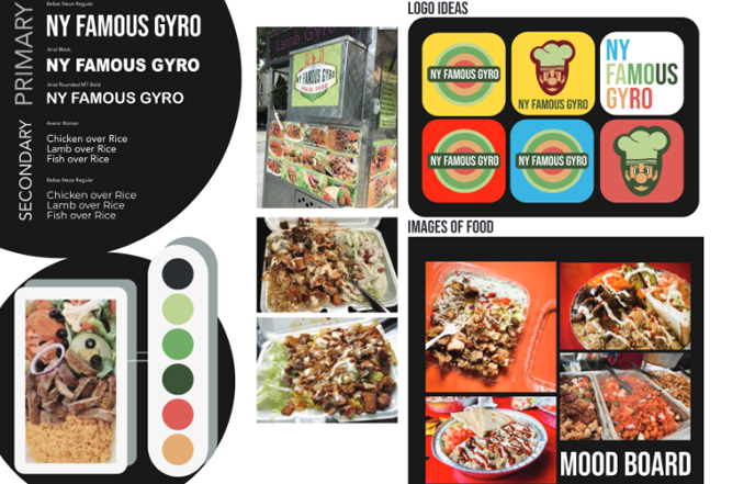
The overall branding of our client was lackluster so we wanted to improve their presence on both campus and the food truck community. Their food cart is heavily overpowered by a mass of images which some are larger than others with different levels of quality. This causes a feeling of lack of consistency and we wanted to fix this. In our app, we kept our images, fonts and colors consistent throughout the different pages. From here, we began a very important step in our research. This was our affinity map which was an exercise that we used in an analysis to discuss potential ideas to incorporate in the design process. This is also around the same time that we sketched 200 unique page layouts with ideas for fonts, colors and interactions.
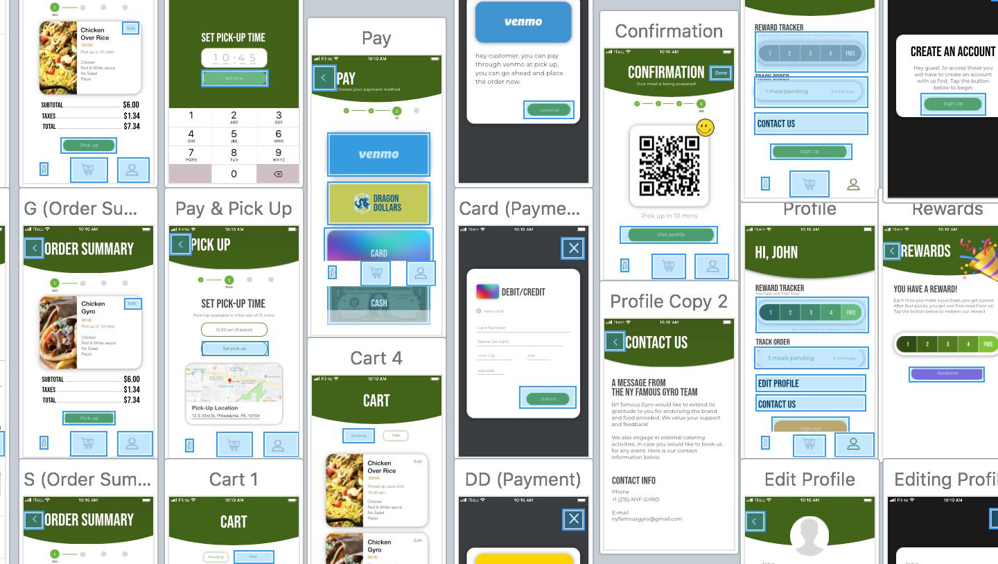
Task flow (Build your meal)
Our research revealed that the entire process of ordering halal, involves building your meal. Customers say what they want and the cook prepares it for them. This is what made our app unique from all others and we wanted to capitalize on that. From our sketches, mood boards and affinity map, we developed a user task flow that we tested with many users.
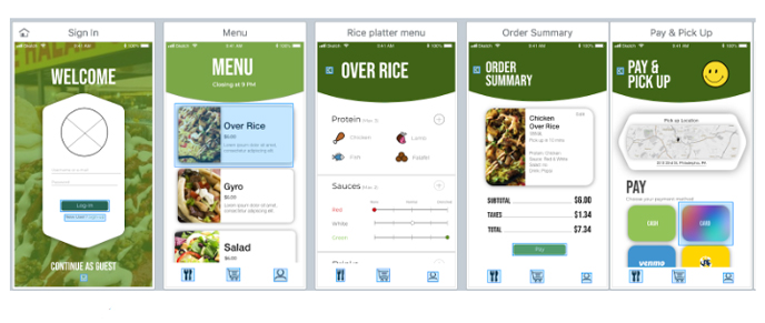
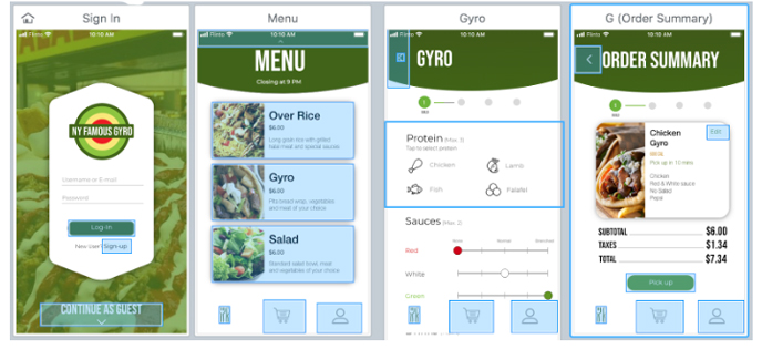
The ordering process is as follows: Users select either rice, salad, or gyro as the base for their meal. After selecting a base, users are prompted to select their proteins, mention the sauces they want, choose their payment method and their beverage option.
We used this same structure but went on to give users more control. We incorporated a slider in our design that allowed users to give cooks more insight into how much sauce they wanted. This is something a lot of customers complained about. We also added a checkout feature, including multiple payment options (dragon dollars, venmo, card and cash). After completing the order, users are led to a checkout along with a tracking option to check on their order progress.
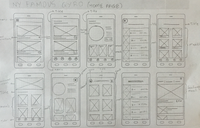
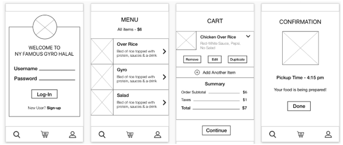
From our initial wireframe, we created a physical paper prototype that was used in place of an actual example of our app. From interviewing users with this paper prototype, we revised it and used what we learned to begin a low-fi prototype of our app in Sketch and Flinto. The low-fi app layout featured only basic information and was restricted to black and white outlines of the layout. Our user flow in our initial prototype was rough and our users referenced that upon interview. Our menu layout was not as smooth as we nor our users wanted, so we improved on the design in our mid-fidelity prototype. From the mid to high-prototype, we added our final design elements and colors to further improve on the user experience. Our users enjoyed the changes to our menu layout. Those changes were larger images, less clicking and searching, and the hints of colors added. This initial low-fi prototype was followed by weekly interviews with users and furthering our prototype from low-fi, to mid-fi, to finally a high-fidelity prototype with all the colors and photos we needed.
The Solution
Our final design features a green monochromatic scheme with rounded edges around our images and buttons. Our main reason behind our heavy use of green is due to how our cart is designed. We wanted to echo our cart’s identity in our design and used large images with a greenish background just like the cart. Our users’ experience is also based around how our client’s card operates. With a smaller menu, we wanted to make sure our app did not feel over cumbersome and kept ordering as simple as possible, but also not lose any customization options. Our app features tracking of orders placed in response to our intended demographic. The tracking of placed orders are perfect for students between busy college classes and for staff members who may not have a very long break time. Our navigation structure is based around being as seamless as possible with a focus on keeping the user flow smooth. We wanted to ensure that no part of our app was confusing or misleading.
The Results
Overall, the project with our completed app was a success. Using all of our hours of research, experimentation, and informed decisions, we have put together both an easy to use and fun app. Each week dedicated to research and prototyping brought us closer and closer to our final iteration of our Halal cart app. If we have the time, we plan on showing the completed app as a proof of concept to the Halal cart owner to see his reaction to our progress over these weeks. Taking into account all of the different ways of research, interviews, and projection we have done, we can safely say that these methods of research will be invaluable to both future projects and workforce.