The Team
- Brianna Buissereth
- Erik Martus
- Beck Rivera
- Ben Schennerman
The Problems
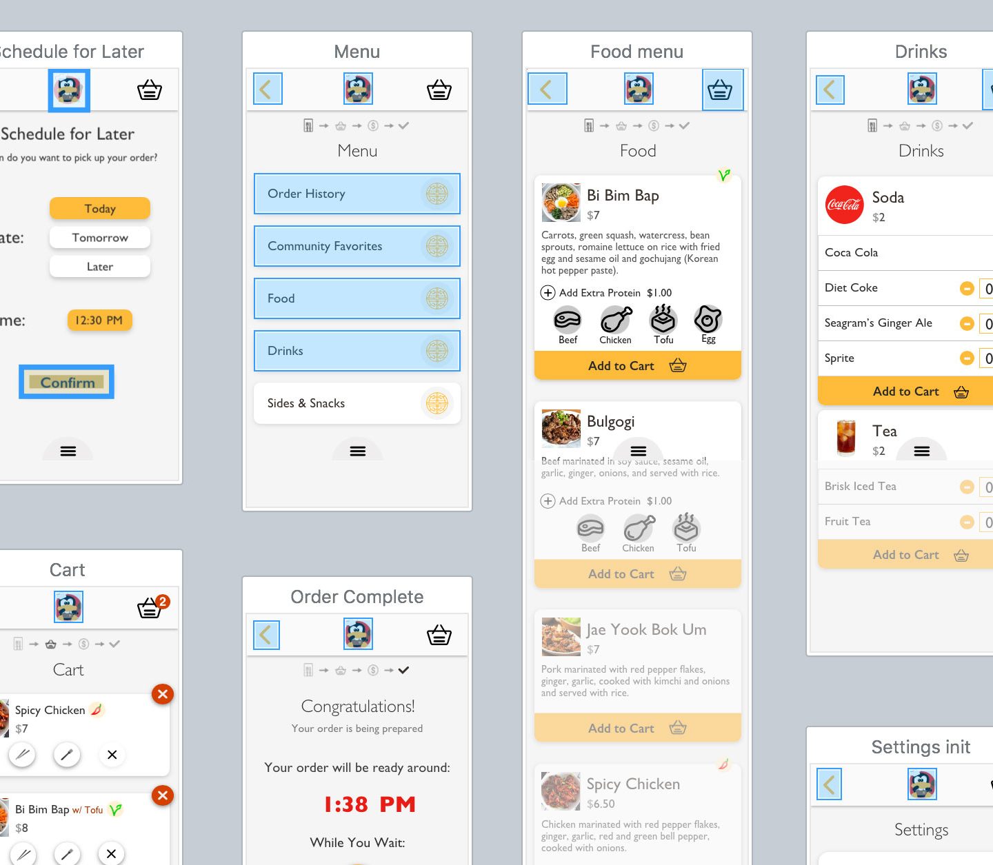
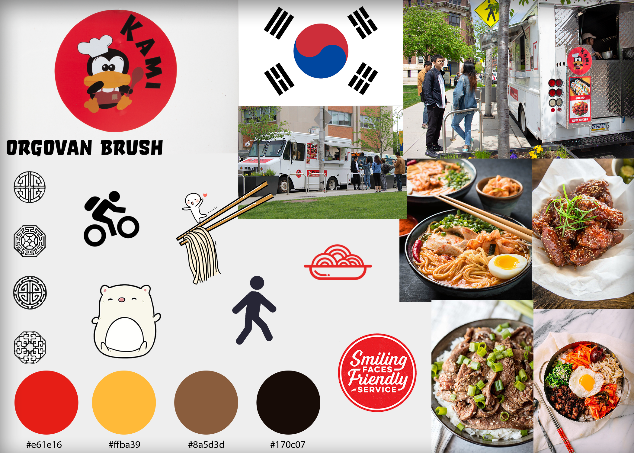
We were tasked with the problem of creating a mobile app for a pre-existing food truck on or near Drexel’s campus. Our challenge was to create a unique mobile ordering process that was fast and simple for users to understand, but still kept all original brand identity of the initial truck.
Going into the project, we all knew that we had weak points we wanted to develop, so we decided this would be a great opportunity to practice those skills. Though we all did a bit of everything, our team had a single dedicated person as the Project Manager, Visual Designer, Information Architect, and UX Researcher.
The initial question we sought out to answer was “How do people interact with Kami?”.
Research
How do people interact with Kami?
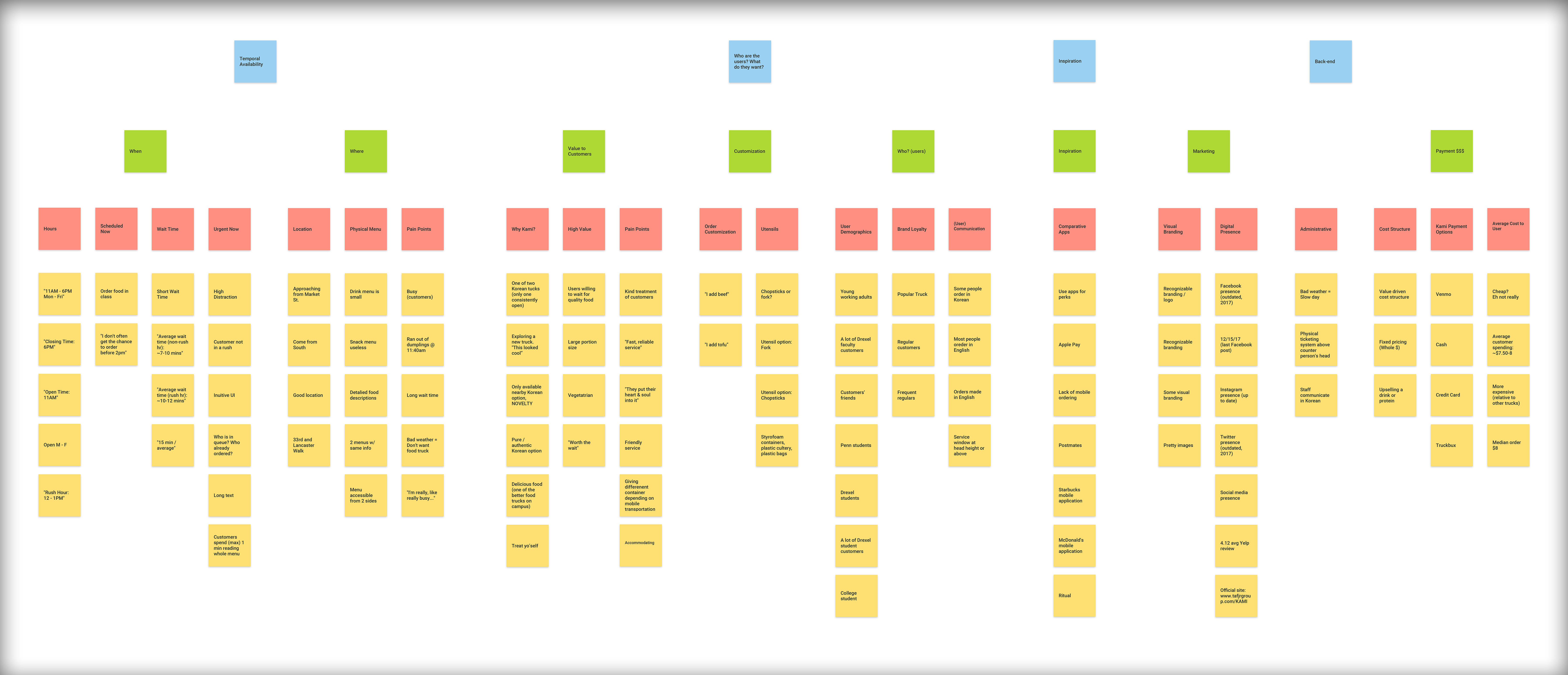
We began researching how people interact with Kami by gathering data while people ordered at the truck, utilizing techniques such as the “Fly on the Wall”. We discovered useful data such as average wait times, group sizes, and median spending. We observed unique interactions such as the customers’ choices between chopsticks or a fork and packaging dependent on the customers’ modes of transportation.
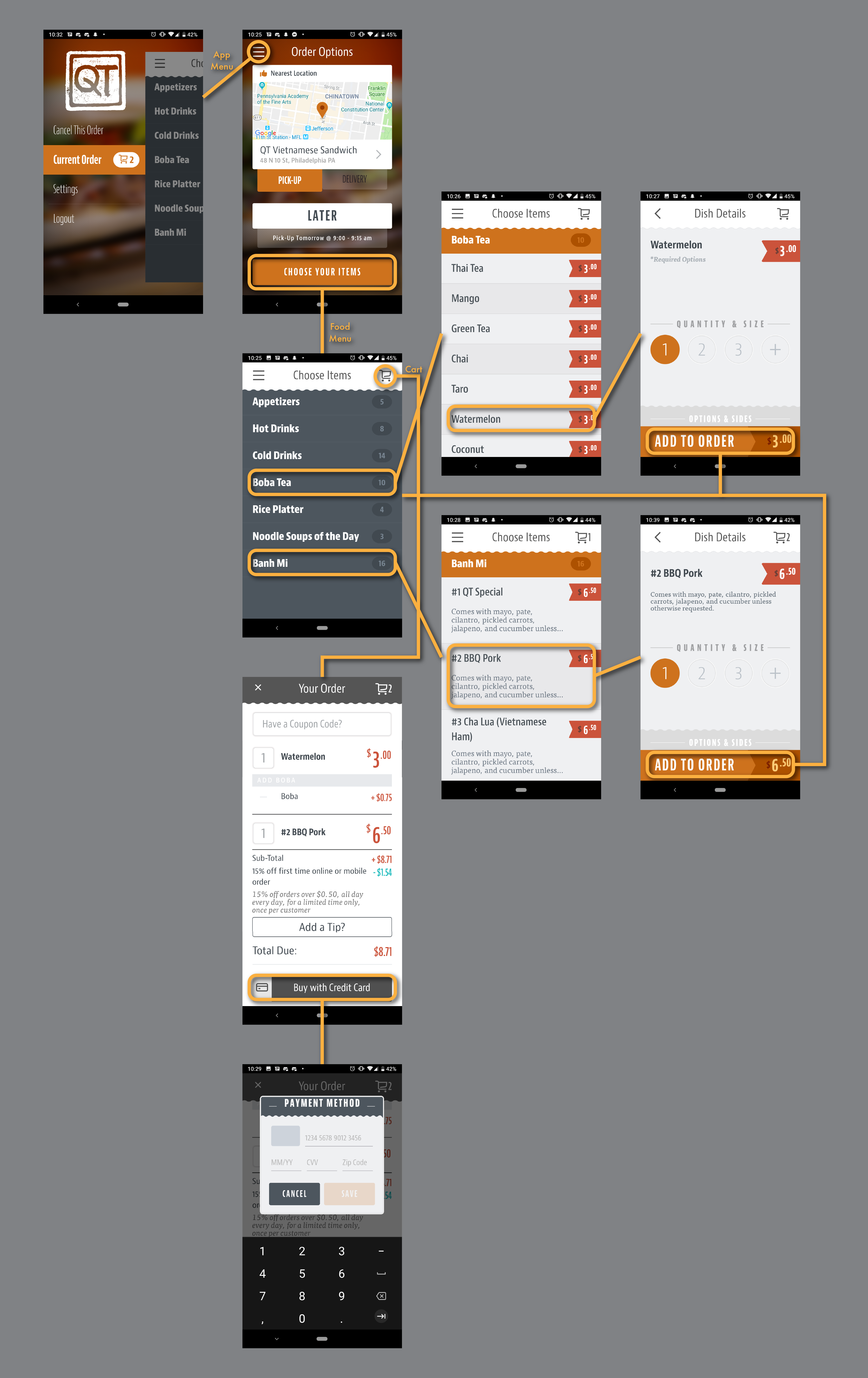
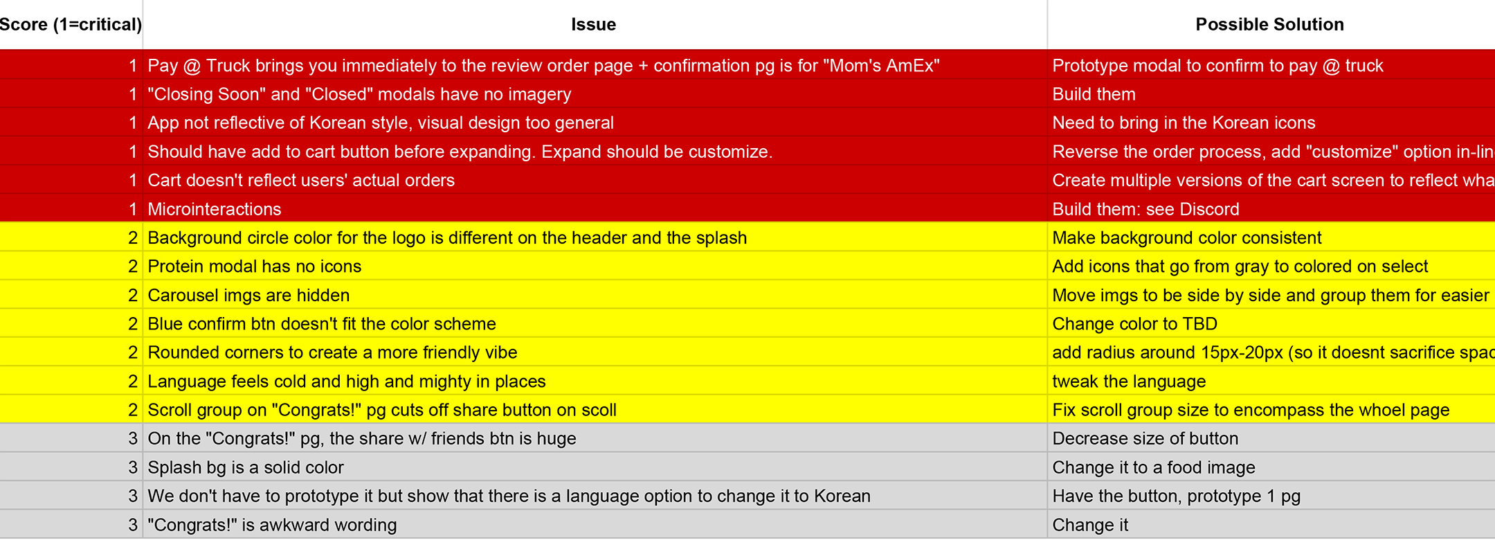
After sorting through business analysis and our interpretations of existing user interactions, we discovered the two most important user task flows which needed perfecting in the digital space. These task flows were ordering food, and re-ordering food.

Workflow
Ordering Food
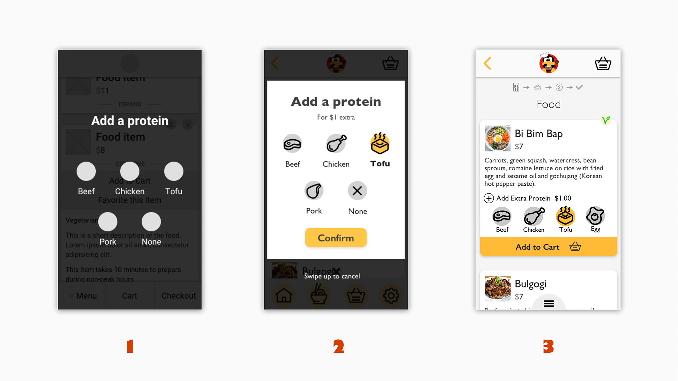
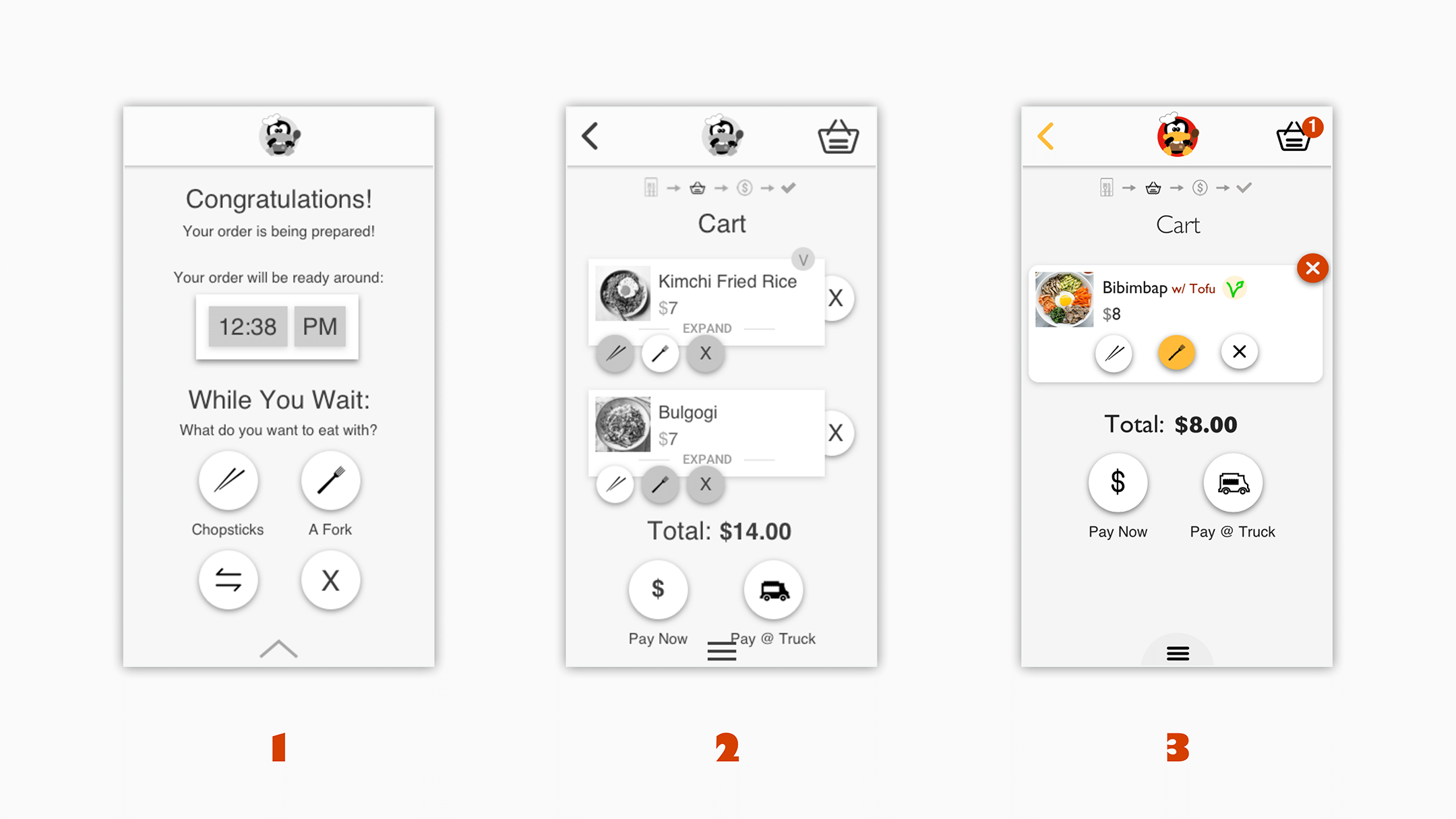
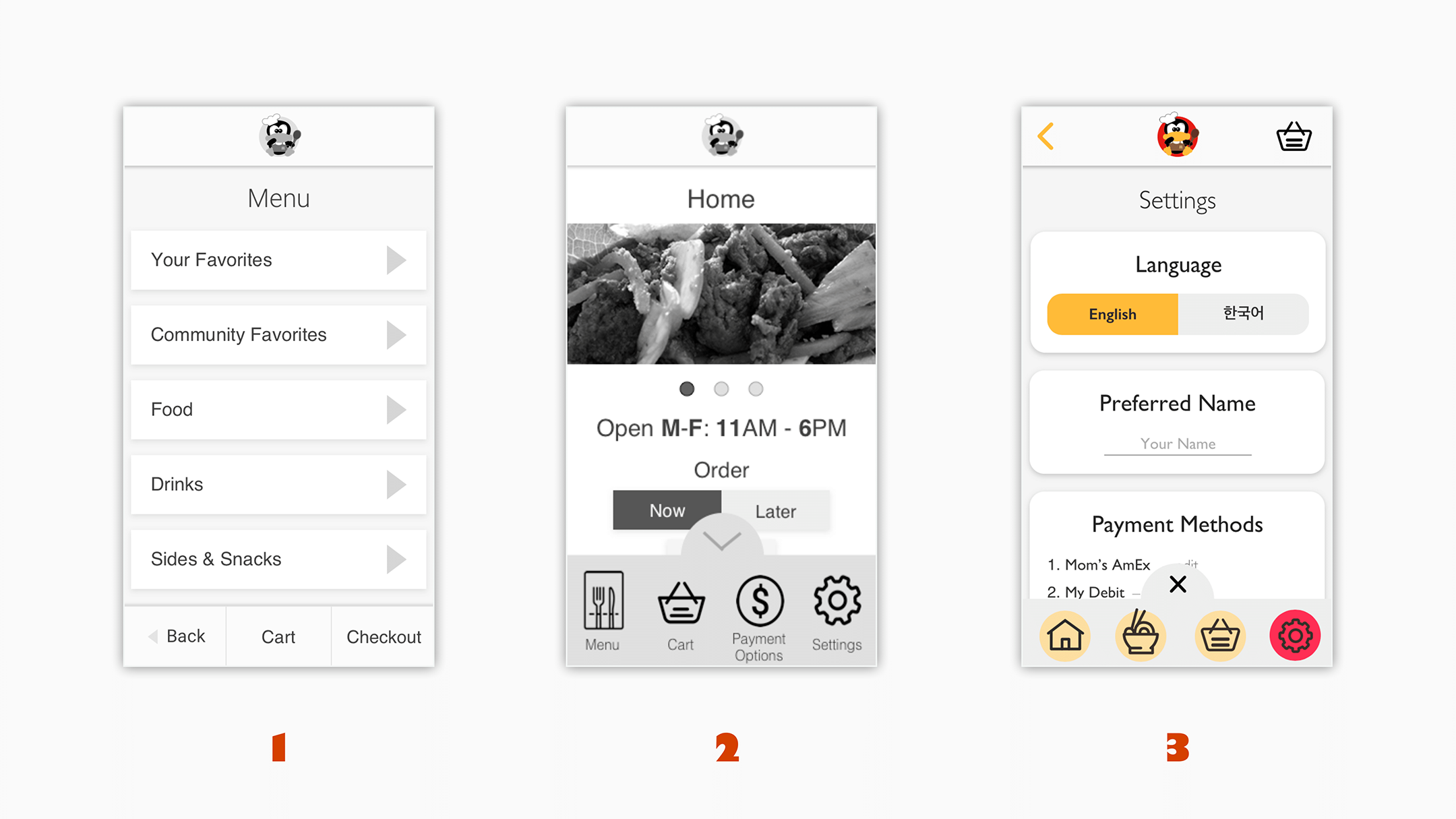
The primary workflow we focused on was the ability to order food as quickly as possible and with as little friction to mirror the experience at the truck. The primary issue and pain point of the ordering process was the wait time during peak operational hours which would sometimes be between ten and fifteen minutes, which wasn’t ideal for someone grabbing food in between classes or appointments. By creating a rapid order process, users would be able to place their order at the end of their previous engagement or as their are on their way to the truck, and then minimize the time they are waiting at the truck. Ultimately, our design was streamlined to the point that an experienced or returning user could easily complete an order in less than one minute.
Reordering Food
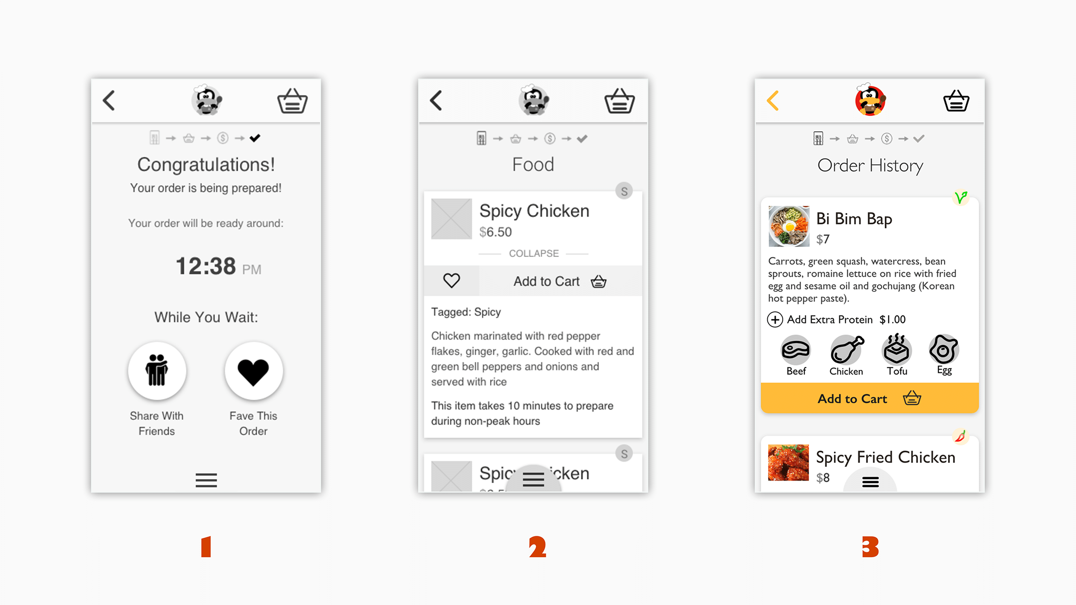
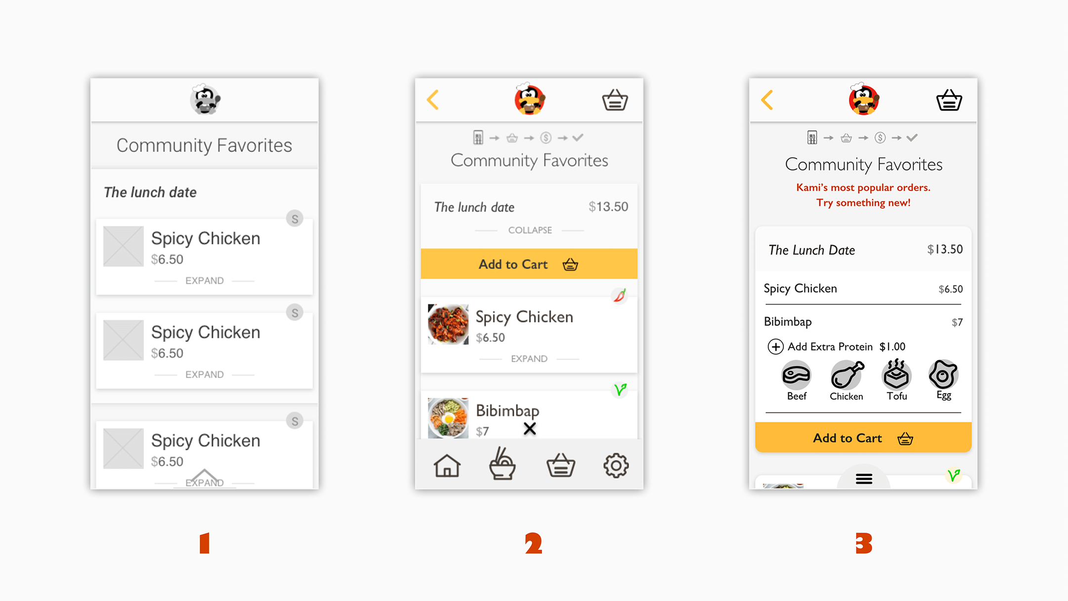
The secondary workflow we focused on was allowing users to easily reorder their favorite items. Initially, we had built out a favoriting system as part of our menu. However, after feedback from our users they essentially said that it was a good idea in theory, but in reality it was useless since the menu was so small anyways. As a result we scrapped the favoriting system for an order history that would give users quick access to their most recent mobile orders. This system would still allow for users that often order the same thing to quickly order that item or entire order while removing the extra workflow of having to manually save an item or an order.
Solutions & Takeaways
Realistically, Kami, as a business, would not benefit from an app, however, the app we delivered sped up the process of ordering and would provide a real benefit to users and as a group we learned a lot along the way of producing the prototype. For all of us, our biggest take away was to realize that in reality we cannot stayed married to our ideas no matter how good we think they are. We may think that we know what’s best for the user, but the user always knows what’s best for themselves. Individually, we were able to focus in on what we considered to be our weak skills and ended up greatly improving upon those skills thanks to the insights provided by our group members.

