Daytrip Team
- Molyna Tep (Project Manager/UX Designer)
- Megan Lam (UX/UI Designer)
- Tynan Drake (UX/UI Designer)
- Allison Drake (UX Researcher)
- Parker Nix (Front-End Dev)
- Kyle Dolphin (Front-End Dev)
- Andrew Stein (Back-End Dev)
Context & Challenge
Background
Daytrip is a new app designed for friends to plan and enjoy trips with minimal stress and enhanced discoverability. Our app integrates collaborative trip planning features, flexible itinerary creation, and robust route details to ensure a seamless day trip experience with your friends in the palm of your hand.
This project was completed over 10 months, relying on our team’s individual skills to research, design, and develop the interactive web app.
Goals
- Conduct research to understand and establish a target audience for the app while analyzing current competitors within the market.
- Design low-, mid-, and high-fidelity prototypes of the app and collect user feedback to inform design and user flow iterations of the app.
- Build a comprehensive design library to ensure seamless handoff to the development team.
- Develop a working web app for the project, prioritizing MVP functions and integrating key APIs.
Problem
Many travel apps exist, however, the current offerings fail to provide a satisfactory planning experience, especially when accounting for group travel. They are often too bogged down with features, focused on selling hotels, curated trips, plane tickets, etc. rather than the overall experience itself.
Process & Insight
Research
Competitor analysis to see what other apps were missing
We researched multiple apps such as Visit a City, Google Maps, Wonderlog, Roadtrippers, and Lonely Planet. We found these apps far too cluttered with features which made them frustrating to use. We knew we wanted to simplify the trip planning experience all in one app.
Brainstorming user needs
We held a group ideation session to make assumptions about what our users want from our app. From our ideas, we were able to make our initial survey and interview questions to see if our assumptions were true or if we needed to pivot.
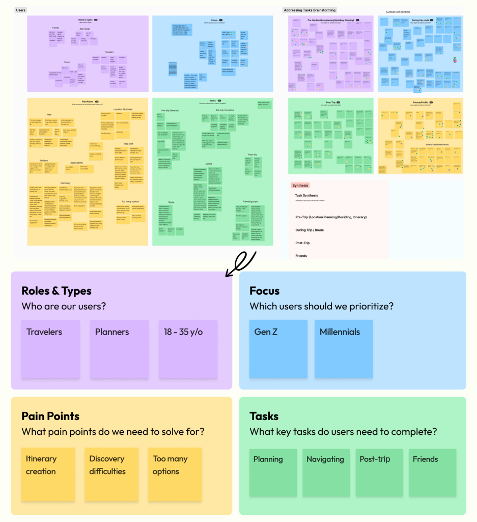
Initial interviews and surveys led us to focus on collaboration
Conducting initial interviews and surveys was essential in understanding the behaviors and experiences around planning and going on day trips with others. These interviews also gauged user interest in the product idea and helped to inform our initial design concepts when thinking about MVP features. We discovered that 88.1% of our 101 survey respondents planned with friends. We initially planned the app to be used by a single person but research caused us to pivot towards collaboration and all of our competitors lacked the collaboration aspect as well.

Our target audience and main archetypes
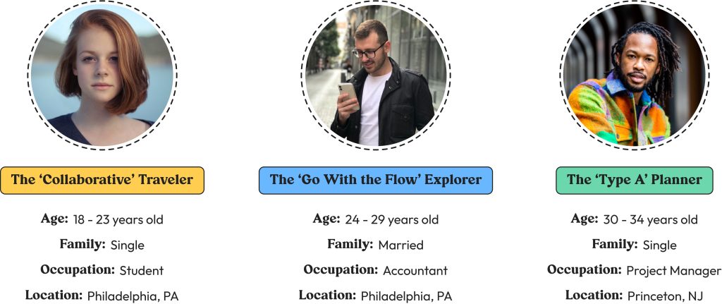
Determined by our potential feature set, user interviews, and distinct planning behaviors, our target audience falls between the ages of 18-40.
Design
Determining functionality based on users’ planning behaviors
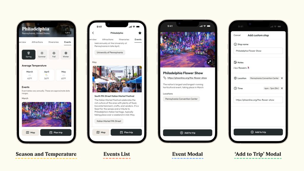
Events Tab
When visiting places they are unfamiliar with, our users expressed an interest in wanting to understand more about the destination before deciding on their activities.
We highlighted seasonal activities on this page and included weather trends to help fill their knowledge gap.
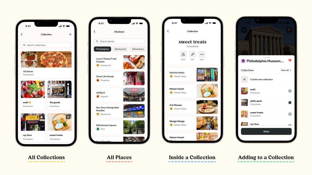
Saved & Collections
Our research shows our users would often make lists of alternative locations and other places they might want to visit. Our Collections feature accommodates this behavior by allowing users to save places and organize them however they’d like.
Creating solutions to accommodate our archetypes
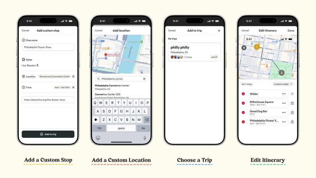
Custom Stops – The Organizer
We knew that the Google Maps API would not cover the entirety of events our users might be interested in. By allowing our users to create custom stops, they can incorporate their social events like concerts or birthday parties into their itineraries.
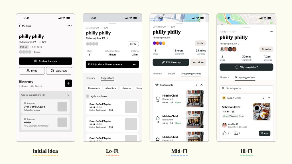
Group Suggestions – The Collaborator
We heard from our younger users that they were more likely to plan places to go with their groups, and one person would build the plan based on their suggestions. Our group suggestions feature allows our users to contribute to these plans, even if they are not the ones organizing the trip.
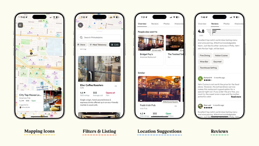
Maps Exploration – The Explorer
While our Explorer archetype might not be interested in building out full itineraries, they still liked being able to discover new locations they could potentially visit. We heard from our users that they would often scroll around on the map and save interesting places, so we included this map interactivity in our app to account for this behavior.
Establishing a key focus on collaboration
Group Suggestions
The collaboration aspect of Daytrip was crucial so we had to ensure our users understood this feature. In the original designs, the tab was titled ‘Suggestions’ but lacked clarity on where these suggestions came from so we renamed it to ‘Group suggestions’. We also categorized the places into accordions for easy browsing and allowed users to like or comment on each suggestion. With these updates, our users had very positive responses.
Itinerary
Through research, we learned there is a leader who creates and manages the entire itinerary. Other users in the group are not allowed to edit to ensure the trip stays organized, but they can view it. There are also comments on each location so everyone can keep track of what they may want to do there. This was a common feature requested by users.
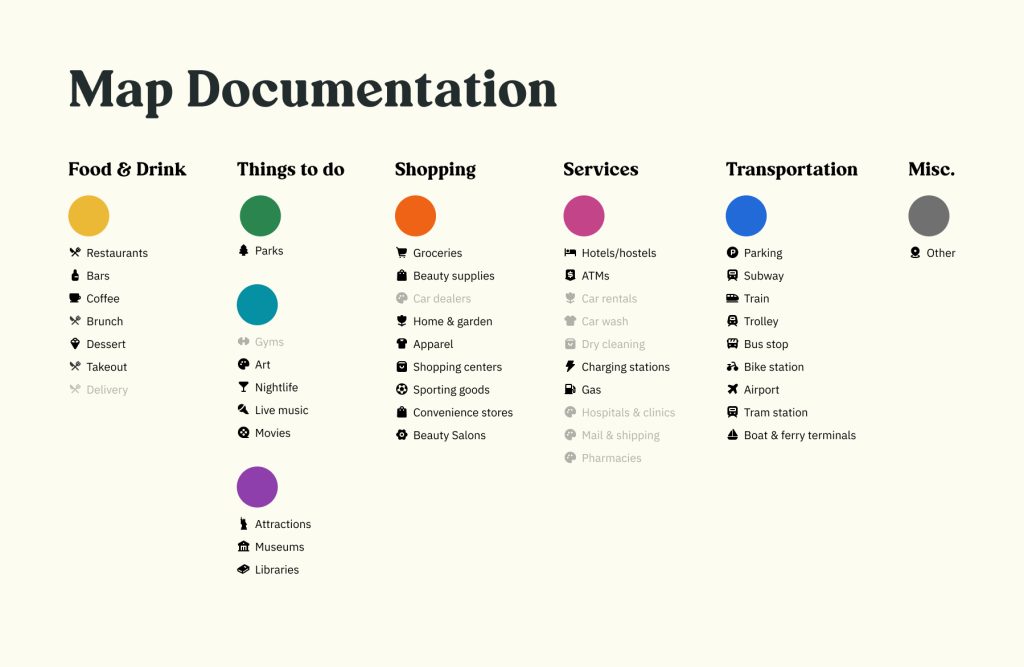
Using color semantically to represent activity types
Each map color within our app correlates to a certain activity type, shown through our icon set.
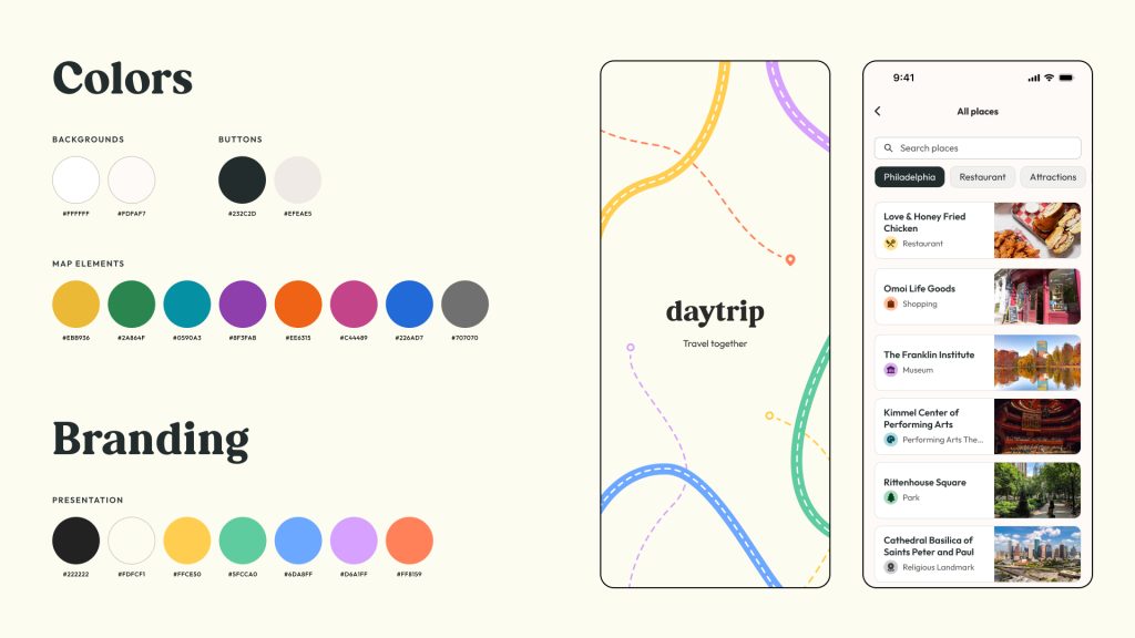
Prioritizing usability through simplified brand identity
To keep the focus on the users’ core actions, we pulled back on heavy branding throughout the app, mainly focusing on the use of limited color and type. As color is also being used to convey various activities, our brand uses a dark neutral color to signify visual hierarchy through value rather than hue/saturation.
Development
Researching technologies
In the early stages of development, we needed to learn the possibilities of the technologies we had and the difficulty of developing each feature.
Documents created included:
- An accessibility report on how to keep the app accessible on mobile devices
- Developer FAQ document with questions and needs from the design team
- API reports to figure out which ones we needed to supply the information.
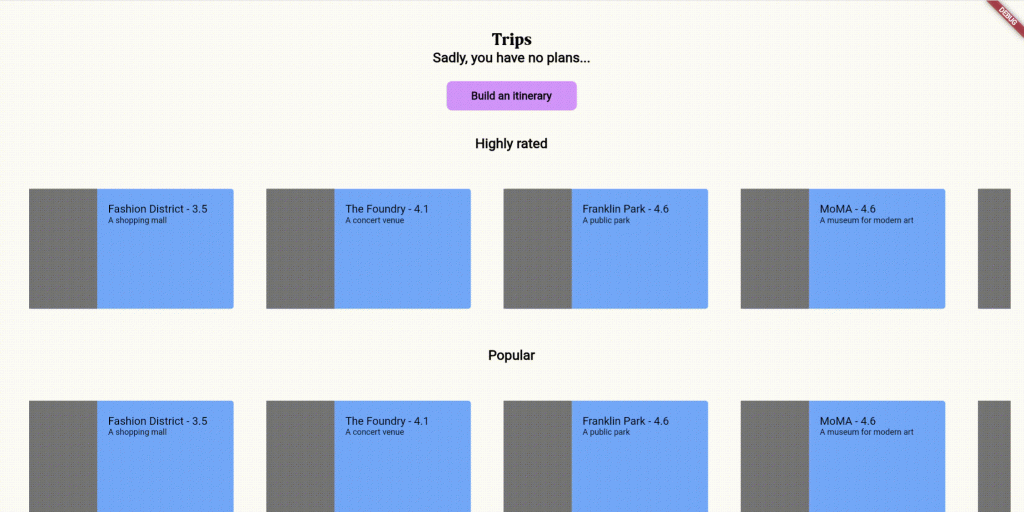
Prototyping and learning Flutter
We used Flutter and Dart to create our app as it provides the most flexibility in coding native apps. However, two of our developers did not have experience with this tool. They took time to learn how to code in Flutter by reading the official documentation and creating prototype app pages while another developer started building out the database.
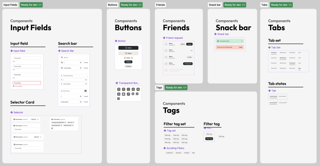
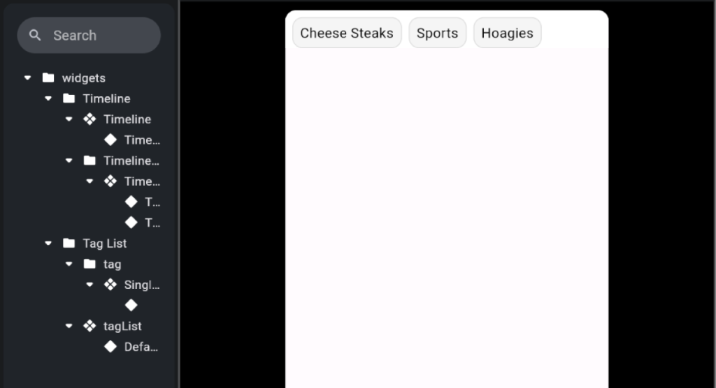
Creating components and global styles
Based on our design library, we created reusable components. This simplified the process by allowing pages to be quickly built out. We also created global styling variables to ensure consistency. This also made it easier to change colors, fonts, and other styles across the app without editing every instance of it.
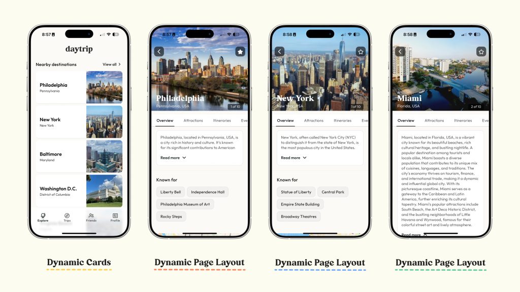
Developing dynamic layouts
We organized our components and styles to create page layouts. We then turned them into dynamic layouts by replacing text, pictures, and other content with variables that can accept data from our database and the Google Maps API.
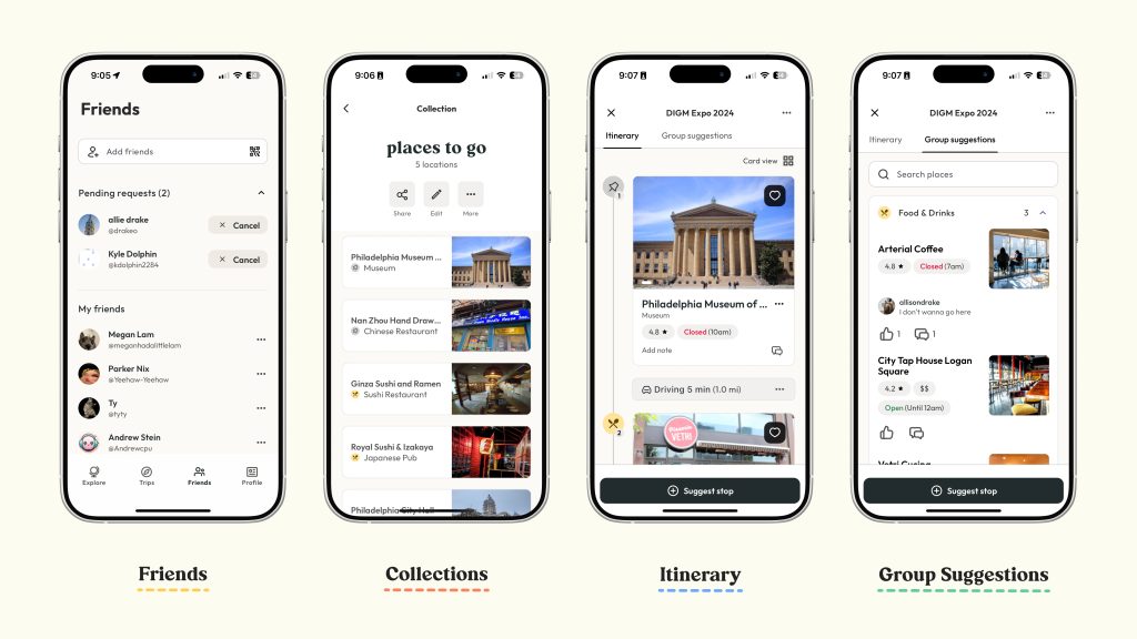
Creating the database
Our database was created to store user accounts with authentication, trip information, favorite places, and more. We also had to connect this to our app to be able to pull the data into our layouts. Devs kept our team informed of the state of the database by consistently communicating about what was available.
Solution
Above is our promo video highlighting our app’s key features.
Our native app remains to be a beta only accessible in TestFlight as more features are built.
The Results
Daytrip was a success for our team based on the tight deadlines and the various features we envisioned and executed for our app. Each of our features was research-backed and all of our users were able to successfully navigate our app quickly. We also received numerous positive feedback from users wanting to download it if it was available. Despite the app not being fully developed, our team is satisfied with all the results we made.

