Final Presentation
March 8, 2021
The Team

- Reid Dumont
- Hunter Hampton
- Gabrielle Hoover
- Wynn O’Donnell
- Charles Wolloch
- James Zangari
Overview

Shuffle is a friendship finding application based around connecting those with similar music tastes. The app allows users to use their Spotify listening data to create their profiles, giving an accurate depiction of one’s genre, artist, and album tastes. The end goal for users is to connect with others in the app through messaging and make lasting friendships. Shuffle was under development by our team for six months.
Everyone on the team was given roles at the beginning of the project, however, we decided to be flexible and we each contributed to roles outside of our original in an effort to learn and contribute more to the project. This also allowed us to avoid project burnout as we were not locked into the same work each week. On top of this everyone in the project was able to gain an understanding of what each role did and this made the process of passing work from one role to another much smoother. Roles in the project consisted of Project Manager, Content Manager, User Interface Designer, User Experience Designer, Front End Developer, and Back End Developer.
Background
User Journey: Jack is a 21-year-old college student. There’s a concert this weekend for his favorite band but all his friends aren’t that interested in their music. He doesn’t want to go to the concert alone because that can be dangerous and not as fun. This is where Shuffle, the app where music tastes align, comes in. Shuffle allows users with similar music tastes to connect virtually and chat online. Shuffle connects to Jack’s Spotify account and is able to pull his Spotify listener data such as most listened artists, favorite genres, and favorite albums. Jack can see other profiles and see what others on the app enjoy listening to. Jack can then message them to build a friendship based on their shared music tastes.
The Problem
There are a multitude of connection-based apps centered around dating but a clear lack of those with a focus on friendship. Our research has identified a niche in the music market that is untouched and by combining the two.
Goal
To create a code-based proof of concept for the problem our research identified. From there we’d move onto testing the prototype to identify areas of improvement. We want the application to broaden one’s social circle with meaningful friendships in a time where meeting new people is difficult. To do this we would effectively work as a team to create a product. Learn to rely on each other and adapt/further our skill sets to needed areas at any point in the project.
Process and Insight
Shuffle’s development can be broken up into three phases:
- Phase 1: Research concept, audience, and competition
- Phase 2: UI Design, Prototyping, and usability testing
- Phase 3: Development and usability testing
These phases overlapped as we employed an agile approach to be efficient and thorough as a team.
Phase 1
Competitive Analysis: In the research phase, we conducted competitive analyses of apps similar to our concept and also sent out numerous surveys to gauge the market interest in an app like ours. Through competitive analyses and research into apps like Tinder, Bumble, and Hinge we were able to get an accurate understanding of each app’s strengths and shortcomings.
Surveys: While we were able to easily receive competitor information, we needed information on a potential app like ours. This prompted us to create various surveys that were sent out over the six months that gave us information on audience interest, age ranges for potential users, and what kind of music-based information they would like to see on a profile.

Journey Map: All the research we conducted prior allowed us to accurately create a user persona and journey map to nail down the core flow of our app and the type of users we targeted to use it. This persona and journey map would act as a guide for us as we moved onto design and prototyping.
Phase 2
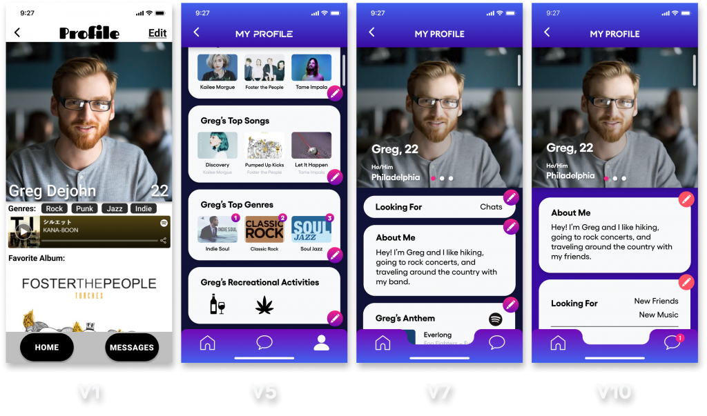
The prototyping and designs of the project took up the largest amount of our time, especially early on. We primarily operated in the program Figma, a prototyping software that allowed all the members of the design and user experience team to work in tandem. Figma allows multiple users to make changes in real-time, which gave us the freedom to have all of our team members working on the same project during a meeting without having to worry about incompatibilities. Through Figma, we created ten prototype iterations that built upon one another from user testing input and added features. The first iteration was extremely bare-bones, only featuring wireframes with boxed out areas for features of the app, the final iteration is our app’s ideal form with features that could not be included in the coded final due to code limitations or lack of time. An example being the settings page, as we lacked certain profile data points to augment information shown such as location radius. If Shuffle were to continue development to the point at which we would appeal to be on an app store, these features would be pursued further and added.
- Iteration v1
- a. We received feedback on how we have our information sectioned, we were told that it was too fragmented and like items should be grouped together. Moving forward we grouped images together and personal info while we placed music-related information in the same area of the profile.
- Iteration v5
- We obtained a lot of feedback on the recreational activities portion of our profile so we decided to revisit if it should remain in the application. We decided after getting user data that it was not on theme with Shuffle and therefore we decided to remove it.
- Iteration v7
- We had removed the recreational activities portion and had replaced it with a “What are you looking for?” block at the top of the profile. We were getting suggestions for additional data blocks that could help users identify who they are within the music world.
- Iteration v10
- We had ironed out the “Who are You?” and “What are you looking for?” data blocks and have them included together at the top of the user’s profile. The addition of this has been praised by many of our users as we conducted our last round of testing and started to allow users into our coded version and interact with each other.
- After creating these 10 versions of our application one can notice how we consolidated information to make the profiles more streamlined for users to view while also offering enough information for one to get to know another.

Phase 3
We began the development phase of Shuffle’s development early, largely overlapping with the prototyping/design phase. This was done because our development group was new to a lot of the programs and processes currently at play in the app and needed the time to learn and apply their knowledge to our final app. These programs include Firebase, Oauth2.0, Nodemon, and Webpack.
One of Shuffle’s big draws is the Spotify API integration within the application, this integration was added through an authorization flow called Oauth2.0. Once the API was embedded in the app, the dev team was able to make requests to pull information from a Spotify profile to be displayed in the app. Nodemon and Webpack were added early on to smooth out the development process by automatically refreshing the server when a change is made and streamlining our file structure. Firebase is a database system that was implemented to store user profile information as it’s made. Pulled Spotify API information gets sent to the corresponding user profile in Firebase as the user goes through the profile creation. The Shuffle homepage displays pulled profile information from the firebase to display the names, images, ages, and anthem in the user thumbnails. The rest of the app is basic scss/sass (styling the pages), Javascript (scripting and running functions), ejs templating (breaking up the project into manageable pieces), and JSON (storing values).
Results
Early on in the project, we wrote out a list of specific criteria the Shuffle project needed to meet before we would deem it a success. Those criteria are:
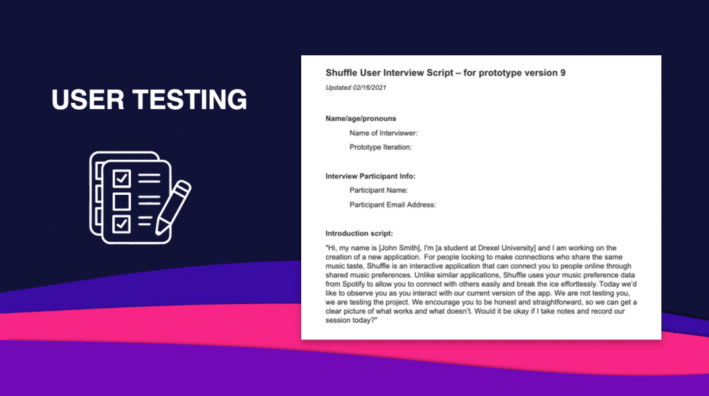
- At least five rounds of user testing
- We completed 6 rounds of user testing with the Figma Prototype and two rounds with the developed prototype
- A coded prototype that properly demonstrates the app features:
- Messaging
- Spotify API login
- Auto-populated profile creation based on Spotify listening info
- An 80% user satisfaction rating from testing with the final prototype
We were able to meet all of these criteria and deem this project successful as a team. Though the project is a success, it isn’t fully realized. If we choose to pursue this project we would have to port it to a different framework. Most likely this would be Swift and Xcode since this is the primary format for developing iOS applications. Secondly, we would want to complete the features that were not fully realized in our developed prototype:
- Functional Settings Page
- Maximum distance
- Age Range
- Single Gender Mode
- Ghost Mode
- Hiding Profile
- Delete your account
- Logout
- Blocking and unblocking of users
- In page editing of your own profile
- On-click Spotify pop-ups during profile creation
- Searchable list of Genres
- Better playlist integration
- Integration of designed microinteractions
- The Connection Algorithm
Our team ultimately achieved what we set out to do and learned a lot for reaching where we are today. As a team, we learned a lot about working together, especially on long-term projects. One of the most difficult aspects of this project was deciding what UX data to use and what to ignore. The main conflicts within our group arose from this issue. If we could start this project from the beginning there would not be many changes that we would make. One of the major changes would be having the whole team try to understand what was going on with the coding aspects of the project. Towards the second half of the project having only a few members of the team understand the code became somewhat difficult. This would have put more of a burden on the UX team but would have also provided them with some much-needed insight into the developed side of the project. As a project Shuffle took a lot of work, and for most of the team was the most important thing we have done in the last two terms. We are proud of the Shuffle project we created, and satisfied with its conclusion.
High Fidelity Figma Prototype


