by Victoria Stewart
IDM-362:Interactive App Design II

The Overview
This project was created for IDM 362. The goal was become acquainted with Xcode. My original concept came from my place of work, for which I wanted to create an easily updatable menu for our selection of virtual reality experiences.
The Context and Challenge
As a full-time college student, I go to my weekly classes, but I also work a part-time job to have a small source of income over the school year. I work at a local restaurant in Fishtown, where they offer the chance to experience virtual reality through Samsung GearVR or the HTC Vive along with dinner. I’ve worked there for over 6 months at this point, and realized that we lacked a way to keep our game menus as up to date as how often we add new apps, as our current method of letting customers select their VR experience is via a printed menu that they can leaf through. I decided that IDM 362 end goal of creating a simple native application through Xcode was the perfect opportunity to develop an app that could have practical use. The project was set on a 10 week timeline. My end goal was to create a virtual menu that shows off our selection of GearVR experiences, HTC Vive games, and our drink menu that is exclusive to the virtual reality section of the restaurant. The main focus of the project was to display all three sections clearly for users and to have it be easily added to as we constantly update our selections offered at my work. This was a solo project that I am going to actually present to my place of work. If they like the app, they will hopefully adopt the app and we can use it on a daily basis to help our customers select their next VR experience.
The Process and Insight
The process of this project was very structured. Each week of the project, over the course of the 10 weeks, I slowly built upon what we accomplished within our class the week before. I started out with some basic wireframes within Xcode. This was unusual for me, as I typically wireframe with a prototyping software such as Sketch, but the outcome was very good. Wireframing within Xcode allowed me to familiarize myself with the tool as I’ve never used Xcode before, and I was able to grasp concepts like constraining and basic element inputting.
The Solution


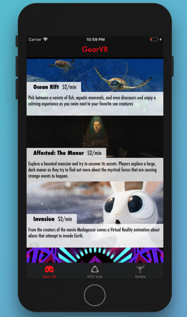
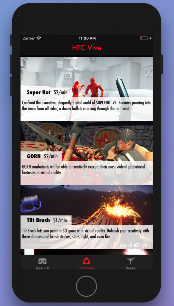
The app ended up spreading across three pages with a tab navigation at bottom. Important pieces of information are highlighted in red, with the main focus, the game entries, taking up 100% width of the device, stacked in a scrollable column. Upon clicking an element, the user is taken to an new page with all of the information one would need to know about that VR experience displayed individually.
The Results
Overall, I felt this project was successful. It was my first time developing in Xcode, so I wanted the main focus to be on functionality. I was able to learn how to create tab navigation, use table views, and dynamically transfer data across pages. Moving forward with this project, I’d like to make the design of it more detailed, though I am satisfied with the base that I have created. I’d also like to push forward with this app and create an iPad version, as that is the most likely method for us to present this menu to customers at work. I’m happy with the work I was able to accomplish in an entirely new medium in such a constrained amount of time, but I’m also looking forward to moving forward with the project.

