Designer/Developer: Seamus Donaldson
Background
“Quote of the Day” is a concept I came up with for my Interactive App Design course. Since this was my first time experimenting with apples integrated development environment, XCode, I knew I wanted to create something simple so that I could focus on learning the basics. The concept for Quote of the Day came to me after seeing an inspirational quote on facebook; my idea was to show users inspirational quotes every day from influential people on their birthdays, thus Quote of the Day was created.

Sitemap
Once I had the idea for my app I needed to organize the content I wanted to include in a way that would make things easily accessible and user friendly. By creating a sitemap, I was able to clearly understand how users would get through the flow of the app. My goal was to make all pages accesible with just two taps.

Sketches
Before I could start designing my screens in XCode I had to come up with some sketches that I could refer back to throughout development. I wanted the screens to be clean and free of all unnecessary content so I made sure to only include functional elements.

Quote of the Day
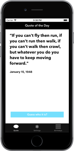
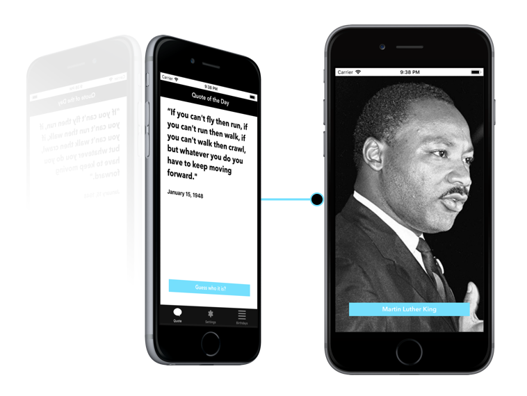
The first page I wanted people to see when opening up the app was the ‘Quote of the Day’. This is the primary function of the app so it made sense to show people the relevant quote of the day first. To make it a little more interesting I left out the name and picture of the person who’s being quoted so users could guess. Once a user had an idea, or just wanted to know who the quote came from, they could simply click ‘Guess who it is’ and the page would flip, showing the full portrait of the person as well as their name.

Settings
The settings page isn’t very interesting but when you’re creating a native app that takes advantage of notifications, it’s important to provide users with options for when they want to receive them, if at all. By simply asking users if and when they want to receive the notification for the quote of the day, I was able to create a clean and easy to understand interface that took advantage of premade elements in XCode.

Birthday List
The birthday listing page is the secondary function of the app which is why it’s not the first page you see. If a user is curious to see more quotes they can go to the birthday listing page to see who’s featured on the app, and if they’re interested in seeing that persons quote, they can simply tap on their cell block and go to a detailed page that shows their quote.

Fonts and Colors
I wanted the aesthetic of the app to feel modern and sleek which is why I chose a black and white color scheme complimented by blue to represent functional buttons. I used Avenir next and regular because they’re both sans serif fonts and are easily readable.

Tools
All assets were created using illustrator and sketch. This included custom icons used throughout the app as well as the app icon. All images featuring influential people were edited in photoshop to share equal proportions. The app was styled using
XCodes premade elements and constraints, and was then made functional using swift.
Conclusion
To conclude, I’d first say, this was an awesome learning experience and definitely something I’d do again. Working in XCode was not nearly as difficult as I thought it would be, and given that I’m very interested in app design, it’s a relief knowing I’ve got some experience under my belt. For the future, I’d try and get some more of my functionality down, but for now I am satisfied with what I’ve created.

