Overview
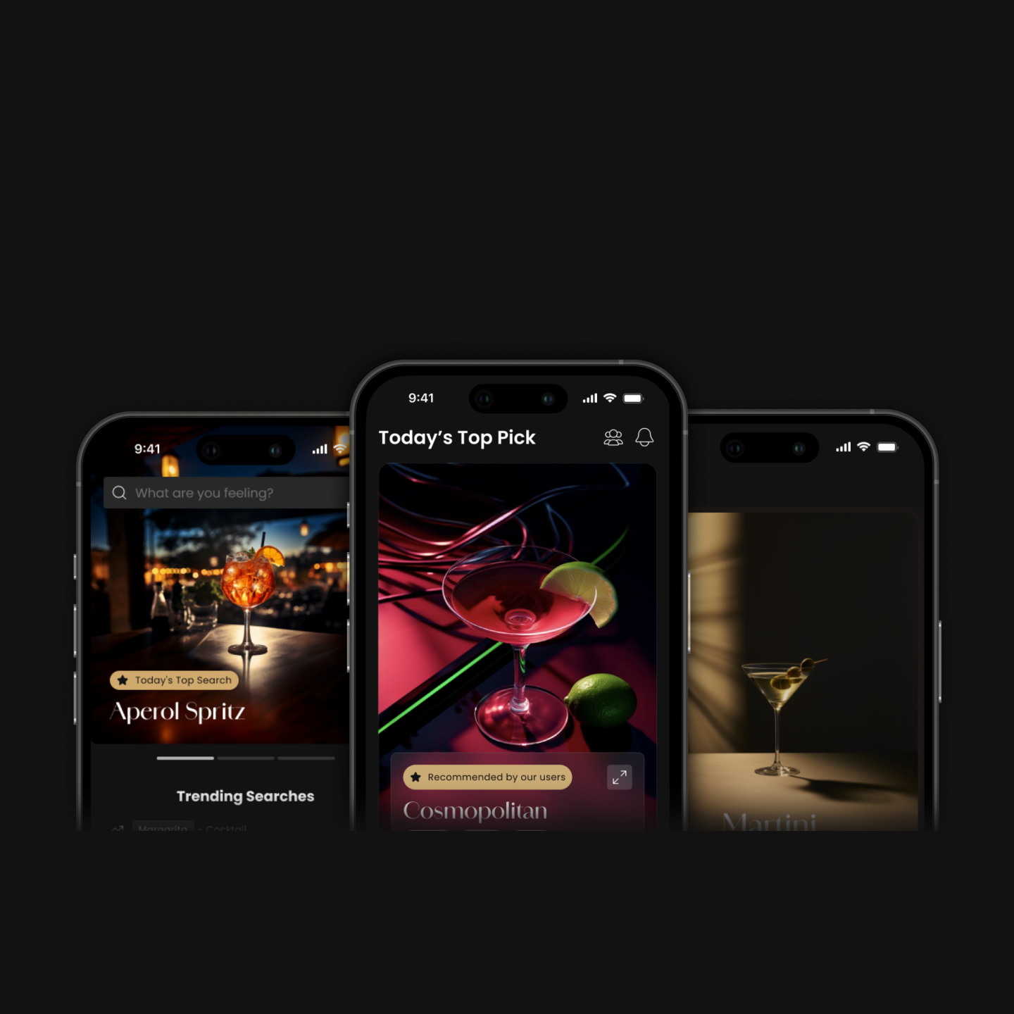
Clink is an app designed to help new drinkers find cocktails to try at the bar. Our team of 5 created it as our UX design senior capstone project. It was inspired from a shared struggle of never knowing what to order when we’d go out.
Timeline: 9 months
Software: Figma, Illustrator, Midjourney
Team & Roles:
- Steven McInerney — Project Lead & UI Design
- Quinn Khuc — UX Research & UX Design
- Sylar Li — UX Design & UX Research
- Christine Yim — UI Design & Graphic Design
- Andrew Lenehan — Content Lead & Graphic Design
Context & Problem
We found that new drinkers often struggled with ordering drinks at the bar. This struggle stemmed from them;
- Feeling overwhelmed by the vast variety of drinks
- Being unfamiliar with their own preferences
- Lacking the knowledge of cocktails & their ingredients
User Research Process
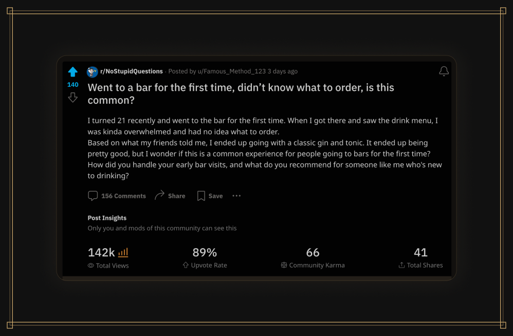
We first had created social media posts to validate this problem. Of the 156 who commented, 84% of them said this was a normal issue for first time bar-goers to have.
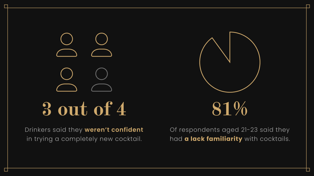
We then sent out a survey to determine our target audience of 21 to 28-year-olds. The questions focused on their general age and experience level with cocktails.
We finally conducted user interviews with 25 participants. These helped us to better understand our target audiences’ process of trying to order a drink.
User Research Takeaways
From our research…
- 90% of inexperienced drinkers said they had trouble deciding what to order.
- 3 out of 4 respondent drinkers were eager to learn more about cocktails.
What people said…
“I was intimidated when I went to the bar for the first couple of years. I never really knew what to order…”
“I get overwhelmed by the many drink options. I wish menus provided more information, like whether a drink is sweet or salty, as I usually just guess from the ingredients…”
From these takeaways, we had a clear idea of the problem, and who we were solving it for.
Features & Taskflows
We conducted competitor analysis, NUF analysis, and an effort/impact matrix. One takeaway was that no existing apps were offering a solution similar to ours. We also determined the 8 MVP Features that would drive the underpinnings and design of our prototype.
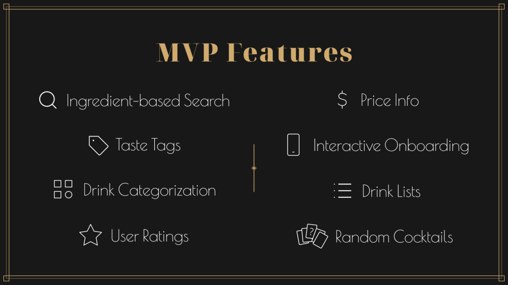
These 8 Features allowed us to build out our app’s main task flows, and the sitemap of main screens that would be present.
We then had each member complete wireframe sketches that incorporated the features, prior to prototyping.
Prototype Iterations
We built out every stage of our prototype in Figma.
For the low-fidelity screens, we focused on the key interaction points of our layouts. We conducted numerous usability tests to confirm our structure and approach.
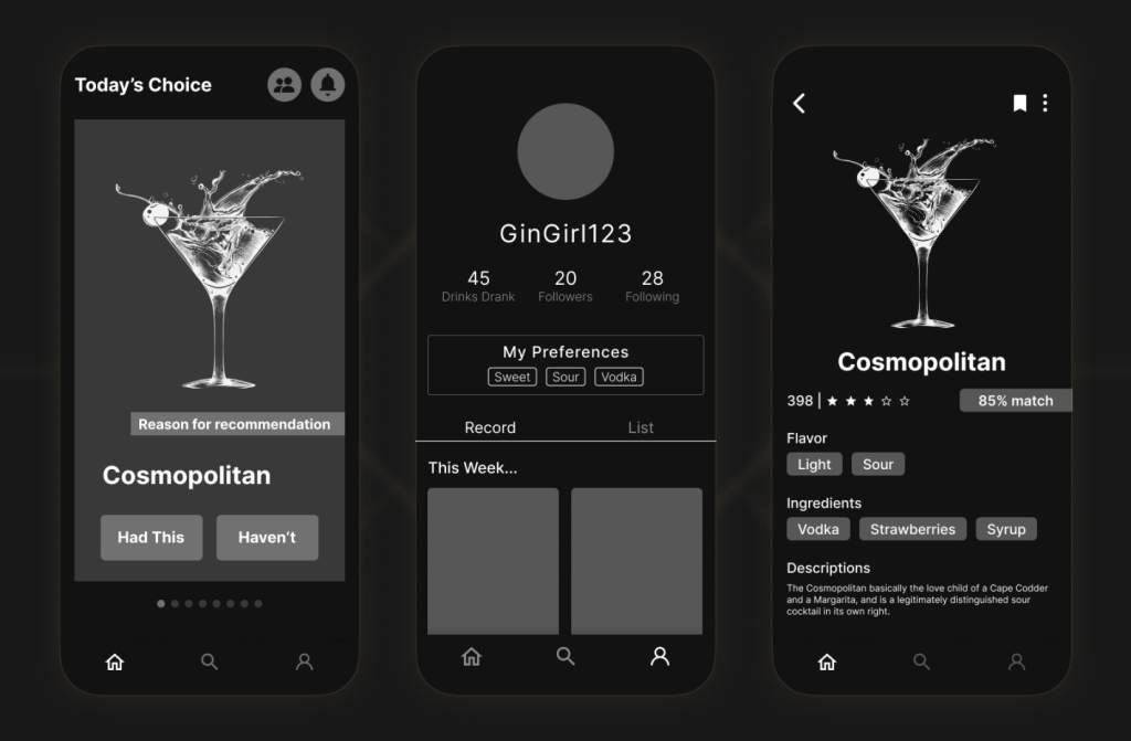
For our mid-fidelity screens, we applied styling. We also had to make crucial adjustments to the way drinks were displayed, and how drink collections were created. Additionally, users were confused by how they “liked” drinks, so we revised that flow as well.
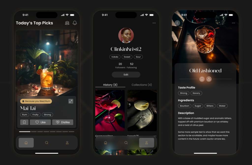
Visual Design
Our design direction was driven by the idea of minimal intrusion. We wanted our app to enhance our users’ bar-going experience, without disrupting it.
These were the fundamental components to our design philosophy;
- Dark mode interface, for clear viewing in dimly lit bars without disruption.
- Photo driven, since we found that users choose drinks based on their appearance.
- AI imagery, we generated all of our drink images in Midjourney, to ensure a cohesive look.
We also created an entire design system to house all our app’s finalized components, styling guidelines, and content.
Solution
Our solution was an app called Clink. Our final interactive prototype was a culmination of our design phases and research. It was rebuilt from the ground up using our design system.
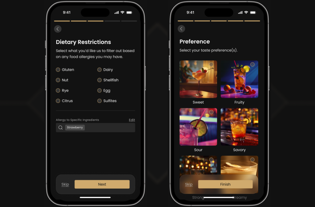
Users first complete the onboarding, in which they select their dietary restrictions, as well as their liquor and taste preferences. We prioritized the use of a more approachable term such as “taste” since new drinkers would be more familiar with it.
Users are presented with 6 daily personalized drink recommendations. These are determined by how the user interacts with each drink. Ingredients and flavors from drinks they like are recommended more frequently, while elements from disliked drinks will appear less. Users can also share and save drinks to collections as well.
The profile centers on three personalized tags which are generated based on a user’s liked drink activity. It also features a History tab, where liked drink cards are easily revisited, and a Collections tab for creating and managing created and saved drink collections.
Users can also search for cocktails manually. With autocomplete and filtering, they can explore new drinks and collections effortlessly.
Results
Our team demoed Clink at Westphal’s Digital Media Senior Showcase & Expo. We had over 40 guests come up to our booth to try out our live prototype, asking if they could download the app. 47 people signed up for our newsletter, to follow the development and future launch of Clink.
We were tremendously proud of the outcome. Our level of polish, and the nearly unanimous excitement that test participants / showcase guests had towards our prototype have pushed us to pursue further development.

