The Team
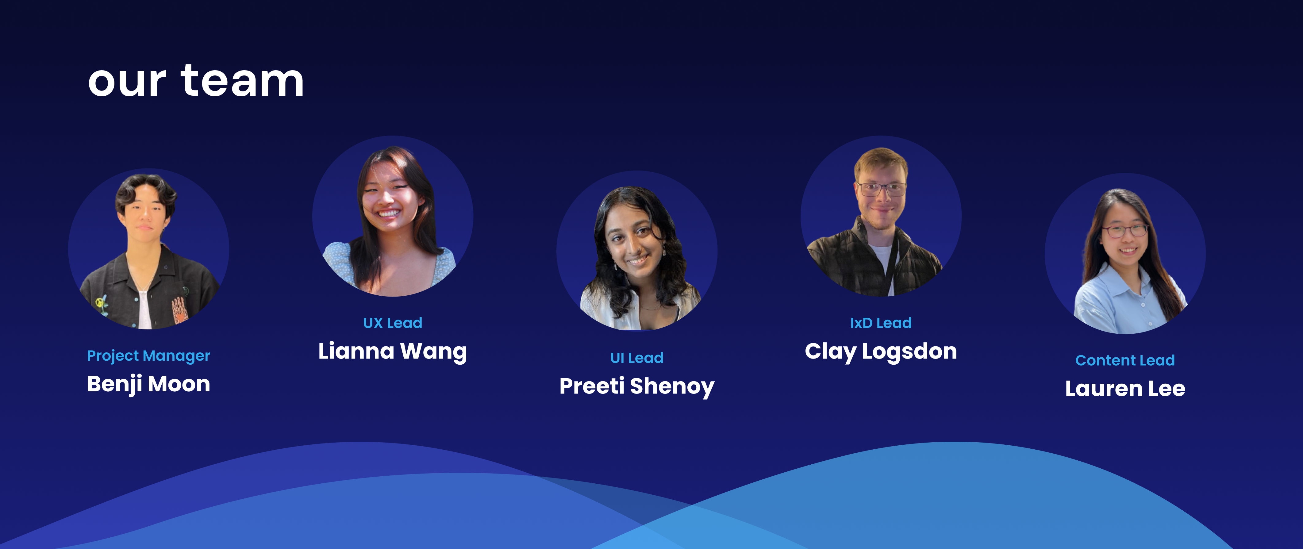
- Project Manager: Benjamin Moon
- UX Lead: Lianna Wang
- Design Lead: Preeti Shenoy
- IXD Lead: Clay Logsdon
- Content Lead: Lauren Lee
Project Introduction
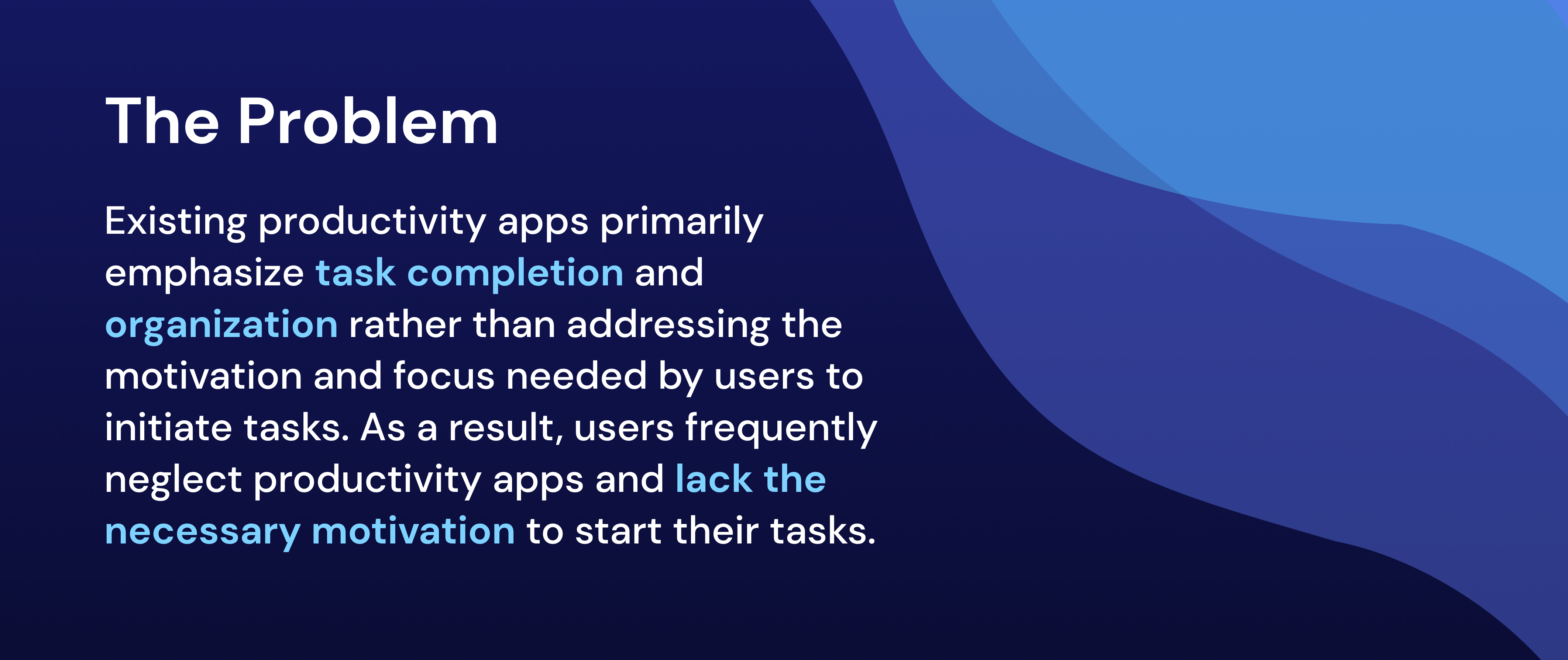
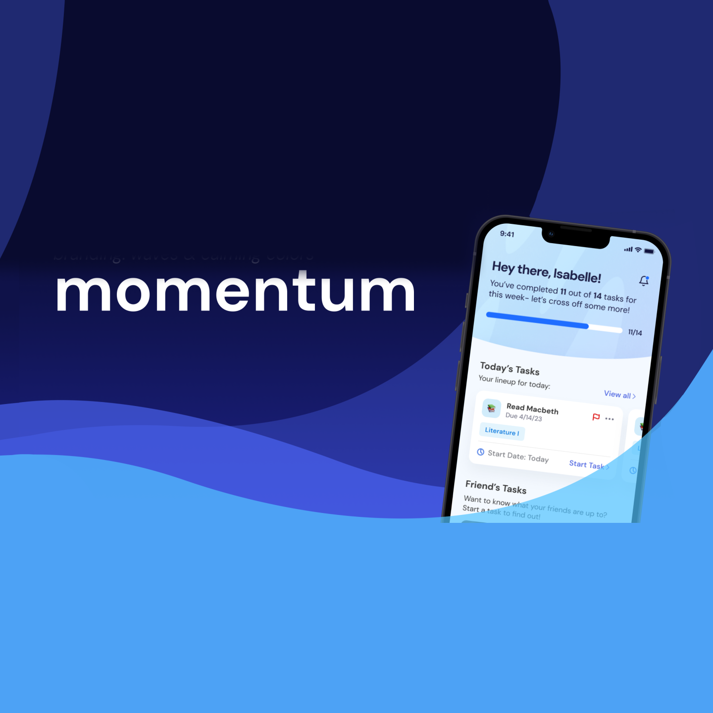
Momentum is a social productivity app that utilizes the power of photo sharing and community engagement to motivate users in accomplishing tasks and achieving their goals. Our project strategy prioritized research and design over development, showcasing our team’s strengths in these areas. This focus allowed us to leverage our expertise effectively, resulting in a solution that met user needs and preferences.
Throughout the 20-week period, we delved into thorough research to gather insights and identify user pain points. Leveraging these findings, we iterated on different design concepts and features to create a solution that resonated with our target audience. The case study provides a comprehensive overview of our journey, from problem identification to solution design and refinement, highlighting the impact of our efforts on enhancing users’ productivity experiences.
Research
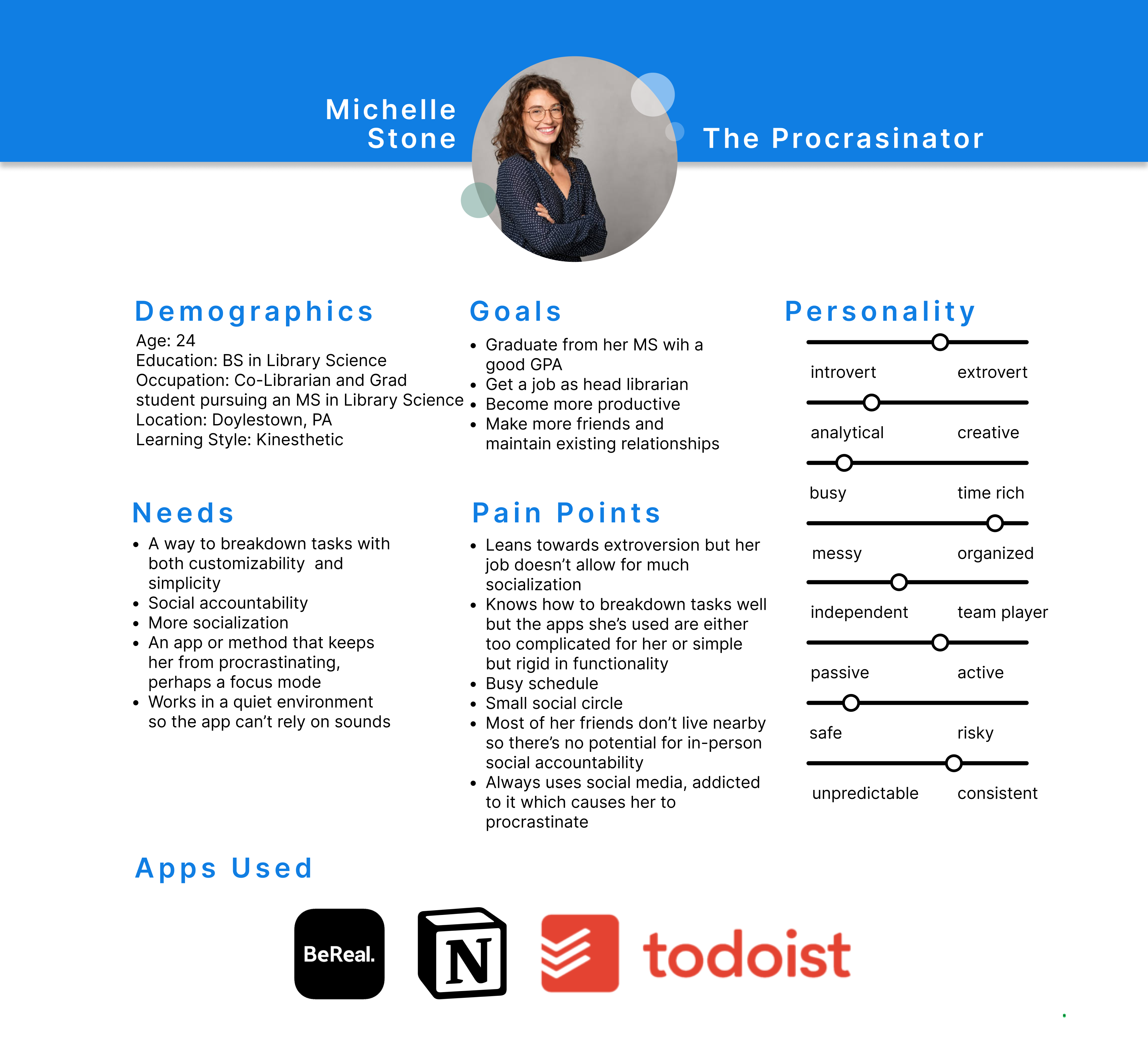
The preliminary survey received several noteworthy insights into user productivity challenges. In these findings, a significant amount of respondents expressed frustration with existing productivity tools’ inability to maintain their focus and motivation. Additionally, many users said that they had feelings of stress due to the inability to manage their tasks and commitments. Notably, our research enabled a pivotal shift in our approach, particularly regarding the implementation of spontaneous progress checks. Supported by both quantitative and qualitative data, with almost half of users expressing a preference against spontaneous checks in the survey (quantitative), and user interviews emphasizing the desire for autonomy and control over progress checks, as well as the option to add middle progress checks themselves (qualitative), we recognized the importance of flexibility and user empowerment in our solution design. This insight reshaped our strategy, emphasizing user-driven features and customization options to better meet the diverse needs of our target audience.The preliminary survey also allowed us to create our user personas and helped us gain a better understanding of our target market.
Through in-depth user surveys and interviews, we gained valuable insights into the nuanced challenges users face in their productivity journeys. Participants shared personal insights and experiences, highlighting themes such as difficulty prioritizing tasks, struggles with time management, and the want for a sense of accomplishment and progress. Also, 34% of survey respondents emphasized the importance of accountability and body doubling in staying productive, indicating a gap in existing productivity tools’ ability to effectively address these needs.
In addition to our surveys and preliminary interviews, we conducted further research by utilizing other research methodologies such as NUF Analysis, Empathy & Affinity Maps, and more to identify common patterns, themes, and pain points among users. These insights served as the foundation for our design process, guiding the development for features and functionalities that addressed user needs and preferences. By translating user feedback into design insights, we made sure that our solution was based on user-centric principles to meet the different challenges of our target audience.
Design Exploration
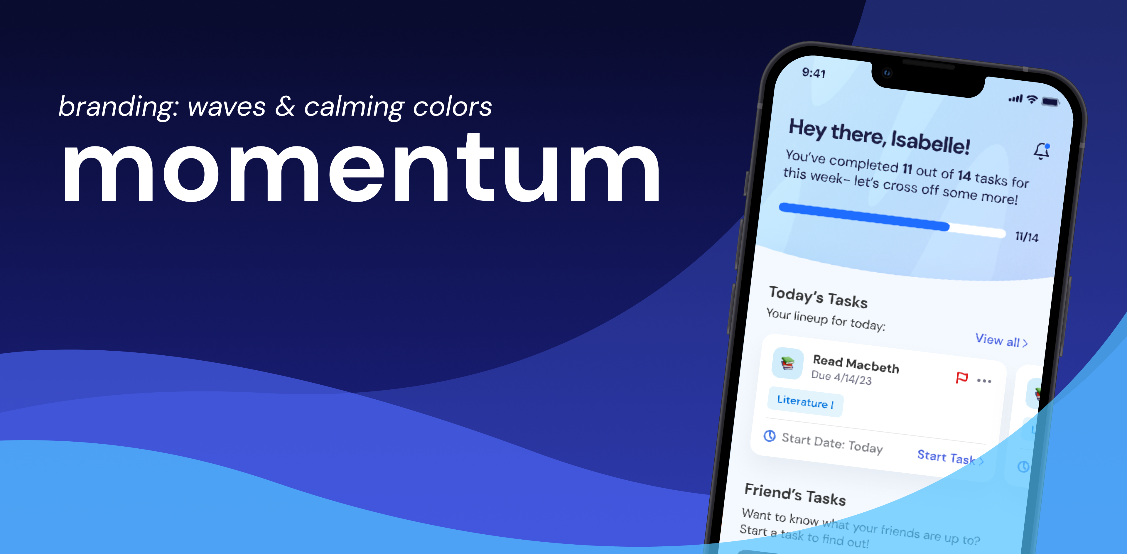
During the design exploration phase, our focus was primarily on creating a brand identity that resonated with the theme of Momentum. Critical to this process was the selection of colors, fonts, and imagery that effectively conveyed our app’s core values of motivation, focus, and productivity. After careful consideration, we chose blue as our primary color due to its calming and productive associations. Blue has long been recognized as a color that promotes a sense of calmness and stability, while also stimulating productivity and concentration. This made it an ideal choice for an app designed to help users stay focused and motivated.
In addition to color selection, we also paid close attention to branding elements that would reinforce the concept of momentum and progress. Inspired by the idea of “making waves” and driving momentum in task completion, we incorporated wave imagery into our branding. The waves symbolize the forward movement and energy associated with making progress, while also serving as a visual representation of the app’s name, Momentum.
Iterative Design Process
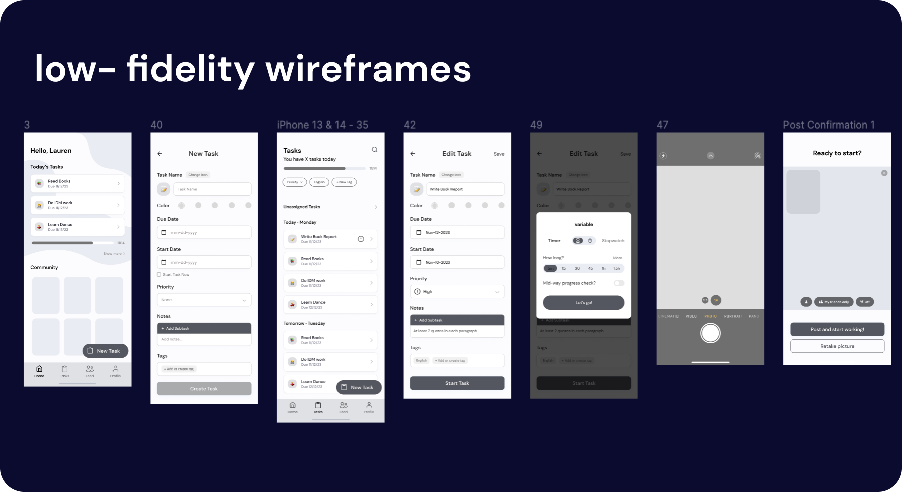
During the low-fidelity wireframing phase, we translated our conceptual ideas into tangible designs, focusing on basic layout and functionality. Through usability testing and feedback sessions, key insights formed, highlighting areas where user interactions could be clarified. These insights guided iterative improvements, making sure that the foundational elements of Momentum’s interface were intuitive.
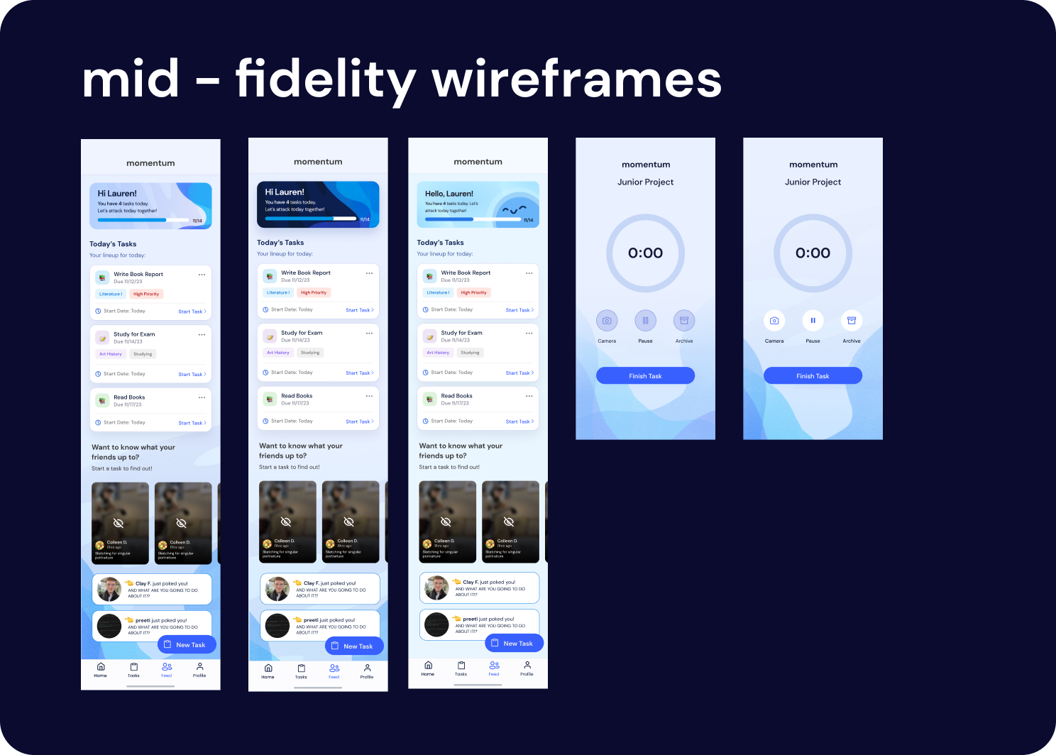
Transitioning to mid-fidelity wireframes, we refined our design even more, incorporating detailed color, visual elements, and interactive components. One significant change involved adding more information to task cards, including tags, due dates, and start dates. This adjustment was informed by user feedback, as participants expressed a want for better organization and clarity within task management. Specific changes made based on user feedback included adjustments to navigation, features, and content organization. A lot of essential insights came from this phase and allowed us to streamline our feature prioritization and task flow.
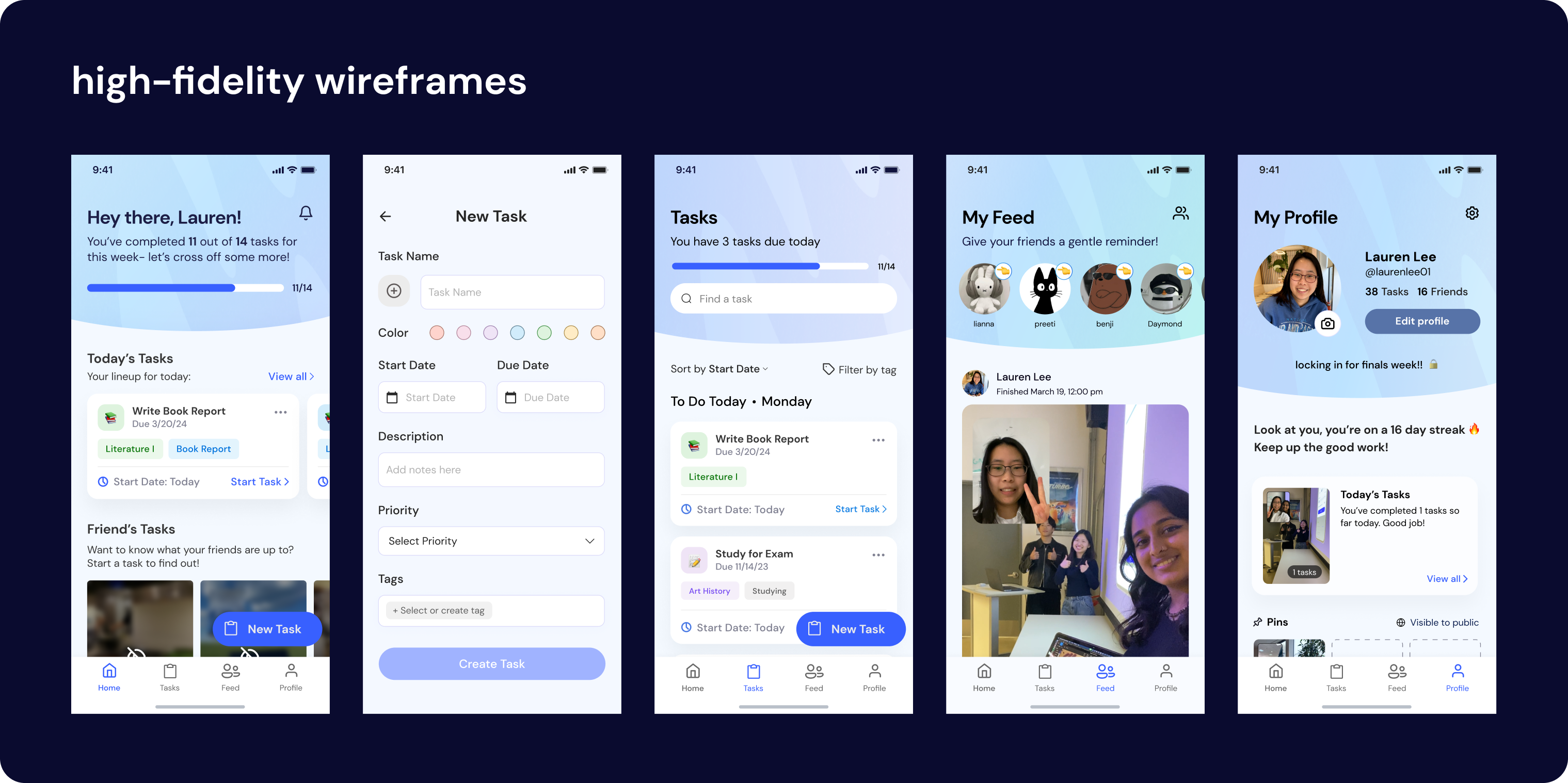
In the high-fidelity wireframing stage, our designs reached their final iteration, with attention to detail and visual refinement. Examples of changes made based on user feedback included fine-tuning of typography, color schemes, and iconography to enhance visual hierarchy and readability. The insights in this phase emphasized the importance of visuals in complementing functionality, highlighting the significance of balance between design and functionality in creating a perfect user experience.
Development
In the beginning of the project, we recognized that development wasn’t our team’s strong suit. With this in mind, we made a decision to pivot towards leveraging our strengths in design and research, applying them to the prototyping process.
As we began the development phase, it became apparent that our initial assumption was validated; we faced limitations in executing a full-fledged development due to technical challenges. Rather than viewing this as a setback, we saw it as an opportunity to innovate and adapt.
Knowing our team’s expertise in design and research, we chose to explore alternative avenues for bringing Momentum to the next step. This led us to focus on utilizing Figma’s variable tool to create an interactive prototype. By prioritizing this approach, we aimed to create a prototype that would effectively showcase the functionality and interactivity of our solution, as if it were a functional app.
Through research and experimentation, we gained a better understanding of Figma variables and its abilities. With this knowledge, we were able to create prototypes that mimicked a fully developed prototype.
Our decision to pivot towards design and research proved to be very important in navigating the challenges we faced in the development phase. By embracing our strengths and leveraging innovative solutions like Figma variables, we were able to overcome obstacles and deliver an interactive prototype that accurately represented Momentum.
Conclusion
What started as us finding a common problem with productivity apps led to us developing an effective solution. Over 20 weeks, we conducted research, designed prototypes, and navigated challenges to bring Momentum to life. Despite many obstacles, we stayed focused on delivering a quality solution backed by our research. Our adaptive approach showcased our team’s flexibility and creativity. Momentum is a project that highlights the team’s dedication and collaboration, aiming to positively impact users’ lives. We’re proud of our journey and excited to implement the lessons learned from this project into future experiences.
Reflection
It’s evident that our effort and dedication has resulted in significant learnings and insights. From our team collaboration to the invaluable research insights gained, each portion of the project has contributed to our growth and success. Our problem-solving approach allowed us to overcome any challenges and setbacks we faced effectively, while our learning opportunities expanded our skill set. Our project is backed by sound research, and we were able to explore the design of Momentum in ways that would not have been possible had we followed the traditional development route. If we were to work on this in the future, we would love to see how our design can be elevated into a fully functional app. Regardless, we are grateful for the experiences and lessons learned, and we look forward to applying our experience from this project to future ones.

