The Overview
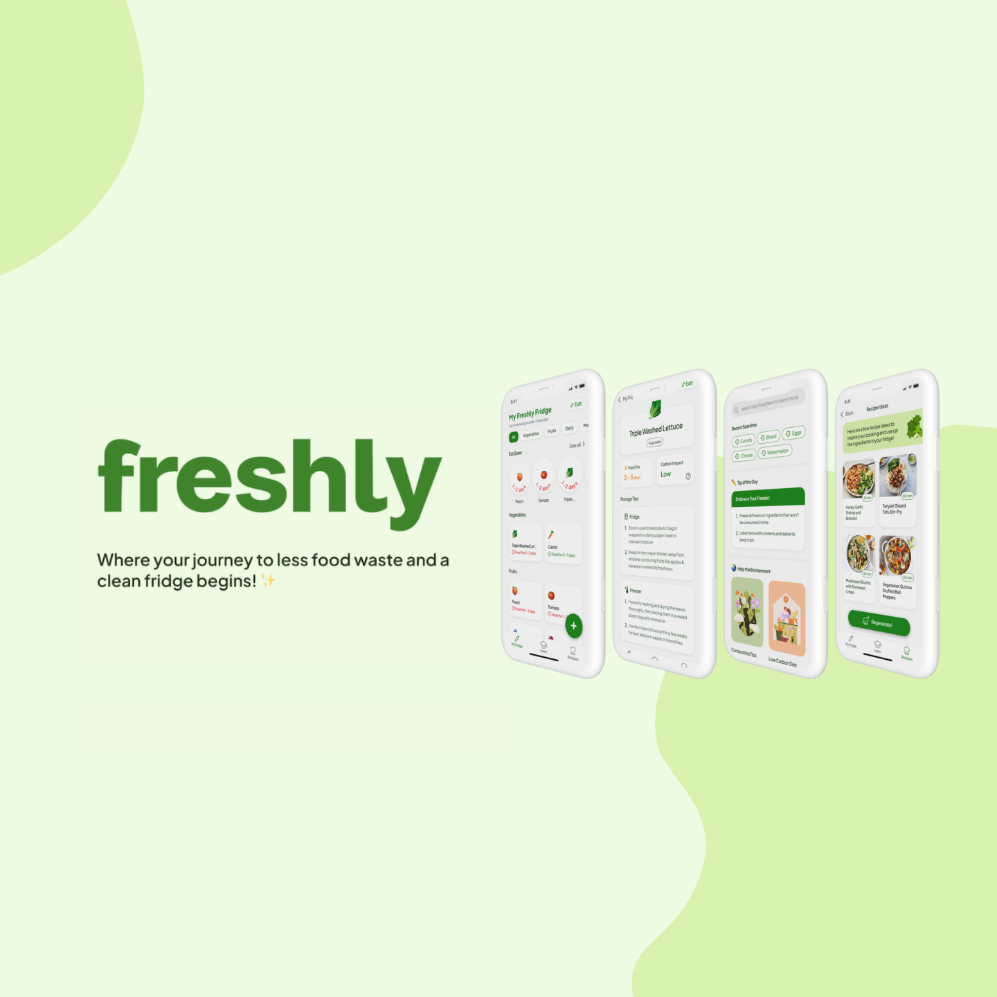
Freshly is a mobile app that helps young adults reduce their food waste by keeping track of their foods’ freshness, giving waste-free recipes, and teaching users about their food and its impact through simply scanning their grocery receipt.
The Context and Challenge
Timeline:
6 months (September 2023 – March 2024)
Roles
The Problem
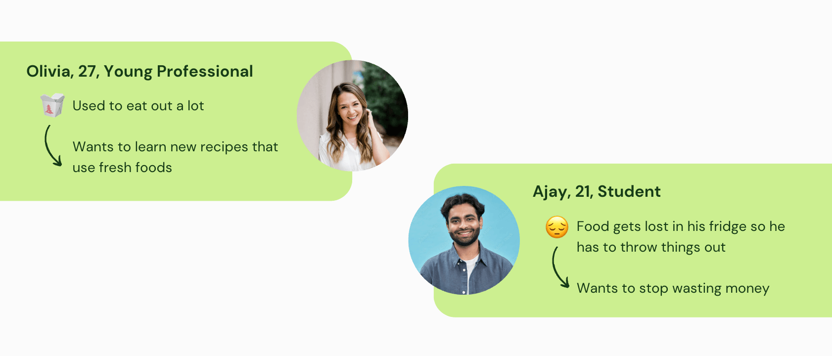
Young adults waste a lot of their food because they struggle to keep track of expiration dates, forget what they have in their kitchen, and are not aware of the best ways to store and use their food.
Goals & Objectives
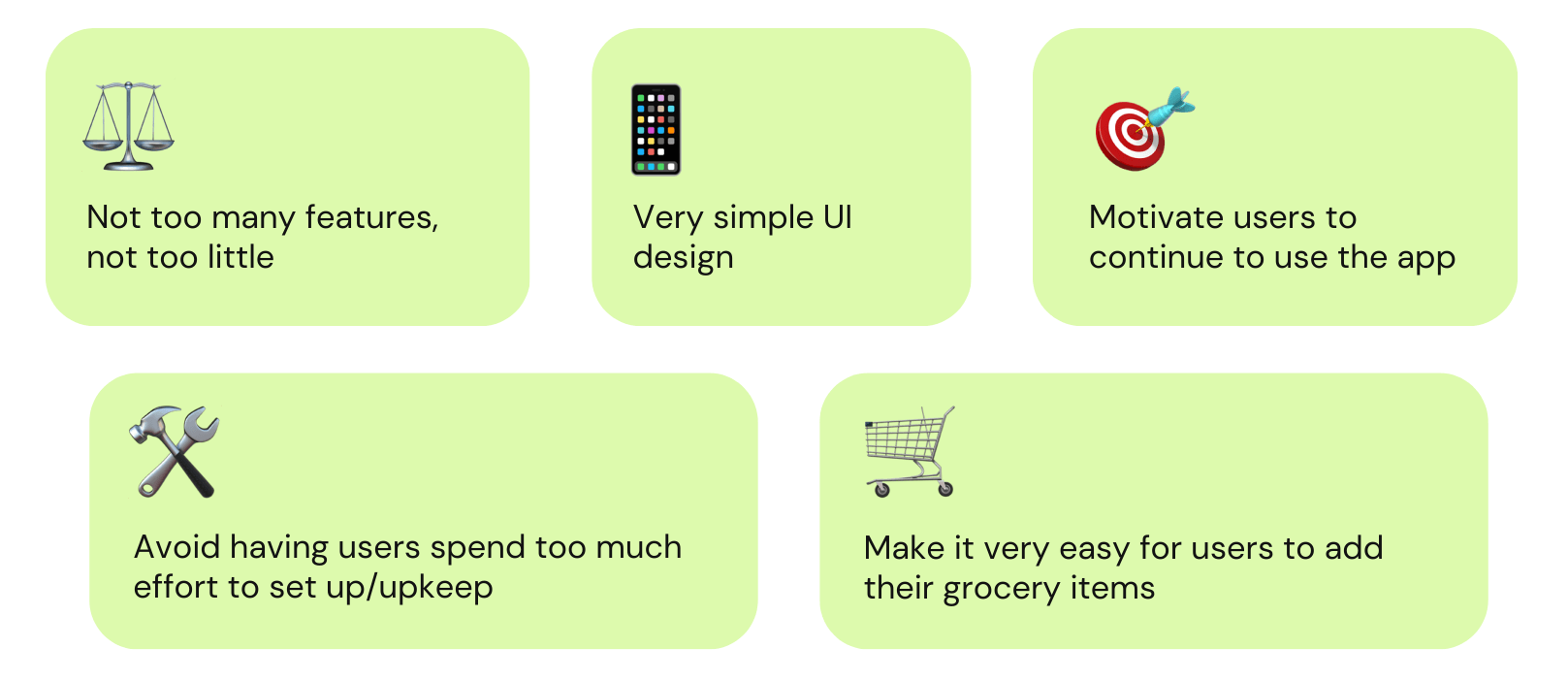
The goal of this project is to create a native mobile app with clean and simple UI for young adults between the ages of 18-30 that motivates and educates them on building good food habits while also reducing their food waste.
The Process & Insight
Research
User Persona
Competitor Analysis
We listed all the features of competitors to see how common they were across the idea space. We also looked at reviews to determine likes and dislikes in the apps. Our main takeaways were:
We then conducted an initial survey and interviews to look into young adults’ food habits and find patterns in how and why their food goes bad.
Survey
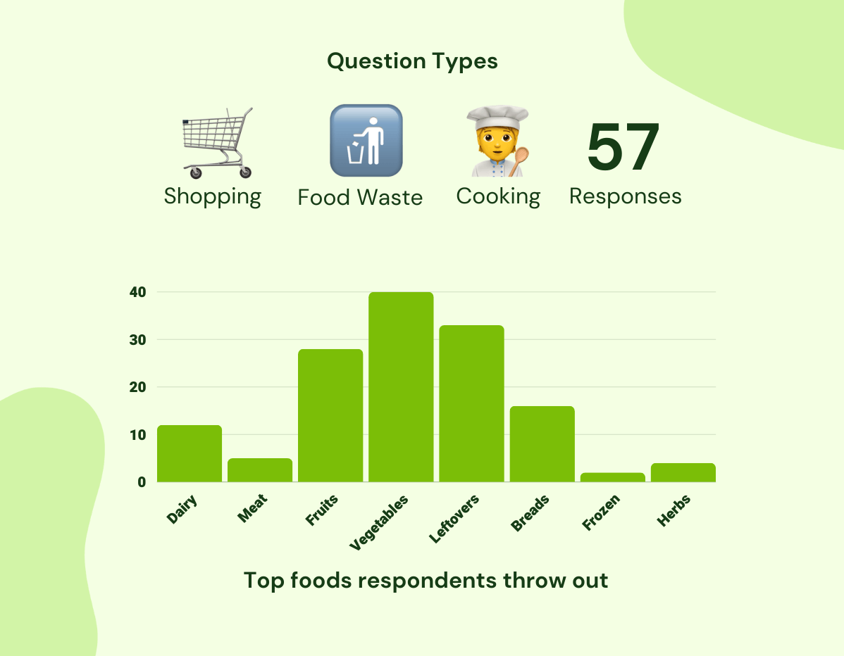
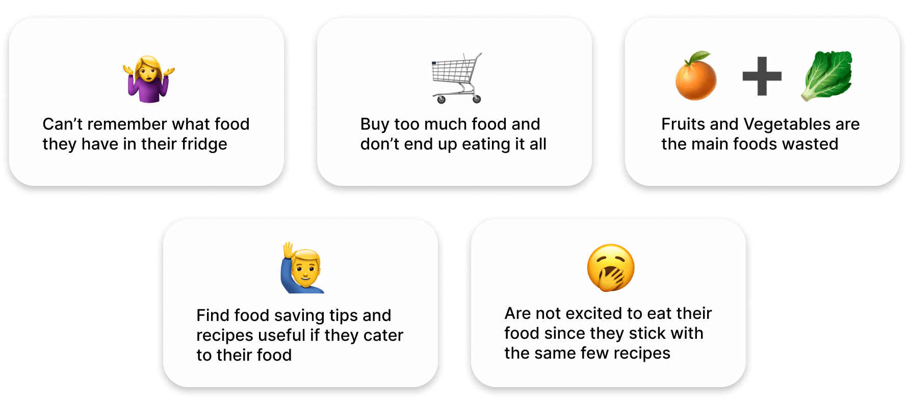
Once we finished our pre-design research, we created an affinity map with all our data to gathered our main takeaways:
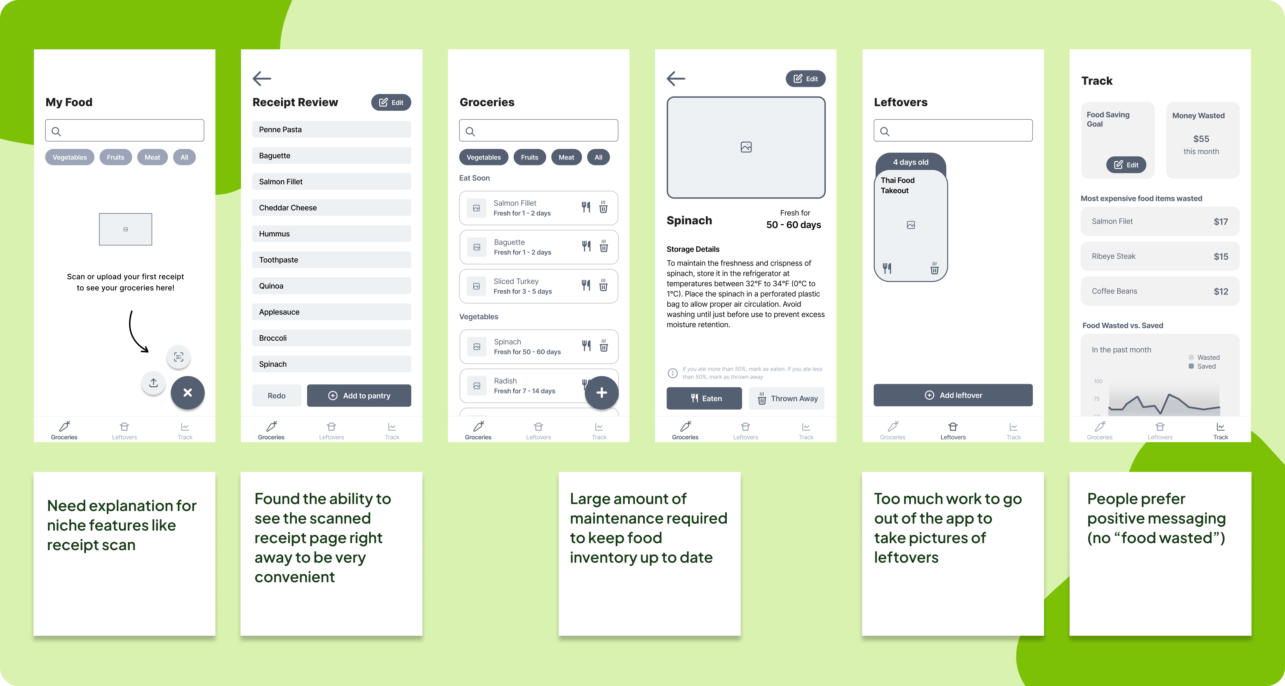
Low-fidelity Testing Takeaways
Based off our user feedback, we realized we needed to pivot our idea and narrow our scope for these reasons:
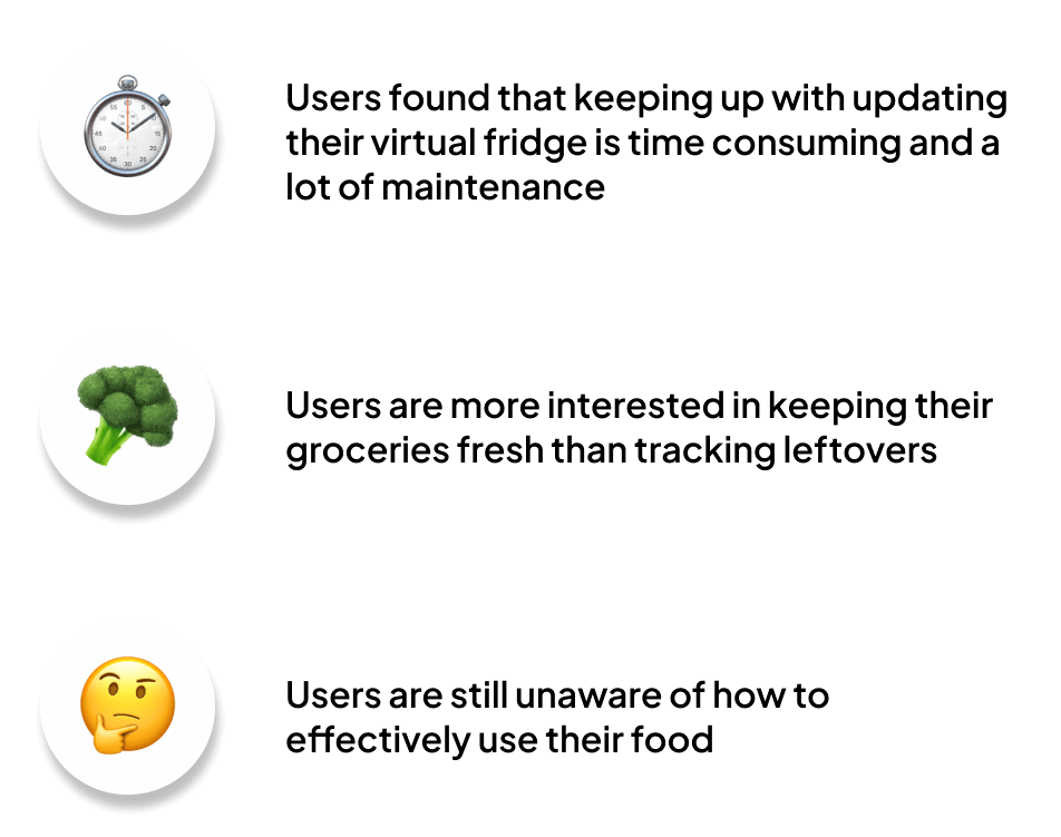
We conducted a Kano survey where we gave users different feature ideas and measured their interest in them to determine our new features.
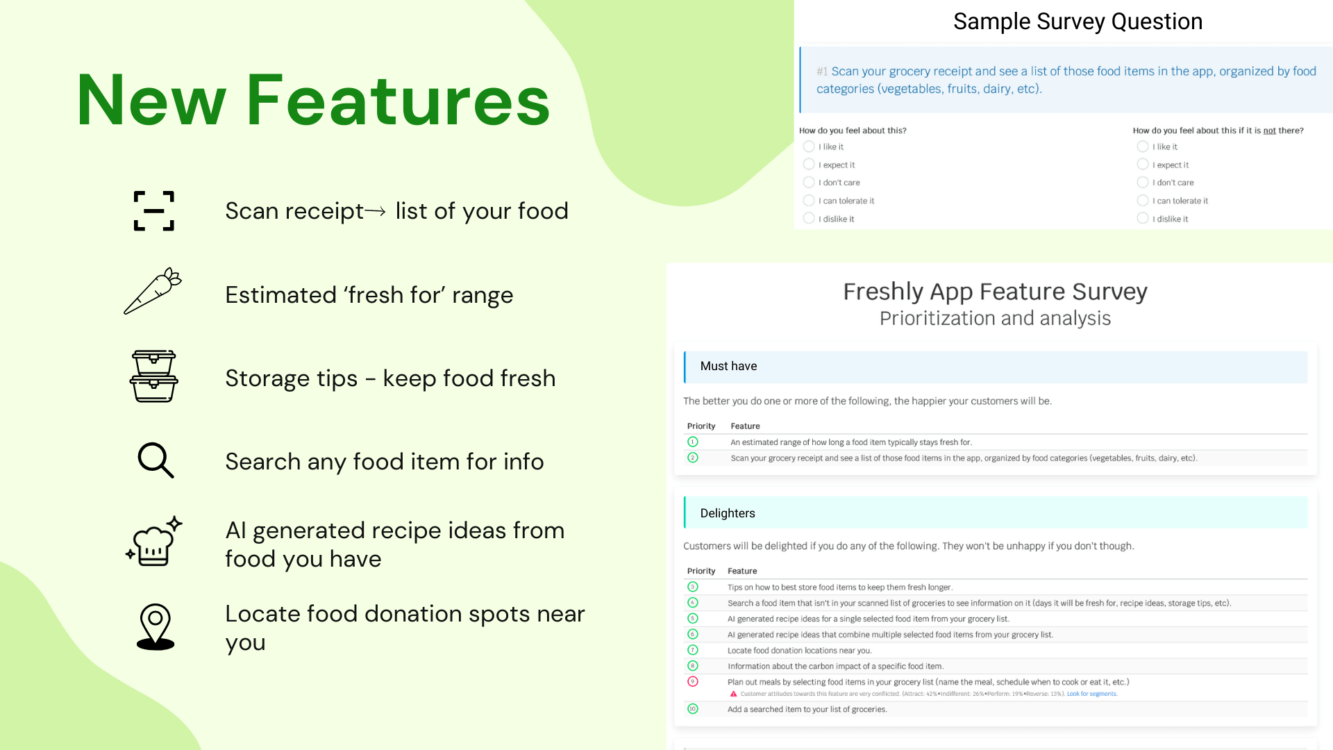
High Fidelity Design Takeaways
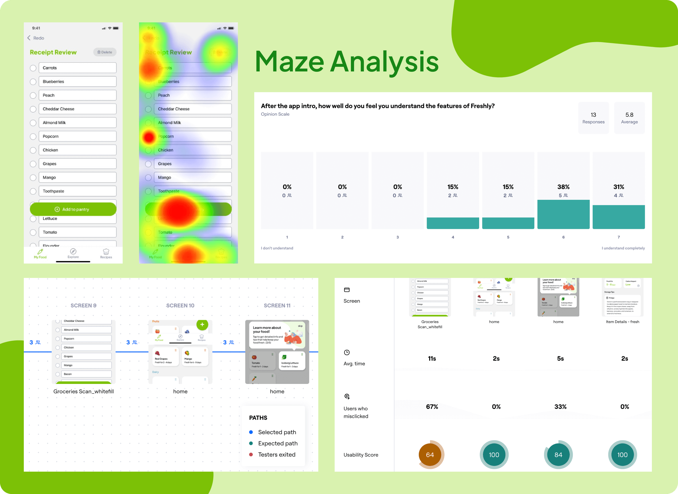
Due to the time taken away from us due to the pivot, we moved straight into creating our hi-fi designs. We ran automated usability testing with Maze to gather feedback on our designs. We found that users only had a few issues:
- Color accessibility with grey background and green text
- Clarity of positive/negative selection of items to add/delete from “Receipt Review” page
- People did not pay attention to the copy in the onboarding
After we fixed these issues, we then conducted in person validation testing to confirm our designs and finalize any changes needed.
The Solution
Development Process
Once we determined our high fidelity designs, Anuj began to work on the backend. We used Python to run the Veryfi API for receipt scan and Open AI API to organize food items into different categories and provide the storage tips. Our front end was built using React Native Expo and Christina and Alex helped to work on the front-end.
Final Screens
Scan/Upload
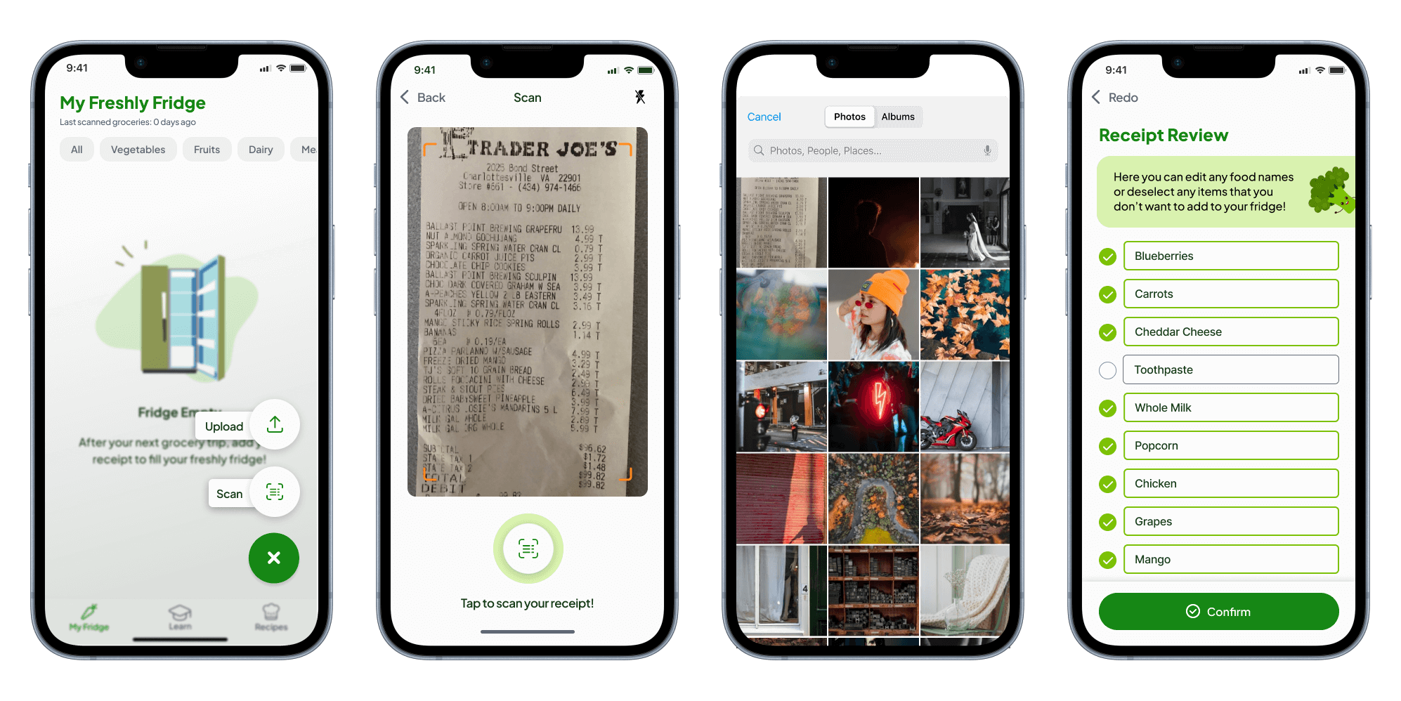
Users can scan or upload an image of their grocery receipt to add food to their Freshly Fridge and keep track of what they have and how long it stays fresh for. Once they upload the image they can rename or deselect items that they don’t want to include in their fridge.
My Freshly Fridge
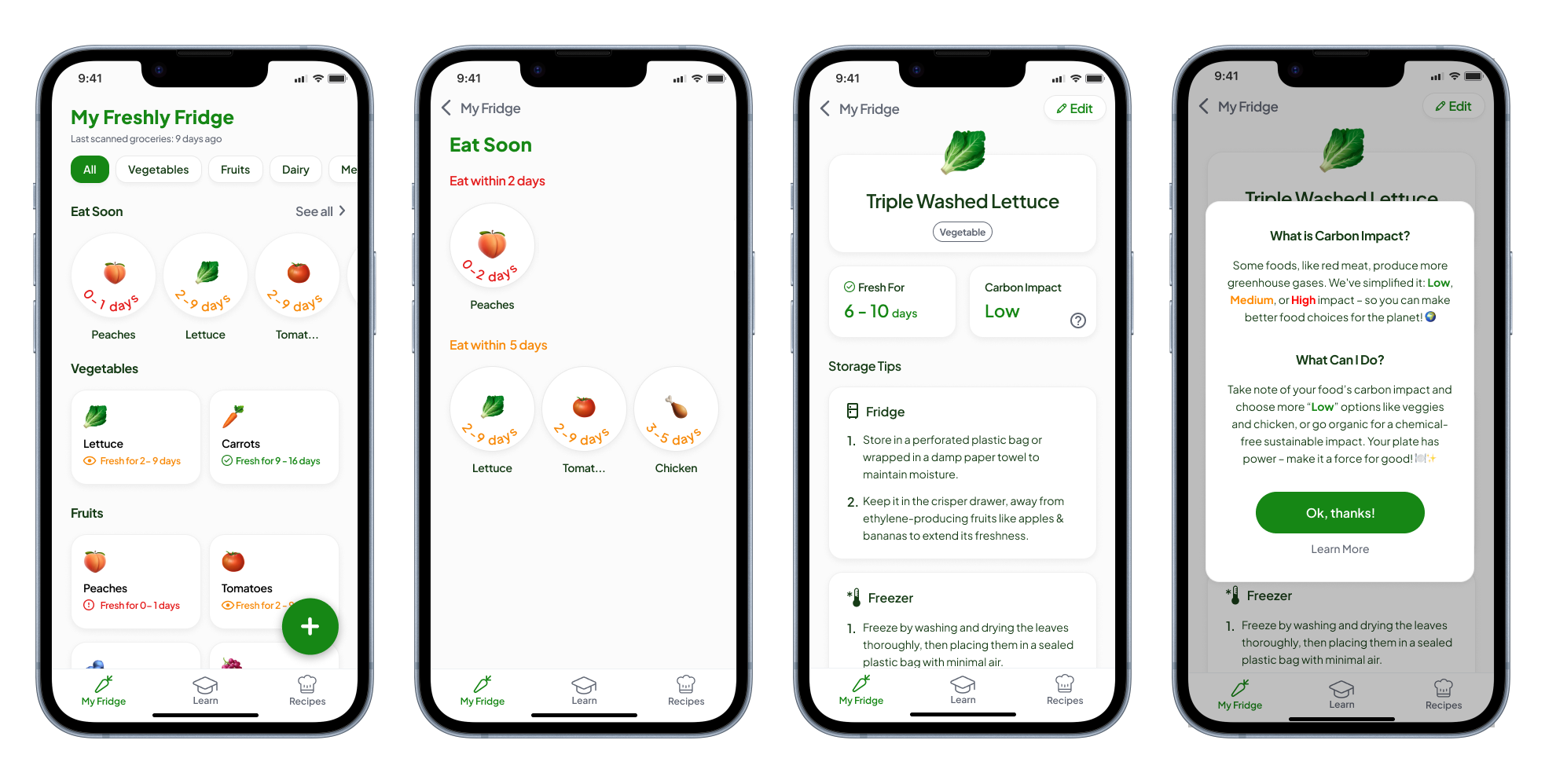
On the Freshly Fridge page, users can check what foods they need to eat soon and see all their food sorted by category. If they click an item, they will be taken to the item detail page which tells them the best ways to store their food and show its carbon impact so that they will be encouraged to throw away less food.
Recipes
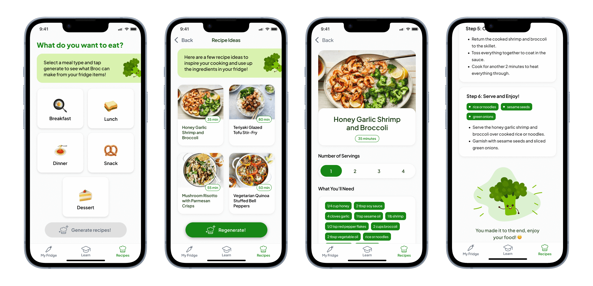
The recipe pages give users recipe ideas based off the food in their Freshly Fridge. They can select a meal and then they will be provided with 4 AI generated recipes that they can select from. This helps give users ideas of how to use up their food.
Learn
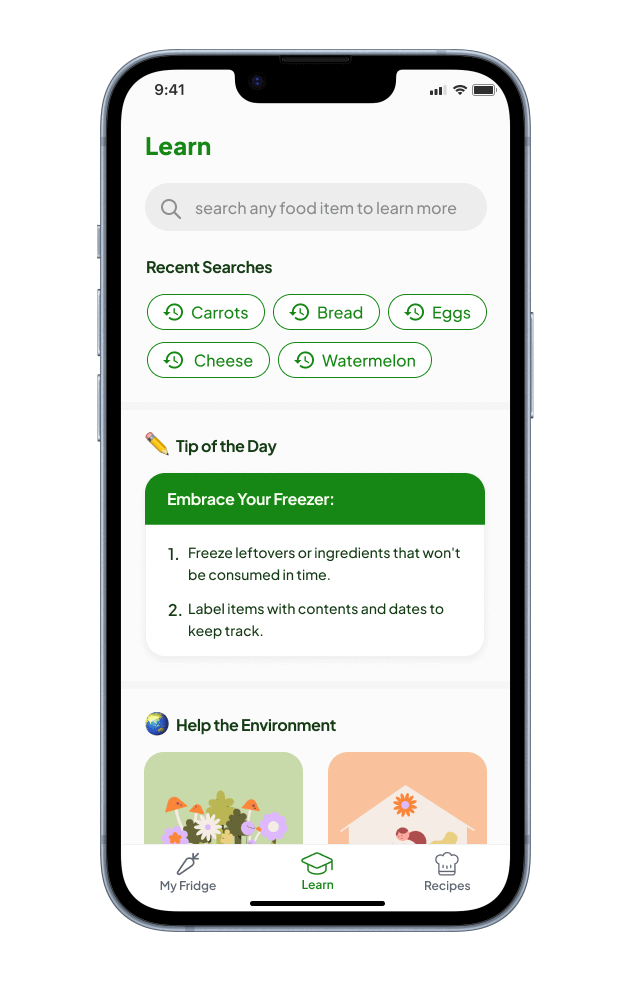
The “Learn” page allows users to search for any food to find the best way to store it, see their recent searches, shows the tip of the day, and provides users with composting tips and low carbon impact articles. This page educates users on how to best store their food and help the environment.
The Results
Success Metrics
Our project was a success since young adults found it engaging and motivational for reducing their food waste. People rated the usability of our app 6.27/7 and we got a lot of positive feedback.
- “I loved how intuitive and easy to use it was. Everything is organized, simple, and even has cute graphics!”
- “My favorite thing was how it lets you know how long you have to eat something because I have the worst habit of buying food and then not doing anything with it and then it goes bad and I’m mad”
- “I love Broc he’s so cute”
Lessons Learned
We learned that it is important to do a kano analysis before designing low-fidelity screens to better understand what features our target audience wants. It is also important to thoroughly test AI-generated results across various use cases. While AI has been incredibly efficient with our project, there are some edge cases.
Next Steps
- Save to collection feature for recipes in case users really enjoyed a recipe that they generated and wanted to remake it.
- Notifications for “Eat Soon” items and “Tip of the Day” so that users can be easily reminded to eat their food.
- Login ensures app functionality and data availability throughout different devices.
Thanks for reading!

