Overview
While the burgeoning field of virtual reality has taken a liking to the game scape, many digital tools that can be improved with VR technology have not yet come to light. One such tool is 3D modeling software, which for the longest time has been spearheaded by programs that operate with a computer and mouse, and thus the controls and your actions have been completely rewired to adjust. A real-life 3D sculptor would be completely lost trying to start out in Blender, and existing VR modeling software still require a change in your mental mapping. In order to bridge this gap in the modeling community, we need to bring an artist’s touch into the picture, offering the gesture-based tools that allow their trained muscle memory to work in a digital modeling environment. Thus, Smoosh was born. This case study will cover the development process that went into designing the comprehensive desktop experience that addresses this problem.
Context and Challenge
For our Experimental Interactive Technologies class, we were given three months to find a newly developed piece of hardware, for the purpose of individually developing a functional software design that makes appropriate and effective use of the technology. I selected the bHaptics haptic gloves, inspired by the capabilities that virtual reality technology offers to our digital society.
The Problem
Historically, there has not been an interface to sculpt 3D models in a way that feels natural and intuitive. Since the early days of CGI, 3D rendering has been based on the manipulation of digital vertices, with modern software only offering more streamlined ways of producing and rearranging each point. Because you cannot reach into the computer and squish the model with your own hands, this is currently the only viable method of manipulating digital models, as you are bound to the keyboard and mouse. Of course, the technology has grown incredibly powerful over the years, but there is still a massive learning curve for those used to sculpting physical objects with their own hands. Furthermore, while geometric and highly polished forms, such as machine parts, are better made in precise CAD programs, organic shapes like character models are much more difficult to fabricate, without looking too blocky.
The Goal
This software aims to incorporate the touch simulating powers of the bHaptic haptic gloves to give the most accurate representation of physical sculpting and modeling in a digital space. The ability to compress and shape objects using your hands should be aided by the vibrating sensors inside the gloves, ultimately giving the same amount of control over digital clay as you would have with actual clay. The design of this software will:
- Simplify the process of making organically shaped digital 3D models
- Effectively simulate real world sculpting techniques
- Offer thorough customization options to tailor the experience towards the user’s needs and senses
- Export base models in usable formats, so touch ups and additional effects can be applied with other programs.
- Cut down on overall modeling time.
Process and Insight
The development of this project follows four phases:
- Competitor and User Research
- Lo-fi Wireframing
- Styling
- Hi-fi Prototyping
Competitor and User Research
First, I wanted to establish what software exists to support 3D modeling in a virtual reality environment, as I was already quite familiar with Blender and the current methods of 3D modeling via computer and mouse. Sculpt VR is a program that allows for virtual reality sculpting, though it is only usable with your typical VR controllers which, while allowing you to be more gestural than mouse modeling, still requires you to learn how each button or control manipulates the model. You cannot actually control or depress the model with the full movement of your fingers. Additionally, needing to use a VR headset to sculpt can be quite disorienting, especially when you need to move around the model frequently. As such, it makes sense to instead build a desktop application that can use the gloves in the same depth of space, so you can still control the model with your hands, but without needing to constantly reposition yourself.
Because the user base will be centered around beginner 3D modelers, or people looking to transition from real life sculpting to digital modeling, we can cut out the detailed modifiers and nodes that Blender uses and stick to basic shape deformation, with only the necessary settings to comfortably change the shape of objects.
Lo-fi Wireframing
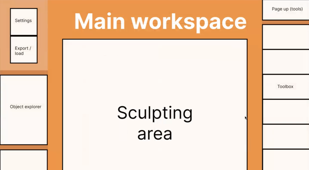
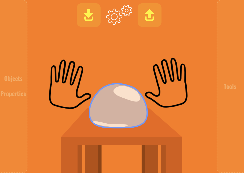
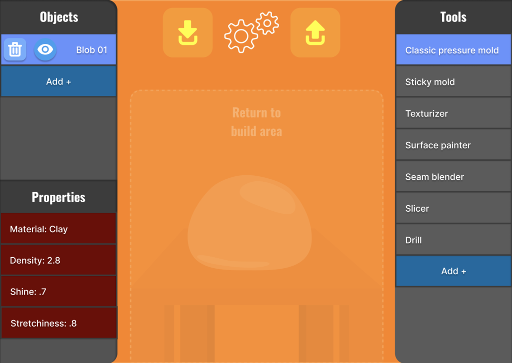
While I had some initial ideas for the color scheme, it was important to lay out all the functionalities of the program in ways that were accessible with both a mouse and with the gloves. Buttons needed to be large and well placed to avoid getting in the way, and gesture controls would need to be added to give maximum control. The main sculpting area would be in the center of the screen, and only after pushing your hands to the sides of the page would the menus appear. The switch between workspace and tools would take some time, so you do not accidentally flip back and forth between the toolbox and your build area.
Styling
The stylings I chose to apply were grounded in the sandbox type of theme this program will convey, with brighter, soft looking colors and a striking, yet readable fonts. This application won’t be for super precise and intricate modeling, but it allows you to be artful. Smoosh your hands together and see what you can make, then clean it up later.
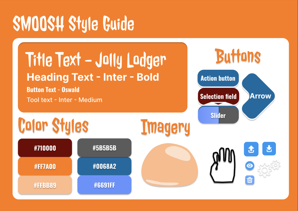
The hands are outlines only, so you can observe the shape of your hand in the 3D space, for visual feedback that will pair with the haptic feedback from pressing into the digital clay. The buttons, sliders, and menu options take a decent amount of inspiration from 2D art programs, which also have a similar sandbox style.
Hi-fi Prototype
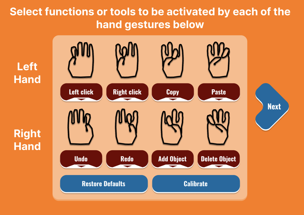
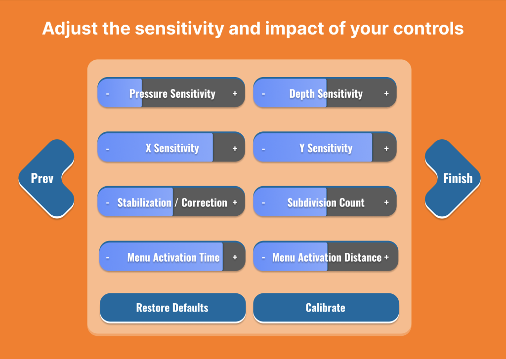
In transitioning to the hi-fi prototype, I made sure to flesh out the sidebar menus to clearly display all the tools, objects, and properties, while moving he settings and loading options in the top middle of the screen to give more priority to their functionality. I took some time to reassess the critical path and put more importance on the loading and exporting of models to align more with the core functionality of the application. I implemented my slider and dropdown menu designs to the settings page and dedicated separate pages to both kinds of adjusters. Ultimately, the end design puts the focus on the core modeling functionality, keeping the UI hidden until you need to use it, and dedicating more detailed areas to the user’s control over the environment rather than the model itself, as all you really need to sculpt organic shapes is your artistic gestural movements. The environment controls help to enable such power.
Solution
To simulate the app’s usage from the start of the modeling process to the export stage, I used Figma prototyping tools to simulate the hands moving freely with the user, as if they had the bHaptics gloves, to show how smooth and efficient the whole modeling process is during the final presentation of the design.
Result
All in all, this project was a wonderful exploration into the world of alternative controls for digital modeling. I can only hope this software can one day become a reality, opening doors for all sorts of people who are intimidated by the current standard keyboard – mouse modeling. We’ve been playing with modeling clay since we were kids, and Smoosh will allow us to make our hand crafted creations last.

