
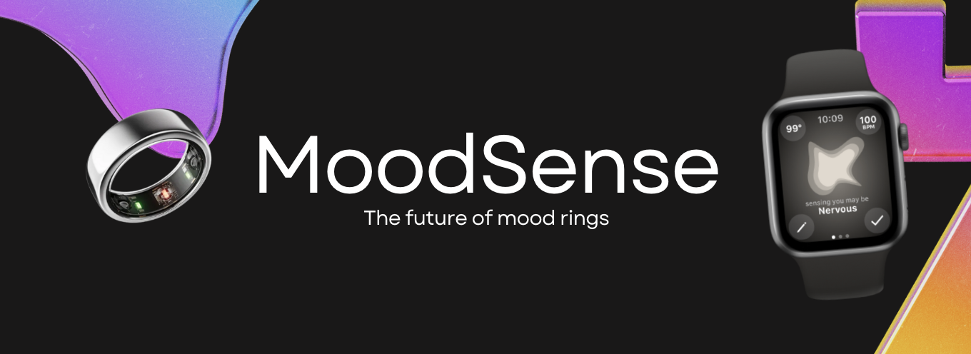
OVERVIEW
Using Figma Prototype to create an apple watch interface that identifies people’s moods, gives personalized activities to promote self-improvement, and allows users to send encouragement to their friends. The app theoretically would connect to a smart ring that tracks user health data to make mood predictions.
PROBLEM
Typical mood rings don’t accurately detect your mood, they are just novelty accessories that change color based on heat. So, after identifying the new technology of smart rings, I realized that I could finally create an accurate mood ring based on the combination of multiple pieces of a users health data.
TECH
Using PPG (Photoplethysmography) technology, this smart ring detects health statistics just from your skin’s surface including information l ike your sleep, temperature, heart rate, activity levels, blood oxygen, and stress levels. Because you can essentially determine someone’s mood based on this information, I wanted to create an apple watch interface that would connect to the smart ring to allow people to track their mood at any time. The main reason for using both the ring and the apple watch is for longevity and comfortable wearing. The ring battery can last up to 6 days after just 1 hour of charging, allowing for more reliable health tracking.
GOAL
Create a watch app that will allow people to address their current emotions and find solutions to them immediately, gradually improving their quality of life overall.
PROCESS
1 – COMPETITOR RESEARCH
I started by looking at what else is out there. How do other apps use this technology?
While limited, there are a few apps out there that connect to smart rings. However, all they do so far is provide an interface to show your tracked health data and nothing more than that. With all of this information on a user, I think it would be a much better use of the technology to do something for the benefit of the user.
Because of this, MoodSense stands out from competitors by combining all of a user’s health data to predict their mood and provide suggested solutions or activities to promote self-improvement.
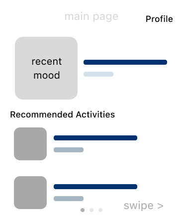
2 – WIREFRAMES
The first step was to plan out all the screens and navigation necessary. I did this by creating low fidelity wireframes of every screen and connecting the navigation with figma prototype interactions.
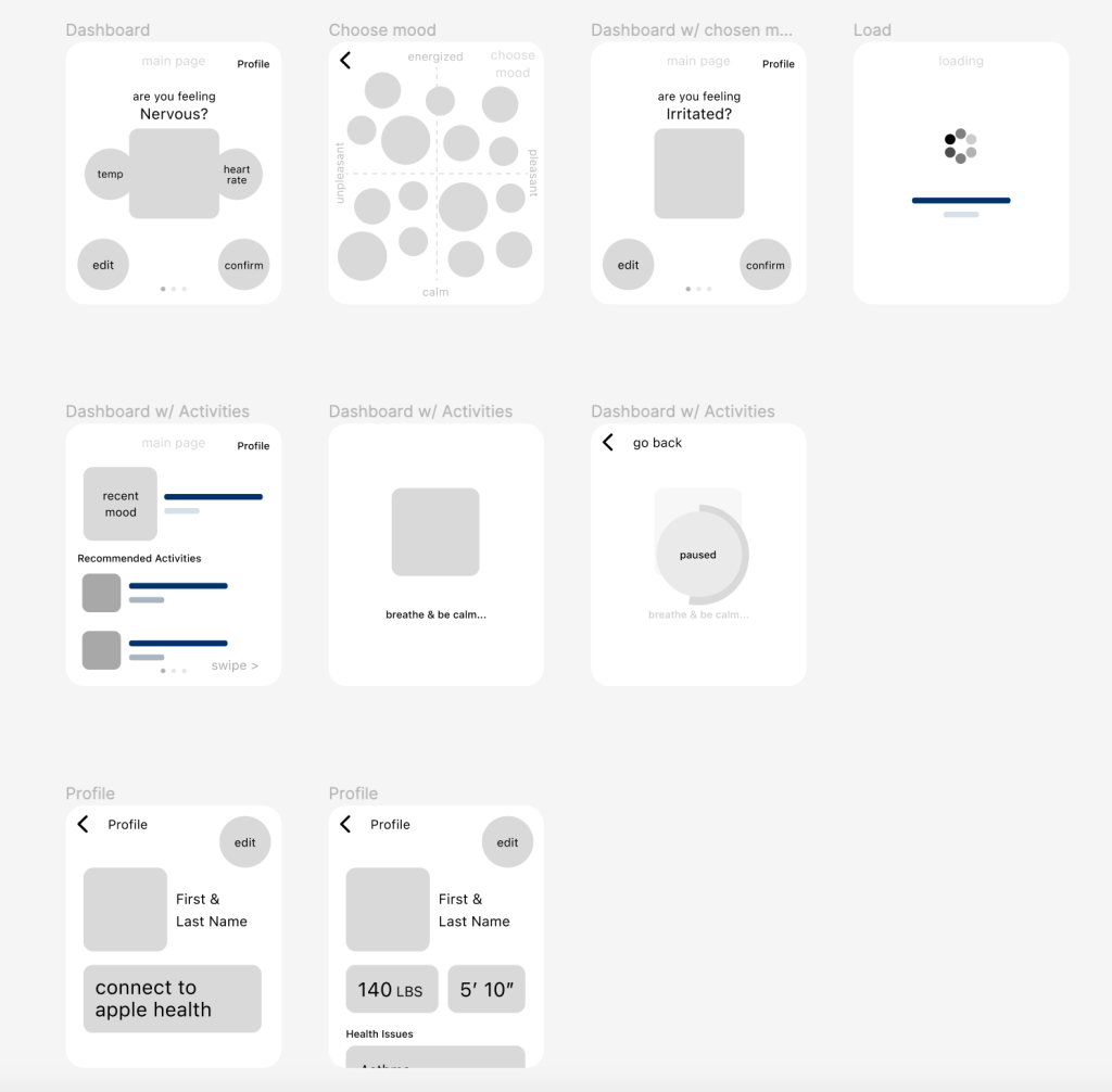
This consisted of an onboarding flow, mood identification, activity suggestions, profile page, friends page, send good vibes flow, add a friend flow, and a page to see your current health tracking.
Interact with the initial wireframe prototype here: https://www.figma.com/proto/q0Ilp6zdOBRkJFFKfnh87F/IDM-381—Exp-Tech?page-id=0%3A1&type=design&node-id=58-1802&viewport=-2038%2C-2727%2C1.31&t=8qwGTlXnfpvE0smg-1&scaling=contain&starting-point-node-id=58%3A1802&mode=design
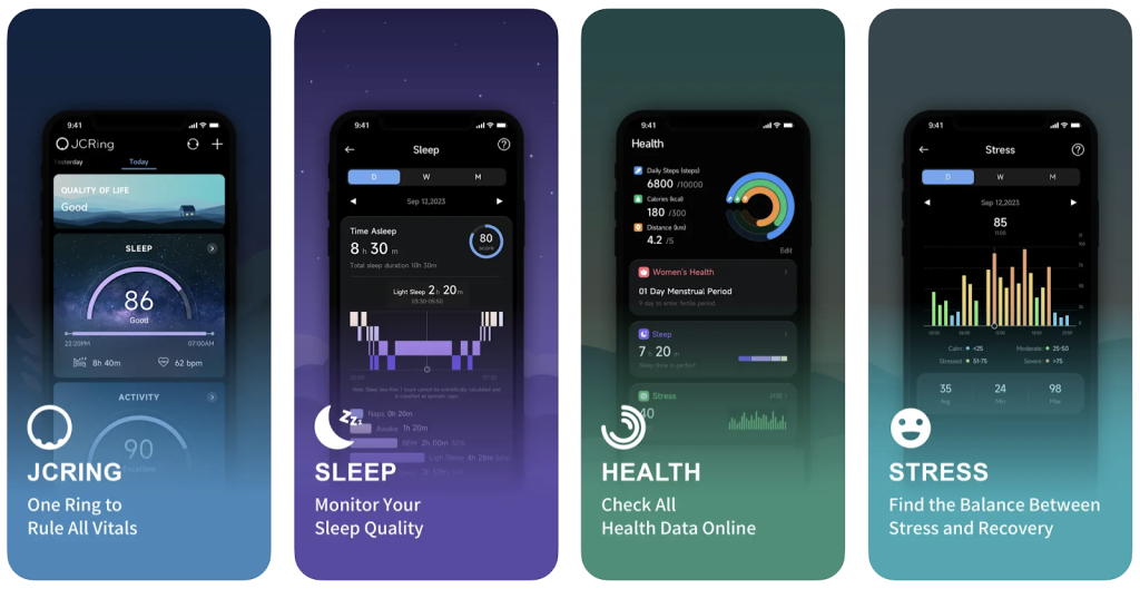
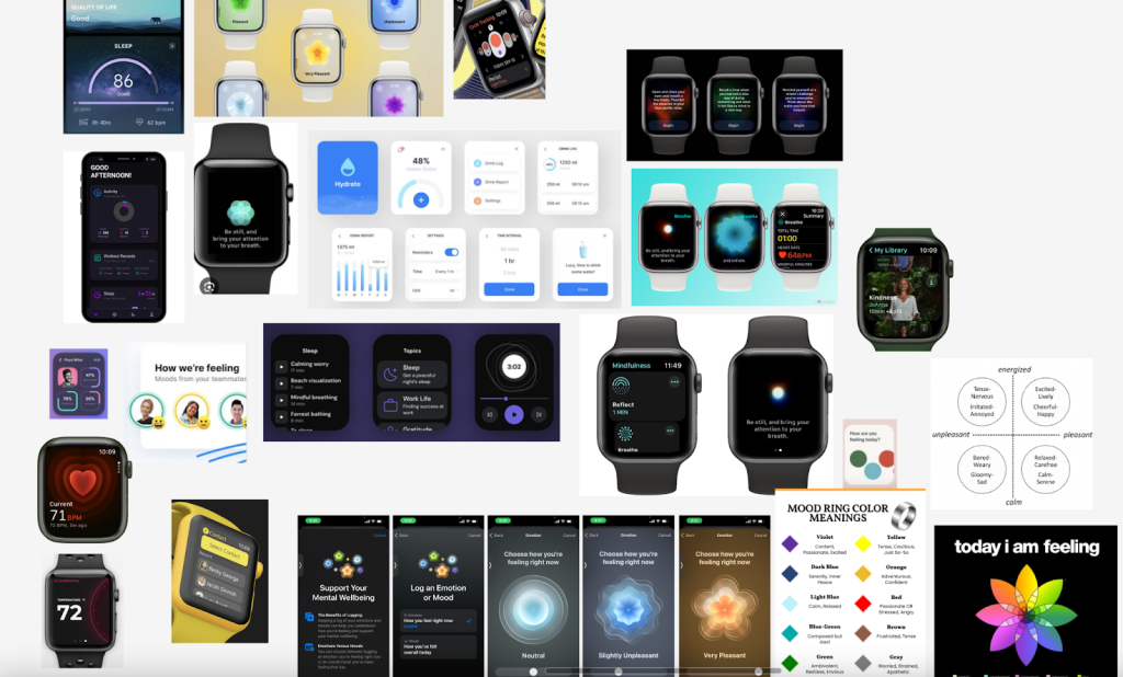
3 – DESIGN INSPIRATION
Before moving on with design I wanted to gather design inspiration to better learn apple watch design standards as well as figure out the visual direction of MoodSense.
I looked at multiple sources including apple watch figma community designs, other meditation and breathe apps, as well as other logging/tracking apps.
For the design of the moods on MoodSense, I wanted to take inspiration from original mood rings where there’s a color associated with each mood. To take it a step further, I also decided to give each mood a specific shape that related to the feeling of the mood as well.
Here is an example of some of the inspiration I used in my design moving forward:
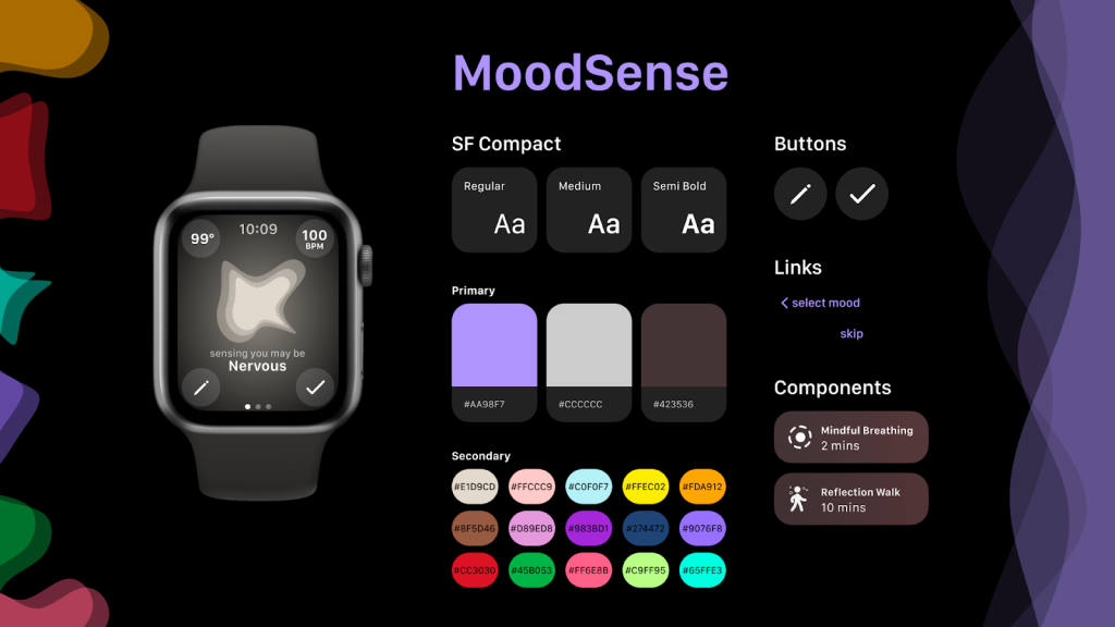
4 – STYLE GUIDE
After Identifying the general visual design style I wanted to implement in MoodSense, I put together this style guide to narrow down the font and colors as well as the style of buttons and components I wanted to go with.
5 – FINAL
Here is a comparison between the Wireframes and the Final where you can see how the style guide was applied:
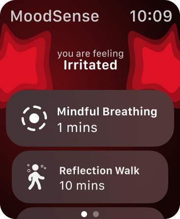
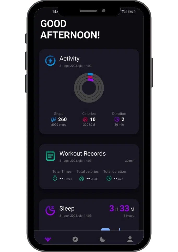
When designing the final screens, I realized that my original scope was too ambitious for the critical path that I wanted my users to interact with. Because of this I ended up getting rid of the profile and health report pages as they weren’t necessary to achieve the goal of MoodSense.
SOLUTION
To make these designs fully interactive, I connected the screens through figma prototype. I learned a lot about how to better use smart animate, which was really fun for me.
You can interact with the final prototype here: https://www.figma.com/proto/q0Ilp6zdOBRkJFFKfnh87F/IDM-381—Exp-Tech?page-id=0%3A1&type=design&node-id=93-1035&viewport=-5848%2C35%2C0.67&t=CN89VfppzRj6fnQX-1&scaling=contain&starting-point-node-id=93%3A1035&mode=design
RESULT
With the combination of the experimental tech of a smart ring and a designed apple watch interface for easy access, users are able to address their current emotions, find solutions to them immediately, and encourage their friends, gradually improving their quality of life overall.