

Overview
The goal of this project is to create an interactive touchscreen interface that would assist prospective and undecided Westphal students in selecting a program of study. Our team of 5 was given about 20 weeks to research, design, prototype, and develop this experience, with the aim of addressing the issue of the Westphal website’s lack of an engaging approach to help students explore majors, and find the best fit for them. By creating an interactive and visually appealing interface, our solution aimed to provide students with an approachable tool that would help them make informed decisions about their academic future.
The Problem
Our users are prospective and undecided students who need a tool to help them decide what to study at Westphal College, because the current website doesn’t cater to uncertain students and is not engaging.
Goals
Our goal was to create an interface that would assist students in selecting a program of study. Since it would mainly live on a touchscreen in the lobby, we wanted this experience to be bite-sized so that the user will only need to spend a short amount of time in front of the display. By doing so, we wanted this interface to serve as a vehicle for students to begin research, something that would spark their interest in the majors offered at Westphal.
The Process, Challenges, and Insight
Research & Persona
To begin the project, we aimed to gain a comprehensive understanding of our potential users. Our process started with an in-depth exploration of our target audience. It was incredibly necessary for us to be able to really get into the minds of these students and their families. We wanted to try and see their process of deciding where and what to study in college.

We conducted multiple user interviews and then synthesized the data using the affinity mapping technique. By doing so, we were able to identify the core problems, pain points, and goals that students and their families face when exploring majors at Westphal.

We then reviewed our findings alongside some of our initial assumptions. Using this information, we developed a User Persona to better understand the needs and preferences of our target audience.

User Flow
Having gained a comprehensive understanding of our users, we began the ideation process by brainstorming a range of possible solutions. During our initial designing phase, we wanted to build upon the current website, bringing some interactivity and reorganizing the content to make them consistent across majors so the student could have an easier time comparing them. After some usability testing, we quickly found out that this information, as helpful as it was, failed to help our users narrow down their selection.
“The last time I was on the website, I honestly felt overwhelmed by the amount of information. I felt that the benefits of each major were not adequately emphasized, like, what makes them stand out?”
– Anonymous Design and Merchandising Freshman
In order to make the project more engaging, we added a questionnaire that targets the user’s interests, personality, and work preferences. By doing so, we could compare the user selections and the tags associated with each major to help them narrow down their selection. After this, we continued to refine our user flow by making it more streamlined and easier to navigate.

Prototyping
We began by sketching out our ideas for the low-fidelity prototype. We wanted to incorporate components that highlighted the major’s very specific details, such as unique aspects of the different curriculums. Our flow followed the users sharing details about themselves through a 3 question, multiple choice “personality quiz”.
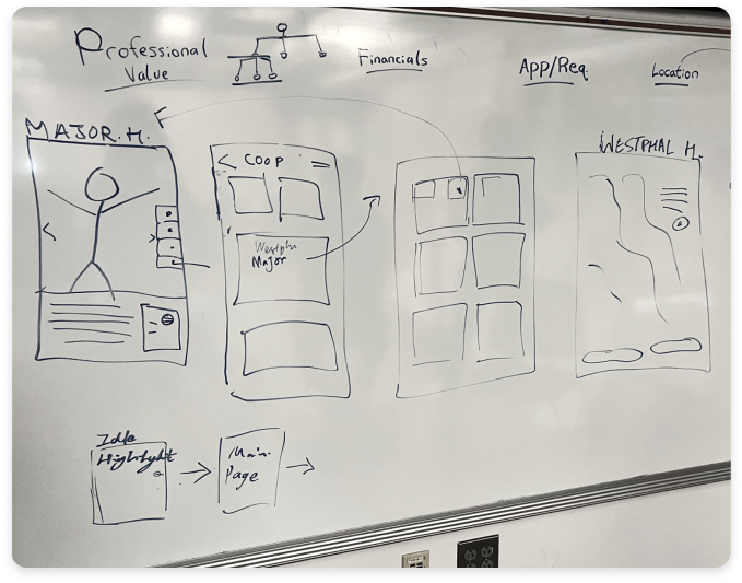
The mid-fidelity design period then followed us refining aspects of the 3 question model that we had developed in the first prototype phase. We added more questions, and revised the display of the 3 screens. At this stage, we were convinced that this approach was successful. We assumed that our question categories made sense to the students, and that the program directors would think that the tags properly defined their majors.

Upon sending out surveys, as well as completing a round of usability testing with the mid-fidelity design, we realized that our current tags and 3-question model actually failed.

Program directors that we had surveyed found that the tags were too generic, and failed to accurately represent the majors. Students found 3 questions to be too long during tests, and they were confused with why they had to share things such as their personality, etc. These deficiencies muddled the purpose of our interface, so we needed to take a step back and improve the tags.
“I feel like the process of choosing our personalities is kinda unnecessary and overbearing. I don’t really get how me being reserved or something would help me get to the realization that I wanted to do graphic design.”
– Anonymous Game Design Freshman
We decided that we needed to streamline, yet still prioritize the question-based approach. We merged the 3 questions into 1, doing away with the personality and work preference questions. We then utilized a word cloud technique to create more accessible yet poignant terms. We had also sent out a survey to current students who had just declared their majors, asking what interests influenced their decision.

We then combined the new tag terms that we made from the word cloud and the survey responses. We slimmed down the total list of tags, and reviewed the final list with the Westphal director of recruitment, Tia James. We now had actual validation behind our approach.
We then conducted a final round of usability testing, with our new question and tag model in our high-fidelity prototype. We also added our near-final styling and imagery.

The last test was a success! Students responded very well to the new approach, with the new tags accurately matching them to the majors that they had expected. Additionally, the single interest page was actually more intriguing to them, and the overall feedback was very positive.

We still had some minor visual tweaks to make, to ensure readability. We solidified the component placement, and the Westphal-based styles across all of our screens.
Content & Development
Content Design
During the prototyping phases, part of our team’s primary focus was to gather and curate content to be featured in the interface. This area was incredibly important, as the DNA behind our experience was that of an advertisement, (meaning the information would be front and center).
We initially began by figuring out what would be the most logically pertinent information to display. We made a considerable amount of decisions based on the initial user pain points, namely in how there was a near-unanimous desire for the current website to feature more information about the co-op opportunities and the career outcomes. We also wanted to have a section which featured information about the unique Westphal facilities that were available to certain programs, but opted to scale this back.
The same approach inspired the fundamentals; 3 distinct takeaways that gave a peek into what the program was about. We wanted to keep the pages image heavy with little text, so they could still capture the essence of the majors but in a more digestible format.
We ultimately decided on a detail page that showed an immersive full-screen image of the major, with 4 additional different sections below, (fundamentals, co-op/custom, careers, and alumni/faculty). This 5-component layout, and bite-sized direction allowed us to dynamically fit content for all the majors. It was kept brief with the use of stats and percentages for easy reading and discovery.
Catalog Structure
To keep everything organized, we developed an information structure in Google Sheets to catalog all of the content, this helped to keep details accounted for.

A few weeks in, we had reached out to Tia and some of the other Westphal faculty to assist in drafting some of the text content. The Google Sheets catalog allowed us to collaboratively work with them throughout the project.
Development
We opted for Svelte as our front-end framework due to its superior modularity and simplicity compared to ReactJS. In addition, we chose Tailwind instead of vanilla CSS for a more standardized and modular web design. Initially, we used a JSON file as our backend, but as the project expanded, we discovered the need for a more user-friendly content management system. Therefore, we integrated Strapi as our backend, offering our client a GUI-based content management system to modify the website’s content without any technical knowledge.
Solution / Final Product
With all of the phases of the design and development coming together, we had a final product, now named Westphal Key, that we were incredibly excited about. Key, with its core path polished, was visually and functionally refined.

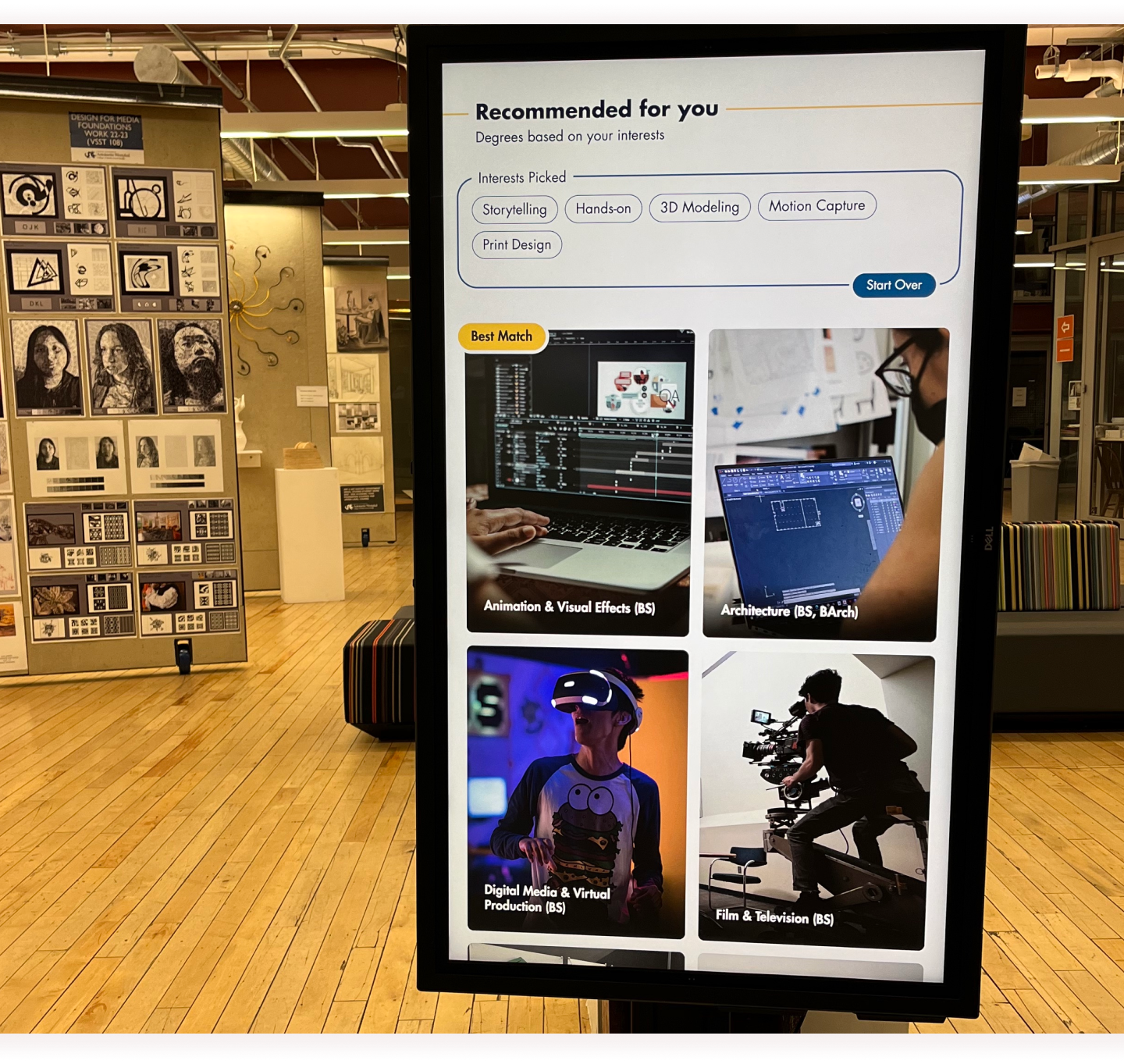
In our final state, users are able to jump into Key through the landing page, and after a brief greeting/ onboarding message, choose their interests from our curated list of tags. Then, after a quick loading animation, they are paired to their results, which populates with the majors that best match their choices in descending order. Below, they have the option to browse all majors. Upon selecting one, they can learn about the program— they get an idea of its foundation, opportunities or benefits, career outcomes, and successful alumni. They then can scan the QR code to continue the research at home, or go back and browse other majors on the screen.
The landing page serves as an access point to Westphal Key. The images or videos featured here intend to intrigue passersby. The page’s CTA is placed at a natural touch point on the screen, to further supplement encouragement to potential students to jump in.
The interest page emphasizes the cluster of unique tags, which spill over the screen, inviting users to scroll through and engage by selecting their interests. Choices are populated into the bottom selection bin, in addition to the tag chips turning blue. It allows users to keep track of and unselect choices, or view their results.
The results page displays the user’s chosen interests back to them, with the most similar majors in descending order above the general list. The best match is highlighted, and imagery is large and descriptive.
As described in the Content section, our detail page prioritizes images within the design to capture and immerse the user, and breaks down the major’s information into the 5 different sections. The pictures of the alumni at the bottom provides a more personally tangible view into the success that can be had through Westphal and its specific programs. Users can go back to the results page with the persistent back button for further browsing.
Results
Now, at the end of our 6-month journey, our team thinks that Key is a success. We had delivered an exciting solution that will actually be a forward-facing product for Westphal college. Our interface was well received by our intended target audience during final tests, with current prospective students saying that the majors that they were matched with fit them well. Nearly unanimously, our participants were engaged with our interface, and intrigued by the idea. Many of them stayed after their tests to ask about if it would actually be released, and if there would be even more features added. But, most of all, we gained a tremendous amount of knowledge from this project. We learned that, even when we were certainly convinced of an idea or approach, it can get completely disproven by the actual users and audience. It genuinely showed us the potential depth of research that is required when creating a solution like this, but also how to make sure to not get lost in said research or scope, straying from the initial project goals.
We’re all grateful for everything we had learned, as well as having been able to create such a sophisticated product. We certainly will take many of the lessons from working on Westphal Key into our future endeavors and projects.