Overview
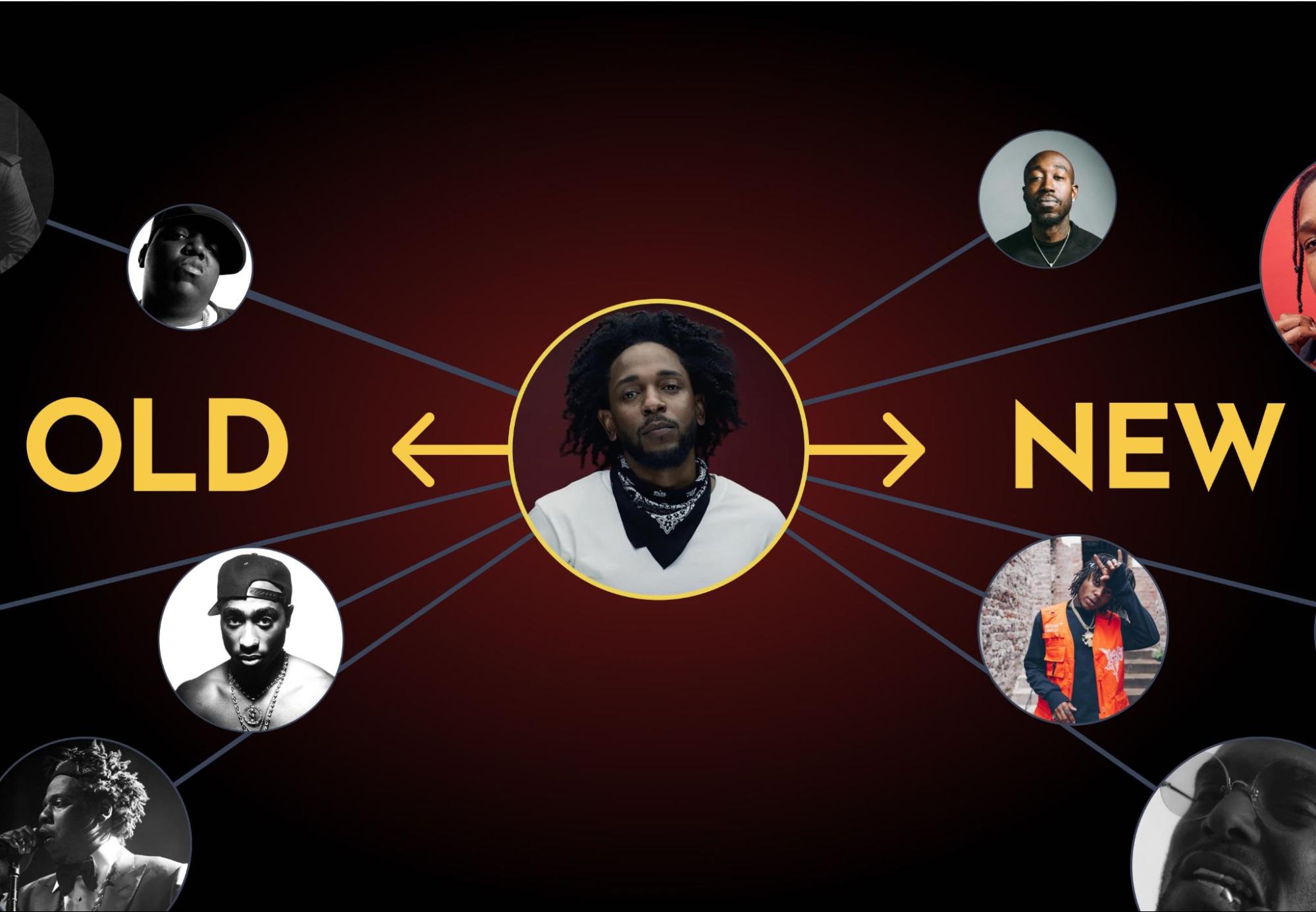
Omni is a music discovery app based on the relational similarity between artists. This product aims to help users find new music by displaying their favorite artists’ influences and similar musicians. After searching for an artist, the options that Omni provides would effectively allow users to move forward or backward throughout the lineage of the searched artist.
Our team consisted of:
- Ty Drake – Project Management / UI Design
- Kyle Dolphin – Front/Backend Development
- Christine Yim – UX Design
- Bryant Lu – Content Management
Context and Challenge
Omni looks to tackle the challenge of music discovery through the exploration of musical lineage. While there are many tools within the music discovery realm, there are very few that explore the aspect of music ancestry. Across history, music artists have continually influenced each other, and many genres have an underlying historical connection that binds artists together. Omni looks to bring that historical thread into an interactive experience that users can use to discover new artists, both past and present.
Over the course of ~20 weeks, we researched, designed, tested, and developed a minimum viable product desktop web-application experience. For Omni, we had four main goals that we were targeting to demonstrate the product:
- Ability to search for any artist
- Creating a network web of other related artists
- Expand this web by interacting with other artists
- Ability to view the overview of each artist, including each artist’s top songs, as well as their discography, which would link to the appropriate Spotify links for each song, album, etc.
Research & Process
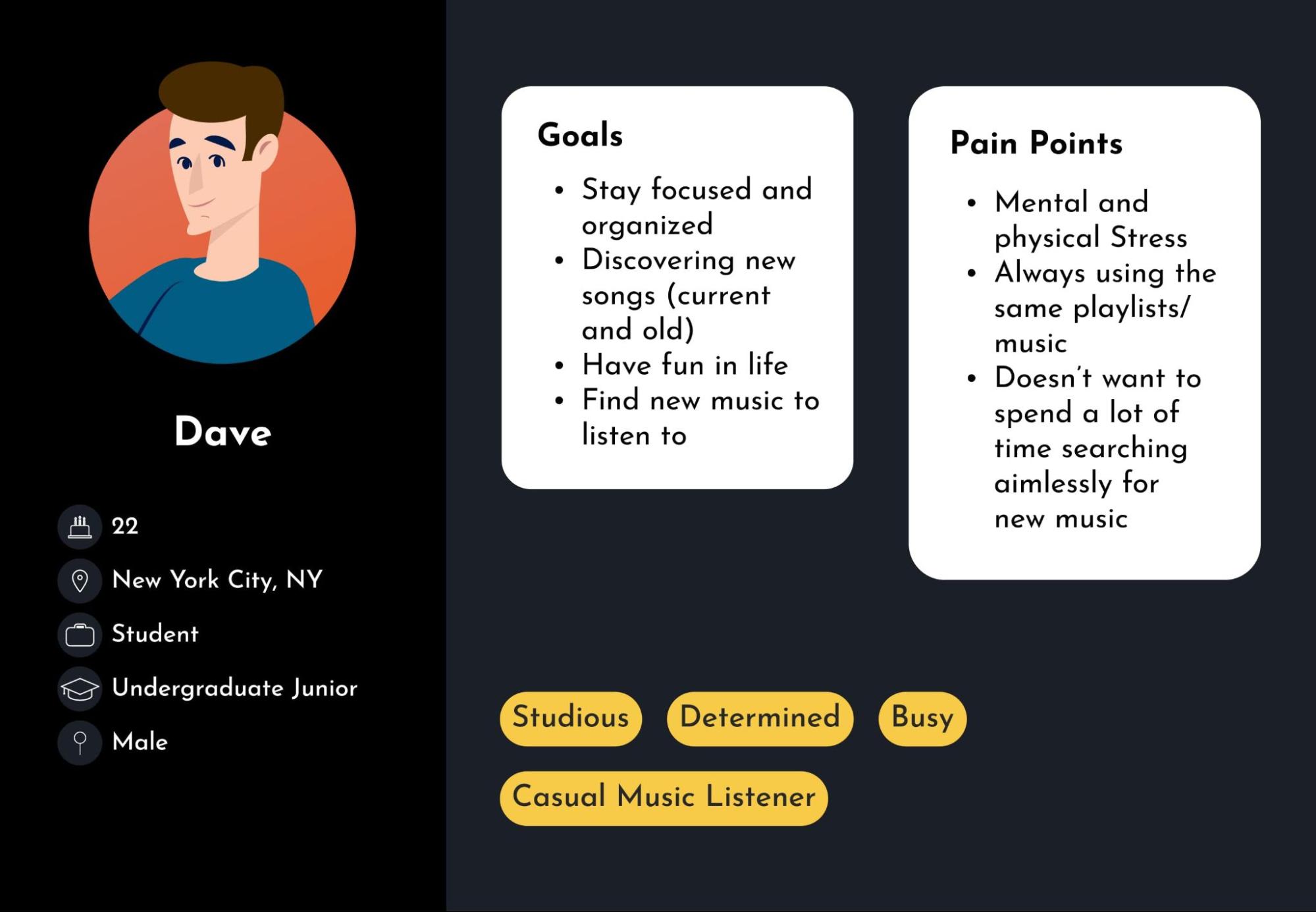
We began by conducting a round of product discovery & concept testing with users to gauge their level of interest in the proposed product. This step helped us understand our potential users and what they wanted from a tool like Omni. Some of the key takeaways that we found are:
- People are trying to find new music, but the perceived effort prevent many from doing so
- Users prefer to find newer, modern artists, however, certain genres (such as soul/funk or subsections of hip-hop) bias towards historical acts
- The “Most Popular” is utilized frequently by users when listening to new artists
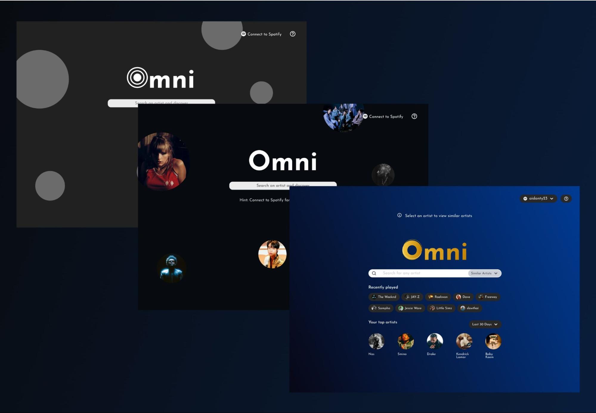
We utilized A/B testing with users throughout the several rounds of testing in order to make validated decisions throughout the design process. While many small tweaks were made to the design throughout this process, there were several significant changes that were shaped by the user testing results.
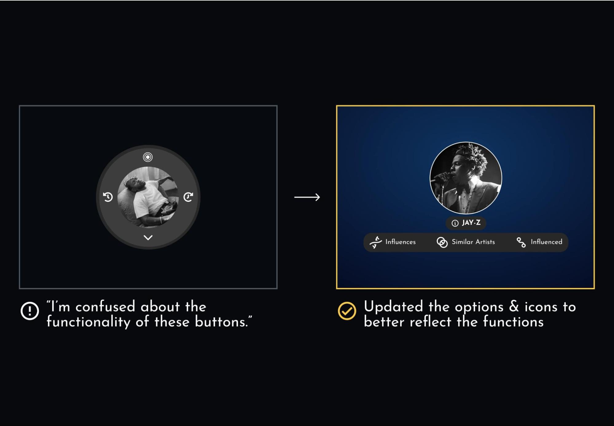
The biggest design challenge was how to represent the “Influences, Similar, and Influenced” options that are key to the concept of Omni. Since comparable applications had few similar functions for reference, we heavily relied on user feedback for inspiration in developing this component. We tested this component with various sets of icons, text placement, and tooltips in an effort to make this as clear as possible. Even with these changes, there are still improvements that could be made if we had additional time to continue testing.
Solution
Omni is meant to make finding new music an easier and more enjoyable experience. We wanted to ensure that the artists are the focus of the product, and accessing their information is never more than a few clicks away. Although there are a wealth of features and functions that could be added to Omni, we felt it was important to keep the whole flow as simple as possible for this MVP iteration.
Music is the main focus of Omni, and we wanted the aesthetics to match the feeling that music can give. “Relaxing, calming, entertaining, energizing,” were all words that were used to describe music by the users we spoke to. While “calming” and “energizing” may seem contradictory, we tried to design the interface to potentially tap into both feelings through the use of complementary blues and oranges, subtle motion, and depth of focus.
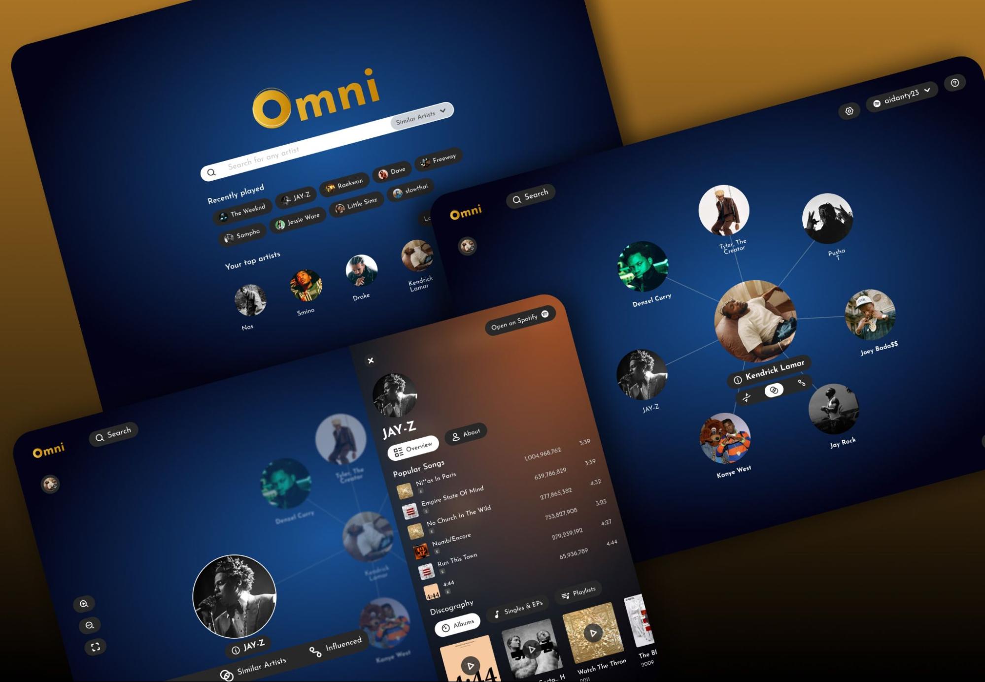
We had initially planned on incorporating multiple data sources in order to display the relationships between artists, however, due to time constraints, we decided to use the Spotify API as the sole data source for Omni. While this may not produce the most accurate results, it allowed us to demonstrate the core concepts of the product without overcomplicating the backend systems.
Results
Although we did not manage to execute the development of every goal that was set out, we managed to implement most of the fundamental concepts necessary to demonstrate Omni. We had set some lofty goals for the project and were unfortunately unable to reach all of them within the timeframe provided. However these shortcomings have taught us a lot from this experience.
For example, more time would be allocated to planning the development phase of the project. We had four main goals that we wanted to hit for development: searching for any artist, creating a network of related artists, the ability to expand this network, and viewing individual artist’s discography information. We were able to execute each of these goals apart from the expanding network. Since we were working with a new framework with d3.js, development on certain features took longer than was initially planned. This resulted in some features getting cut for time, as well as not having the time to refine certain aspects of the experience to match the prototypes.
More time would be dedicated to the testing phase of the project as well. Although we had several rounds of design testing, we were unable to get equivalent feedback through usability testing with the live product due to the tight timeline required for development.
However, if development were to continue on Omni, we would be in a great place to continue researching, designing, and developing refinements to the experience as well as adding additional functionality.

