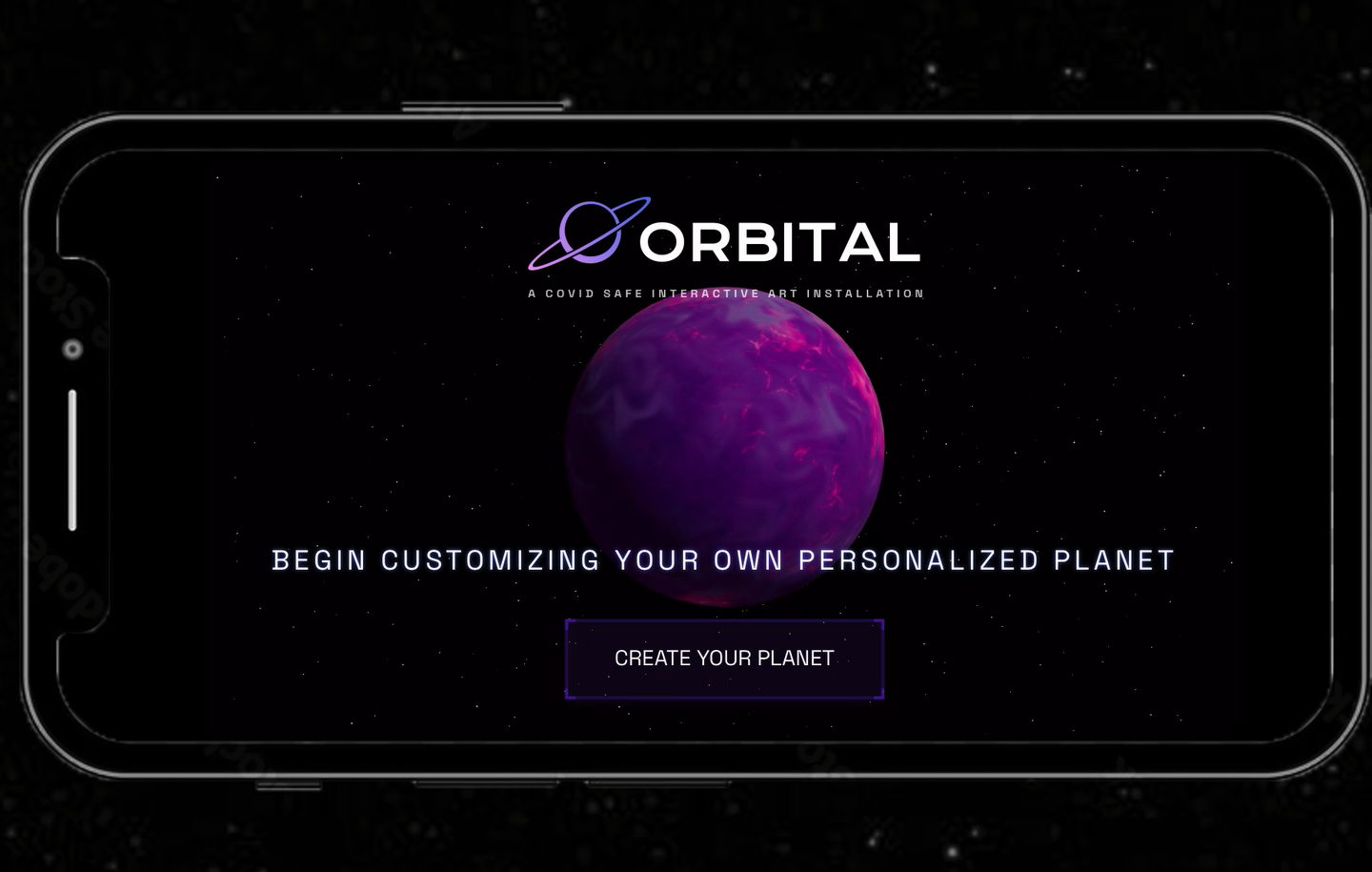
ORBITAL
The Project Overview
Orbital, a covid-safe interactive art installation allowing for the collaboration of visitors to manipulate and create a one-of-a-kind galaxy in real time.
Our vision for the Drexel Westphal 2021-22 senior project is to create a covid-safe interactive art installation allowing for the collaboration of visitors to manipulate and create a one-of-a-kind experience in real time. Over a timeline of 9 months our team ideated, designed, tested, developed, and deployed a galaxy themed interactive art installation for visitors from all over Drexel to take part in.
The Team Members
- Charles Wolloch: Project Manager, UX/UI
- Melissa Gabriele: UX/UI, Dev
- Reid Dumont: UX/UI, Project Manager
- James Zangari: Dev, UX/UI
The Project Summary
Our main goal is to design and develop an interface for visitors to make their own custom planet and add it to our galaxy that is being projected in real time, while also creating interactions that excite, intrigue, and are memorable. Our minimal viable product will consist of the planet customizer application, the galaxy canvas for the planets to be added to, and a statistics dashboard that will show off fun metrics collected from the event, live.
Although we present ourselves with this galaxy theme today, we weren’t always centered around this concept of building a galaxy together from scratch. We always knew we wanted to enable visitors to collaborate to create a piece of art together through their individual efforts but our original intent was to allow for anything to be displayed.
Our original plans were for visitors to have a free range of drawing tools and visuals so they can create their own individual art piece which, upon saving, would be collaged with the rest of the submitted works. Over time this would create a giant collage of the work of everyone who took part and ideally would appear as a magnificent mural representing all of the collaboration that occurred.
After receiving feedback that our original idea was too broad, we quickly pivoted into the galaxy creation theme. It offered a unique niche for us to explore and an experience to build while also working off of the themes we initially wanted to capture.
The Challenge
The basis for our project is centered around us solving this challenge statement:
- How can we create an interactive art experience that excites, engages, and is memorable for our users?
To solve this challenge we took our 9 month timeline and split it into 3 phases:
- Research, Design & Development, and Execution.
Each phase lasted 3 months (a single term’s length) and our project ended with the senior showcase presentation.
The Solution
Research
In order for us to succeed we started by spending 1 term researching and ideating. We conducted interviews, user workshops, met with industry professionals, and conducted other user research methodologies to gain insight into what makes engaging, memorable, and fun interactive art.
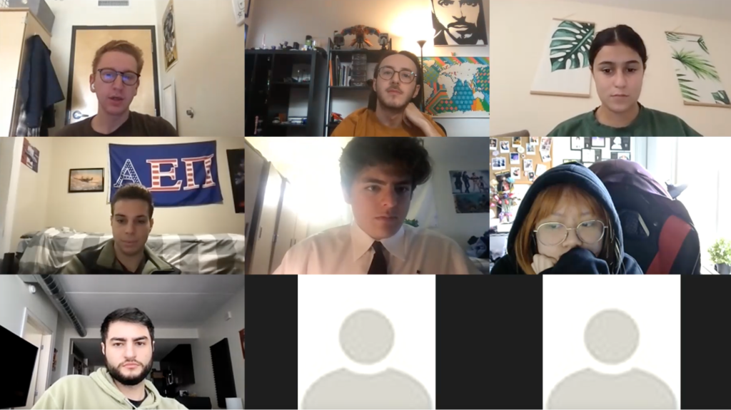
It was also at this time that we identified our target audience as being the Drexel student population, since we were limited due to covid restrictions. We then created a user persona representing our target audience.
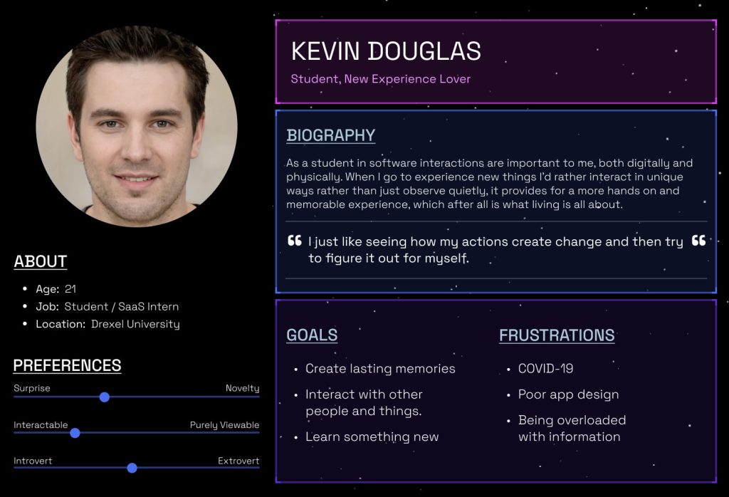
After identifying our target audience, we began forming our User experience, interface, and interaction designs. We tested our prototypes with real users based on our target audience and used those insights to refine our approach and ideas.
Design
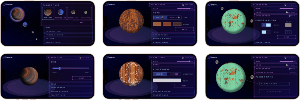
Once we had chosen the solar system concept, it was time to begin focusing on the planet creation design. We knew we wanted users to create unique planets which would be added to our collaborative solar system. Our first round of design allowed users to select one of NASA’s 4 planet types and customize size, surface, orbiting elements, etc.
Feedback obtained from users showed us that they did not notice the bottom scroll menu or enjoy using it. We explained too much with text and not enough with visuals. The feedback from this round of user testing helped influence a completely new design for the flow that users understood and enjoyed using more.
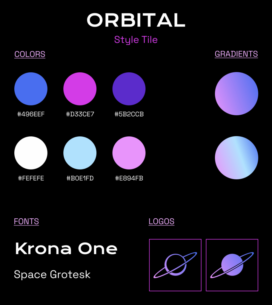
We also focused on branding, creating a logo, name, and graphics, and selecting colors that fit with the sci-fi/space atmosphere we wanted at the event.
This new design was much less text heavy, showing rather than explaining. We had a lot of facts in the app which were removed in this round of edits. We decided to place the facts on the walls in our installation so visitors could learn about the planets they were creating. The new design uses tabs to guide the user through the flow and includes the planet type selection as one of the tabs so users can easily edit their planet type if desired. As the user makes choices, the tabs show each selected option and they will see their planet update with those choices.
The final update focused on smaller changes now that we had a finalized format that users understood and enjoyed. Confusion from users about color choice correlation led us to incorporate it into the atmosphere and core tabs instead of having its own tab. The main focus of this UI update was to create a UI style that fit with the planet building experience and the ambience we were trying to create at our event.
The final product was a streamlined process that took around a minute to complete with enough variability that each visitor could create a unique planet. Our goal was to create a process that was quick and easy for everyone to use and understand.
Development
The Orbital web app is built with Next.js, a React framework, and uses an additional set of packages to help improve and enhance the user experience. The core technology behind this application is react-three-fiber (R3F), a React renderer for three.js (3D javascript library). Using R3F combined with lamina, a layer based shader material, allows for multiple images and colors to be combined and layered onto a 3d object, which in our case was a sphere representing a planet. The planet creation flow uses key features of React such as the “useState” hook, which allows the user’s selection to be stored as a variable. When the user submits their planet to our solar system, these variables are then passed to the database as a JSON object where the data can then be manipulated for each unique planet that is created. We were able to achieve real-time updates for our web app on exhibit day using SWR, a React Hooks library for data fetching. This allowed us to set a refresh interval on the pages where the web app would refresh every 60 milliseconds checking for updates in our database. Additionally, Tailwind was added to reduce the amount of CSS files included in our application.
The essentials: planet creation flow, solar system, and mission control, were finalized early enough where we had some resources to devote to other interactions. This led us to incorporate the joystick station. We used the Logitech Extreme 3D Pro Joystick and connected it to our planet database to cycle through the planets.
We did this by using JavaScript to connect to the USB port to detect inputs. This input was then split so we could read a roll to the left or right. A roll left would pull the previous array entry, and a roll right would pull the next entry.
Execution
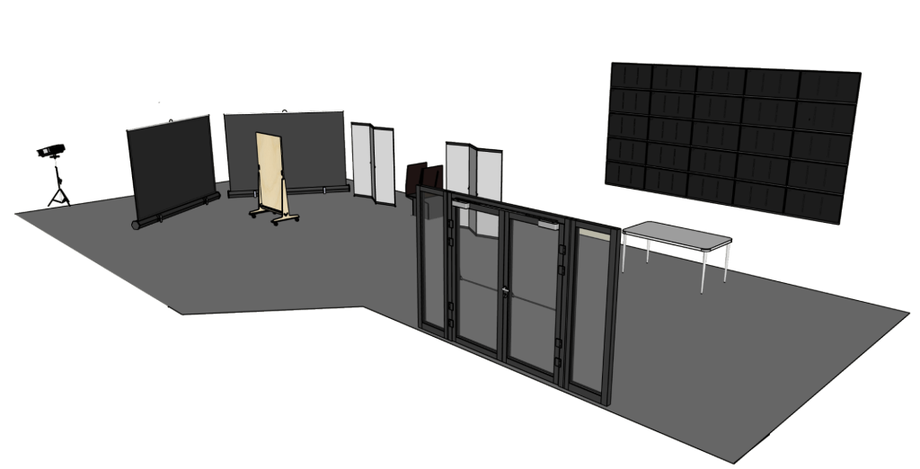
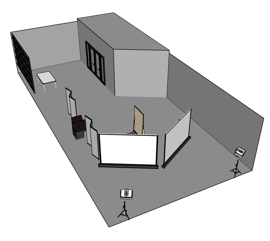
The event was held in the Westphal lobby of Drexel. We created a floor plan that optimized the darkness of our given space while allowing visitors to progress safely through the installation. The large mission control screen, shown on Westphal’s big multi-screen display, grabbed the attention of visitors as they walked through the front door. Visitors then could approach our information table that displayed facts about each planet type along with a scale model of the planets presented with stickers and treats. QR codes and informational flyers about each interaction and the exhibit were placed around the entire room. The large screens each displayed a different rear projected view of the solar system. This was done so visitors could get as close to the screens as they wanted without obstructing the view. We placed QR codes to create planets, more facts about the planet types, and information about the exhibit for visitors to read as they progressed through on the walls surrounding our exhibit. The joystick station, where visitors enjoyed scrolling through the database of planets, sat between the screens and the information table. This set-up was something we researched by referencing our space and other installations. We tested our equipment in multiple sessions, and updated our planned setup based on research and application throughout the final term.
The Results
Final UI demo
Promotional video highlighting our event
The Conclusion
Our goal was to create an interactive art exhibit that excites, intrigues, and is memorable while also offering a covid safe experience for our visitors.
We know we succeeded when we saw high user interest and engagement within our exhibit. Additionally, we saw our backend database filled with all of the data provided from users coming in and making their own custom planet. This serves as a great metric for us because we saw a significant amount of user input into our database.
Our main goal was to create a collaborative piece that allowed each person to contribute something unique as an expression of themselves. Based on the unique planets that populate our database, and the diverse solar system it creates, it is clear that this was successful.

