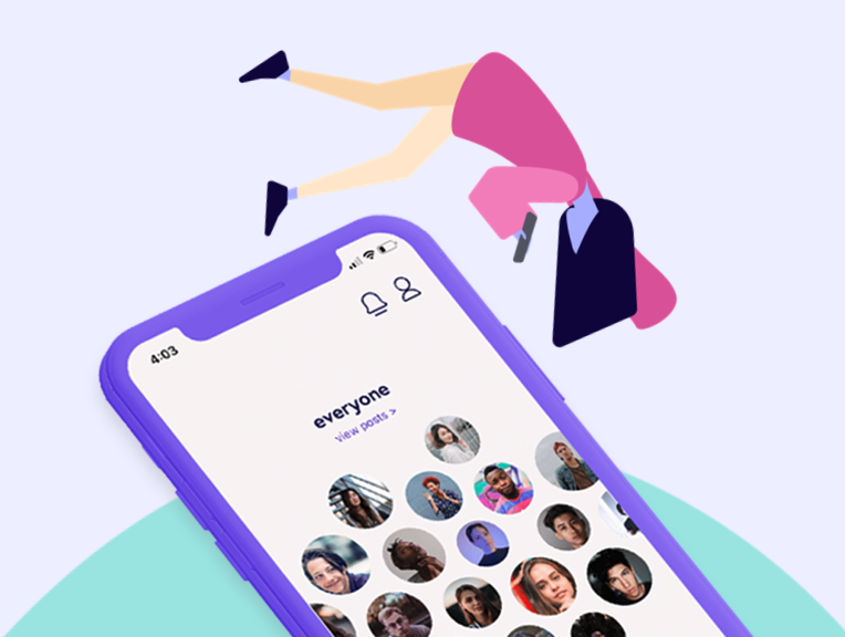
Goal
Pluto is an experimental social network that focuses on fostering meaningful connections. This raises two fundamental questions: What is a meaningful connection, and how can we foster them? For this reason, Pluto must identify what features will best accomplish this goal and ultimately create an engaging platform for our users.
Summary
Pluto redefines social media by putting an emphasis on meaningful relationships. It’s an app for close friends only, with extra layers of privacy that other social media platforms lack. Nobody can find your profile unless you send them an invite, and your posts are only shown to the people you choose. The same goes for viewing posts. Say you want to separate the happenings of your family members and your college friends- Pluto allows you to organize your connections into multiple feeds.
Roles & Responsibilities
| Sarah Bray | Project Manager – Lead project, managed research and design initiatives |
| Mike Carbone | Backend Developer – Built the pluto backend API and pluto site |
| Rob Nashed | UI Designer – Created the color scheme and final screen designs |
| Woo Song | Design Technologist – Prototyped and designed the app via react native |
| Clay Tercek | Frontend Developer – Led the react native development |
| Veronica Lin | UX Researcher – Administered usability testing and user interviews |
Defining the Problem
When forming a team, a sentiment shared among all members was that people do not feel as though modern social media networks value their privacy. Current leading social media platforms are all about sharing everything with everyone- therefore, our goal is to create an app that is fundamentally focused on creating a private sharing space.
How can we foster meaningful connections in an online space?
The first three months would be dedicated to better defining a need, and seeing how a new social media application could help with the following:
- Foster and maintain meaningful connections
- Maintain a sense of privacy when using the network
Research
We followed a data driven approach based on various collections of user centered feedback and individualized research. We had a claim, and we needed to back it with comparative research and data surrounding how user’s feel when using social media.
The first phase in research consisted of independent research- following processes such as comparative analysis, gathering research on pre-existing studies, and conducting various inquiry interviews and surveys to get a better grasp on the user perspective.
From the comparative analysis data we were able to better identify a gap in ‘meaningful connections online’ and what current social media sites are providing:
- encourage users to create large networks
- high barrier for posting “quality content”
- content driven by trends and hashtags
- space for business, ads, fake accounts, and bots
- intimate connections
- one-on-one interactions with your network
- space that is both private and secure
- lower barrier for creating and sharing new content.
Users & Audience
Our target market is for all genders 16-80, who live in English-speaking countries, and like to easily share personal content to those that are close to them. For this research, however, we’ll be targeting potential users aged 18-25 on the presumption that young users are crucial to a platform’s success.
Screener Survey
The screener survey consisted of 15 questions surrounding the participant’s social media usage habits. We also used this opportunity to validate early assumptions, asking high-level questions about users’ perceptions regarding privacy and their social media connections’ meaningfulness.
Lasting four days, the survey garnered 250 responses with some notable results:
- 80% use social media to connect with close friends and family
- 57% of people feel their connections on social media aren’t meaningful
- 70% feel having a social media account makes you ‘public’
- 65% feel current networks don’t value their privacy
I Like, I Want, What If
Next step in the research was to have a discussion with our users. ‘I like, I want, What if’ exercise allowed us to open a discussion with our users about what they value and what they wish from social media platforms. Here are our main takeaways:
- Content is KING: Most participants’ favorite aspects of social media derives from the content they see and how they see it
- Communities Count: Many participants are drawn to platforms by being apart of communities
- Smart Moderation: Participants value free speech, but want content to be more heavily moderated
- Connections Matter: Participants wish many certain platforms made it easier for them to connect with others
User Interviews
User interviews also helped us tremendously in understanding our users more. With over 200 minutes recorded and over 33,000 words transcribed, we used the method of inductive coding to find common concepts throughout all of the interviews. These commonalities guided us in defining our features. The most important concept that we found was that most meaningful online connections are formed around repeated engagement through anything that most closely resembles face-to-face interaction.
Our Solution
Through our research, we found that the main obstacle getting in the way of meaningful interactions was a lack of privacy on current popular social media platforms. Our solution was to make privacythe foundation of our app’s design, rather than make it an option in the settings like most other social media. Here’s how we went about doing this.
Visualizing Connections
One of our first challenges was designing a home screen that allowed the user to easily organize and view their connections. We decided to use ‘groups’ as a way to filter content. Here are some of the various iterations we went through before landing on our home screen:
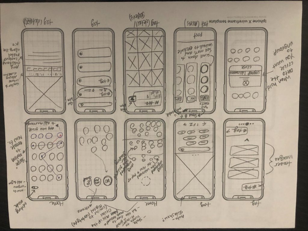
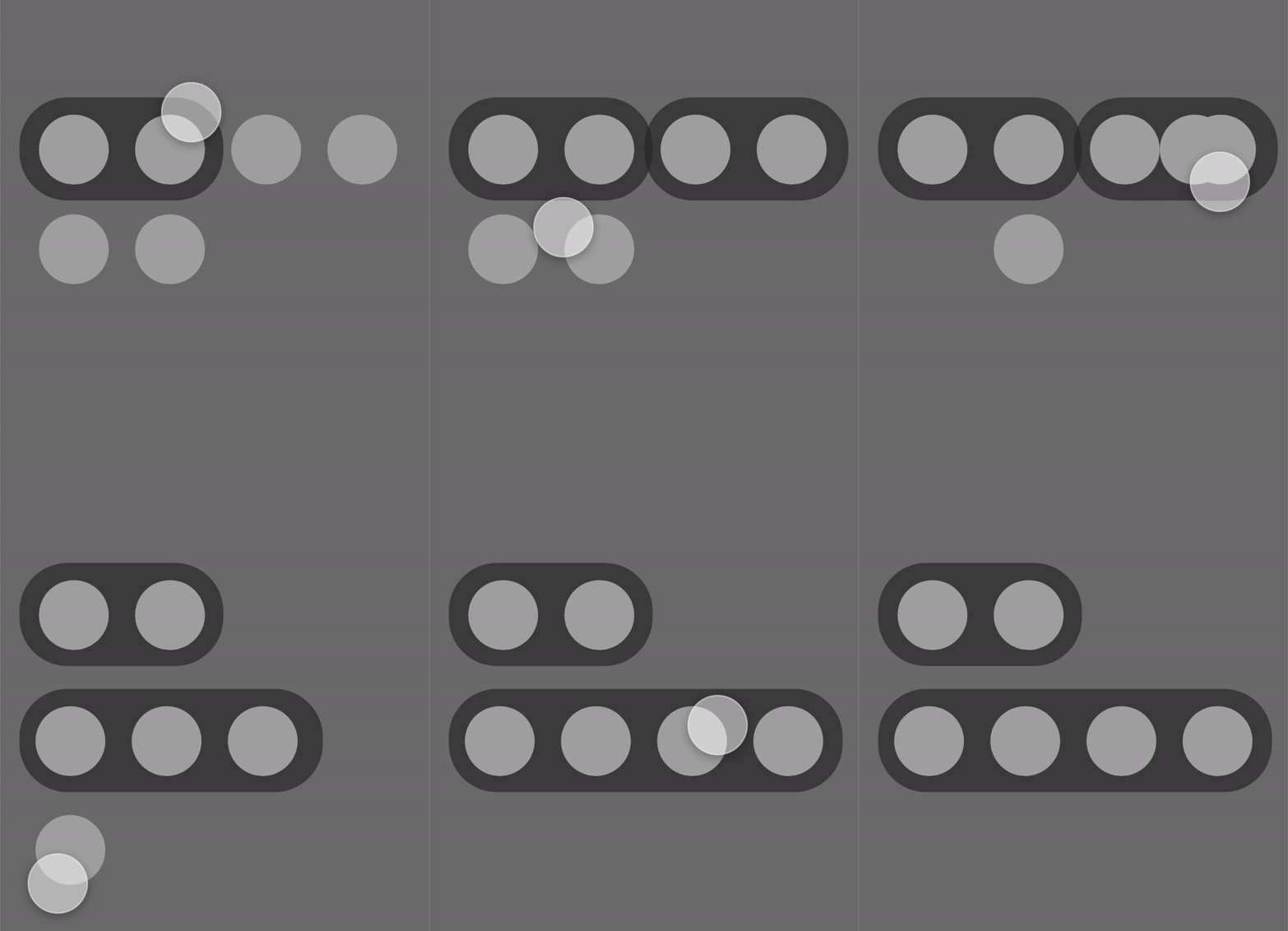
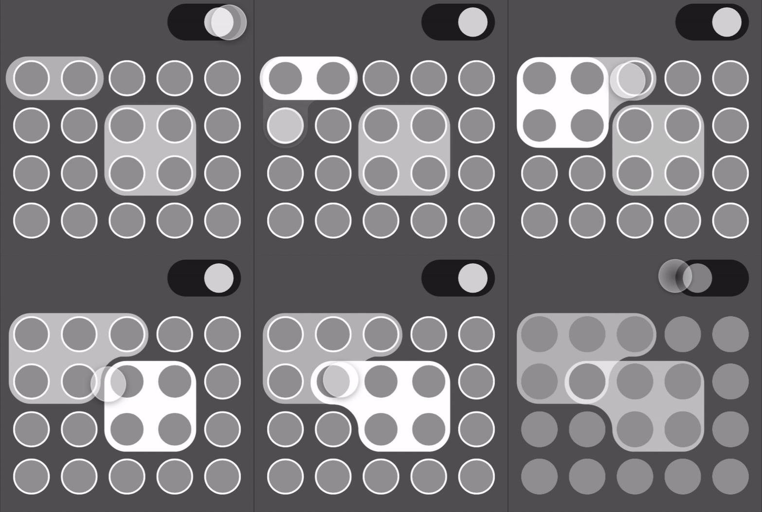
Prototypes exploring different ways to create and organize groups
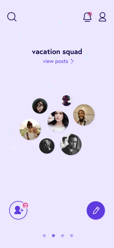
High-fidelity prototype on home with grouping
A Focus on Privacy
Since we wanted to create a place where people could post privately, audience control became our design’s central focus. We decided that a way to simply control who can see your posts would be to organize your connections into groups. Every time the user makes a post, they can choose precisely who can see it. They can select one or multiple groups, and even individual friends. This ensures that the user knows exactly who can see their content, ensuring that they can post with a sense of security.
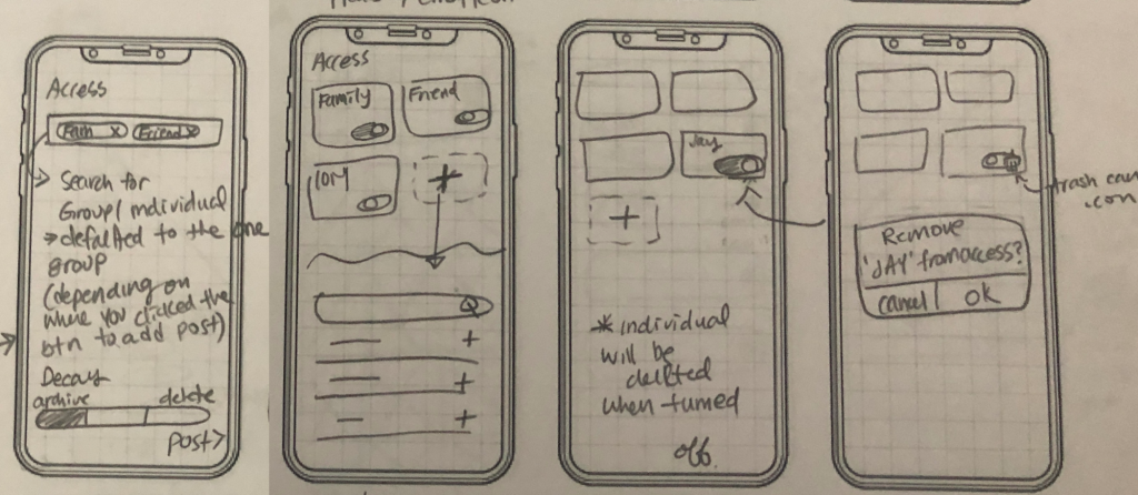
Early prototype showing ways to control post access
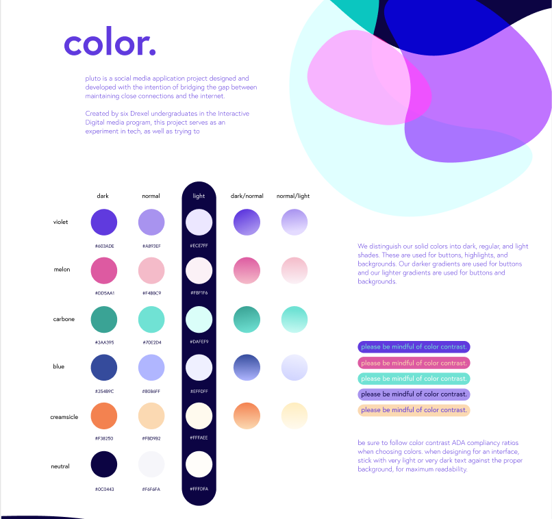
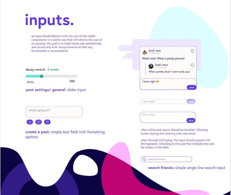
Parts of pluto’s design system
High-fidelity prototype on post access screen
Design
Designing for Pluto was a highly iterative process, factoring in things such as color theory and associative psychology when developing the brand.
When dealing with a social media interface, it’s important to try and maintain a clean, blank slate- instead of trying to create a kind of perception with the interface, allow for the user driven content to speak for itself.
Our design incorporates all these ideas into one, by creating an interface that is both stylish and interplanetary as well as a blank slate to best feature user’s content.
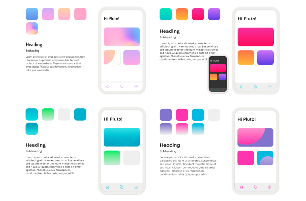
First few iterations on colors and typography
Microinteractions
Our home screen features a fun way to play with your connections and navigate from group to group. We wanted to incorporate that same feeling of delight throughout our app. So, we accompanied an animation with the ability to ‘heart’ a post unlimited times.
Backend
Written in Node.js with a Mongo database, Pluto is working off of 39 separate endpoints, each controlling a different action in a very specific way. We developed a few unique concepts to help us in making sure we can push features quickly while also making sure the code is high-quality. With a privacy focus, the server also ensures each piece of data sent with every request is secure and private.
One example of our privacy-first design is our commenting system. If you’re not friends with someone, we don’t want their name visible at all on the platform. So what happens when a stranger comments on your friends’ post? The backend now must prepare each comment section, ensuring that if a comment was posted by someone you’re not friends with, that poster’s name is changed to a pseudonym. We want that pseudonym to be the same if they comment multiple times, but also want it to change on different posts. So, we introduce dynamic name changing each time comments are loaded and sent from the server, to ensure each user’s privacy.
Frontend
Our frontend is built in react native, which allows us to share code between iOS and android instead of writing, updating, and maintaining two totally separate codebases. It also gives us the performance and hardware access of a native app, like the camera and push notifications, but with the convenience of writing in a language we’re all familiar with.
Conclusion
Our original intent when embarking on this project was to not only design and develop a professional quality mobile app packed with fun interactions and deploy it publicly, but also to assess whether creating a virtual environment where users have more control over their privacy would make it easier to strengthen and maintain virtual relationships.
Pluto has since accumulated over 150 active users during our beta testing, many of which have remarked that they feel more comfortable sharing personal content in pluto than any currently existing platform. We feel this proves the potential for more intimate relationships online, which are only becoming more relevant and desired in our current state of physical isolation.

