Overview
Boldly is a unique marketing platform that connects like-minded creators and brands. Social media marketing is one of the most promising and profitable new forms of advertising, yet the industry often lacks accessibility and sincerity. Rather than focusing on high budgets or follower counts, Boldly runs on a personalized matching algorithm based on mutual values and interests.
The Team
IDM
- Mel Gross
- Caroline Scheinfeld
- Claudia Bonitatibus
- Ryan Van DOngen
CCI
- Antigone Bellanich
- Chris Forsythe
- Miles Kelly
- Nataline Kolbe
- Kediel Morales
- Sam Platek
- Kevin Tayah
Advisors
- Troy Finamore
- Robert Lloyd
- Jeff Savage
Context and Challenge
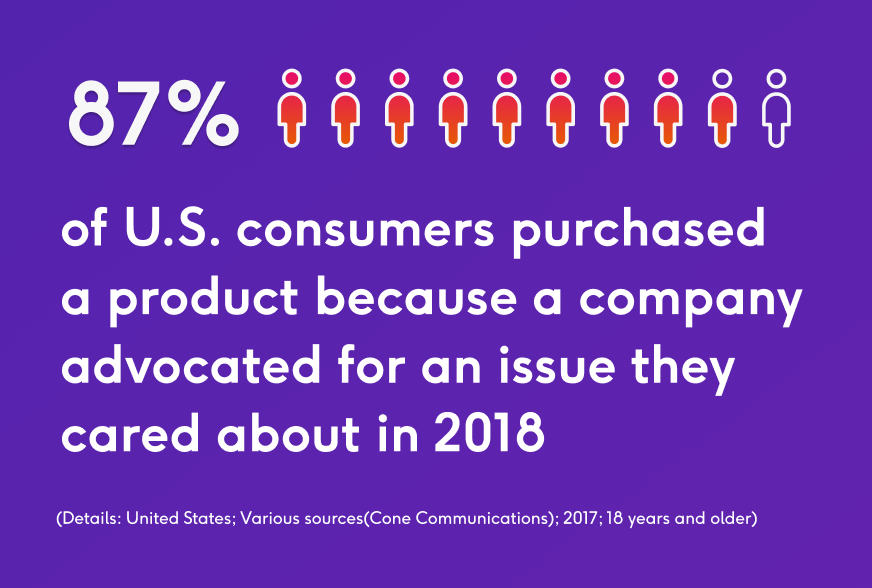
Contrary to traditional marketing techniques, social media marketing allows brands to target specific audiences and gain their trust through relevance and reliability. In 2018, 87% of U.S. consumers purchased a product because a company advocated for an issue they cared about. As consumers become more conscious in their shopping habits, marketing campaigns are shifting focus. Now more than ever, care is our greatest currency.
Research
In order to best understand which problems we wanted to solve, we conducted in-depth research on the ins and outs of social media marketing. This began by identifying our target audience and potential users. After speaking with content creators, brand managers and legal professionals from a variety of backgrounds, we were able to form a well-rounded understanding of what success looks like in this market. We found that Boldly competitors have a high barrier of entry – therefore ignoring a large population that can benefit from having a strong presence on social platforms.
Coming into the year with an existing product was beneficial, but this meant that we had some gaps to fill. Thus, our focus for this year was to dive deep into research for our collaborative contract feature. Our intention is to bring more transparency and communication to the processes surrounding contracts, specifically in the influencer industry.
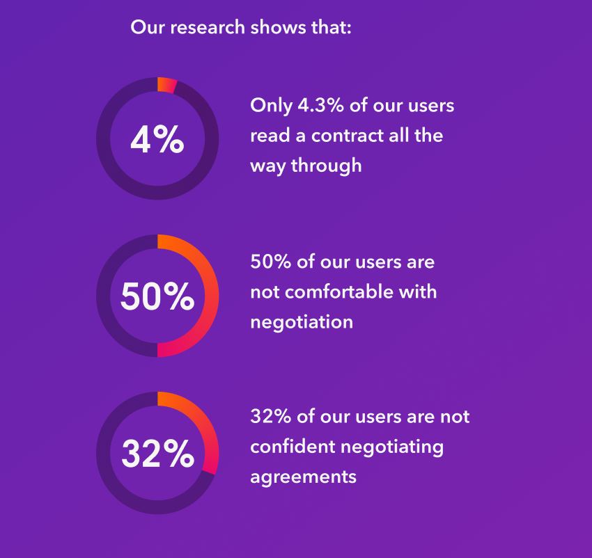
Our research shows that:
Our Process
Boldly came into fruition through collaborative meetings, copious research and many iterations of usability testing. Our design process followed an agile workflow, which means our process was iterative and showcased a human-centered design — not only within our app, but also within the structure of our team. By following this process, we have created a platform that is transparent, accessible, and familiar.
We started this project in September 2018 for our Interactive Digital Media Junior Workshop. We created a front-end prototype that showcased our user-centered design and won two awards! After six months, we still saw many opportunities for growth and refinement. So, we teamed up with our talented external team and restructured to bring Boldly into the senior project.
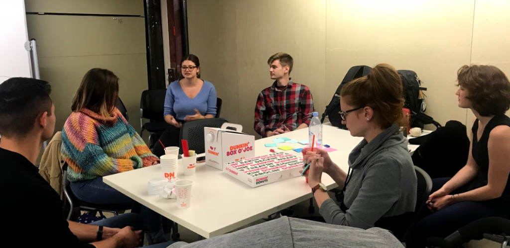
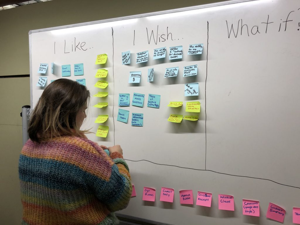
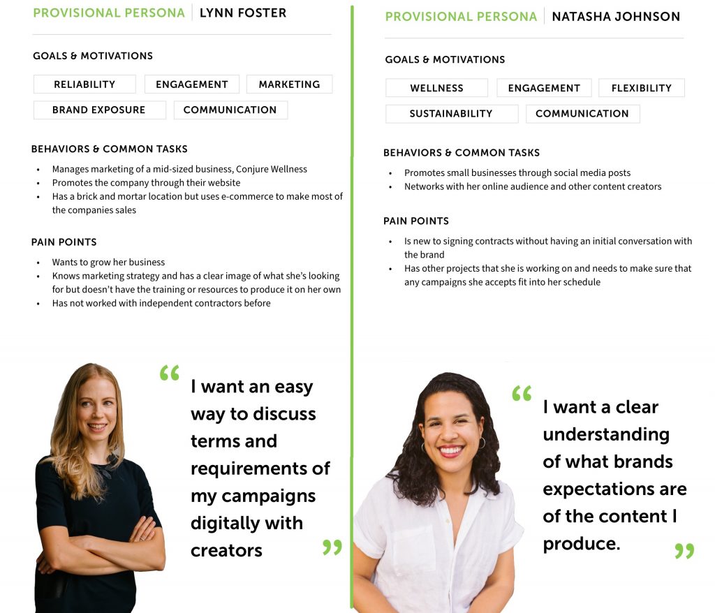
In order to create a seamless experience for our users, we put a heavy emphasis on qualitative and quantitative research. This consisted of investigation into the social media marketing industry and existing tools. In the fall term, the four of us took a deeper look into usability surrounding legal agreements. Our findings validated our initial goals and introduced us to some pertinent information that helped guide further research throughout the year.
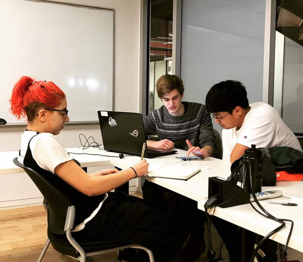
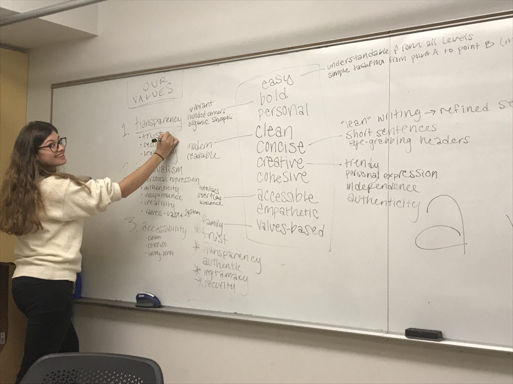
Much like our general workflow, our research followed a cyclical process. Each major feature began with user interviews to give us insights, which helped us identify the problems to address and understand how potential Boldly users behave. Using our new understanding of our audience, we moved onto whiteboarding possible designs solutions and after getting our initial ideas down we would conduct exercises with users to find out what features they would like to see in our app. For our team, design is a collaborative process filled with whiteboarding exercises, detailed sketches and post-its galore. Based on these work sessions, we figured out how to incorporate user’s input into our product before moving onto the more polished design stages of creating an interactive prototype showing how our app functions.
As we developed the prototype, we conducted usability testing sessions to ensure that the flow of our app was natural. When key themes were identified, we went back to the drawing board and continued testing until all issues were resolved. It was, for example, through conversations with our potential users that we found the perfect length, order, and format for the onboarding survey. Once elements were finalized, we documented them in a design system for handoff to the development team.
Throughout the year, the development team was in constant communication with us, hard at work on documenting and developing our designs. After researching and comparing our options for development tools, we decided on using Amazon Web Services to host our servers, PostgreSQL to build our relational database, the Phoenix elixir framework for our back end code, and we decided on a React Native front end for flexible multi-platform development on iOS and Android.
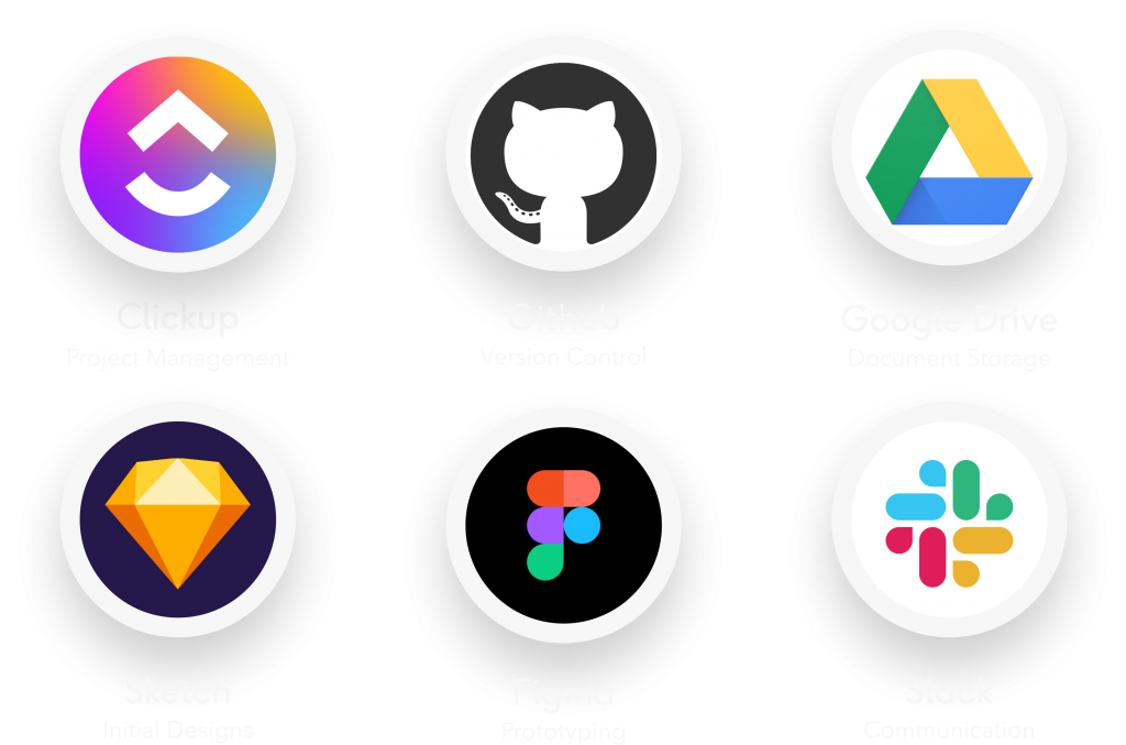

The team also made use of many tools made for working collaboratively. For organizing tasks and tickets, we used Clickup. For version control and organizing development, we used Github. For shared document storage. We used Google Drive, and for designing the prototype together, we used Sketch and Figma. For team communication, we used a Slack workspace throughout our process.
Outcomes and Lessons
The opportunity to continue a group project over two academic years brought us many lessons. For example, working across two colleges had its challenges. Each team had different processes and vocabulary, so establishing clear communication and efficient management systems that worked for the full team was very important.
We always try to stay on top of the curve and make realistic plans, but inevitably we had to deal with hard decisions such as scope cuts and unexpected changes — like a global pandemic. The experience of working on a project for two years taught us invaluable lessons about project management, multidisciplinary teamwork, and above all, perseverance.
We finished this process with an award winning Android build and user-experience design. We are proud to announce that this past Tuesday, Boldly took first place in the Corporate category and third place overall in the CCI Senior Design competition. Regardless of your level of experience, Boldly allows you to connect with authentic people who are dedicated to the same cause.

