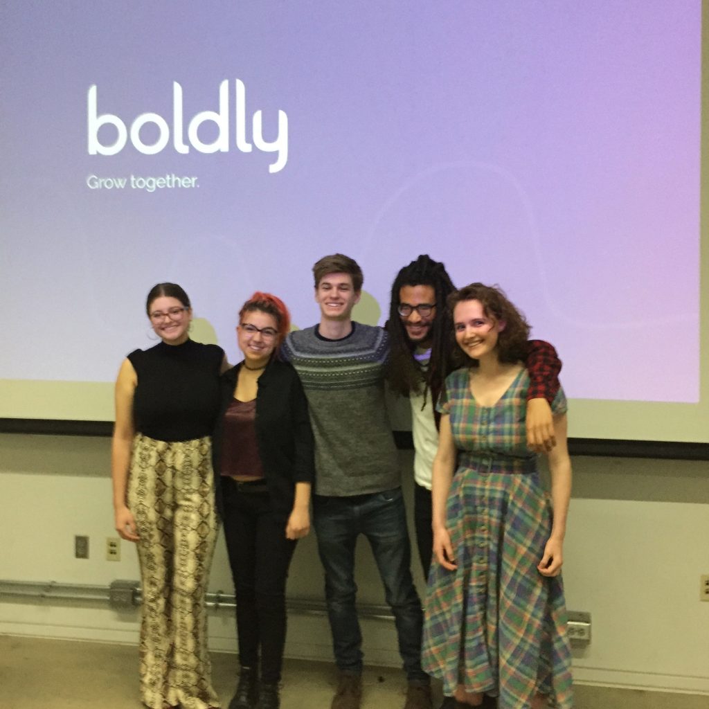
The Team:
- Mel Gross
- Ryan Van Dongen
- Claudia Bonitatibus
- Jordan Zagerman
- Caroline Scheinfeld
The Context
A 2017 survey of 5,700 marketers revealed that 69% are developing loyal fans for their brands via social media marketing. Contrary to traditional marketing techniques, it allows brands to target specific audiences and gain their trust through relevance and reliability. Content creators, whose followers align with their opinions and priorities, work as brand ambassadors by posting about products or events in exchange for payment or gifts. It seems like a win-win situation; yet because of the grand perks, consumers are often seeing biased reviews from creators who are recommending products that don’t actually align with their values. This leads to a loss of trust, unsuccessful campaigns and very little Return On Investment (ROI). We’re here to change that.
The Problem
The use of social media marketing is growing rapidly – as are the number of creators and brands trying to be part of it. Worth just $2 billion in 2017, the industry is expected to hit $10 billion by 2020 – making it one of the most promising and profitable forms of advertising; however, the industry lacks accessibility and sincerity. While many all-in-one platforms already exist for this market, we found that Boldly’s competing products have a high barrier of entry – therefore ignoring a large population that can benefit from having a strong presence on social platforms.
The Solution
With a massive shift in this industry towards nano- and microinfluencers (accounts with under 5,000 followers), we saw a need major need: connectivity and resources for those who could benefit from branded content. We wondered, “How could we make our mark on this industry while staying true to ourselves and our beliefs?” Our answer: create connections between content creators and brands based on like-minded values and interests. Successful digital promotions come from aligned audiences and that’s exactly what values-based matching can achieve. Through collaborative meetings, copious research and many iterations of usability testing while following an agile workflow, we achieved our goal of creating an intuitive mobile prototype over the course of six months.
The Team
Mel Gross managed the project’s overall progress, completion, and quality. She planned deadlines, broke down, and delegated tasks, managed the timeline and task completion, and helped with the group’s dynamics. She also helped with research, wrote testing material, conducted usability testing, and helped with development.
As development lead, Ryan Van Dongen managed production of the prototypes. He helped build and connect the initial Figma prototype following the group’s wireframes, and once the team moved into building the HTML prototype, he rebuilt the style guide in HTML to use as a base for further development. From there, he developed screens, elements, and microinteractions in HTML, CSS and Javascript, brought NodeJS with Semantic UI into the development environment, and managed the Github Repository and pushing prototype updates to the live site for testing.
Claudia Bonitatibus was the team’s content manager, which entailed extensive research into the industry of social media marketing, production of informational content, and assessment of information architecture. Claudia synthesized her research to identify pain points, create wireframes, accumulate learning resources for users, and conceptualize a series of gamified tutorials. During the later stages of the production process, Claudia contributed to the development of the prototype by using HTML and CSS to translate styles from the static interface design to an interactive format.
As the user interface designer, Jordan Zagerman worked alongside other group members to both design and develop the high fidelity prototype. From drawing out wireframes, to styling divs, Jordan really adapted to the tasks at hand. Working with Sketch, Illustrator, Photoshop, HTML, CSS, and Javascript. Jordan helped provide solutions, as well as create original content for the boldly team.
As the experience design lead, Caroline Scheinfeld directed the app’s product ideation and creation. After conducting competitive analysis and market/consumer research, she guided the project from paper and pencil wireframe sketches to a low-fidelity Figma prototype. She prepared protocols for multiple rounds of usability testing and continued to implement user feedback to a high-fidelity prototype, which was built based upon her screen designs. Caroline focused on establishing guiding principles and ensured the following of ethical design practices and accessibility standards.
The Process and Insight
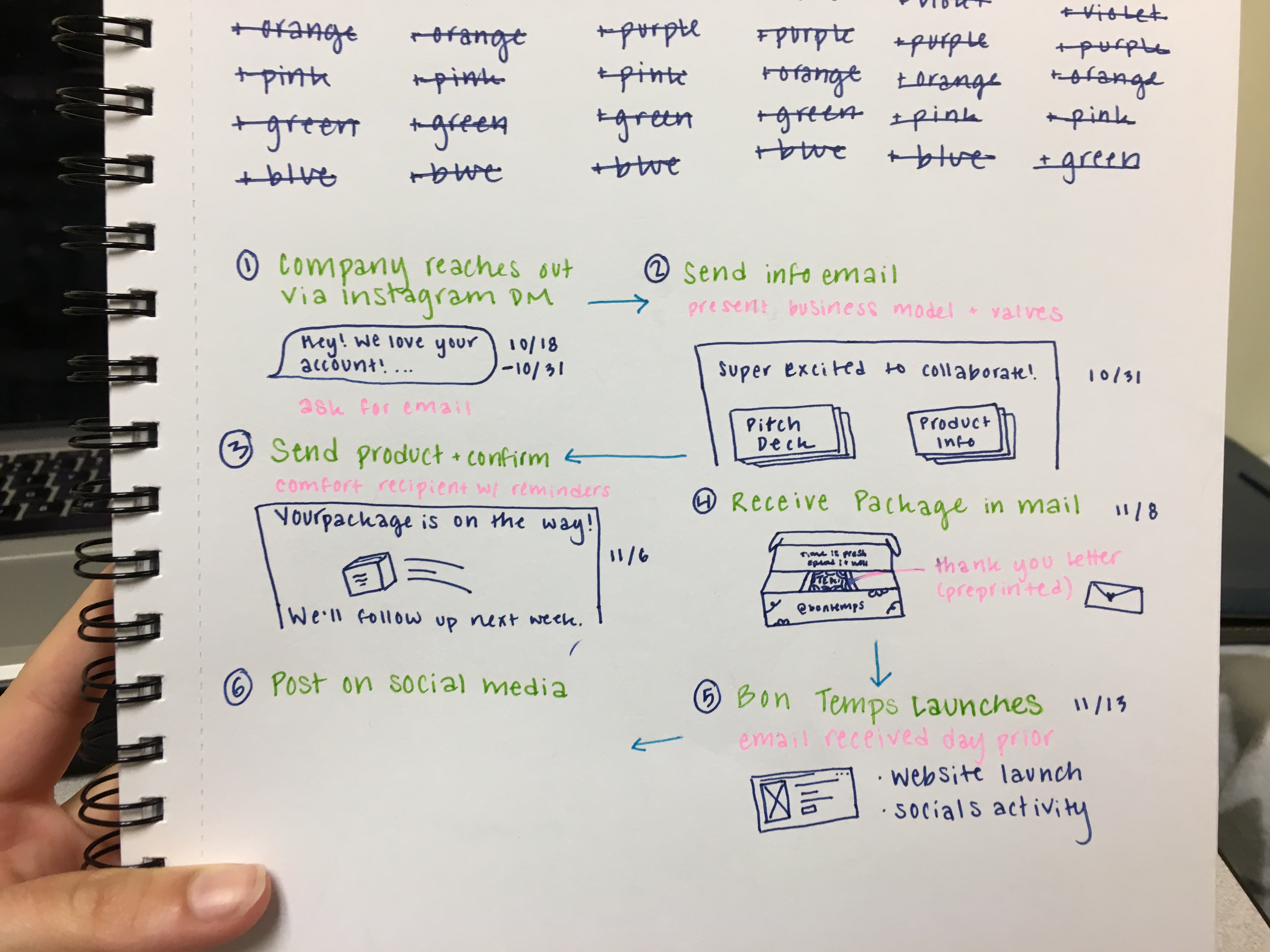
Our research began with reaching out to content creators and business owners for one-on-one interviews. We focused on learning about their current social media marketing practices as well as what the process of initial contact and negotiations looks like. This gave us a better understanding of what features and functionalities would benefit our users.
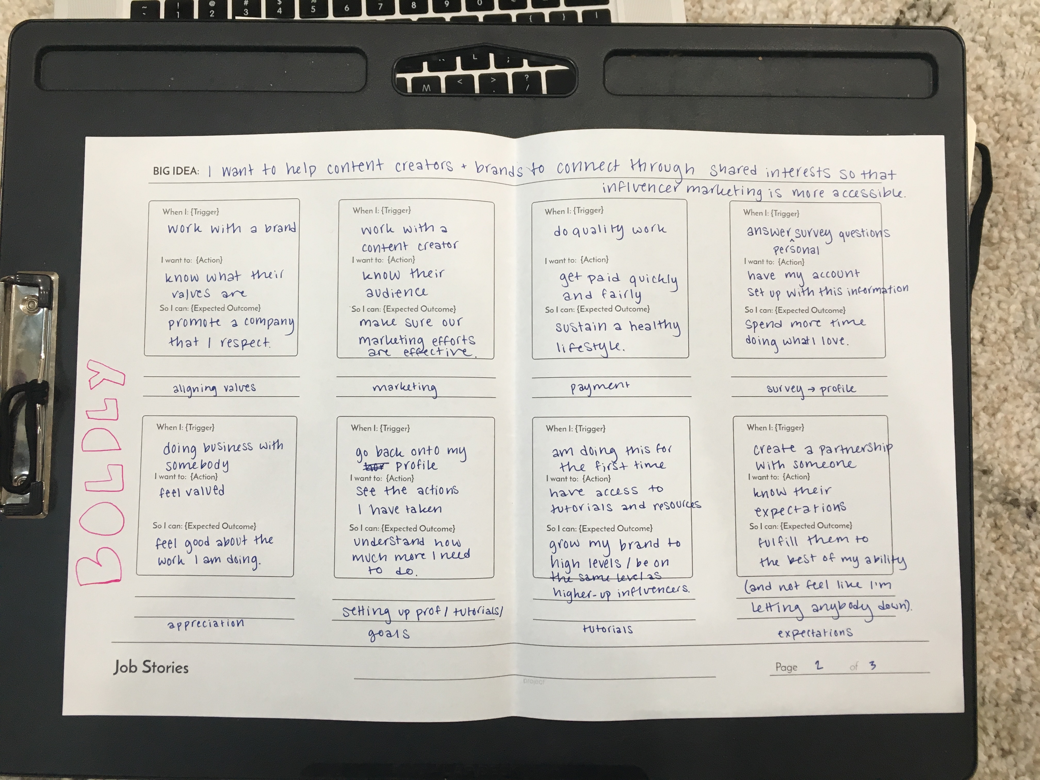
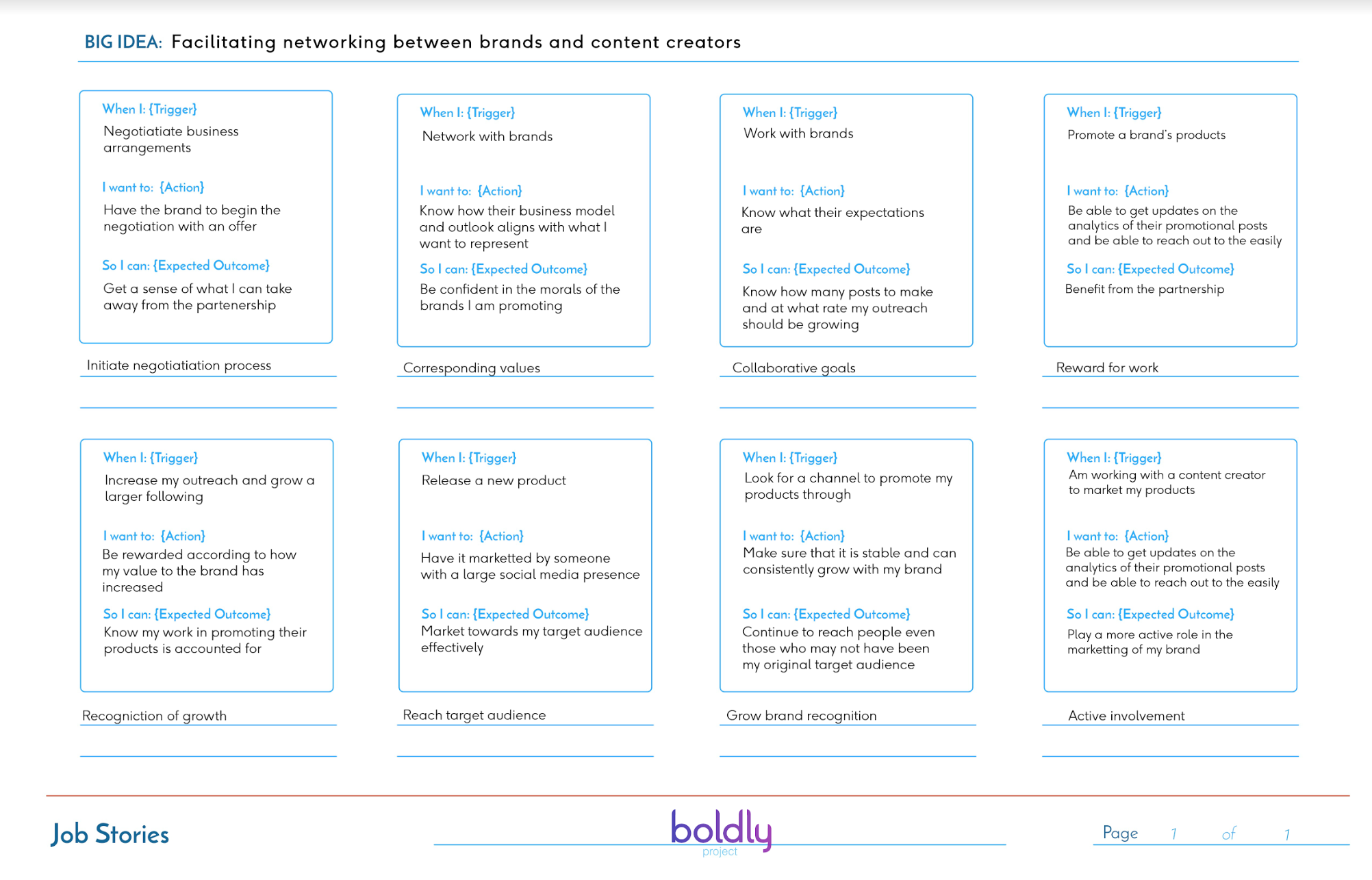
Since Boldly is targeting a niche market, we conducted a competitive analysis that addresses the core features of similar products. From there, we moved into identifying tasks that our target audience would want to complete by writing job stories.
Next came a focus on strategy to keep our project on track. We conducted a team and product SWOT analysis to get a sense of what would be a feasible scope. After establishing our personal and professional goals for this project, we decided on three main values: accessibility, individuality and transparency. By incorporating these ideals into each screen, design and feature, Boldly should provide an intuitive, user-centered experience.
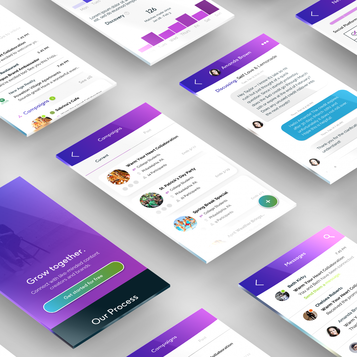
As we identified the information architecture, we moved into wireframe sketches. Our goal was to have a personal, engaging onboarding survey create users profile and immediately get them involved in active campaigns for which they have matched the criteria. While trying to tie together the flow between profile pages, campaign details, an intuitive messaging system and educational tutorials, it became evident that users could become lost or overwhelmed fairly quickly. To solve this, we created a dashboard that broke down the key elements of each user’s Boldly usage into various cards. The layout of cards change based on the user’s activity and each category’s information updates accordingly.
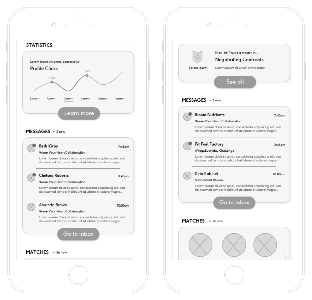
This brought us near the midpoint of our project and we reach our alpha goal of creating a low-fidelity prototype on Figma for usability testing. Throughout multiple sessions, we received great feedback on overall comprehension and navigation. We received helpful suggestions for ways to make Boldly stand out.
Moving into the second phase, we created custom branding and developed a style guide. Creating a visual language and color coding system helped to break up potential walls of text and establish a better sense of navigation throughout the app. This system was implemented into our high-fidelity prototype, which was developed using HTML, CSS and Javascript, NodeJS with Semantic UI. Testing results came back positive, with users generally understanding the difference between campaigns, connections, messaging and tutorial notifications looked like.
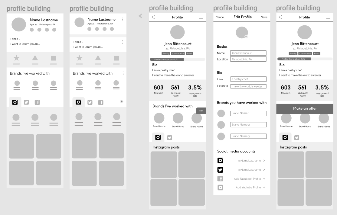
In the last two months of the project, Boldly came to life through an iterative design process. We continued to test with users and make informed decisions based off of their results.
The Results
Boldly has been a success due to our group’s diligence, creativity and passion. Our functional prototype shows how brands and content creators can connect through a personalized matching system. We catered to our users and created a product that sticks by the beliefs on which it was built. The challenge of creating something that cannot be cross referenced has been difficult, but a true learning experience. It has been exhilarating to see our ideas go from disconnected thoughts to design breakthroughs.
Regardless of your age, ethnicity or level of experience, you can connect with authentic people that are ready to try something new. You have the opportunity to collaborate with people who care about what you care about. With Boldly, you grow together.
As we finish Junior Workshop, we hope to expand on our ideas and continue into senior project by developing the algorithmic matching system. The idea of our product becoming a reality is pretty wild. We are eager to build on the trust, joy and loyalty the social media market can provide by creating a product that includes our users throughout every step of the process.
Live your values. Live Boldly.

