Designer/Developer: Kristen Rehm
An Overview
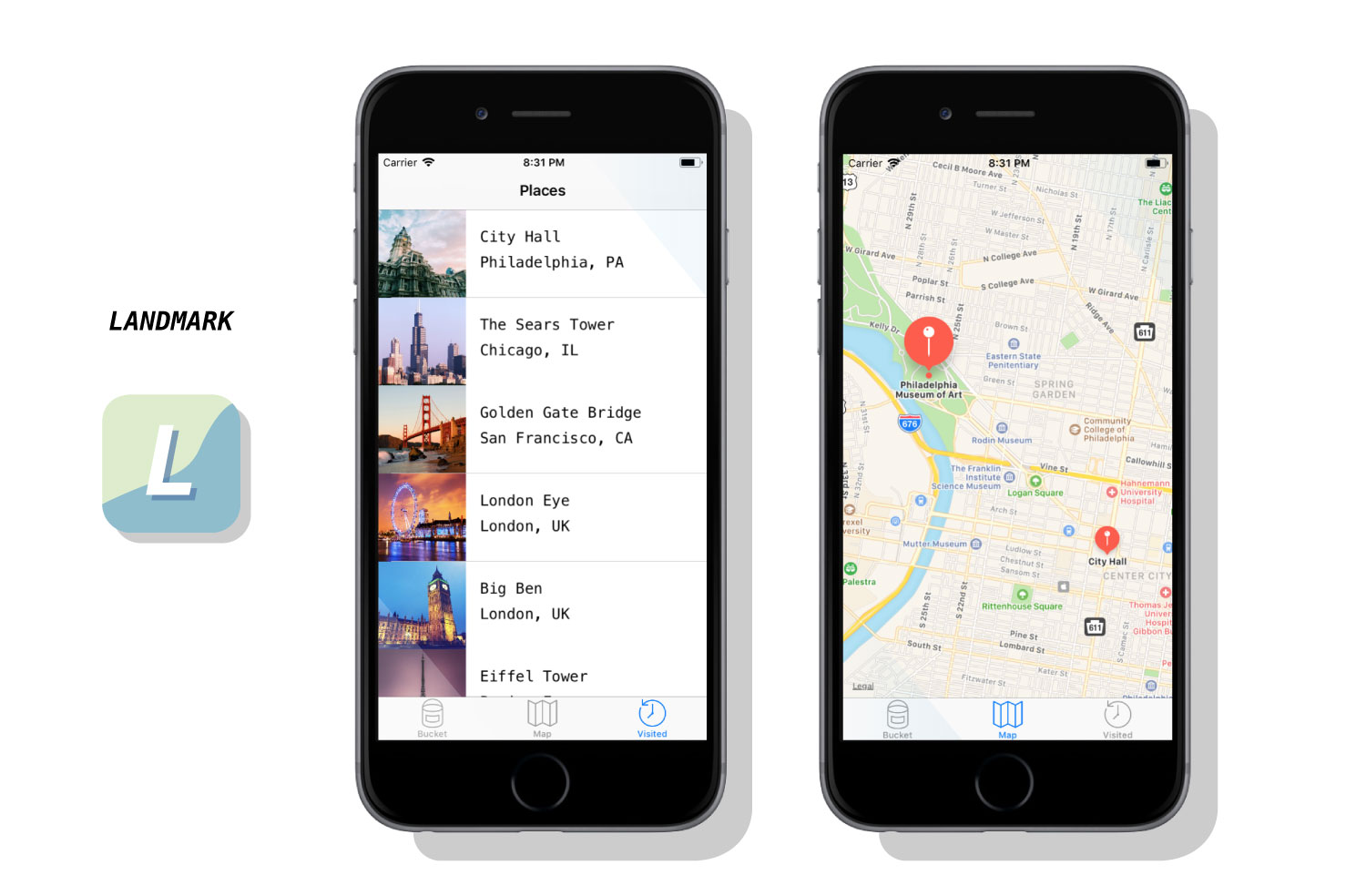
Simply put, Landmark is a travel companion application. But it’s also much more than that. The idea for Landmark originated as an AR application – one where a user could pick up 3D collectables once they’re at a physical tourist attraction. However, time (and knowledge) constraints left me condensing the idea into a tracking application instead. Landmark allows its users to track the tourist attractions they’ve visited, and create a bucket list of the ones they want to visit next. It features an interactive map, where users can explore the city they’re in, and see the popular spots to visit within.
The Context and Challenge
This app was created with the intention of solving a problem – the cluttered camera roll. Oftentimes people who frequently travel, document their experiences by taking lots of photos on their mobile devices. But there isn’t a satisfying way to track where you’ve been, or what you’ve seen while traveling. Sure, you can scroll through vast amounts of pictures to finally find your selfie with Mount Rushmore – or you could use Landmark to document the experience, have it conveniently saved in one location, and to find new places you’d like to go next. Landmark is designed specifically to inspire it’s users to add to their bucket list.
Creating a native app for the first time meant a lot of challenges – aside from learning the ins-and-outs of xCode. One of those was discovering a solid task flow from screen to screen; what did users want to see first? Were they more interested in the map or the bucket list? The places they’ve already visited, perhaps? This led to user testing, which helped me solve some of these problems upfront. But as with any project, more roadblocks – and need for iteration – came after.
The Process and Insight
While creating Landmark, there were some ideas that I had to scrap. I originally was going to have a search feature for different cities and locations, thinking this would be the best way for people to discover new places for their bucket list. However, I found that users typically already have an idea in mind of where they’re going next – or want to go. Rather than having search functionality, I created an add button that allowed users to input their own locations and landmarks. This allows for more customization, and a more personalized experience.
![]()
The Solution
Landmark helps users record where they’ve been, when they visited a famous tourist location, and keep track of what they want to see next. It provides a unique space for this task, and is a great application for anyone who wants to travel more, document their experiences, or see what else is out there that they might’ve missed. I ensured the task-flow was simple and straightforward — there’s nothing more stressful and frustrating than not understanding how an application works. It might be simple in nature, but this really allows users of Landmark to take it and run with it. After several uses, Landmark becomes a reminiscent journal of sorts – one where you can enjoy the things you’ve done and seen, and look forward to the future and what’s next.
The Results
Despite being unable to create all that I envisioned, I think Landmark is absolutely a success. I wanted an app that users could keep returning to in order to track where they’ve been, and I’ve successfully created that. While additional features, such as AR collectables, gamification, etc would have been added bonuses, Landmark serves it’s original purpose, and serves it well. That being said, I am incredibly happy with the outcome of this app, and would enjoy working on it more in the future to live up to the higher potential it has.


