Built from the ground up, Trestle is a web application that bridges communication between parents, teachers, and other caregivers in the lives of students with Autism Spectrum Disorder.
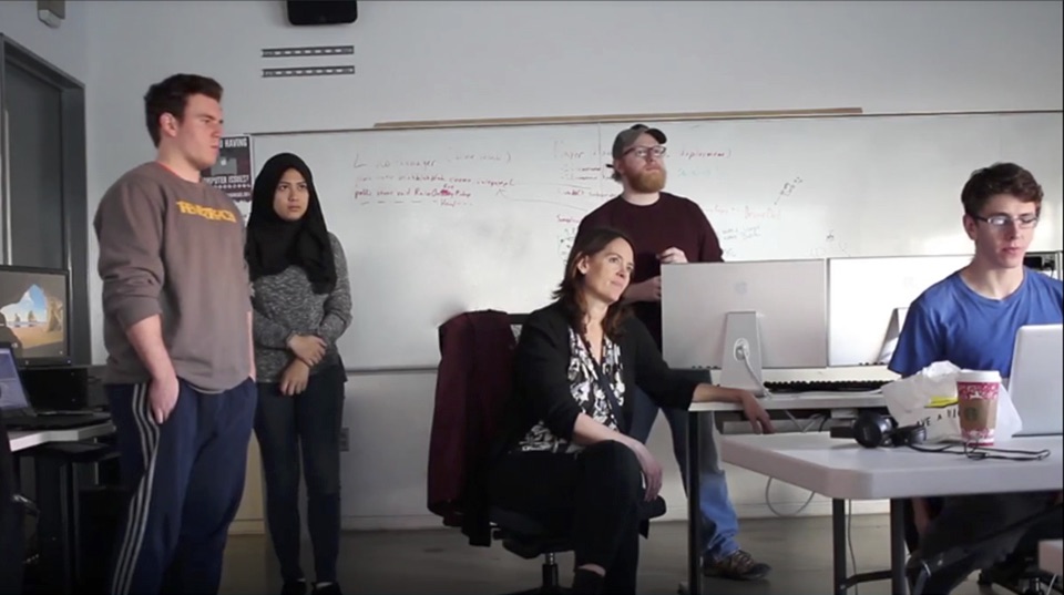
There were two primary obstacles that were tackled in the creation of Trestle. First was Dr. Hassrick’s method of using pencil and paper for her data collection. This was tedious and unreliable. Second, Dr. Hassrick had discovered that parents and teachers of children with autism were often communicating poorly, or not at all. Through weekly meetings with Dr. Hassrick, the team was able to define the needs of the application.
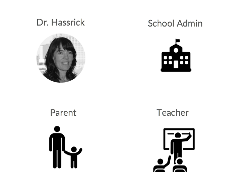
Based on the people involved in Dr. Hassrick’s research, they determined that the app would have 4 user types.
Dr. Hassrick is in charge of entering and managing all Trestle accounts. Based on the people involved in Dr. Hassrick’s research, we determined our app would have 4 user types. The school admin is a faculty member at a school that is participating in Dr. Hassrick’s research. They are responsible for pairing teachers to the students they work with. Parents and teachers make up our two main user groups. They create the majority of the data used in Dr. Hassrick’s research. They are the able to view and create posts that outline the activities and learning strategies that the children participate in. This is the data that is used by Dr. Hassrick in her research. For privacy reasons, the parents only have access to the teachers that work with their own child.
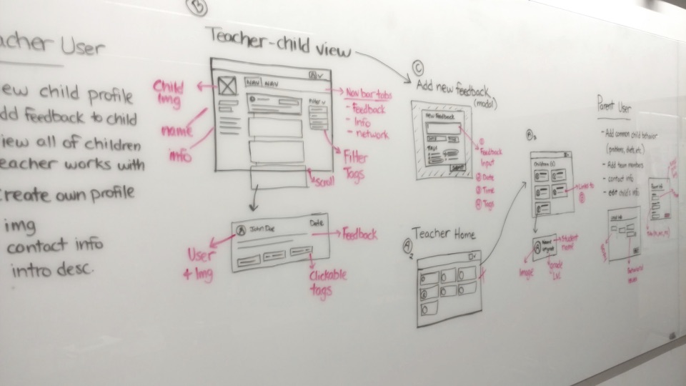
From the start, we designed the application to be simple and intuitive, but also fun. This helps streamline the data collection process while still providing an engaging user experience. The process started by white boarding design ideas. Using these to create user journeys to define how each user type would navigate throughout the application. From there, wireframes were created to define the structural organization of the pages to be created in the app.
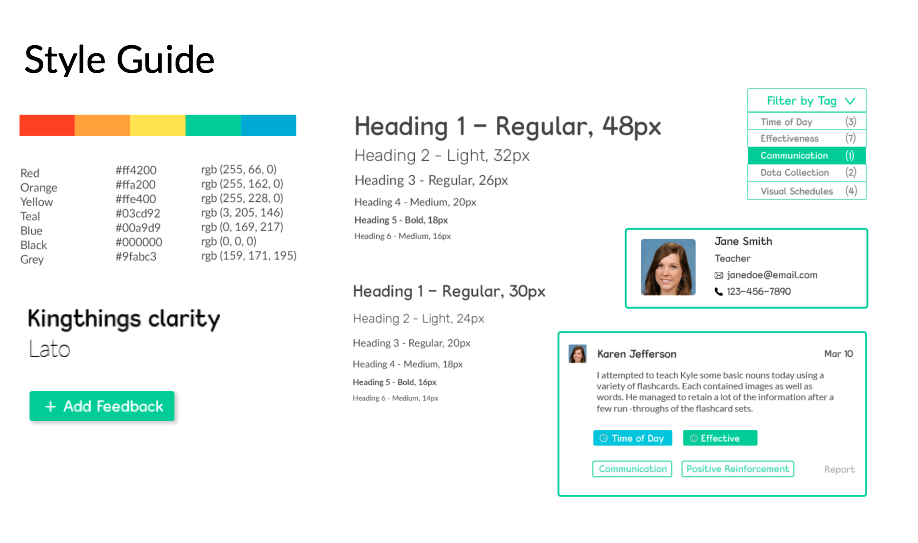
After multiple iterations through design idea generation, based on assorted feedback and research a style guide defining a fully custom, colorful, and clean look was developed. In addition to all the elements in the style guide, the team implemented a little Trestle mascot into the design as well. By appearing throughout pages of the application, the Trestle mascot adds a friendlier and inviting feel.
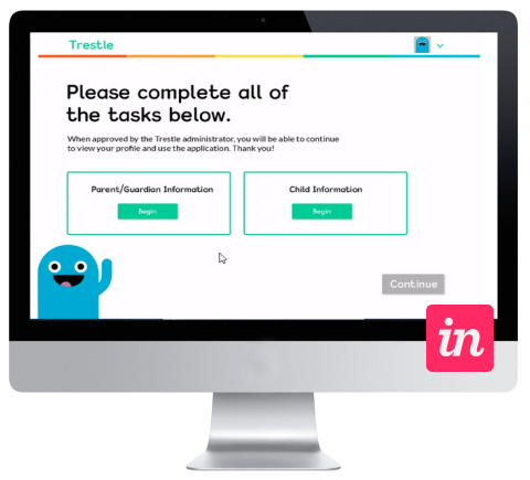
The style guide was then applied to the wireframes to create a cohesive and easy to navigate application. The colorful theme was useful in calling the user’s attention to certain buttons, menus, or areas of the page. While the app was in the process of being coded, the team tested the design with users in a prototyping tool called Invision. Through Invision, they were able to conduct usability testing to get necessary feedback from parents, teachers, and colleagues of Dr. Hassrick.
To build the app, the team used the Mean stack; Mongo DB, Express, Angular, and Node. As the app involves collecting personal information, a big concern was making sure it was secure as possible. The team made sure to build Trestle around industry best security practices, using some of the most reliable platforms, including Amazon web services, and took every precaution to make sure the user’s data was safe.
Once all of this useful information is stored within our database, Dr. Hassrick only has to click a single button to download all of it and begin using it in her research. As you can imagine compared to her previous pencil and paper method, it’s become a much easier process.
Trestle was created by Jacob Blank, Sarah Naftzger, Craig Conville, Matt Baggaley, Diego Torres, and Farah Fauzi, and advises by Prof. Troy Finamore
