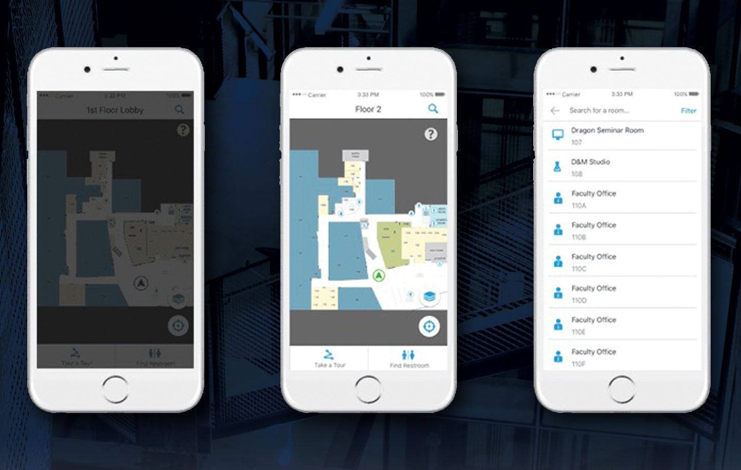
Every day hundreds of people pass through Drexel University’s URBN Center, home to the Westphal College of Media Arts and Design. This winding maze of a building features endless staircases and a disorienting numerical structure that leaves its visitors struggling to find what they are looking for. I worked with a team of students to develop a mobile wayfinding application to help people successfully navigate the building.
![]()
This project used Estimote beacons. They are Bluetooth enabled sensors that can transform any building into a location-aware environment. Think in a sense like when you use a GPS or an app like Google Maps. Those devices are getting your location from a satellite way up in space. When you’re indoors, the beacons act like those satellites, being able to grab your location while you’re in the URBN Center and therefore make our app possible. With this initial technology we were ready to make our app. We started our project with a solid foundation in design and user experience.
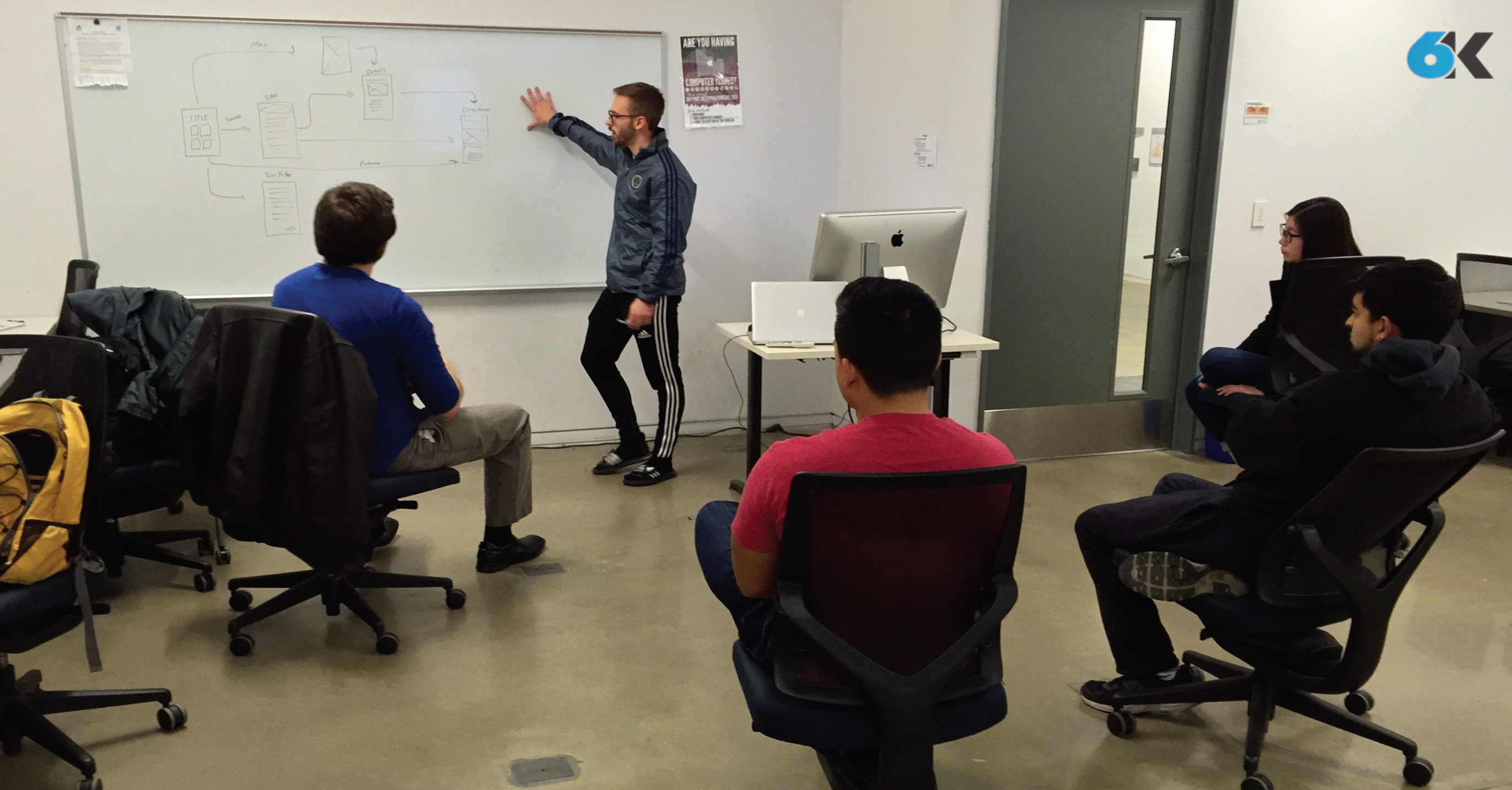
The team established three core values that were carried throughout the design process: “Simple, friendly and intuitive”. These served as a foundation to lean on in the face of the various design and development challenges that were experienced throughout the life of the project. The team utilized whiteboard brainstorming, user interviews, and quick iterations of wireframes to settle on screen layouts and a flow that they felt optimized the way-finding process.
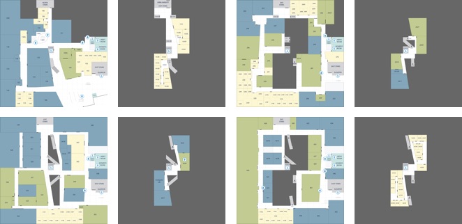
They developed a visual style guide based on the research and defined rules for the general experience, and made sure that the two worked alongside each other. They moved through a few iterations, and the final look is ultimately very much in line with the core principles. Next, they developed custom map designs, iconography, colors schemes and layout patterns that all work together to make for a refined and effective experience. They simplified the architectural floor maps by combined with our iconography, we used different colors to distinguish a classroom from an office, or an open lab, allowing users ease of use. Altogether, we incorporated these styles throughout the different floor levels into URBN Explore, to present the maps in a more clear and concise way to our users, as well as bring a better grasp on the space as a whole.

While the core functionality of the main app was still being developed, they created a prototype using a software known as Pixate. While this software did not have any of the actual location based functionality, they were able to simulate the kind of flow the users would go through when they opened the app. This involved things like what buttons they press, where all the elements are located, and the general timing of each step throughout the app’s workflow. With this prototype in place, they were able to get feedback from a bunch of potential users on the look, feel, and structure of the app’s workflow. They collected a lot of feedback regarding what did or did not work. They would then update the prototype based on based on their findings from these usability testing sessions. With this working prototype in place, the development team knew exactly what the real app needed to be as they worked on making it actually functional.
The majority of this app was made by using a software framework known as indoo.rs. Indoors is great because it allowed the team to build the app for both iOS and Android devices. They used it specifically to create the maps necessary for the app to function. The process starts by importing the map files that were created by the design team. Then defining the walls in order to label the rooms, and portals to let the app know how to plan its routes through the hallways, staircases and elevators. Now with the maps ready, the rest of our development team could start to build the app that would guide our users through them.
With the app, when a user needs to find a room, they can start by searching for it. The main search feature filters its results based off of the room number that all Drexel students see on their class schedule. However, the app can also filter the rooms by what technology it has in it, what type of room it is, and even by the student’s major. There’s a feature to let visitors take a pre-defined route of rooms based on major. The app gives users the ability to toggle on wheelchair accessibility so the app can recommend the best route for them to take. And last, but certainly not least, is the button that will guide users to the nearest restroom no matter what floor they are on.

For the Apple Watch, they created a companion app to URBN Explore iOS app. This app gives the user subtle, non-interfering updates such as identifying what floor they are currently on, keeping them on track for the room they need to get to and notifying them of some engaging information about the room once they’ve visited it.
Awards:



Download:
Team 6K:
Rahul Jaggi, Designer
Jeff Matthews, Designer
XinYi Wang, Designer
Patrick Brady, Developer
Dan Mennella, Developer
Paul Phan, Developer
Zach Stockmal, Project Manager

