Techradar Site Redesign
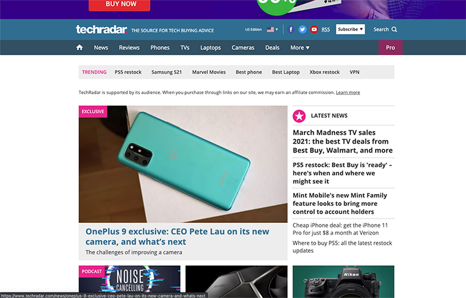
I was tasked with analyzing an existing news website and employing heuristic analysis to identify its weaknesses.
Then, using mobile-first design philosophy, I would redesign the site at the three major breakpoints (Mobile, Tablet, & Desktop) with advertisement content factored in. I chose Techradar.com because I felt that my personality made up a good portion of the user base and that it would be easy to come up with an effective site redesign.
ANALYSIS
Part I
Mapping the Site
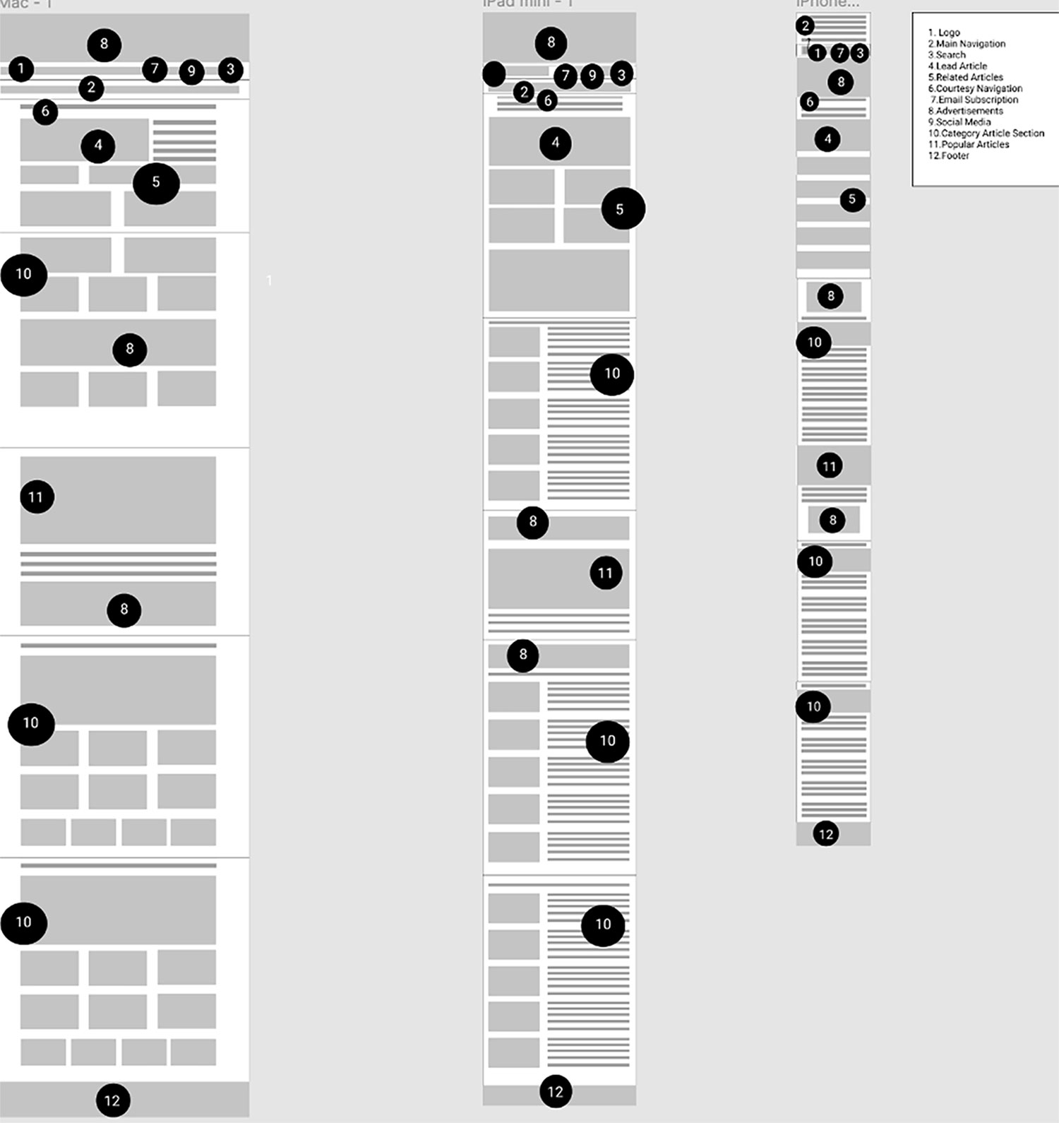
My first step in this process was to “map out” the current organization of Techradar.com. I accomplished this by:
- Tracing over screenshots of of the actual site
- Cataloging different image and written content as well as ads.
The goal of this exercise was to gain insights on the site layout as it currently stands now.

Identifying the User
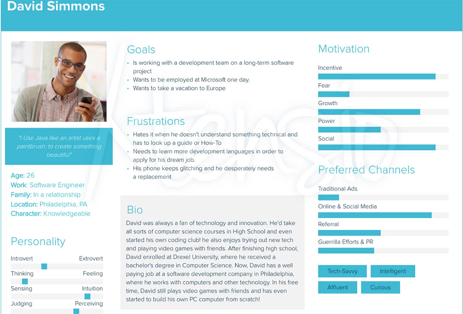
From Techradar's advertisement media kit, I was able to cultivate an idea of the site's current audience and constructed a preliminary user persona so I could get a better sense of who I was redesigning the site for. Through my research, I determined that my average user was:
- Young to Middle age
- College Educated
- Had higher incomes
- Technologically affluent
- Intelligent
Pinpointing Weaknesses
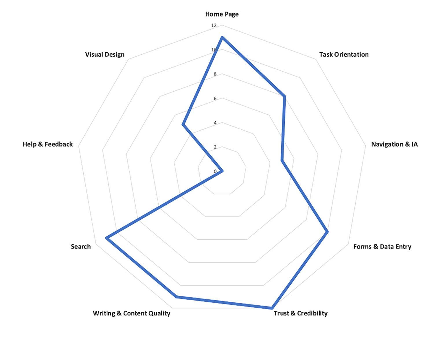
Next, I set out to identify the key problems within Techradar.com's design. These factors were based on a heuristic analysis I performed on the site. The main problems I identified as a result of this assessment were that:
- Ads were sometimes intrusive and were often put first over content, often taking away from the actual site
- The Navigational menu wasn't intuitive which made navigating the actual site cumbersome
- The site lacked any Help and Feedback pages/forms
- The visual design was much to be desired and overall “uninspiring” or engaging to users

Laying out my Goals
After finishing my initial breakdown of Techradar.com, I laid out my goals that I would focus on in my redesign. My main focuses included:
- Fixing navigation so that it is never hard or cumbersome to navigate the actual site.
- Changing advertisement placement/format so that ads are no longer intrusive or dominating over actual site content
- Overhauling the visual design to give the site a fresh look that engages audiences and reflects Techradar's brand
DESIGN
Part II
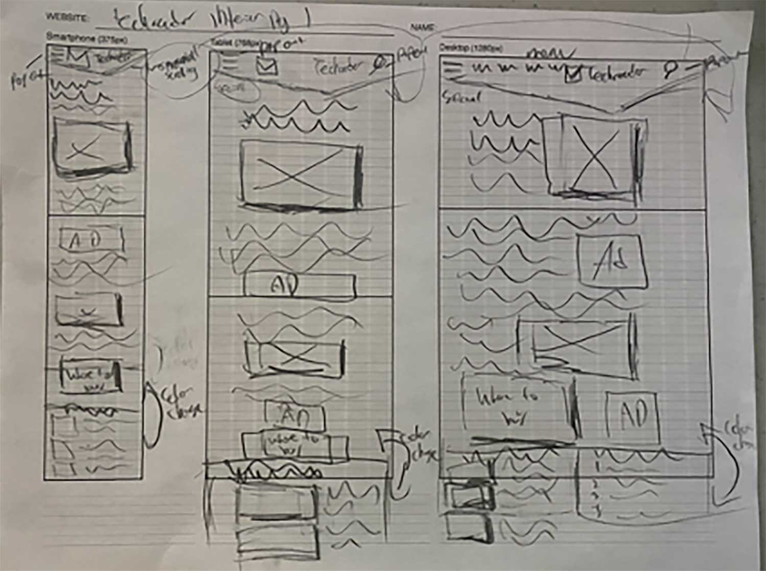
Sketching out Ideas
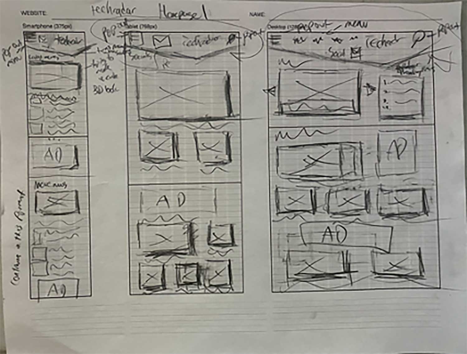
My first step in designing my actual site revolved around rough wireframe sketches. These drawings weren't about detail and their primary goal revolved around me getting my initial layout ideas onto a physical space.
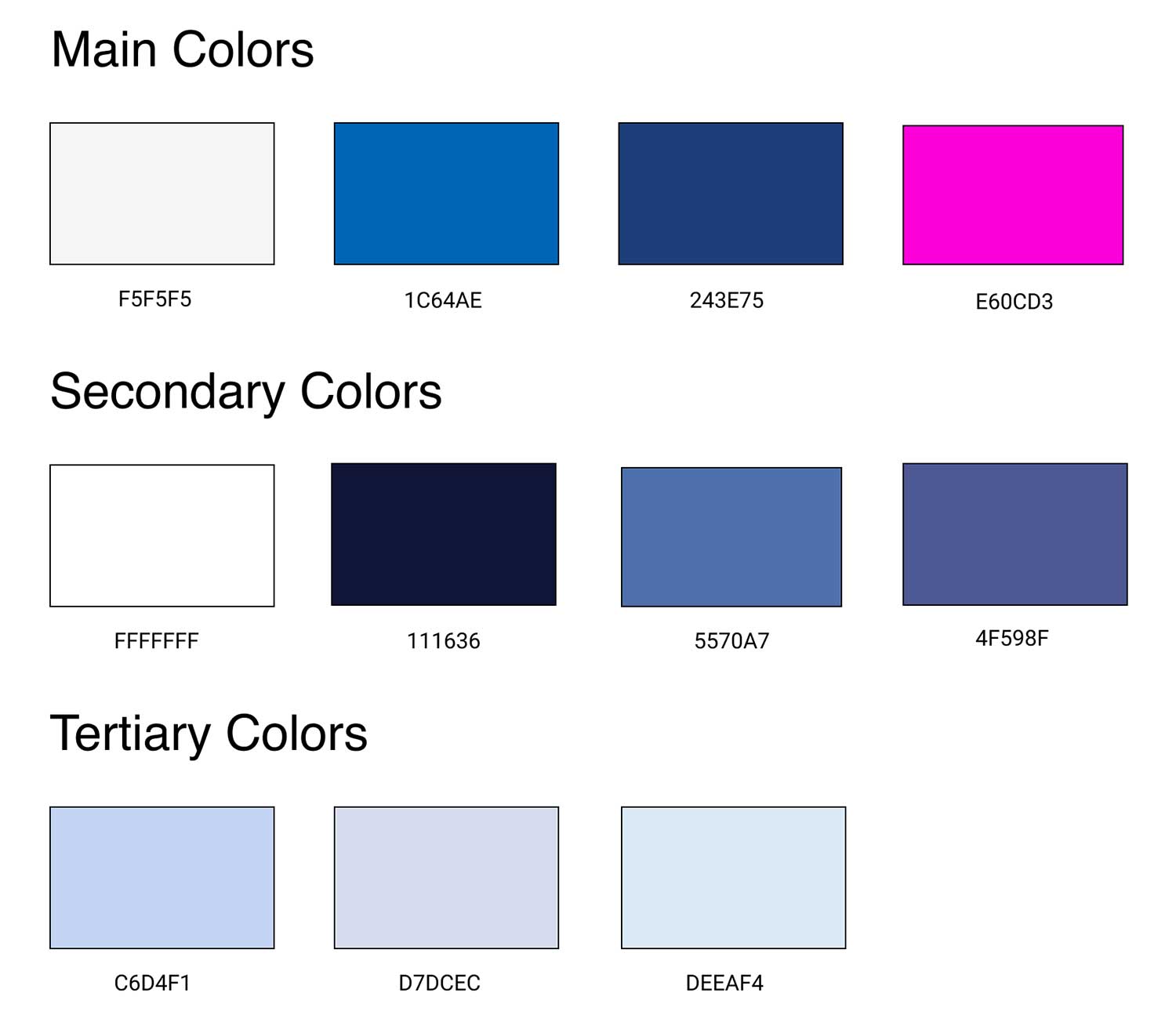
Finding my Colors
Next, I consolidated a color palette that would be used in my redesign. While selecting a new palette I tried to shift the color scheme of the existing brand, while not abandoning the original colors completely.
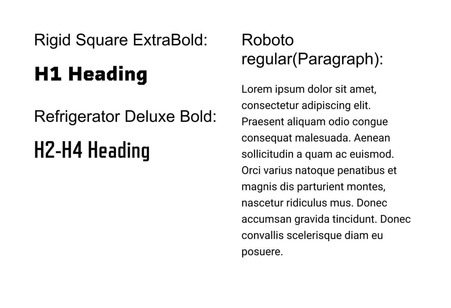
Exploring Typography
After color selection, I then played around with different font types. For this project, I tried to find alternative font types that fit the new design aesthetics I was going to implement in the redesign.
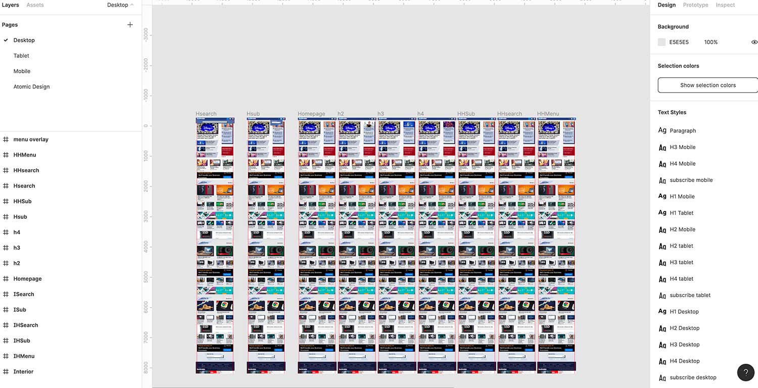
Crafting High-Res Wireframes
After I completed all my style-based information I created my High-Res wireframes in Figma, putting together all the work I had done in my earlier steps.
FINAL HIGH-RES PROTOTYPE
Part III
My Final Design
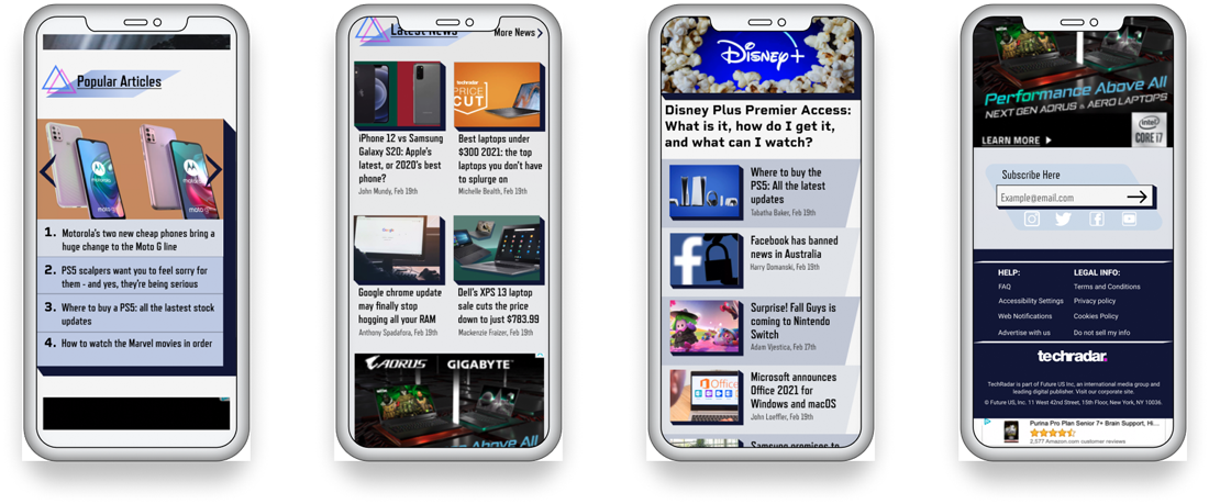
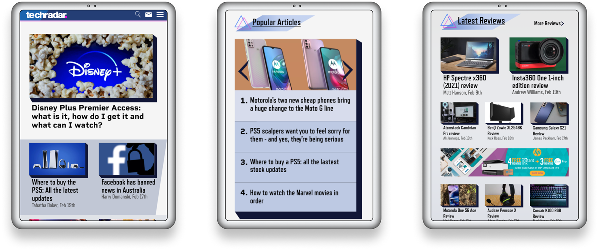
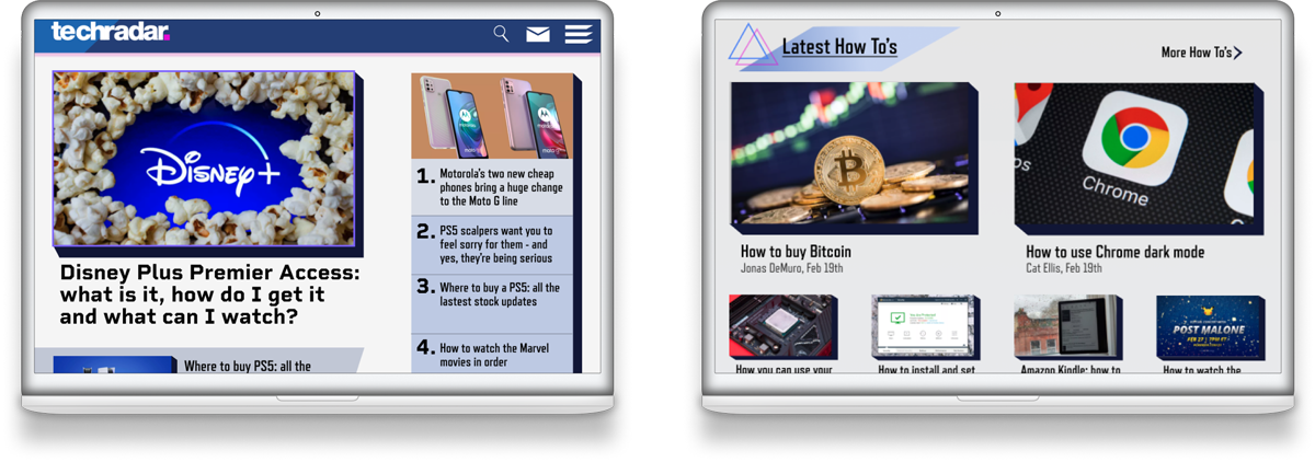
From my high-res wireframes, I populated my site redesign with actual Techradar.com content/advertisements and added multiple types of interactivity to demo at all breakpoints, such as:
- Dropdown Menus/tabs
- Working Naviagation
- Image Carousels
- Hover Interactivity
Below are some sample images my final project pages at the three main breakpoints.
