
The Team
Aaron Monro, Kyle Dolphin, Andrew Lenehan, Sylar Li
The Overview
This project focuses on designing and developing a high-fidelity prototype food ordering app for a food truck of our choice. In a 10week time frame, we researched, designed, user-tested, and developed a high fidelity prototype application for a food truck called El Toro Serrano. The final product is a prototype, which has 4-5 tasks that can be completed by walking through the app.
The main objective of this app is to deliver a fast and effective way to order food for the general population of Drexel’s campus. We derived our UI design from the food truck’s visual identity and an array of inspiration we gathered from already established app successes. Overall, this was a very successful project which can be used as a baseline to develop an actual food ordering application for El Toro Serrano.
The Context & Challenge
We were given 10 weeks total to do research, design, interview users, and prototype our food ordering app. The purpose of this project was to create an app that is easy and intuitive to use and allows users to order food from a food truck.
We were seeking to solve the issue of overcrowding on sidewalks near food trucks, as well as make ordering food ahead of time possible in order to relieve stress from students and faculty alike. Overcrowding on sidewalks tends to happen because there are noways to order ahead, so giving this option to users would hopefully fix this issue.
The Process & Insight
Our process started with our team defining our goals and objectives for this project. Once we had them set, we focused on looking at other food apps to gain an understanding of the functionality that users have come to expect from a food ordering app.
After we had decided what functionality we wanted in our app, we had to gain an understanding of the physical ordering process that users went through at our food truck. We realized that the ordering process needed to be similar enough to order in-person so that people wouldn’t be confused, but concise enough that it would be more efficient to order on the app. To do this, we needed more research, which is displayed in more detail below.
The Research
User Persona
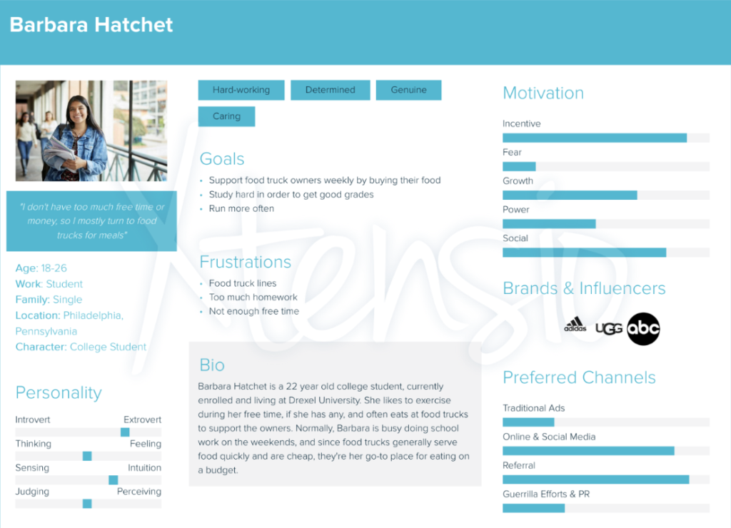
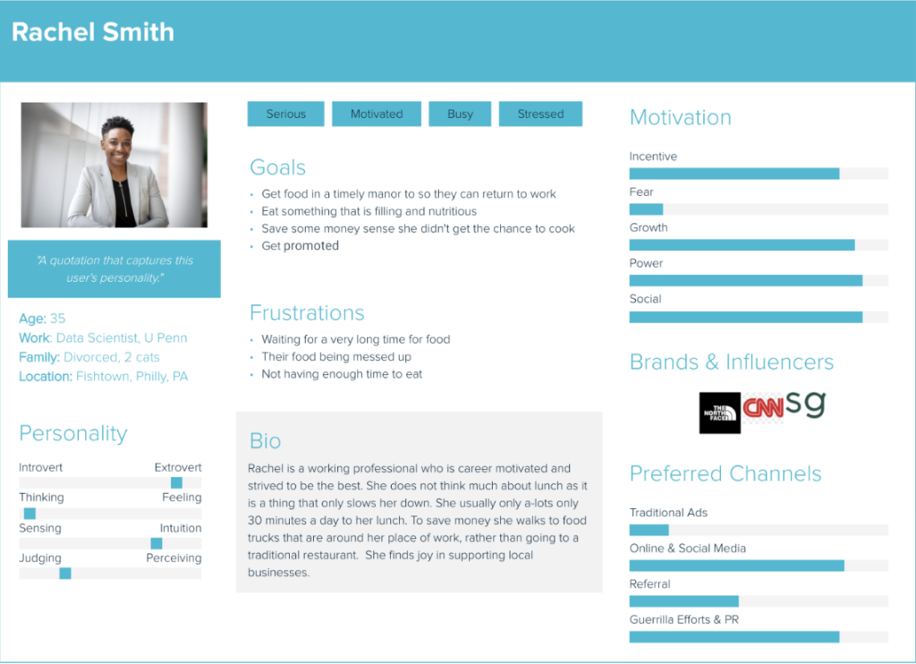
Starting off our research, we first had to figure out what type of users specifically would be interested in our project – our target audience. We started off our research with the “fly off the wall” observation. To do this, we stood out in front of the food truck and observed customers browsing the menu, ordering, waiting, and finally getting their food. Based on the observation, our team held a discussion and determined that our main target users would-be college students, locals, and faculty/working professionals. Below are a couple of our user personas, which reflect our target users.
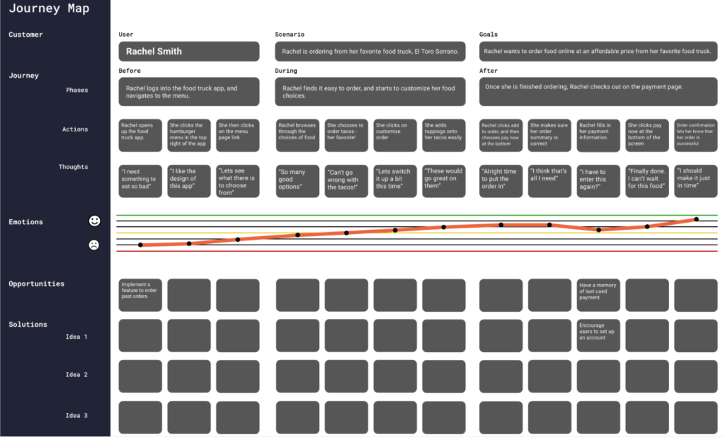
Journey Mapping
Now that we have our target users figured out, it was time to discuss what our user journeys would look like. Using the information we had accumulated from the “fly on the wall” exercise, we created a journey map to explain the average ordering process for our food truck, which is posted below.
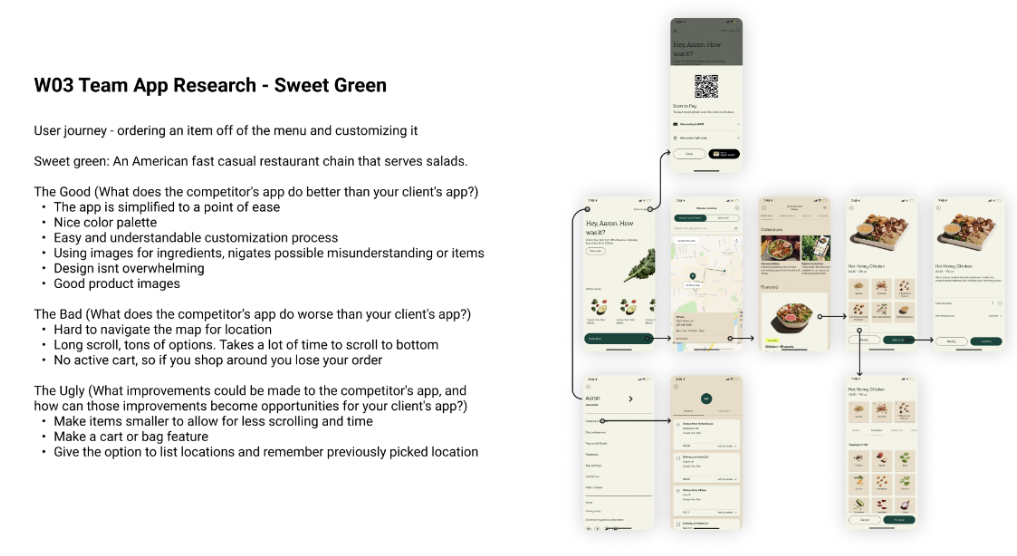
Competitive Analysis
We also assigned one of our team members to do a competitive analysis to get a better picture of what our competitors are doing. We also created a competitor app research to get a good picture of what the usual practices are for food ordering apps, what worked for them, and what did not.
Prototyping
Paper Prototype
As a team, we first decided what we wanted the feel of the app to be. We then created an initial paper prototype and conducted user interviews to collect feedback as well as observe how the users interacted with our prototype.
We then went on to create low, mid, and high fidelity prototypes and gained feedback from each of their respective interview sessions. After each set of interviews, we reconvened and tweaked the design and functionality of the app to increase the visual appeal and make it a smoother experience.
Low Fidelity Prototype
Mid Fidelity Prototype
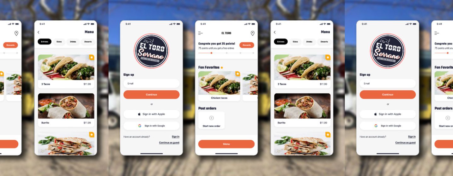
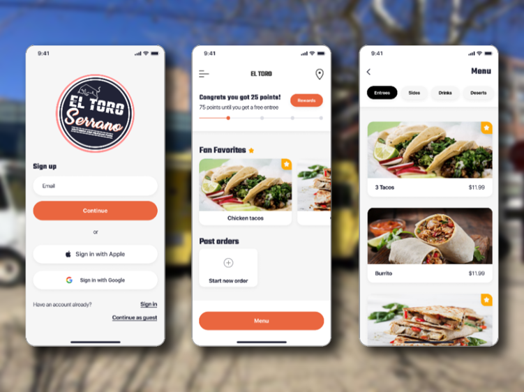
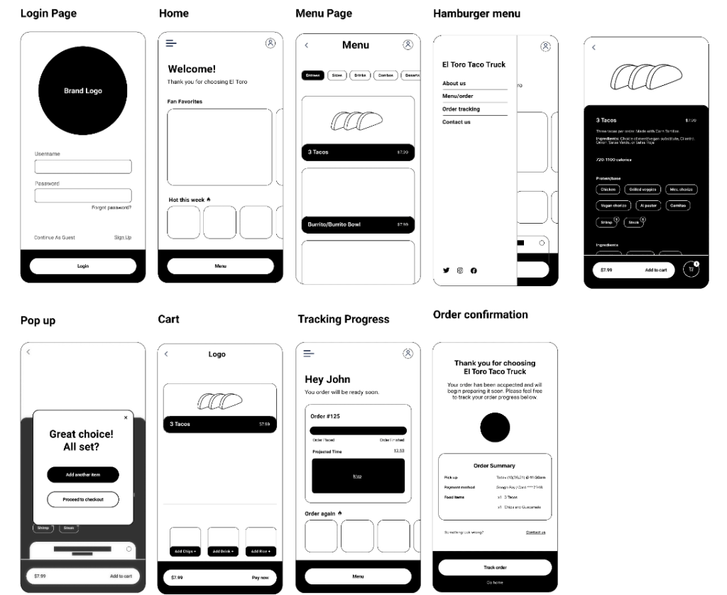
High Fidelity Prototype


At the end of our process, we finally had a finished high-fidelity prototype. This prototype was the culmination of 2 1/2 months of feedback from various possible users, across multiple differently designed prototypes.
Solution
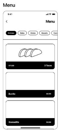
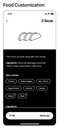
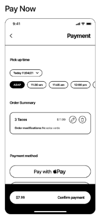
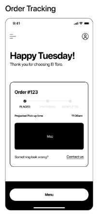
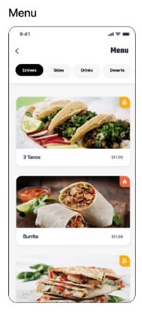
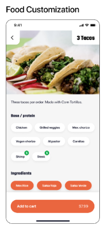
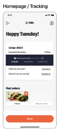
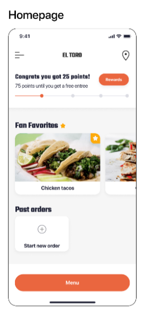
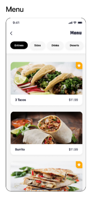
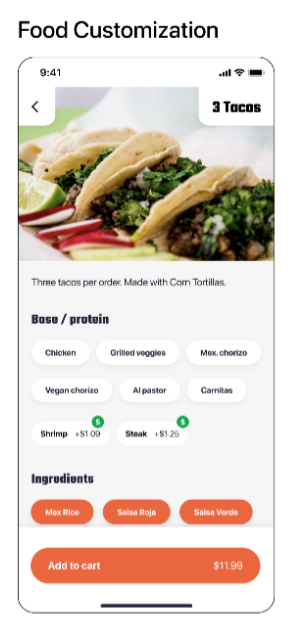
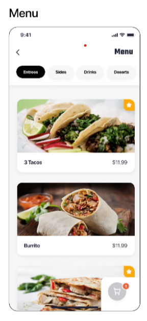
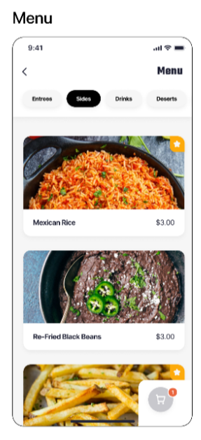
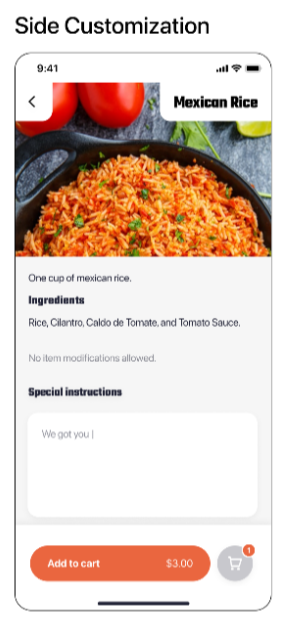
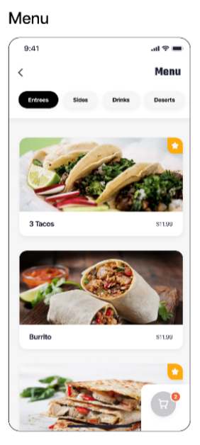
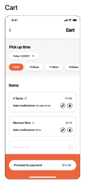
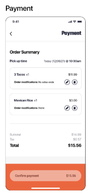
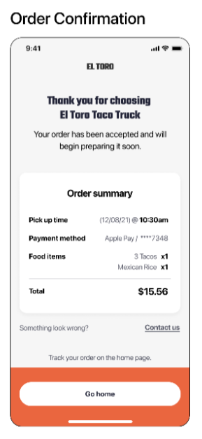
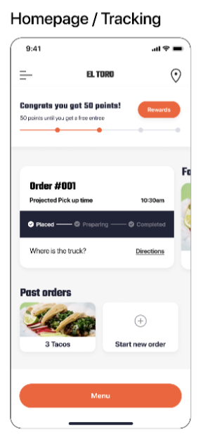
After a few weeks of research and user testing, we have our solution. We created a high-fidelity prototype of our designs, which acts as a real app would act if it were fully developed. Included are multiple task flows, the first of which consists of choosing a food item, customizing it, and adding it to your cart. The second task is to go back to the menu to add another food item to your cart, while the third task is to go to your cart and check out. The fourth task is to go to the homepage to track your order, while the final task is to go and view the rewards page. Below are pictures, as well as text, that goes into more detail about our overall designs.
Universal Navigation Button
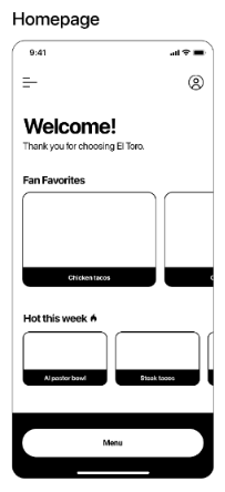
In our design, we included a universal button fixed to the bottom of every screen. This gives users a natural way to progress through the app, where the bottom button will lead them to the next task.
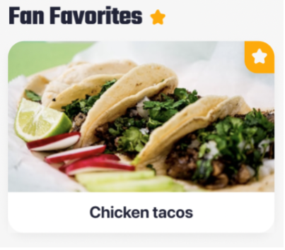
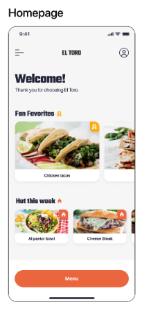
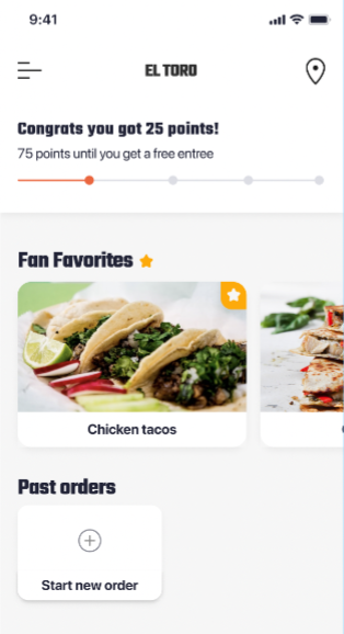
Fan Favorites
The use of the star icon over any other as a fan favorite is a conscious decision. The use of a star is widely used throughout many apps so the users will know what it means.
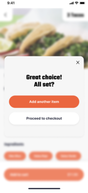
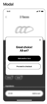
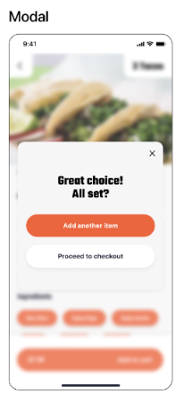
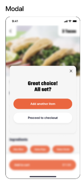
Modal Time
A unique mobile attribute we added was this modal that appears after adding something to the cart. This prompts users to add another item by using the same formatting as the main button but doesn’t penalize them for not choosing it.
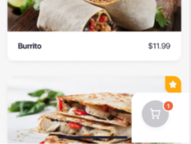
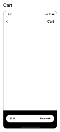
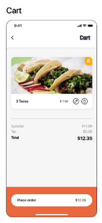
Cart Easily Accessible
The cart icon at the bottom right of the screen floats where the user’s thumbs usually rest (the “sweet spot”), allowing for an easy click. If the cart were at the top of the screen, there could be issues with comfort depending on the size of the phone being used.
Results
The project as a whole was very successful. We were able tocreate a high-fidelity prototype centering around critiques from possible users. The design that we created allows users tocustomize and place their orders efficiently, as well as give usersthe option to order ahead which would alleviate sidewalk crowding. We learned that a very efficient way of getting feedbackwas to go directly to our target audience and ask them specificallywhat their thoughts were on the current build of our project.