Website Redesign – Savas Brick Oven Pizza
You can View My Redesign Here
Savas Brick Oven Pizza is a pizza parlor close to me that college age students including myself go to for late night food and snacks. For my User Interface class, I was tasked with redesigning a website and decided this would be a good candidate for a redesign.
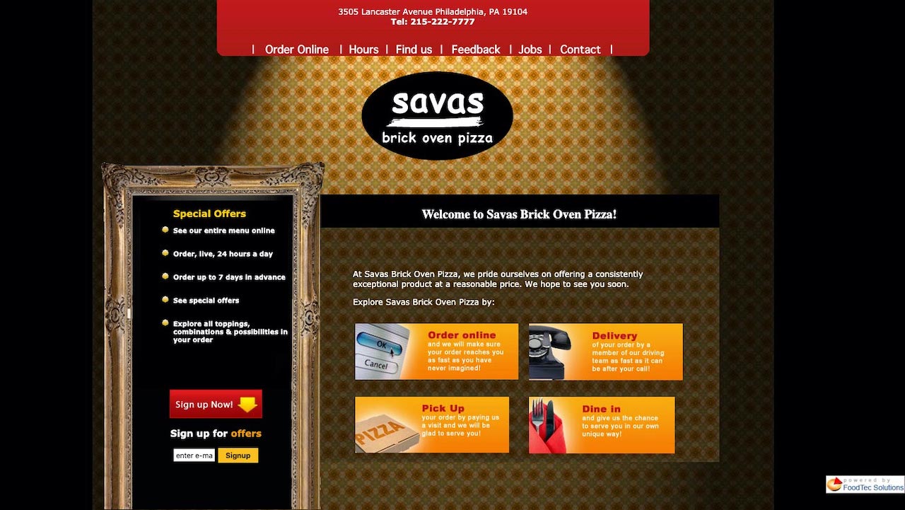
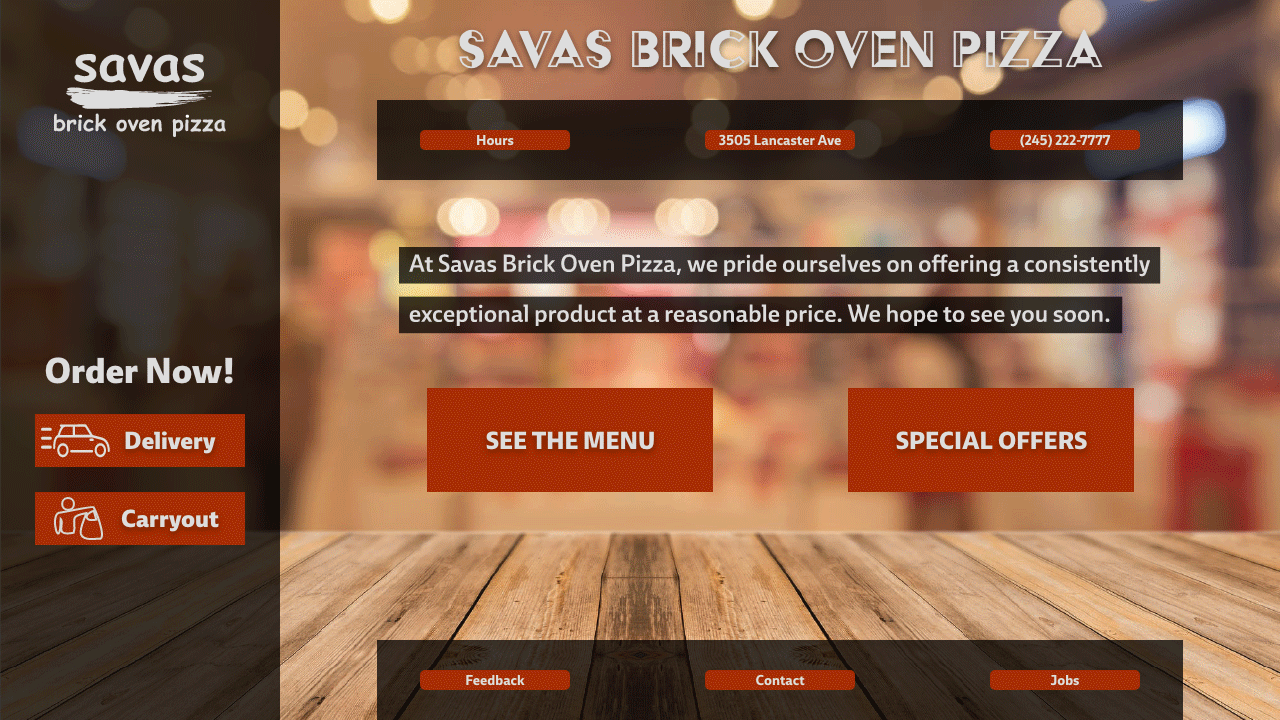
A strength going for the current design is phone ordering priority, this is the quickest way to order at the current stage located right smack at the top of the landing page.
Weaknesses include that the website is very lacking in core principles of design, is not very welcoming, and I get the sense that opting to call the business is the easiest mode as opposed to navigating their site (as I normally do myself).
Upon closer inspection the first clickable option in both the header and explore section is “Order Online” leading me to believe they are attempting to make online ordering the major mode of service. The website actually has no gallery of their product at all and the customer is left with no menu and has no idea what other products they offer from the website.
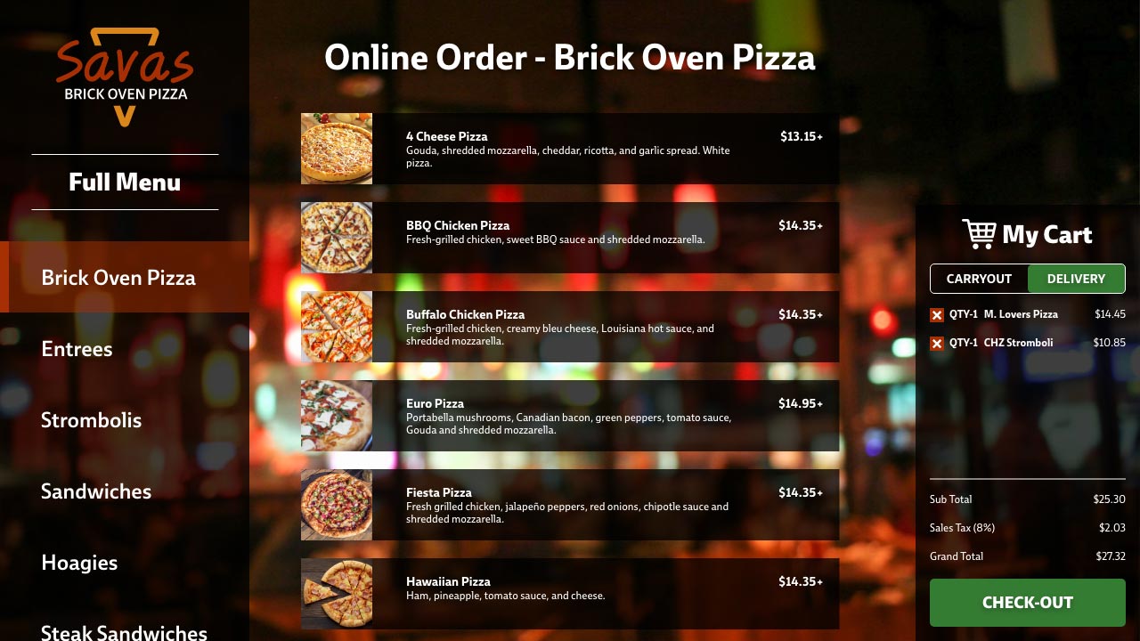
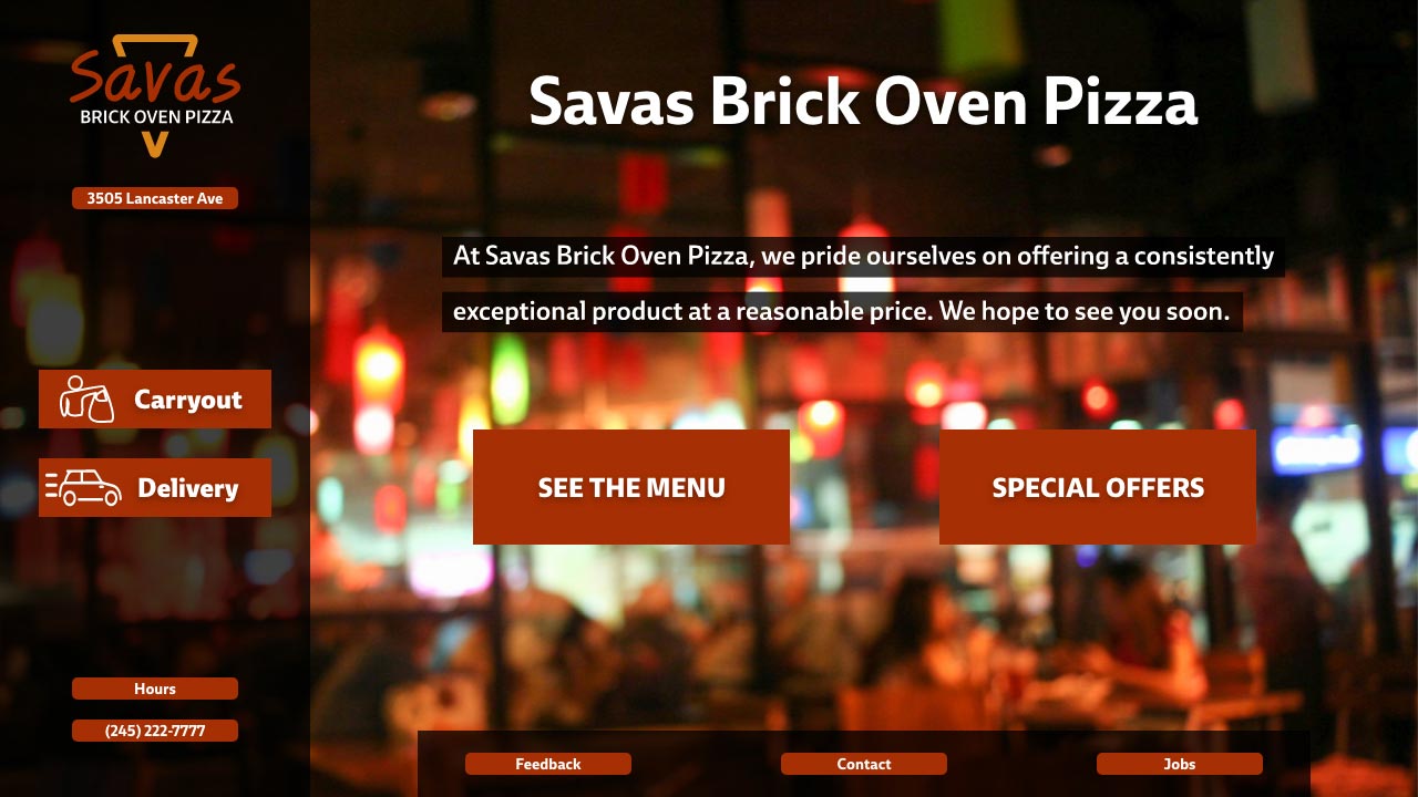
My goal for this site was to make online ordering a priority to nudge the user into choosing the more efficient mode of ordering for the business. This would be done by overhauling the interface to make it easy to use by prioritizing consistency, organization, and modern aesthetic.
Step #1: User Research & Wireframe
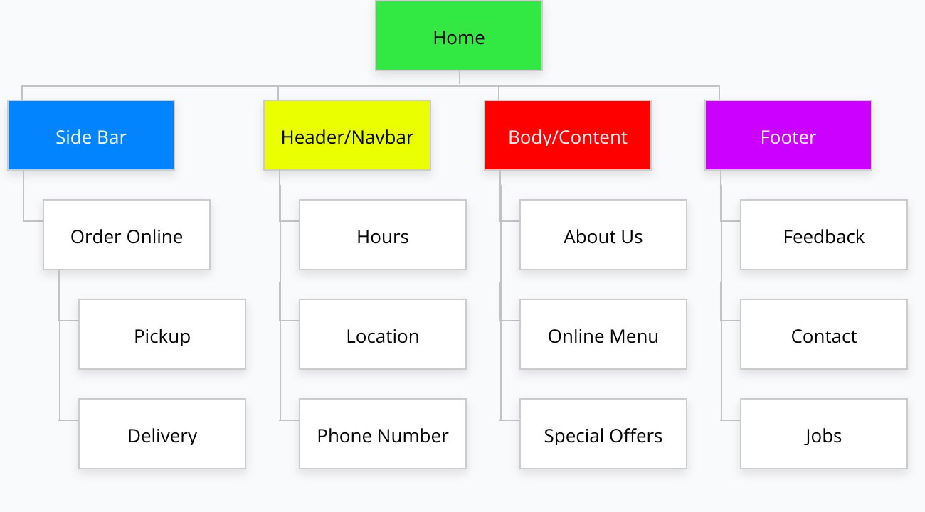
My first step was user testing with a card sort to get an idea of what non-designers would expect of a restaurant website.
Averaging 10 card sorts, the above sort was generated. I would keep the phone number in the Header for convenience, but last in the list to prioritize this mode. I also kept the ordering modes in the Sidebar pane to prioritize this ordering method to align with my goals.
The big take always from this test is relevance over features, specific rearrangement methods, naming clarification, and removal of the “Dine-In” as a mode of ordering.
At first thought, a reservation feature for a restaurant seems crucial for customer satisfaction, but in a broader scope, I should be aware this restaurant is quick service. And more importantly, understand my role as the designer is not finding what I think should be, but what the consumer thinks should be.
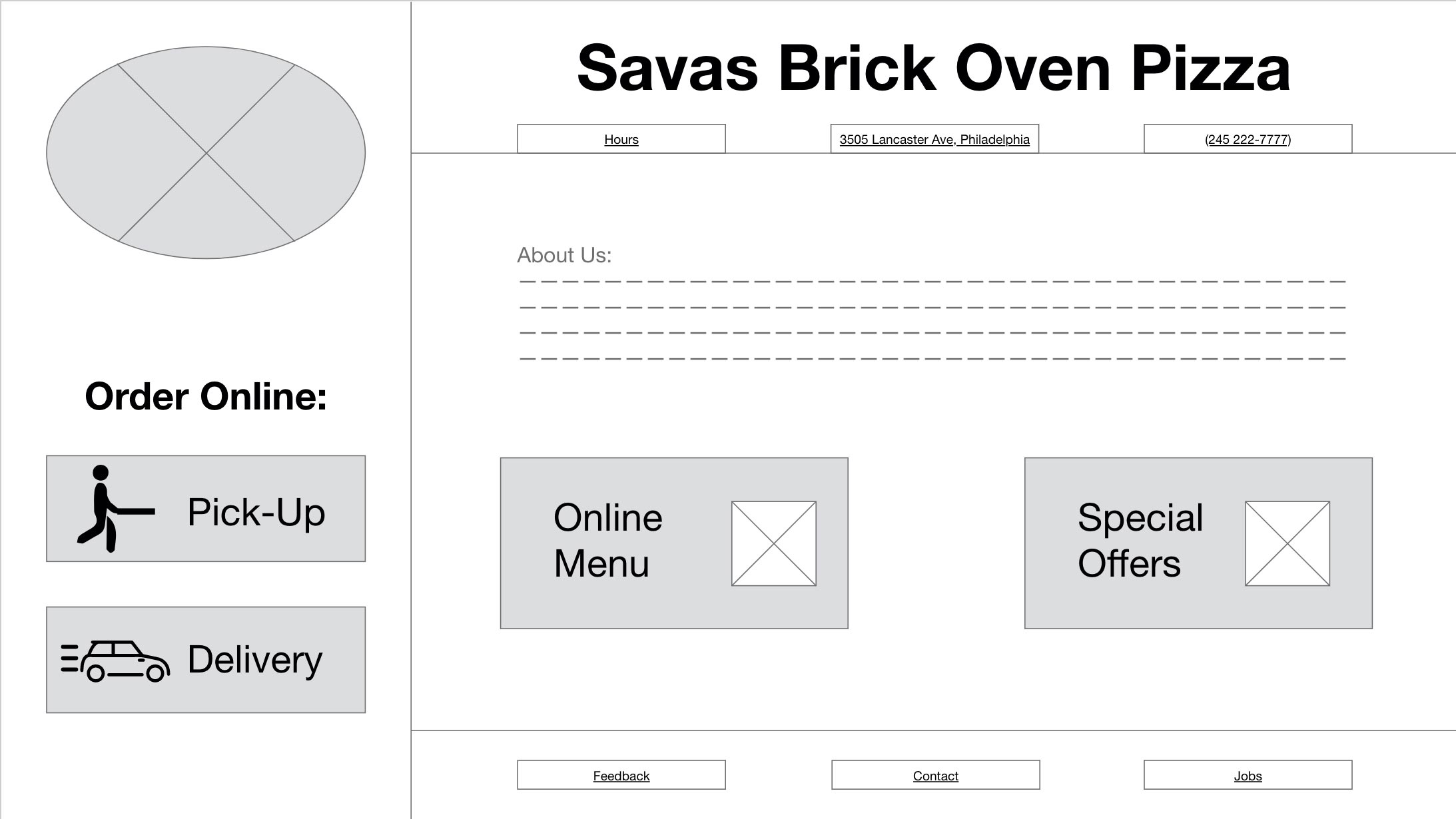
Step #2: Design, Function, & Color
My next step was to flesh out the design, functionality, and apply color.
Taking full advantage of grouping, repeating elements and components, good naming convention, and style guide, I was able to quickly create the general design complete with mobile ordering prototyping.
Step #3: Typography
After step #2, I went on to select a fitting font. I narrowed my search to three options: Mongoose, CarlMarx, and Ebony.
Font Family of Choice: Ebony
- Good contrast
- Most legible copy text
- Fit the aesthetic
Final Steps: Design Decisions & Interactions
The final steps included many small design changes and interactions.
The Mid-Fidelity prototype was functional and met the user expectations, but lacked personality. This was addressed with transitions, rounded corners, and other small considerations.
I even created a new logo to fit the redesign.
You can check out the new design by Viewing the Online Prototype